
Perfect Greige
Perfect Greige is a Neutral paint color from Sherwin-Williams, but its character reaches beyond a single label. It appears in Living Well - Breathe, placing it within several distinct decorating stories rather than a single fixed look. Treat the digital swatch as an opening note, then watch a physical sample from morning light through evening lamps.
Hex
#B7AB9FLRV
41.70
Perfect Greige's Color Strip
Perfect Greige is the third shade on this 7-color strip, sitting between Versatile Gray and Chatura Gray. The strip spans from Popular Gray at the lightest end to Chateau Brown at the deepest. Browsing strip 242 alongside this color helps you gauge whether to go lighter, darker, or stay right here.


Perfect Greige in Rooms
Follow Perfect Greige from one space to another and watch how light, scale and surrounding materials reshape its character. 7 sourced room photos sit alongside 14 generated visualizations.
8 Living Room Photos
Perfect Greige (6073) can change noticeably under the movement from window light to lamplight. Sample it beside the finishes that will remain in the room.
Living room walls in Perfect Greige offer versatile neutral warmth.
@mybudgetrecipes
2 Bedroom Photos
The 2 bedroom images turn a neutral swatch into something more spatial and expressive. Its midtone saturation keeps the color expressive without letting it dominate every surface around it.

Bedroom painted in Perfect Greige creates a serene backdrop.
@mybudgetrecipes

Bedroom in Perfect Greige provides a restful neutral palette.
@mybudgetrecipes
2 Kitchen Photos
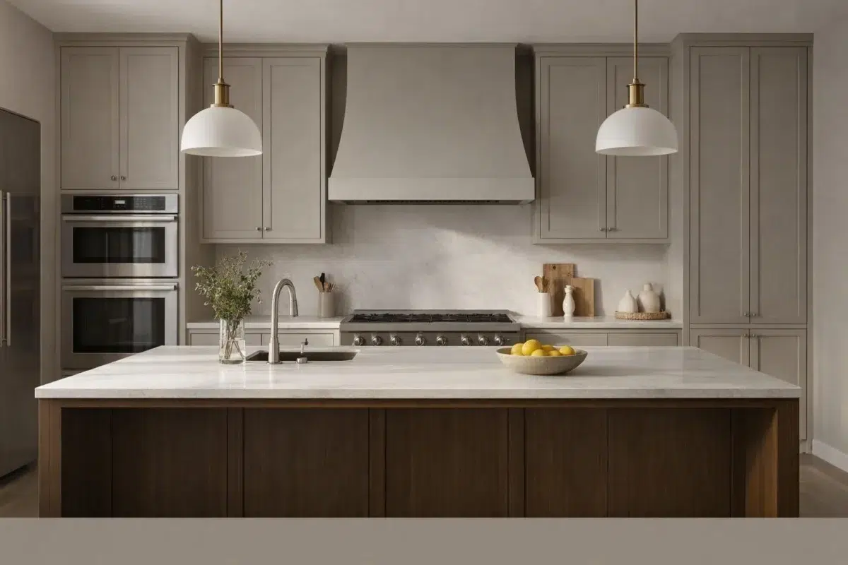
The 2 kitchen images turn a neutral swatch into something more spatial and expressive. Its midtone saturation keeps the color expressive without letting it dominate every surface around it.

Kitchen cabinets in Perfect Greige provide timeless neutral appeal.
@mybudgetrecipes

Kitchen in Perfect Greige works with various cabinet and hardware styles.
@mybudgetrecipes
2 Bathroom Photos
Perfect Greige (6073) offers a starting mood rather than a finished formula: Its warm classification can feel inviting beside tactile, natural materials. Test it under window light, mirrors and focused task lighting.

Bathroom finished in Perfect Greige feels clean and refined.
@mybudgetrecipes

Bathroom walls in Perfect Greige create a spa-like sanctuary.
@mybudgetrecipes
2 Home Office Photos
2 home office images trace Perfect Greige (6073) through the transition between focused work and the rest of the home. Its place within Living Well - Breathe hints at the range of palettes it can inhabit.

Home office walls in Perfect Greige enhance focus and calm.
@mybudgetrecipes

Home office painted in Perfect Greige boosts productivity and clarity.
@mybudgetrecipes
2 House Photos
2 house images trace Perfect Greige (6073) through the façade’s movement through sun, shade and season. Its place within Living Well - Breathe hints at the range of palettes it can inhabit.

Exterior house painted in Perfect Greige offers understated elegance.
@mybudgetrecipes

House exterior in Perfect Greige offers versatile curb appeal.
@mybudgetrecipes
2 Front Door Photos
2 generated visualizations explore how the color might shape the finished space. Together they show Perfect Greige (6073) as inspiration rather than a promise of an identical result.

Front door in Perfect Greige complements classic architectural details.
@mybudgetrecipes

Front door in Perfect Greige balances warmth with neutrality.
@mybudgetrecipes
1 Misc Photo
Viewed across 1 misc image in an assortment of spaces that reveals the color outside a single design formula, Perfect Greige (6073) reveals how much color depends on scale, surface and shadow. An LRV of 41.7 lets the color hold its identity across both brighter and more shaded parts of the room.

Desk setup benefits from the calming Perfect Greige wall treatment nearby.
@mylilttledecor
Expert Perspectives
Articles and features from across our network of home and design sites.
Coordinating Colors


At LRV 75 vs 42, Heron Plume is decisively the brighter choice.


At LRV 73 vs 42, Aesthetic White is decisively the brighter choice.


Perfect Greige reflects far more light (LRV 42 vs 26), opening up a space where Hushed Auburn encloses it.
Trim Color
At LRV 75 vs 42, Heron Plume is decisively the brighter choice.
Similar Colors

A 4-point LRV gap (42 vs 38) makes Perfect Greige the marginally brighter of the two.


Their light reflectance is nearly identical (LRV 42 vs 39), so neither reads brighter in a room.


Balanced Beige reads slightly lighter (LRV 46 vs 42), a gap that shows most in low-lit rooms.


Their light reflectance is nearly identical (LRV 43 vs 42), so neither reads brighter in a room.


Diverse Beige reads slightly lighter (LRV 47 vs 42), a gap that shows most in low-lit rooms.

With LRVs of 42 and 42, the two reflect almost the same amount of light.


A 5-point LRV gap (42 vs 37) makes Perfect Greige the marginally brighter of the two.

Their light reflectance is nearly identical (LRV 42 vs 40), so neither reads brighter in a room.

Studio Beige reads slightly lighter (LRV 46 vs 42), a gap that shows most in low-lit rooms.


Requisite Gray reads slightly lighter (LRV 45 vs 42), a gap that shows most in low-lit rooms.
Complementary Colors


At LRV 42 vs 6, Perfect Greige is decisively the brighter choice.


A 8-point LRV gap (42 vs 34) makes Perfect Greige the marginally brighter of the two.


At LRV 42 vs 7, Perfect Greige is decisively the brighter choice.


At LRV 42 vs 11, Perfect Greige is decisively the brighter choice.


At LRV 42 vs 7, Perfect Greige is decisively the brighter choice.


At LRV 69 vs 42, Starry Night is decisively the brighter choice.


Perfect Greige reflects far more light (LRV 42 vs 20), opening up a space where Soulful Blue encloses it.
Lighter Colors


Grayish reflects far more light (LRV 60 vs 42), opening up a space where Perfect Greige encloses it.
With LRVs of 42 and 42, the two reflect almost the same amount of light.
Requisite Gray reads slightly lighter (LRV 45 vs 42), a gap that shows most in low-lit rooms.

Original White reflects far more light (LRV 74 vs 42), opening up a space where Perfect Greige encloses it.


At LRV 61 vs 42, Mercurial is decisively the brighter choice.
Darker Colors


Perfect Greige reflects far more light (LRV 42 vs 20), opening up a space where Virtual Taupe encloses it.


At LRV 42 vs 18, Perfect Greige is decisively the brighter choice.


Perfect Greige reflects far more light (LRV 42 vs 27), opening up a space where Sycamore Tan encloses it.


At LRV 42 vs 27, Perfect Greige is decisively the brighter choice.


At LRV 42 vs 29, Perfect Greige is decisively the brighter choice.
Color Codes
Manufacturer description
To create a warm, welcoming mood in your living room or bedroom, try this creamy mid-tone gray with red undertones.