
Citrine
At first glance, Citrine belongs to the yellow family; in a room, light and context can make it far more elusive. Its neutral temperature leaves room for surrounding materials and light to pull the color warmer or cooler. Its related shades below reveal where the color harmonizes—and where contrast brings it fully to life.
Hex
#E8ECD1LRV
81.98
Citrine in Rooms
Follow Citrine from one space to another and watch how light, scale and surrounding materials reshape its character. 10 generated visualizations explore how the color might shape a finished room.
1 Bedroom Photo
Citrine (6714) can change noticeably under gentle morning light and low evening lamps. Sample it beside the finishes that will remain in the room.
A moody bedroom painted in Citrine
@mybudgetrecipes
1 Bathroom Photo
Across 1 bathroom image, Citrine (6714) meets window light, mirrors and focused task lighting. Its neutral temperature gives the surrounding palette unusual influence over the final mood.

Citrine — modern luxury bathroom
@mybudgetrecipes
1 Home Office Photo
These 1 home office image show how Citrine (6714) can sit beside wood, paper, shelving and upholstered seating. The yellow hue classifications suggest the subtle directions the color may take as the room changes.

Sherwin-Williams Citrine in a unique home office
@mybudgetrecipes
1 Dining Room Photo
The room’s change from everyday meals to evening occasions can draw different notes from Citrine (6714). The yellow hue classifications suggest the subtle directions the color may take as the room changes.

Citrine paint in a rustic modern dining room
@mybudgetrecipes
1 Front Door Photo
Citrine (6714) moves through 1 front door image without becoming a fixed prescription for the room. Its neutral temperature gives the surrounding palette unusual influence over the final mood.

classy front door featuring Citrine by Sherwin-Williams
@mybudgetrecipes
1 Mudroom Photo
Citrine (6714) moves through 1 mudroom image without becoming a fixed prescription for the room. Its neutral temperature gives the surrounding palette unusual influence over the final mood.

Citrine paint in a rustic modern mudroom
@mybudgetrecipes
1 Kitchen Photo
Citrine (6714) brings its yellow character into a hardworking room where color meets movement and strong surfaces. Its neutral temperature gives the surrounding palette unusual influence over the final mood.

Citrine — contemporary kitchen
@mybudgetrecipes
1 House Photo
Citrine (6714) offers a starting mood rather than a finished formula: Its neutral temperature gives the surrounding palette unusual influence over the final mood. Test it under full daylight, cloud cover and long evening shadows.

Citrine color — coastal house inspiration
@mybudgetrecipes
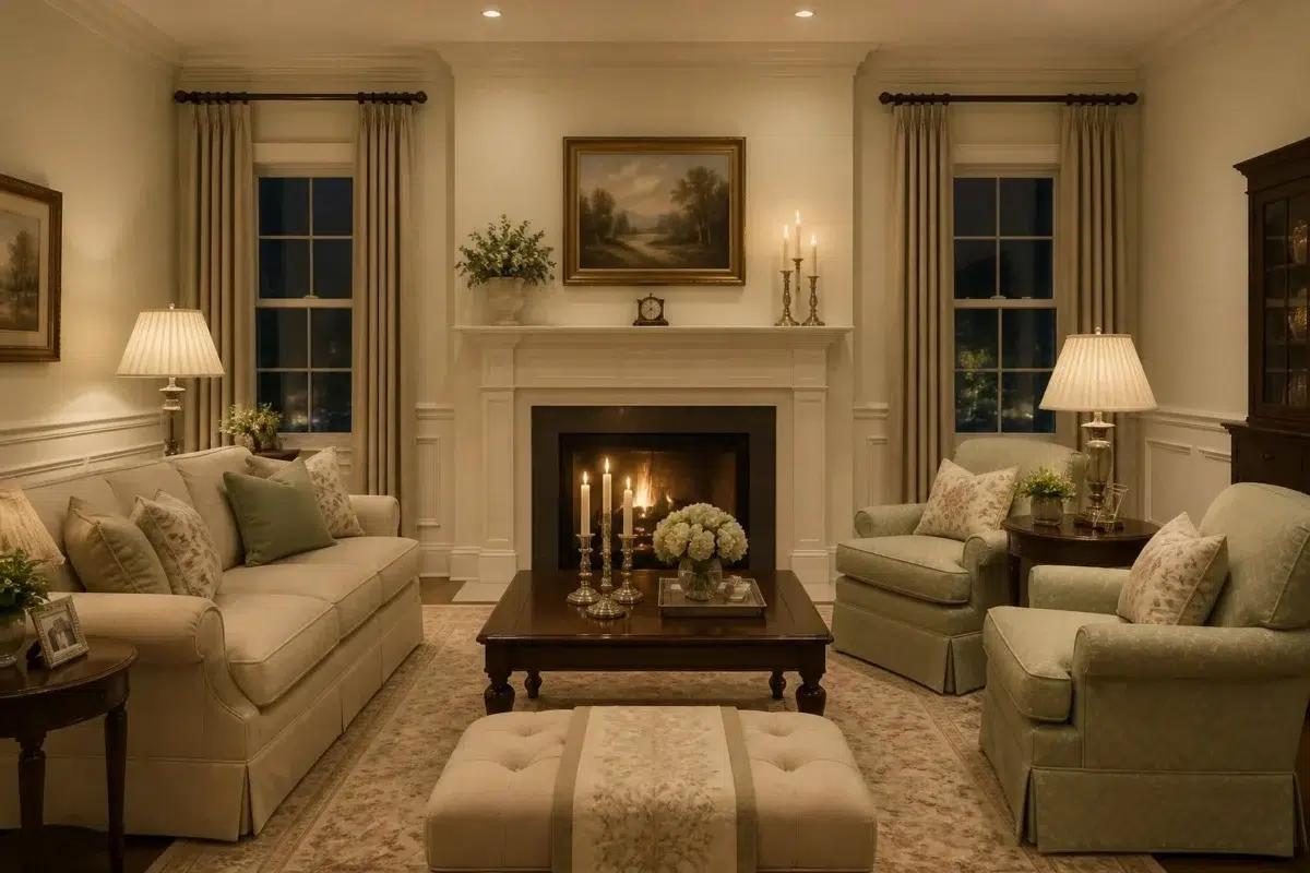
1 Living Room Photo
Citrine (6714) brings its yellow character into a space shaped by conversation, quiet evenings and changing daylight. Its neutral temperature gives the surrounding palette unusual influence over the final mood.

A traditional living room painted in Citrine
@mybudgetrecipes
1 Patio Photo
Citrine (6714) moves through 1 patio image without becoming a fixed prescription for the room. Its neutral temperature gives the surrounding palette unusual influence over the final mood.

rustic modern patio featuring Citrine by Sherwin-Williams
@mybudgetrecipes
Expert Perspectives
Articles and features from across our network of home and design sites.
Coordinating Colors


Westhighland White reads slightly lighter (LRV 86 vs 82), a gap that shows most in low-lit rooms.


Similar Colors

With LRVs of 82 and 81, the two reflect almost the same amount of light.


Their light reflectance is nearly identical (LRV 82 vs 80), so neither reads brighter in a room.


Their light reflectance is nearly identical (LRV 83 vs 82), so neither reads brighter in a room.


Citrine reads slightly lighter (LRV 82 vs 74), a gap that shows most in low-lit rooms.


With LRVs of 82 and 81, the two reflect almost the same amount of light.


Complementary Colors

At LRV 82 vs 12, Citrine is decisively the brighter choice.


A 6-point LRV gap (82 vs 76) makes Citrine the marginally brighter of the two.


Citrine reflects far more light (LRV 82 vs 16), opening up a space where Forget-Me-Not encloses it.

At LRV 82 vs 5, Citrine is decisively the brighter choice.


At LRV 82 vs 29, Citrine is decisively the brighter choice.
Lighter Colors
With LRVs of 82 and 81, the two reflect almost the same amount of light.
Darker Colors


Citrine reads slightly lighter (LRV 82 vs 73), a gap that shows most in low-lit rooms.


Citrine reflects far more light (LRV 82 vs 58), opening up a space where Dancing Green encloses it.
Color Codes
Manufacturer description
This luminous pale yellow strikes a perfect balance between warmth and restraint, casting a gentle glow reminiscent of late afternoon sunlight filtered through sheer linen. Its neutral undertones make it an ideal choice for kitchens, sunrooms, or bedrooms where you want brightness without boldness.