
Brave Purple
Brave Purple is a Purple paint color from Sherwin-Williams, but its character reaches beyond a single label. Its blue and purple classifications hint at the directions it may take as daylight, lamps and neighboring colors move around it. The manufacturer's description below offers one reading; the room imagery leaves space for your own.
Hex
#968DB8LRV
28.93
Brave Purple's Color Strip
Brave Purple is the fifth shade on this 7-color strip, sitting between Forever Lilac and Forget-Me-Not. The strip spans from Inspired Lilac at the lightest end to Izmir Purple at the deepest. Browsing strip 181 alongside this color helps you gauge whether to go lighter, darker, or stay right here.


Brave Purple in Rooms
Follow Brave Purple from one space to another and watch how light, scale and surrounding materials reshape its character. 10 generated visualizations explore how the color might shape a finished room.
1 Dining Room Photo
Brave Purple (6823) offers a starting mood rather than a finished formula: Its cool classification can bring a composed, clean tension to warmer finishes. Test it under natural light, candles and pendant lighting.
Brave Purple paint in a rustic modern dining room
@mybudgetrecipes
1 Bedroom Photo
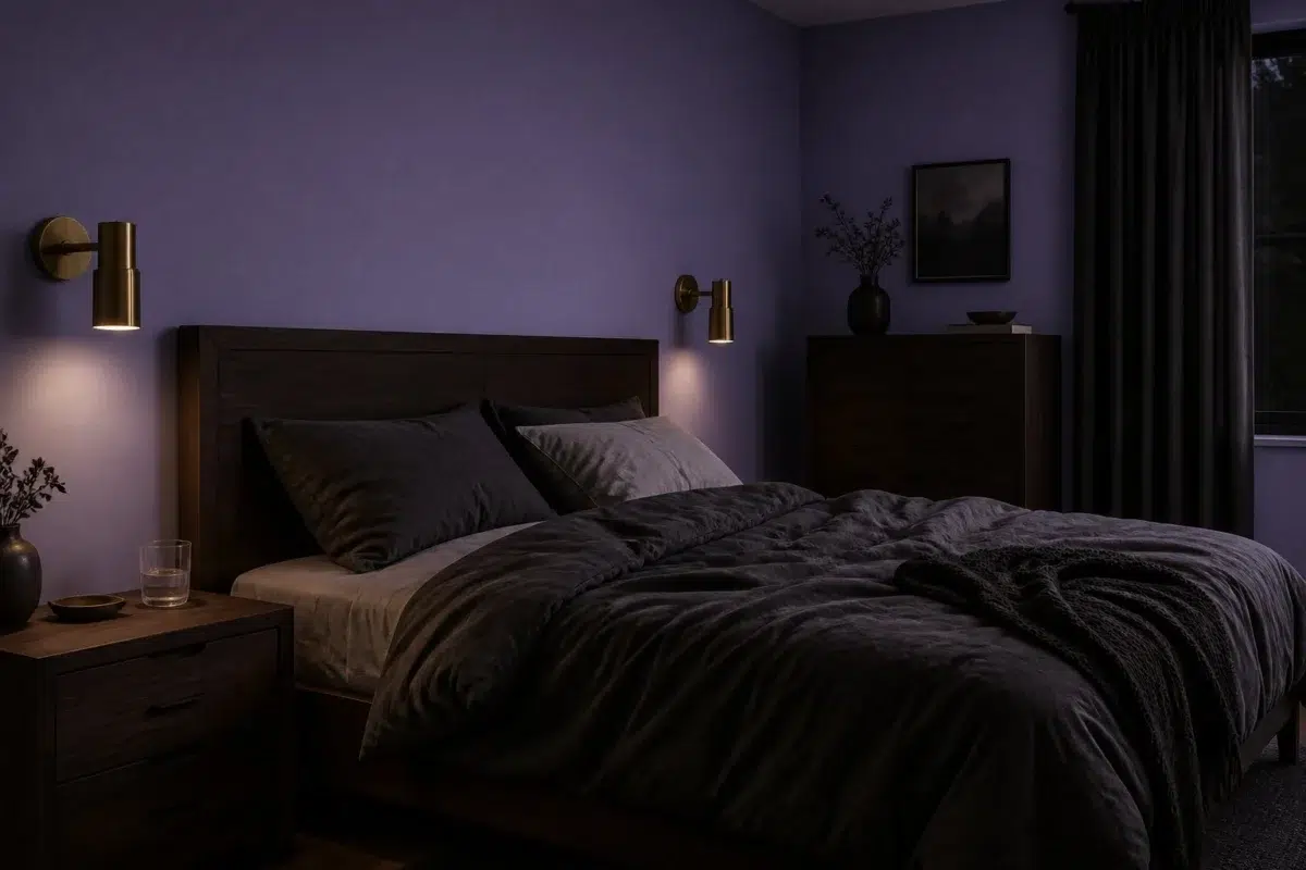
These 1 bedroom image show how Brave Purple (6823) can sit beside bed linen, timber, wool and upholstered textures. The blue, purple hue classifications suggest the subtle directions the color may take as the room changes.

A moody bedroom painted in Brave Purple
@mybudgetrecipes
1 Front Door Photo
Against hardware, glazing, masonry, timber and surrounding trim, Brave Purple (6823) may feel quieter, sharper or more atmospheric than the digital swatch alone. An LRV of 28.9 lets the color hold its identity across both brighter and more shaded parts of the room.

minimalist front door featuring Brave Purple by Sherwin-Williams
@mybudgetrecipes
1 Bathroom Photo
These 1 bathroom image show how Brave Purple (6823) can sit beside tile, stone, glass, timber and metal fixtures. The blue, purple hue classifications suggest the subtle directions the color may take as the room changes.

Brave Purple — traditional bathroom
@mybudgetrecipes
1 House Photo
Brave Purple (6823) can change noticeably under full daylight, cloud cover and long evening shadows. Sample it beside the finishes that will remain in the room.

Brave Purple color — rustic modern house inspiration
@mybudgetrecipes
1 Living Room Photo
Brave Purple (6823) brings its purple character into a space shaped by conversation, quiet evenings and changing daylight. Its brighter saturation allows the hue to remain present rather than fading quietly into the background.

A hollywood regency living room painted in Brave Purple
@mybudgetrecipes
1 Kitchen Photo
Across 1 kitchen image, Brave Purple (6823) meets daylight, task lighting and evening pendants. Its cool classification can bring a composed, clean tension to warmer finishes.

Brave Purple — organic modern kitchen
@mybudgetrecipes
1 Mudroom Photo
1 mudroom image trace Brave Purple (6823) through the daily movement of arrivals, departures and changing weather. The blue, purple hue classifications suggest the subtle directions the color may take as the room changes.

Brave Purple paint in a earthy mudroom
@mybudgetrecipes
1 Patio Photo
Brave Purple (6823) moves through 1 patio image without becoming a fixed prescription for the room. Its cool classification can bring a composed, clean tension to warmer finishes.

boho patio featuring Brave Purple by Sherwin-Williams
@mybudgetrecipes
1 Home Office Photo
Brave Purple (6823) can change noticeably under daylight beside desk lamps and screen glow. Sample it beside the finishes that will remain in the room.

Brave Purple — industrial home office
@mybudgetrecipes
Expert Perspectives
Articles and features from across our network of home and design sites.
Coordinating Colors


Original White reflects far more light (LRV 74 vs 29), opening up a space where Brave Purple encloses it.


At LRV 59 vs 29, Useful Gray is decisively the brighter choice.


Brave Purple reflects far more light (LRV 29 vs 9), opening up a space where Connor's Lakefront encloses it.
Trim Color
Original White reflects far more light (LRV 74 vs 29), opening up a space where Brave Purple encloses it.
Similar Colors


With LRVs of 29 and 29, the two reflect almost the same amount of light.

Their light reflectance is nearly identical (LRV 29 vs 28), so neither reads brighter in a room.


With LRVs of 29 and 28, the two reflect almost the same amount of light.


With LRVs of 32 and 29, the two reflect almost the same amount of light.


Berry Frappe reads slightly lighter (LRV 39 vs 29), a gap that shows most in low-lit rooms.


Forever Lilac reads slightly lighter (LRV 40 vs 29), a gap that shows most in low-lit rooms.


With LRVs of 29 and 28, the two reflect almost the same amount of light.


With LRVs of 29 and 26, the two reflect almost the same amount of light.


With LRVs of 29 and 28, the two reflect almost the same amount of light.

Brave Purple reads slightly lighter (LRV 29 vs 22), a gap that shows most in low-lit rooms.
Complementary Colors


Conservative Gray reflects far more light (LRV 63 vs 29), opening up a space where Brave Purple encloses it.


Spare White reflects far more light (LRV 77 vs 29), opening up a space where Brave Purple encloses it.


Their light reflectance is nearly identical (LRV 31 vs 29), so neither reads brighter in a room.


Brave Purple reflects far more light (LRV 29 vs 10), opening up a space where Rookwood Dark Green encloses it.


At LRV 73 vs 29, Opaline is decisively the brighter choice.

Pine Frost reflects far more light (LRV 65 vs 29), opening up a space where Brave Purple encloses it.


A 12-point LRV gap (41 vs 29) makes Clary Sage the marginally brighter of the two.
Lighter Colors
Forever Lilac reads slightly lighter (LRV 40 vs 29), a gap that shows most in low-lit rooms.


At LRV 62 vs 29, Potentially Purple is decisively the brighter choice.

At LRV 48 vs 29, Wisteria is decisively the brighter choice.
Darker Colors


At LRV 29 vs 16, Brave Purple is decisively the brighter choice.
Color Codes
Manufacturer description
Step boldly into a jewel-toned sanctuary with this vibrant, saturated purple that radiates creative confidence and artistic spirit. Perfect for powder rooms, creative spaces, or accent walls, it pairs beautifully with warm metallics and crisp whites to let its cool intensity truly shine.