
Concord Grape
Sherwin-Williams's Concord Grape is a purple shade whose quieter details emerge through comparison. Its midtone saturation balances color with restraint, so the hue can register without overwhelming nearby finishes. Because screens flatten both light and texture, sample the paint beside the finishes that will ultimately surround it.
Hex
#443757LRV
4.60
Concord Grape's Color Strip
Concord Grape is the seventh shade on this 7-color strip, the deepest shade in this coordinated family. Strip 189 lines up the full value range so you can see exactly where this color lands among its closest relatives.


Concord Grape in Rooms
Follow Concord Grape from one space to another and watch how light, scale and surrounding materials reshape its character. 10 generated visualizations explore how the color might shape a finished room.
1 Front Door Photo
Viewed across 1 front door image in a small architectural moment with an outsized first impression, Concord Grape (6559) reveals how much color depends on scale, surface and shadow. With an LRV of 4.6, it carries enough visual weight to make light, trim and texture feel especially deliberate.
bold front door featuring Concord Grape by Sherwin-Williams
@mybudgetrecipes
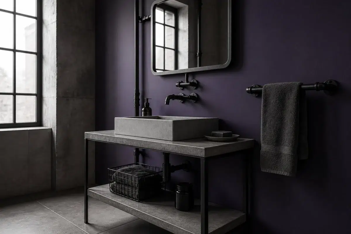
1 Bathroom Photo
The purple hue classifications suggest the subtle directions the color may take as the room changes. In this setting, let window light, mirrors and focused task lighting and tile, stone, glass, timber and metal fixtures guide the final sample decision.

Concord Grape — industrial bathroom
@mybudgetrecipes
1 Dining Room Photo
1 dining room image trace Concord Grape (6559) through the room’s change from everyday meals to evening occasions. The purple hue classifications suggest the subtle directions the color may take as the room changes.

Concord Grape paint in a elegant dining room
@mybudgetrecipes
1 Home Office Photo
Concord Grape (6559) brings its purple character into a focused room balancing work, concentration and comfort. Its midtone saturation keeps the color expressive without letting it dominate every surface around it.

Sherwin-Williams Concord Grape in a art deco home office
@mybudgetrecipes
1 Bedroom Photo
1 bedroom image place Concord Grape (6559) in a room designed around rest, softness and retreat. With an LRV of 4.6, it carries enough visual weight to make light, trim and texture feel especially deliberate.

A moody bedroom painted in Concord Grape
@mybudgetrecipes
1 Patio Photo
The 1 patio image turn a purple swatch into something more spatial and expressive. Its midtone saturation keeps the color expressive without letting it dominate every surface around it.

minimalist patio featuring Concord Grape by Sherwin-Williams
@mybudgetrecipes
1 Mudroom Photo
In a practical threshold where the outdoors enters the home, the most interesting quality of Concord Grape (6559) may be the way it responds to flooring, storage, timber, baskets and hardware. The purple hue classifications suggest the subtle directions the color may take as the room changes.

Concord Grape paint in a industrial mudroom
@mybudgetrecipes
1 House Photo
The façade’s movement through sun, shade and season can draw different notes from Concord Grape (6559). The purple hue classifications suggest the subtle directions the color may take as the room changes.

Concord Grape color — aesthetic house inspiration
@mybudgetrecipes
1 Kitchen Photo
The purple hue classifications suggest the subtle directions the color may take as the room changes. In this setting, let daylight, task lighting and evening pendants and stone, timber, tile and metal finishes guide the final sample decision.

Concord Grape — modern luxury kitchen
@mybudgetrecipes
1 Living Room Photo
Viewed across 1 living room image in a space shaped by conversation, quiet evenings and changing daylight, Concord Grape (6559) reveals how much color depends on scale, surface and shadow. With an LRV of 4.6, it carries enough visual weight to make light, trim and texture feel especially deliberate.

A scandinavian living room painted in Concord Grape
@mybudgetrecipes
Expert Perspectives
Articles and features from across our network of home and design sites.
Coordinating Colors


At LRV 83 vs 5, Snowbound is decisively the brighter choice.


Natural Linen reflects far more light (LRV 66 vs 5), opening up a space where Concord Grape encloses it.


At LRV 26 vs 5, Gentle Grape is decisively the brighter choice.
Trim Color
At LRV 83 vs 5, Snowbound is decisively the brighter choice.
Similar Colors


With LRVs of 5 and 5, the two reflect almost the same amount of light.

Their light reflectance is nearly identical (LRV 5 vs 5), so neither reads brighter in a room.


With LRVs of 7 and 5, the two reflect almost the same amount of light.


Their light reflectance is nearly identical (LRV 6 vs 5), so neither reads brighter in a room.

Their light reflectance is nearly identical (LRV 6 vs 5), so neither reads brighter in a room.


A 4-point LRV gap (9 vs 5) makes Impulsive Purple the marginally brighter of the two.


With LRVs of 7 and 5, the two reflect almost the same amount of light.


A 4-point LRV gap (8 vs 5) makes Fully Purple the marginally brighter of the two.


Their light reflectance is nearly identical (LRV 6 vs 5), so neither reads brighter in a room.


Their light reflectance is nearly identical (LRV 7 vs 5), so neither reads brighter in a room.
Complementary Colors


A 6-point LRV gap (10 vs 5) makes Rookwood Dark Green the marginally brighter of the two.


Opaline reflects far more light (LRV 73 vs 5), opening up a space where Concord Grape encloses it.

At LRV 65 vs 5, Pine Frost is decisively the brighter choice.


Vogue Green reads slightly lighter (LRV 9 vs 5), a gap that shows most in low-lit rooms.


Artichoke reflects far more light (LRV 21 vs 5), opening up a space where Concord Grape encloses it.


At LRV 64 vs 5, Filmy Green is decisively the brighter choice.

At LRV 30 vs 5, Leaflet is decisively the brighter choice.
Lighter Colors


Clematis reads slightly lighter (LRV 16 vs 5), a gap that shows most in low-lit rooms.


African Violet reads slightly lighter (LRV 11 vs 5), a gap that shows most in low-lit rooms.
Color Codes
Manufacturer description
Picture twilight descending over a vineyard, where clusters of deep purple grapes hang heavy with mysterious richness and cool blue undertones. This sumptuous, deeply saturated shade brings dramatic elegance to dining rooms and studies, grounding a space with sophisticated depth.