
Clematis
Sherwin-Williams's Clematis is a purple shade whose quieter details emerge through comparison. Its purple classifications hint at the directions it may take as daylight, lamps and neighboring colors move around it. Its related shades below reveal where the color harmonizes—and where contrast brings it fully to life.
Hex
#7E6596LRV
15.93
Clematis's Color Strip
Clematis is the sixth shade on this 7-color strip, sitting between Kismet and Impulsive Purple. The strip spans from Elation at the lightest end to Impulsive Purple at the deepest. Color strip 182 groups these shades together so you can see how each reads next to its neighbors.


Clematis in Rooms
Follow Clematis from one space to another and watch how light, scale and surrounding materials reshape its character. 10 generated visualizations explore how the color might shape a finished room.
1 Front Door Photo
The 1 front door image turn a purple swatch into something more spatial and expressive. Its brighter saturation allows the hue to remain present rather than fading quietly into the background.
bold front door featuring Clematis by Sherwin-Williams
@mybudgetrecipes
1 Bedroom Photo
The 1 bedroom image turn a purple swatch into something more spatial and expressive. Its brighter saturation allows the hue to remain present rather than fading quietly into the background.

A industrial bedroom painted in Clematis
@mybudgetrecipes
1 Dining Room Photo
Viewed across 1 dining room image in a gathering space that can move from daylight to ceremony, Clematis (6831) reveals how much color depends on scale, surface and shadow. With an LRV of 15.9, it carries enough visual weight to make light, trim and texture feel especially deliberate.

Clematis paint in a boho dining room
@mybudgetrecipes
1 Home Office Photo
Clematis (6831) offers a starting mood rather than a finished formula: Its cool classification can bring a composed, clean tension to warmer finishes. Test it under daylight beside desk lamps and screen glow.

Sherwin-Williams Clematis in a warm home office
@mybudgetrecipes
1 Bathroom Photo
1 generated visualization explores how the color might shape the finished space. Together they show Clematis (6831) as inspiration rather than a promise of an identical result.

Clematis — earthy bathroom
@mybudgetrecipes
1 Mudroom Photo
Viewed across 1 mudroom image in a practical threshold where the outdoors enters the home, Clematis (6831) reveals how much color depends on scale, surface and shadow. With an LRV of 15.9, it carries enough visual weight to make light, trim and texture feel especially deliberate.

Clematis paint in a tiny mudroom
@mybudgetrecipes
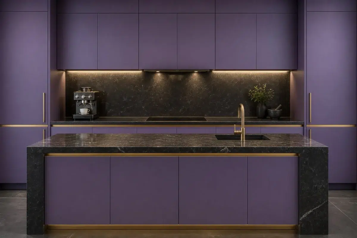
1 Kitchen Photo
The 1 kitchen image turn a purple swatch into something more spatial and expressive. Its brighter saturation allows the hue to remain present rather than fading quietly into the background.

Clematis — bold kitchen
@mybudgetrecipes
1 Patio Photo
Clematis (6831) brings its purple character into an outdoor room surrounded by sky, planting and open light. Its brighter saturation allows the hue to remain present rather than fading quietly into the background.

warm patio featuring Clematis by Sherwin-Williams
@mybudgetrecipes
1 Living Room Photo
Clematis (6831) can change noticeably under the movement from window light to lamplight. Sample it beside the finishes that will remain in the room.

A organic modern living room painted in Clematis
@mybudgetrecipes
1 House Photo
1 generated visualization explores how the color might shape the finished space. Together they show Clematis (6831) as inspiration rather than a promise of an identical result.

Clematis color — traditional house inspiration
@mybudgetrecipes
Expert Perspectives
Articles and features from across our network of home and design sites.
Coordinating Colors


At LRV 74 vs 16, Original White is decisively the brighter choice.


Origami White reflects far more light (LRV 76 vs 16), opening up a space where Clematis encloses it.


A 8-point LRV gap (16 vs 8) makes Clematis the marginally brighter of the two.
Trim Color
At LRV 74 vs 16, Original White is decisively the brighter choice.
Similar Colors


With LRVs of 16 and 16, the two reflect almost the same amount of light.

Clematis reads slightly lighter (LRV 16 vs 12), a gap that shows most in low-lit rooms.

With LRVs of 16 and 13, the two reflect almost the same amount of light.


Clematis reads slightly lighter (LRV 16 vs 11), a gap that shows most in low-lit rooms.

Their light reflectance is nearly identical (LRV 16 vs 16), so neither reads brighter in a room.


Clematis reads slightly lighter (LRV 16 vs 11), a gap that shows most in low-lit rooms.

A 6-point LRV gap (22 vs 16) makes Lavish Lavender the marginally brighter of the two.

A 5-point LRV gap (21 vs 16) makes Veri Berri the marginally brighter of the two.


A 4-point LRV gap (16 vs 12) makes Clematis the marginally brighter of the two.
Complementary Colors


A 6-point LRV gap (16 vs 10) makes Clematis the marginally brighter of the two.


At LRV 65 vs 16, Pine Frost is decisively the brighter choice.


Clematis reads slightly lighter (LRV 16 vs 9), a gap that shows most in low-lit rooms.


At LRV 33 vs 16, Rookwood Jade is decisively the brighter choice.
Lighter Colors


At LRV 39 vs 16, Berry Frappe is decisively the brighter choice.
Darker Colors


A 7-point LRV gap (16 vs 9) makes Clematis the marginally brighter of the two.
Clematis reads slightly lighter (LRV 16 vs 11), a gap that shows most in low-lit rooms.


Clematis reads slightly lighter (LRV 16 vs 5), a gap that shows most in low-lit rooms.
Color Codes
Manufacturer description
This jewel-toned purple draws its richness from cool violet undertones, evoking the deep velvety petals of clematis flowers in twilight. A dramatically saturated choice for accent walls or moody bedrooms that demand elegance and intrigue.