
Constant Coral
Sherwin-Williams's Constant Coral is a red shade whose quieter details emerge through comparison. Its midtone saturation balances color with restraint, so the hue can register without overwhelming nearby finishes. Because screens flatten both light and texture, sample the paint beside the finishes that will ultimately surround it.
Hex
#CD8E7FLRV
33.86
Constant Coral's Color Strip
Constant Coral is the third shade on this 7-color strip, sitting between Mellow Coral and Coral Clay. The strip spans from Romance at the lightest end to Fireweed at the deepest. Strip 114 lines up the full value range so you can see exactly where this color lands among its closest relatives.


Constant Coral in Rooms
Follow Constant Coral from one space to another and watch how light, scale and surrounding materials reshape its character. 10 generated visualizations explore how the color might shape a finished room.
1 Bathroom Photo
Constant Coral (6325) offers a starting mood rather than a finished formula: Its warm classification can feel inviting beside tactile, natural materials. Test it under window light, mirrors and focused task lighting.
Constant Coral — minimalist bathroom
@mybudgetrecipes
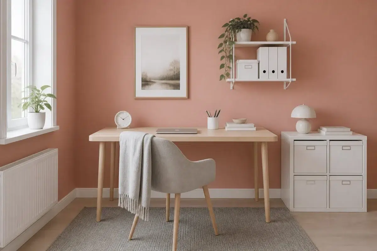
1 Home Office Photo
1 generated visualization explores how the color might shape the finished space. Together they show Constant Coral (6325) as inspiration rather than a promise of an identical result.

Sherwin-Williams Constant Coral in a scandinavian home office
@mybudgetrecipes
1 Dining Room Photo
The 1 dining room image turn a red swatch into something more spatial and expressive. Its midtone saturation keeps the color expressive without letting it dominate every surface around it.

Constant Coral paint in a rustic modern dining room
@mybudgetrecipes
1 Front Door Photo
1 front door image place Constant Coral (6325) in a small architectural moment with an outsized first impression. An LRV of 33.9 lets the color hold its identity across both brighter and more shaded parts of the room.

scandinavian front door featuring Constant Coral by Sherwin-Williams
@mybudgetrecipes
1 Bedroom Photo
Against bed linen, timber, wool and upholstered textures, Constant Coral (6325) may feel quieter, sharper or more atmospheric than the digital swatch alone. An LRV of 33.9 lets the color hold its identity across both brighter and more shaded parts of the room.

A organic modern bedroom painted in Constant Coral
@mybudgetrecipes
1 Mudroom Photo
Across 1 mudroom image, Constant Coral (6325) meets doorway light and the softer illumination of an internal passage. Its warm classification can feel inviting beside tactile, natural materials.

Constant Coral paint in a cottagecore mudroom
@mybudgetrecipes
1 Kitchen Photo
1 kitchen image place Constant Coral (6325) in a hardworking room where color meets movement and strong surfaces. An LRV of 33.9 lets the color hold its identity across both brighter and more shaded parts of the room.

Constant Coral — organic modern kitchen
@mybudgetrecipes
1 Patio Photo
These 1 patio image show how Constant Coral (6325) can sit beside stone, timber, metal, textiles and greenery. The pink, red hue classifications suggest the subtle directions the color may take as the room changes.

warm patio featuring Constant Coral by Sherwin-Williams
@mybudgetrecipes
1 House Photo
1 house image trace Constant Coral (6325) through the façade’s movement through sun, shade and season. The pink, red hue classifications suggest the subtle directions the color may take as the room changes.

Constant Coral color — aesthetic house inspiration
@mybudgetrecipes
1 Living Room Photo
These 1 living room image show how Constant Coral (6325) can sit beside upholstery, timber, art and metal accents. The pink, red hue classifications suggest the subtle directions the color may take as the room changes.

A hollywood regency living room painted in Constant Coral
@mybudgetrecipes
Expert Perspectives
Articles and features from across our network of home and design sites.
Coordinating Colors


At LRV 77 vs 34, Intimate White is decisively the brighter choice.


At LRV 76 vs 34, Steamed Milk is decisively the brighter choice.


A 8-point LRV gap (34 vs 26) makes Constant Coral the marginally brighter of the two.
Trim Color
At LRV 77 vs 34, Intimate White is decisively the brighter choice.
Similar Colors


Their light reflectance is nearly identical (LRV 36 vs 34), so neither reads brighter in a room.


Their light reflectance is nearly identical (LRV 34 vs 34), so neither reads brighter in a room.


With LRVs of 34 and 32, the two reflect almost the same amount of light.


With LRVs of 34 and 34, the two reflect almost the same amount of light.

A 6-point LRV gap (40 vs 34) makes Sockeye the marginally brighter of the two.


Their light reflectance is nearly identical (LRV 34 vs 32), so neither reads brighter in a room.


A 6-point LRV gap (40 vs 34) makes Ravishing Coral the marginally brighter of the two.


Persimmon reads slightly lighter (LRV 39 vs 34), a gap that shows most in low-lit rooms.


A 6-point LRV gap (34 vs 28) makes Constant Coral the marginally brighter of the two.


A 5-point LRV gap (38 vs 34) makes Rose Tan the marginally brighter of the two.
Complementary Colors


Niebla Azul reflects far more light (LRV 53 vs 34), opening up a space where Constant Coral encloses it.


At LRV 53 vs 34, Silver Lake is decisively the brighter choice.


At LRV 34 vs 16, Constant Coral is decisively the brighter choice.


At LRV 77 vs 34, Glass Bead is decisively the brighter choice.


Constant Coral reads slightly lighter (LRV 34 vs 29), a gap that shows most in low-lit rooms.


Constant Coral reflects far more light (LRV 34 vs 6), opening up a space where Mount Etna encloses it.


With LRVs of 34 and 34, the two reflect almost the same amount of light.
Lighter Colors
With LRVs of 34 and 34, the two reflect almost the same amount of light.
Their light reflectance is nearly identical (LRV 34 vs 34), so neither reads brighter in a room.
A 5-point LRV gap (38 vs 34) makes Rose Tan the marginally brighter of the two.


At LRV 66 vs 34, Rosy Outlook is decisively the brighter choice.
Their light reflectance is nearly identical (LRV 36 vs 34), so neither reads brighter in a room.
Darker Colors


Constant Coral reflects far more light (LRV 34 vs 16), opening up a space where Jalapeño encloses it.


At LRV 34 vs 17, Constant Coral is decisively the brighter choice.


A 8-point LRV gap (34 vs 26) makes Constant Coral the marginally brighter of the two.

At LRV 34 vs 20, Constant Coral is decisively the brighter choice.


A 8-point LRV gap (34 vs 25) makes Constant Coral the marginally brighter of the two.
Color Codes
Manufacturer description
This warm coral red pulses with life and energy, summoning the glow of a perfect sunset reflected across calm waters. Perfect for creating an inviting focal point in a dining room or bedroom, it pairs beautifully with warm whites and soft neutrals to balance its spirited intensity.