
Copper Harbor
At first glance, Copper Harbor belongs to the orange family; in a room, light and context can make it far more elusive. An LRV of 29.7 places it through the middle of the scale, where color and depth can remain visible as the light changes. Because screens flatten both light and texture, sample the paint beside the finishes that will ultimately surround it.
Hex
#D57E52LRV
29.71
Copper Harbor's Color Strip
Copper Harbor is the fourth shade on this 7-color strip, sitting between Inventive Orange and Determined Orange. The strip spans from Naive Peach at the lightest end to Raucous Orange at the deepest. Strip 120 puts these related shades in sequence, making it simple to find the tone that suits your room.


Copper Harbor in Rooms
Follow Copper Harbor from one space to another and watch how light, scale and surrounding materials reshape its character. 10 generated visualizations explore how the color might shape a finished room.
1 Front Door Photo
Viewed across 1 front door image in a small architectural moment with an outsized first impression, Copper Harbor (6634) reveals how much color depends on scale, surface and shadow. An LRV of 29.7 lets the color hold its identity across both brighter and more shaded parts of the room.
classy front door featuring Copper Harbor by Sherwin-Williams
@mybudgetrecipes
1 Bedroom Photo
Against bed linen, timber, wool and upholstered textures, Copper Harbor (6634) may feel quieter, sharper or more atmospheric than the digital swatch alone. An LRV of 29.7 lets the color hold its identity across both brighter and more shaded parts of the room.

A moody bedroom painted in Copper Harbor
@mybudgetrecipes
1 Bathroom Photo
Its place within ABC's and 123's and Energetic hints at the range of palettes it can inhabit. In this setting, let window light, mirrors and focused task lighting and tile, stone, glass, timber and metal fixtures guide the final sample decision.

Copper Harbor — japandi bathroom
@mybudgetrecipes
1 Home Office Photo
Viewed across 1 home office image in a focused room balancing work, concentration and comfort, Copper Harbor (6634) reveals how much color depends on scale, surface and shadow. An LRV of 29.7 lets the color hold its identity across both brighter and more shaded parts of the room.

Sherwin-Williams Copper Harbor in a scandinavian home office
@mybudgetrecipes
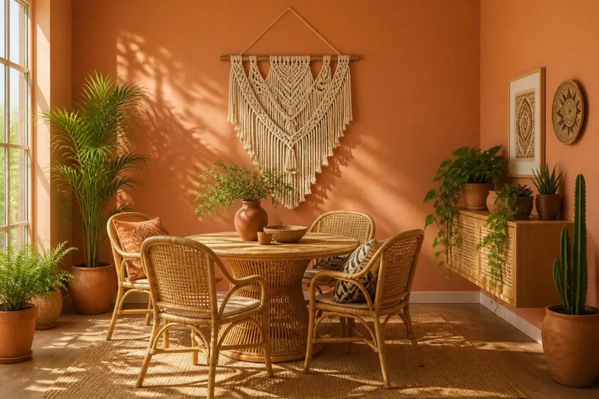
1 Dining Room Photo
These 1 dining room image show how Copper Harbor (6634) can sit beside timber, table linen, glass and artwork. The beige hue classifications suggest the subtle directions the color may take as the room changes.

Copper Harbor paint in a boho dining room
@mybudgetrecipes
1 House Photo
Viewed across 1 house image in an exterior viewed across distance, weather and the changing sky, Copper Harbor (6634) reveals how much color depends on scale, surface and shadow. An LRV of 29.7 lets the color hold its identity across both brighter and more shaded parts of the room.

Copper Harbor color — traditional house inspiration
@mybudgetrecipes
1 Kitchen Photo
1 generated visualization explores how the color might shape the finished space. Together they show Copper Harbor (6634) as inspiration rather than a promise of an identical result.

Copper Harbor — bold kitchen
@mybudgetrecipes
1 Mudroom Photo
Copper Harbor (6634) offers a starting mood rather than a finished formula: Its warm classification can feel inviting beside tactile, natural materials. Test it under doorway light and the softer illumination of an internal passage.

Copper Harbor paint in a tiny mudroom
@mybudgetrecipes
1 Living Room Photo
These 1 living room image show how Copper Harbor (6634) can sit beside upholstery, timber, art and metal accents. The beige hue classifications suggest the subtle directions the color may take as the room changes.

A minimalist living room painted in Copper Harbor
@mybudgetrecipes
1 Patio Photo
The 1 patio image turn a orange swatch into something more spatial and expressive. Its brighter saturation allows the hue to remain present rather than fading quietly into the background.

boho patio featuring Copper Harbor by Sherwin-Williams
@mybudgetrecipes
Expert Perspectives
Articles and features from across our network of home and design sites.
Coordinating Colors


At LRV 75 vs 30, Nearly Peach is decisively the brighter choice.

Modest White reflects far more light (LRV 73 vs 30), opening up a space where Copper Harbor encloses it.
Trim Color
At LRV 75 vs 30, Nearly Peach is decisively the brighter choice.
Similar Colors


With LRVs of 30 and 29, the two reflect almost the same amount of light.


Their light reflectance is nearly identical (LRV 30 vs 27), so neither reads brighter in a room.

Copper Harbor reads slightly lighter (LRV 30 vs 27), a gap that shows most in low-lit rooms.


With LRVs of 30 and 28, the two reflect almost the same amount of light.


Copper Harbor reads slightly lighter (LRV 30 vs 27), a gap that shows most in low-lit rooms.

Their light reflectance is nearly identical (LRV 30 vs 27), so neither reads brighter in a room.


Their light reflectance is nearly identical (LRV 30 vs 28), so neither reads brighter in a room.


With LRVs of 30 and 29, the two reflect almost the same amount of light.

A 4-point LRV gap (34 vs 30) makes Tango the marginally brighter of the two.


Their light reflectance is nearly identical (LRV 32 vs 30), so neither reads brighter in a room.
Complementary Colors

At LRV 67 vs 30, Little Boy Blu is decisively the brighter choice.


Copper Harbor reads slightly lighter (LRV 30 vs 18), a gap that shows most in low-lit rooms.


Sleepy Hollow reflects far more light (LRV 57 vs 30), opening up a space where Copper Harbor encloses it.


Copper Harbor reflects far more light (LRV 30 vs 11), opening up a space where Bunglehouse Blue encloses it.


Billowy Breeze reflects far more light (LRV 55 vs 30), opening up a space where Copper Harbor encloses it.


A 8-point LRV gap (38 vs 30) makes Aquitaine the marginally brighter of the two.


At LRV 47 vs 30, French Moire is decisively the brighter choice.
Lighter Colors


Persimmon reads slightly lighter (LRV 39 vs 30), a gap that shows most in low-lit rooms.

At LRV 54 vs 30, Warming Peach is decisively the brighter choice.


Windswept Canyon reflects far more light (LRV 43 vs 30), opening up a space where Copper Harbor encloses it.

At LRV 50 vs 30, Soft Apricot is decisively the brighter choice.


Fame Orange reads slightly lighter (LRV 40 vs 30), a gap that shows most in low-lit rooms.
Darker Colors


A 11-point LRV gap (30 vs 18) makes Copper Harbor the marginally brighter of the two.
Their light reflectance is nearly identical (LRV 30 vs 27), so neither reads brighter in a room.
Copper Harbor reads slightly lighter (LRV 30 vs 27), a gap that shows most in low-lit rooms.


Their light reflectance is nearly identical (LRV 30 vs 30), so neither reads brighter in a room.


Serape reads slightly lighter (LRV 34 vs 30), a gap that shows most in low-lit rooms.
Color Codes
Manufacturer description
This vibrant burnt orange glows with warmth and the earthy richness of aged copper, evoking the rugged beauty of lakeside cabins and autumn afternoons. Perfect for accent walls, dining rooms, or any space craving bold character and inviting energy.