
Coral Bells
At first glance, Coral Bells belongs to the red family; in a room, light and context can make it far more elusive. Its pink and red classifications hint at the directions it may take as daylight, lamps and neighboring colors move around it. Its related shades below reveal where the color harmonizes—and where contrast brings it fully to life.
Hex
#BB4B51LRV
16.30
Coral Bells's Color Strip
Coral Bells is the fifth shade on this 7-color strip, sitting between Grenadine and Show Stopper. The strip spans from Alyssum at the lightest end to Poinsettia at the deepest. Strip 106 puts these related shades in sequence, making it simple to find the tone that suits your room.

Coral Bells in Rooms
Follow Coral Bells from one space to another and watch how light, scale and surrounding materials reshape its character. 10 generated visualizations explore how the color might shape a finished room.
1 Dining Room Photo
The room’s change from everyday meals to evening occasions can draw different notes from Coral Bells (6593). The pink, red hue classifications suggest the subtle directions the color may take as the room changes.
Coral Bells paint in a moody dining room
@mybudgetrecipes
1 Home Office Photo
1 home office image place Coral Bells (6593) in a focused room balancing work, concentration and comfort. With an LRV of 16.3, it carries enough visual weight to make light, trim and texture feel especially deliberate.

Sherwin-Williams Coral Bells in a warm home office
@mybudgetrecipes
1 Bedroom Photo
Coral Bells (6593) can change noticeably under gentle morning light and low evening lamps. Sample it beside the finishes that will remain in the room.

A moody bedroom painted in Coral Bells
@mybudgetrecipes
1 Front Door Photo
Viewed across 1 front door image in a small architectural moment with an outsized first impression, Coral Bells (6593) reveals how much color depends on scale, surface and shadow. With an LRV of 16.3, it carries enough visual weight to make light, trim and texture feel especially deliberate.

bold front door featuring Coral Bells by Sherwin-Williams
@mybudgetrecipes
1 Bathroom Photo
Coral Bells (6593) offers a starting mood rather than a finished formula: Its warm classification can feel inviting beside tactile, natural materials. Test it under window light, mirrors and focused task lighting.

Coral Bells — industrial bathroom
@mybudgetrecipes
1 Patio Photo
1 generated visualization explores how the color might shape the finished space. Together they show Coral Bells (6593) as inspiration rather than a promise of an identical result.

warm patio featuring Coral Bells by Sherwin-Williams
@mybudgetrecipes
1 Mudroom Photo
Coral Bells (6593) moves through 1 mudroom image without becoming a fixed prescription for the room. Its warm classification can feel inviting beside tactile, natural materials.

Coral Bells paint in a industrial mudroom
@mybudgetrecipes
1 Living Room Photo
These 1 living room image show how Coral Bells (6593) can sit beside upholstery, timber, art and metal accents. The pink, red hue classifications suggest the subtle directions the color may take as the room changes.

A scandinavian living room painted in Coral Bells
@mybudgetrecipes
1 House Photo
The pink, red hue classifications suggest the subtle directions the color may take as the room changes. In this setting, let full daylight, cloud cover and long evening shadows and roofing, masonry, timber, planting and trim guide the final sample decision.

Coral Bells color — aesthetic house inspiration
@mybudgetrecipes
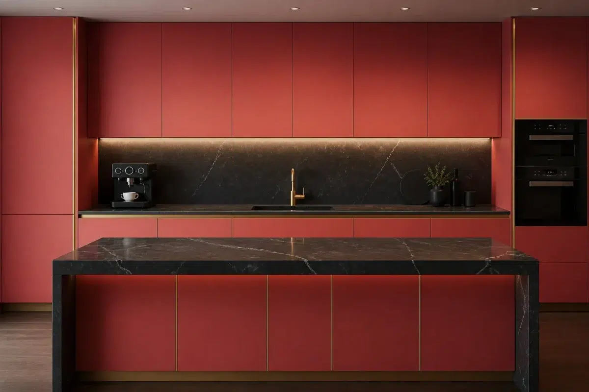
1 Kitchen Photo
Coral Bells (6593) can change noticeably under daylight, task lighting and evening pendants. Sample it beside the finishes that will remain in the room.

Coral Bells — bold kitchen
@mybudgetrecipes
Expert Perspectives
Articles and features from across our network of home and design sites.
Coordinating Colors


At LRV 84 vs 16, Ibis White is decisively the brighter choice.


At LRV 74 vs 16, Aged White is decisively the brighter choice.


At LRV 48 vs 16, Queen Anne Lilac is decisively the brighter choice.
Trim Color
At LRV 84 vs 16, Ibis White is decisively the brighter choice.
Similar Colors


Their light reflectance is nearly identical (LRV 16 vs 16), so neither reads brighter in a room.


Their light reflectance is nearly identical (LRV 17 vs 16), so neither reads brighter in a room.

With LRVs of 16 and 14, the two reflect almost the same amount of light.

Their light reflectance is nearly identical (LRV 18 vs 16), so neither reads brighter in a room.


Their light reflectance is nearly identical (LRV 17 vs 16), so neither reads brighter in a room.


Their light reflectance is nearly identical (LRV 16 vs 16), so neither reads brighter in a room.

A 4-point LRV gap (16 vs 13) makes Coral Bells the marginally brighter of the two.


Coral Bells reads slightly lighter (LRV 16 vs 13), a gap that shows most in low-lit rooms.


With LRVs of 16 and 15, the two reflect almost the same amount of light.


Their light reflectance is nearly identical (LRV 16 vs 14), so neither reads brighter in a room.
Complementary Colors


Mountain Air reflects far more light (LRV 73 vs 16), opening up a space where Coral Bells encloses it.


Niebla Azul reflects far more light (LRV 53 vs 16), opening up a space where Coral Bells encloses it.


At LRV 53 vs 16, Silver Lake is decisively the brighter choice.


Their light reflectance is nearly identical (LRV 16 vs 16), so neither reads brighter in a room.


At LRV 77 vs 16, Glass Bead is decisively the brighter choice.


Morning at Sea reflects far more light (LRV 29 vs 16), opening up a space where Coral Bells encloses it.


At LRV 35 vs 16, Calico is decisively the brighter choice.
Lighter Colors


Memorable Rose reflects far more light (LRV 33 vs 16), opening up a space where Coral Bells encloses it.
Their light reflectance is nearly identical (LRV 16 vs 16), so neither reads brighter in a room.
Their light reflectance is nearly identical (LRV 17 vs 16), so neither reads brighter in a room.

Pink Flamingo reads slightly lighter (LRV 26 vs 16), a gap that shows most in low-lit rooms.

At LRV 30 vs 16, Tuberose is decisively the brighter choice.
Darker Colors


Coral Bells reads slightly lighter (LRV 16 vs 7), a gap that shows most in low-lit rooms.


Coral Bells reads slightly lighter (LRV 16 vs 7), a gap that shows most in low-lit rooms.

Coral Bells reads slightly lighter (LRV 16 vs 9), a gap that shows most in low-lit rooms.

Coral Bells reads slightly lighter (LRV 16 vs 10), a gap that shows most in low-lit rooms.

Coral Bells reads slightly lighter (LRV 16 vs 7), a gap that shows most in low-lit rooms.
Color Codes
Manufacturer description
This deep, saturated coral-red glows with an inner warmth that recalls the jewel tones of a sunset over desert hills. Perfect for creating an intimate, bold accent wall or feature room that radiates richness and sophisticated drama.