
Ablaze
Sherwin-Williams Ablaze (6870) carries the measured structure of its color data and the less predictable beauty of paint in a finished space. It appears in Artistically Bright and Intrinsic, placing it within several distinct decorating stories rather than a single fixed look. Move between the room imagery, color measurements and coordinating shades to build a fuller sense of how it might live in your space.
Hex
#C04641LRV
16.01
Ablaze in Rooms
Follow Ablaze from one space to another and watch how light, scale and surrounding materials reshape its character. 10 generated visualizations explore how the color might shape a finished room.
1 Dining Room Photo
Against timber, table linen, glass and artwork, Ablaze (6870) may feel quieter, sharper or more atmospheric than the digital swatch alone. With an LRV of 16.0, it carries enough visual weight to make light, trim and texture feel especially deliberate.
Ablaze paint in a minimalist dining room
@mybudgetrecipes
1 Bathroom Photo
1 generated visualization explores how the color might shape the finished space. Together they show Ablaze (6870) as inspiration rather than a promise of an identical result.

Ablaze — japandi bathroom
@mybudgetrecipes
1 Front Door Photo
Ablaze (6870) can change noticeably under direct sun, porch shade and evening exterior light. Sample it beside the finishes that will remain in the room.

scandinavian front door featuring Ablaze by Sherwin-Williams
@mybudgetrecipes
1 Home Office Photo
Ablaze (6870) moves through 1 home office image without becoming a fixed prescription for the room. Its warm classification can feel inviting beside tactile, natural materials.

Sherwin-Williams Ablaze in a scandinavian home office
@mybudgetrecipes
1 Bedroom Photo
1 bedroom image place Ablaze (6870) in a room designed around rest, softness and retreat. With an LRV of 16.0, it carries enough visual weight to make light, trim and texture feel especially deliberate.

A industrial bedroom painted in Ablaze
@mybudgetrecipes
1 Mudroom Photo
Ablaze (6870) can change noticeably under doorway light and the softer illumination of an internal passage. Sample it beside the finishes that will remain in the room.

Ablaze paint in a small mudroom
@mybudgetrecipes
1 Living Room Photo
1 living room image place Ablaze (6870) in a space shaped by conversation, quiet evenings and changing daylight. With an LRV of 16.0, it carries enough visual weight to make light, trim and texture feel especially deliberate.

A cozy living room painted in Ablaze
@mybudgetrecipes
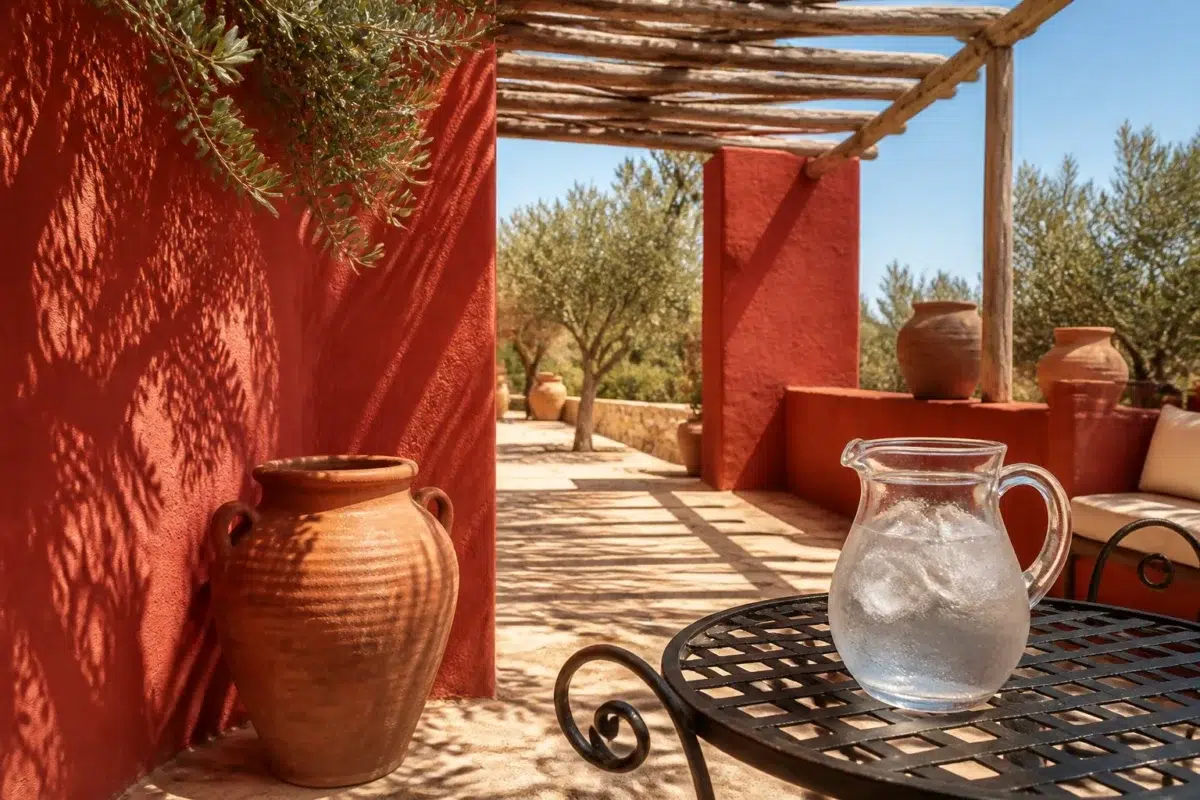
1 Patio Photo
1 generated visualization explores how the color might shape the finished space. Together they show Ablaze (6870) as inspiration rather than a promise of an identical result.

mediterranean patio featuring Ablaze by Sherwin-Williams
@mybudgetrecipes
1 Kitchen Photo
Ablaze (6870) brings its pink character into a hardworking room where color meets movement and strong surfaces. Its warm classification can feel inviting beside tactile, natural materials.

Ablaze — industrial kitchen
@mybudgetrecipes
1 House Photo
Viewed across 1 house image in an exterior viewed across distance, weather and the changing sky, Ablaze (6870) reveals how much color depends on scale, surface and shadow. With an LRV of 16.0, it carries enough visual weight to make light, trim and texture feel especially deliberate.

Ablaze color — traditional house inspiration
@mybudgetrecipes
Expert Perspectives
Articles and features from across our network of home and design sites.
Coordinating Colors


Similar Colors


Their light reflectance is nearly identical (LRV 16 vs 15), so neither reads brighter in a room.


Their light reflectance is nearly identical (LRV 16 vs 14), so neither reads brighter in a room.


With LRVs of 16 and 16, the two reflect almost the same amount of light.


Ablaze reads slightly lighter (LRV 16 vs 13), a gap that shows most in low-lit rooms.


Their light reflectance is nearly identical (LRV 16 vs 16), so neither reads brighter in a room.
Complementary Colors


At LRV 73 vs 16, Mountain Air is decisively the brighter choice.


At LRV 53 vs 16, Niebla Azul is decisively the brighter choice.


Silver Lake reflects far more light (LRV 53 vs 16), opening up a space where Ablaze encloses it.


Glass Bead reflects far more light (LRV 77 vs 16), opening up a space where Ablaze encloses it.


At LRV 29 vs 16, Morning at Sea is decisively the brighter choice.


A 10-point LRV gap (16 vs 6) makes Ablaze the marginally brighter of the two.
Lighter Colors


A 6-point LRV gap (22 vs 16) makes Quite Coral the marginally brighter of the two.


Full Bloom reads slightly lighter (LRV 26 vs 16), a gap that shows most in low-lit rooms.
Darker Colors


Their light reflectance is nearly identical (LRV 16 vs 15), so neither reads brighter in a room.


Ablaze reads slightly lighter (LRV 16 vs 11), a gap that shows most in low-lit rooms.
Color Codes
Manufacturer description
This deep, smoldering red-orange glows with an intensity that captures the heart of a dying fire, perfect for creating intimate spaces filled with warmth and drama. Pair it with rich golds and deep neutrals to let its fiery character command a bedroom, dining room, or accent wall.