
Ethereal Mood
Sherwin-Williams's Ethereal Mood is a neutral shade whose quieter details emerge through comparison. A muted saturation softens the hue, giving it a quieter quality that can sit comfortably among layered neutrals. Because screens flatten both light and texture, sample the paint beside the finishes that will ultimately surround it.
Hex
#AEA594LRV
38.22
Ethereal Mood's Color Strip
Ethereal Mood is the fourth shade on this 7-color strip, sitting between Gateway Gray and Fawn Brindle. The strip spans from Grecian Ivory at the lightest end to Mountain Road at the deepest. Color strip 247 groups these shades together so you can see how each reads next to its neighbors.


Ethereal Mood in Rooms
Follow Ethereal Mood from one space to another and watch how light, scale and surrounding materials reshape its character. 14 generated visualizations explore how the color might shape a finished room.
2 Living Room Photos
2 living room images place Ethereal Mood (7639) in a space shaped by conversation, quiet evenings and changing daylight. An LRV of 38.2 lets the color hold its identity across both brighter and more shaded parts of the room.
Soft walls in Ethereal Mood create a serene, inviting living room.
@mybudgetrecipes

Living room walls in Ethereal Mood embrace warmth and comfort.
@mybudgetrecipes
2 Bedroom Photos
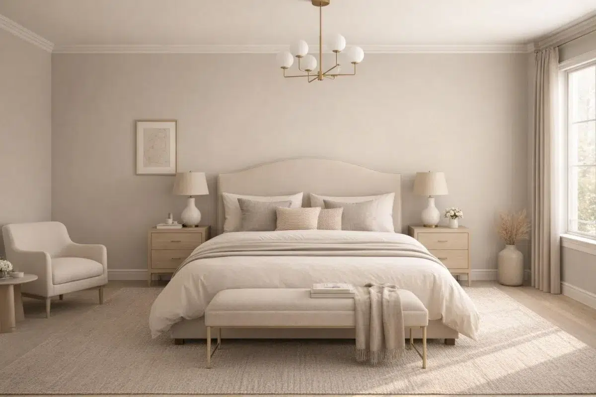
Against bed linen, timber, wool and upholstered textures, Ethereal Mood (7639) may feel quieter, sharper or more atmospheric than the digital swatch alone. An LRV of 38.2 lets the color hold its identity across both brighter and more shaded parts of the room.

Bedroom walls painted in Ethereal Mood evoke calm, restful atmosphere.
@mybudgetrecipes

Master bedroom walls in Ethereal Mood provide peaceful retreat.
@mybudgetrecipes
2 Kitchen Photos
Ethereal Mood (7639) can change noticeably under daylight, task lighting and evening pendants. Sample it beside the finishes that will remain in the room.

Kitchen cabinets finished in Ethereal Mood provide warm, neutral elegance.
@mybudgetrecipes

Kitchen cabinetry in Ethereal Mood bridges traditional and modern styles.
@mybudgetrecipes
2 Bathroom Photos
In a compact setting where tile, fixtures and color sit close together, the most interesting quality of Ethereal Mood (7639) may be the way it responds to tile, stone, glass, timber and metal fixtures. The greige, grey hue classifications suggest the subtle directions the color may take as the room changes.

Bathroom walls in Ethereal Mood pair beautifully with marble accents.
@mybudgetrecipes

Bathroom painted Ethereal Mood creates spa-like tranquility.
@mybudgetrecipes
2 Home Office Photos
These 2 home office images show how Ethereal Mood (7639) can sit beside wood, paper, shelving and upholstered seating. The greige, grey hue classifications suggest the subtle directions the color may take as the room changes.

Workspace walls in Ethereal Mood encourage focus and creativity.
@mybudgetrecipes

Home office walls in Ethereal Mood foster productive, calm environment.
@mybudgetrecipes
2 House Photos
The 2 house images turn a neutral swatch into something more spatial and expressive. Its muted saturation softens the color’s edges, making texture and shadow part of the composition.

House exterior painted Ethereal Mood offers warm, inviting curb appeal.
@mybudgetrecipes

Home exterior in Ethereal Mood combines warmth with timeless appeal.
@mybudgetrecipes
2 Front Door Photos
Ethereal Mood (7639) brings its neutral character into a small architectural moment with an outsized first impression. Its muted saturation softens the color’s edges, making texture and shadow part of the composition.

Front door in Ethereal Mood welcomes visitors with understated charm.
@mybudgetrecipes

Entry door finished in Ethereal Mood adds subtle sophistication.
@mybudgetrecipes
Expert Perspectives
Articles and features from across our network of home and design sites.
Coordinating Colors


At LRV 74 vs 38, Shoji White is decisively the brighter choice.


At LRV 74 vs 38, Aged White is decisively the brighter choice.


A 6-point LRV gap (38 vs 32) makes Ethereal Mood the marginally brighter of the two.
Trim Color
At LRV 74 vs 38, Shoji White is decisively the brighter choice.
Similar Colors


Their light reflectance is nearly identical (LRV 39 vs 38), so neither reads brighter in a room.


Their light reflectance is nearly identical (LRV 40 vs 38), so neither reads brighter in a room.

Their light reflectance is nearly identical (LRV 38 vs 36), so neither reads brighter in a room.


With LRVs of 38 and 36, the two reflect almost the same amount of light.


Gateway Gray reads slightly lighter (LRV 41 vs 38), a gap that shows most in low-lit rooms.

With LRVs of 38 and 38, the two reflect almost the same amount of light.

Their light reflectance is nearly identical (LRV 38 vs 38), so neither reads brighter in a room.


Their light reflectance is nearly identical (LRV 41 vs 38), so neither reads brighter in a room.


With LRVs of 38 and 37, the two reflect almost the same amount of light.


Their light reflectance is nearly identical (LRV 38 vs 36), so neither reads brighter in a room.
Complementary Colors


Ethereal Mood reflects far more light (LRV 38 vs 7), opening up a space where Sea Mariner encloses it.


Starry Night reflects far more light (LRV 69 vs 38), opening up a space where Ethereal Mood encloses it.


At LRV 38 vs 20, Ethereal Mood is decisively the brighter choice.


A 10-point LRV gap (38 vs 28) makes Ethereal Mood the marginally brighter of the two.


Lakeside reads slightly lighter (LRV 47 vs 38), a gap that shows most in low-lit rooms.


Ethereal Mood reflects far more light (LRV 38 vs 3), opening up a space where After the Storm encloses it.

At LRV 83 vs 38, Lavender Wisp is decisively the brighter choice.
Lighter Colors

With LRVs of 38 and 37, the two reflect almost the same amount of light.


Their light reflectance is nearly identical (LRV 39 vs 38), so neither reads brighter in a room.


Pussywillow reads slightly lighter (LRV 42 vs 38), a gap that shows most in low-lit rooms.


On The Rocks reflects far more light (LRV 62 vs 38), opening up a space where Ethereal Mood encloses it.


Their light reflectance is nearly identical (LRV 38 vs 37), so neither reads brighter in a room.
Darker Colors

At LRV 38 vs 25, Ethereal Mood is decisively the brighter choice.


At LRV 38 vs 20, Ethereal Mood is decisively the brighter choice.

Ethereal Mood reflects far more light (LRV 38 vs 22), opening up a space where Meadow Trail encloses it.

A 10-point LRV gap (38 vs 28) makes Ethereal Mood the marginally brighter of the two.


Ethereal Mood reflects far more light (LRV 38 vs 18), opening up a space where Messenger Bag encloses it.
Color Codes
Manufacturer description
The cool green undertone in this delicate gray adds an airy, nature-infused vibe to any space. Consider this versatile yet soothing neutral in a bedroom.