
Dorian Gray
Dorian Gray begins as a neutral color on paper, then shifts with every surface, shadow and neighboring material. Its neutral temperature leaves room for surrounding materials and light to pull the color warmer or cooler. Move between the room imagery, color measurements and coordinating shades to build a fuller sense of how it might live in your space.
Hex
#ACA79ELRV
38.72
Dorian Gray's Color Strip
Dorian Gray is the third shade on this 7-color strip, sitting between Mindful Gray and Acier. The strip spans from Repose Gray at the lightest end to Black Fox at the deepest. Browsing strip 244 alongside this color helps you gauge whether to go lighter, darker, or stay right here.


Dorian Gray in Rooms
Follow Dorian Gray from one space to another and watch how light, scale and surrounding materials reshape its character. 17 sourced room photos sit alongside 7 generated visualizations.
4 Living Room Photos
Against upholstery, timber, art and metal accents, Dorian Gray (7017) may feel quieter, sharper or more atmospheric than the digital swatch alone. An LRV of 38.7 lets the color hold its identity across both brighter and more shaded parts of the room.
Living room walls in Dorian Gray introduce sophisticated neutral elegance.
@mybudgetrecipes

Accent walls in Dorian Gray define the living room seating area.
@housetohomenc

Fireplace surround painted Dorian Gray creates visual depth.
@housetohomenc

Built-in shelving painted Dorian Gray frames the living room.
@im_like_a_housecat
3 Bedroom Photos
Dorian Gray (7017) can change noticeably under gentle morning light and low evening lamps. Sample it beside the finishes that will remain in the room.

Bedroom painted Dorian Gray achieves calm, contemporary style.
@mybudgetrecipes

Bedroom accent wall in Dorian Gray adds subtle depth and drama.
@clovergreeley

Soft bedroom walls in Dorian Gray create a serene sleeping sanctuary.
@across_the_creek_farmhouse
3 Kitchen Cabinets Photos
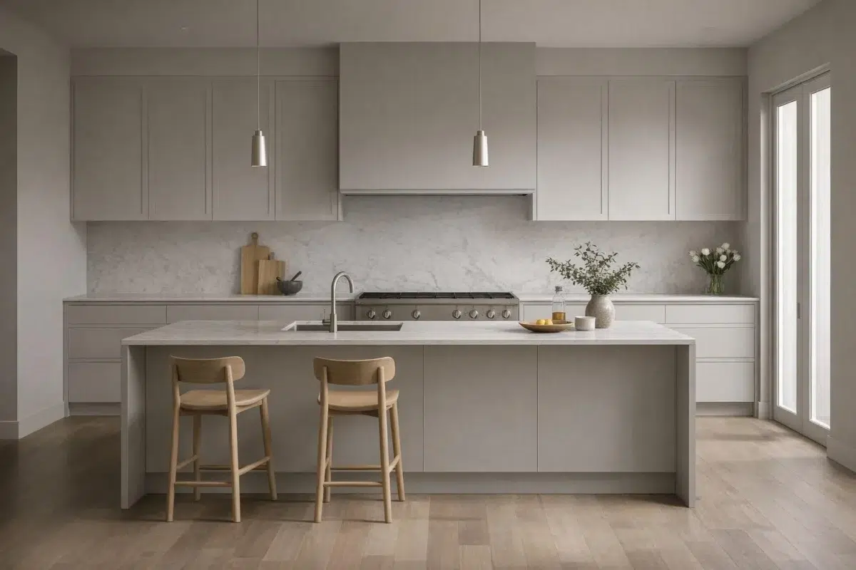
Against countertops, hardware, splashbacks and flooring, Dorian Gray (7017) may feel quieter, sharper or more atmospheric than the digital swatch alone. An LRV of 38.7 lets the color hold its identity across both brighter and more shaded parts of the room.

Kitchen cabinets in Dorian Gray offer modern, understated refinement.
@mybudgetrecipes

Cabinet fronts in Dorian Gray provide subtle sophistication to the kitchen.
@annacreekcottage

Island cabinetry painted Dorian Gray anchors the kitchen workspace.
@hartwares
6 Bathroom Photos
Across 6 bathroom images, Dorian Gray (7017) meets window light, mirrors and focused task lighting. Its neutral temperature gives the surrounding palette unusual influence over the final mood.

Bathroom walls in Dorian Gray create a spa-like atmosphere.
@mybudgetrecipes
1 Home Office Photo
Its place within Acute Care Cool Foundations and Living Well - Renew hints at the range of palettes it can inhabit. In this setting, let daylight beside desk lamps and screen glow and wood, paper, shelving and upholstered seating guide the final sample decision.

Home office in Dorian Gray supports focus with quiet sophistication.
@mybudgetrecipes
3 House Photos
In an exterior viewed across distance, weather and the changing sky, the most interesting quality of Dorian Gray (7017) may be the way it responds to roofing, masonry, timber, planting and trim. The grey hue classifications suggest the subtle directions the color may take as the room changes.

Exterior in Dorian Gray presents a sleek, contemporary facade.
@mybudgetrecipes

Horizontal siding in Dorian Gray gives this home a modern aesthetic.
@the.painted.piano

Board-and-batten exterior in Dorian Gray suits contemporary architecture.
@the.painted.piano
1 Front Door Photo
Viewed across 1 front door image in a small architectural moment with an outsized first impression, Dorian Gray (7017) reveals how much color depends on scale, surface and shadow. An LRV of 38.7 lets the color hold its identity across both brighter and more shaded parts of the room.

Front door in Dorian Gray makes an elegant architectural statement.
@mybudgetrecipes
1 Mudroom Photo
Dorian Gray (7017) moves through 1 mudroom image without becoming a fixed prescription for the room. Its neutral temperature gives the surrounding palette unusual influence over the final mood.

Laundry room cabinets painted Dorian Gray maximize storage style.
@johnaskewcustomhomes
2 Misc Photos
Dorian Gray (7017) offers a starting mood rather than a finished formula: Its neutral temperature gives the surrounding palette unusual influence over the final mood. Test it under the varied light of hallways, corners and transitional rooms.

Walls finished in Dorian Gray provide a neutral backdrop.
@kchomereport

This shade delivers sophisticated neutral tones throughout any space.
@amarilysm1
Expert Perspectives
Articles and features from across our network of home and design sites.
Coordinating Colors


Eider White reflects far more light (LRV 73 vs 39), opening up a space where Dorian Gray encloses it.


Dorian Gray reads slightly lighter (LRV 39 vs 32), a gap that shows most in low-lit rooms.
Trim Color
Eider White reflects far more light (LRV 73 vs 39), opening up a space where Dorian Gray encloses it.
Similar Colors


Their light reflectance is nearly identical (LRV 39 vs 38), so neither reads brighter in a room.

Their light reflectance is nearly identical (LRV 39 vs 37), so neither reads brighter in a room.


A 3-point LRV gap (42 vs 39) makes Pussywillow the marginally brighter of the two.


With LRVs of 39 and 37, the two reflect almost the same amount of light.


Their light reflectance is nearly identical (LRV 39 vs 37), so neither reads brighter in a room.


With LRVs of 40 and 39, the two reflect almost the same amount of light.


Dorian Gray reads slightly lighter (LRV 39 vs 36), a gap that shows most in low-lit rooms.

Warm Pewter reads slightly lighter (LRV 42 vs 39), a gap that shows most in low-lit rooms.


With LRVs of 40 and 39, the two reflect almost the same amount of light.

With LRVs of 39 and 36, the two reflect almost the same amount of light.
Complementary Colors


At LRV 39 vs 7, Dorian Gray is decisively the brighter choice.


At LRV 69 vs 39, Starry Night is decisively the brighter choice.


Dorian Gray reflects far more light (LRV 39 vs 20), opening up a space where Soulful Blue encloses it.


Dorian Gray reads slightly lighter (LRV 39 vs 28), a gap that shows most in low-lit rooms.


A 8-point LRV gap (47 vs 39) makes Lakeside the marginally brighter of the two.


At LRV 39 vs 3, Dorian Gray is decisively the brighter choice.

Lavender Wisp reflects far more light (LRV 83 vs 39), opening up a space where Dorian Gray encloses it.
Lighter Colors


A 10-point LRV gap (49 vs 39) makes March Wind the marginally brighter of the two.


Zircon reflects far more light (LRV 59 vs 39), opening up a space where Dorian Gray encloses it.


Light French Gray reflects far more light (LRV 53 vs 39), opening up a space where Dorian Gray encloses it.


Knitting Needles reflects far more light (LRV 53 vs 39), opening up a space where Dorian Gray encloses it.


Silverplate reflects far more light (LRV 53 vs 39), opening up a space where Dorian Gray encloses it.
Darker Colors

Dorian Gray reflects far more light (LRV 39 vs 19), opening up a space where Solitary Slate encloses it.


Dorian Gray reflects far more light (LRV 39 vs 20), opening up a space where Anonymous encloses it.

Dorian Gray reflects far more light (LRV 39 vs 23), opening up a space where Terrain encloses it.


A 11-point LRV gap (39 vs 28) makes Dorian Gray the marginally brighter of the two.

Dorian Gray reflects far more light (LRV 39 vs 19), opening up a space where Settlement encloses it.
Color Codes
Manufacturer description
This neutral feels perpetually fresh and lively. Warm brown undertones set a mood that's elegantly inviting.