
Malted Milk
Malted Milk is a Orange paint color from Sherwin-Williams, but its character reaches beyond a single label. Its warm classification can bring a gentle glow to the color, particularly beside natural wood and softer whites. Treat the digital swatch as an opening note, then watch a physical sample from morning light through evening lamps.
Hex
#DECABDLRV
61.45
Malted Milk's Color Strip
Malted Milk is the first shade on this 7-color strip, the lightest in this coordinated family. Browsing strip 195 alongside this color helps you gauge whether to go lighter, darker, or stay right here.


Malted Milk in Rooms
Follow Malted Milk from one space to another and watch how light, scale and surrounding materials reshape its character. 15 sourced room photos sit alongside 14 generated visualizations.
2 Living Room Photos
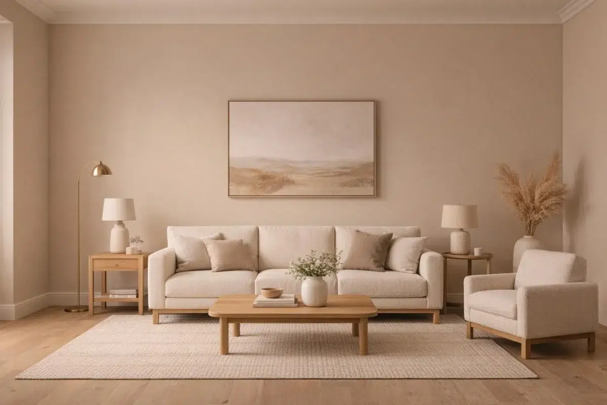
Its place within Diaphanous and Living Well - Renew hints at the range of palettes it can inhabit. In this setting, let the movement from window light to lamplight and upholstery, timber, art and metal accents guide the final sample decision.
Walls in Malted Milk flood this living room with soft, warm light.
@mybudgetrecipes

Sofa wall anchors the gathering space in soft Malted Milk.
@mybudgetrecipes
9 Bedroom Photos
Against bed linen, timber, wool and upholstered textures, Malted Milk (6057) may feel quieter, sharper or more atmospheric than the digital swatch alone. An LRV of 61.5 lets the color hold its identity across both brighter and more shaded parts of the room.

Bedroom painted Malted Milk creates a serene, peaceful retreat.
@mybudgetrecipes
2 Kitchen Photos
Malted Milk (6057) offers a starting mood rather than a finished formula: Its warm classification can feel inviting beside tactile, natural materials. Test it under daylight, task lighting and evening pendants.

Kitchen cabinets in Malted Milk brighten the cooking and gathering space.
@mybudgetrecipes

Cabinetry and countertop backsplash shine in creamy Malted Milk.
@mybudgetrecipes
5 Bathroom Photos
The contrast between bright mornings and quieter evening light can draw different notes from Malted Milk (6057). The beige hue classifications suggest the subtle directions the color may take as the room changes.

Bathroom walls in Malted Milk provide a cheerful, sunny atmosphere.
@mybudgetrecipes

Vanity and wall surfaces blend seamlessly in soothing Malted Milk.
@mybudgetrecipes

Mirror and cabinetry reflect light beautifully in Malted Milk.
@suzanne.glenda

Shower surround and walls create spa-like serenity in Malted Milk.
@suzanne.glenda

Fixtures and tile accents complement walls in creamy Malted Milk.
@suzanne.glenda
2 Home Office Photos
Against wood, paper, shelving and upholstered seating, Malted Milk (6057) may feel quieter, sharper or more atmospheric than the digital swatch alone. An LRV of 61.5 lets the color hold its identity across both brighter and more shaded parts of the room.

Desk and shelving walls create a focused workspace painted in warm Malted Milk.
@mybudgetrecipes

Wall paneling and desk area glow with warm Malted Milk coverage.
@mybudgetrecipes
2 House Photos
In an exterior viewed across distance, weather and the changing sky, the most interesting quality of Malted Milk (6057) may be the way it responds to roofing, masonry, timber, planting and trim. The beige hue classifications suggest the subtle directions the color may take as the room changes.

Exterior siding and trim gleam in soft, neutral Malted Milk tones.
@mybudgetrecipes

House facade displays the timeless appeal of Malted Milk.
@mybudgetrecipes
3 Front Door Photos
In a small architectural moment with an outsized first impression, the most interesting quality of Malted Milk (6057) may be the way it responds to hardware, glazing, masonry, timber and surrounding trim. The beige hue classifications suggest the subtle directions the color may take as the room changes.

Wooden front door stands out against bright trim in classic Malted Milk.
@mybudgetrecipes

Entry door makes a subtle statement painted in understated Malted Milk.
@mybudgetrecipes

Entrance door commands attention in refined Malted Milk.
@house_of_arroyo
2 Dining Room Photos
Across 2 dining room images, Malted Milk (6057) meets natural light, candles and pendant lighting. Its warm classification can feel inviting beside tactile, natural materials.

Dining walls create an inviting atmosphere in rich Malted Milk.
@highwaterbungalow

Wainscoting and upper walls unite in elegant Malted Milk.
@casa_carlisle
1 Misc Photo
Malted Milk (6057) brings its orange character into an assortment of spaces that reveals the color outside a single design formula. Its muted saturation softens the color’s edges, making texture and shadow part of the composition.

Walls glow with the subtle warmth of Malted Milk throughout.
@midcenturymaude_atl
1 Kitchen Cabinets Photo
These 1 kitchen cabinets image show how Malted Milk (6057) can sit beside countertops, hardware, splashbacks and flooring. The beige hue classifications suggest the subtle directions the color may take as the room changes.

Cabinet doors and drawers shine in creamy Malted Milk finish.
@houseofvandel
Expert Perspectives
Articles and features from across our network of home and design sites.
Coordinating Colors


Polite White reflects far more light (LRV 74 vs 61), opening up a space where Malted Milk encloses it.


Ibis White reflects far more light (LRV 84 vs 61), opening up a space where Malted Milk encloses it.

Malted Milk reflects far more light (LRV 61 vs 28), opening up a space where Yearling encloses it.
Trim Color
Polite White reflects far more light (LRV 74 vs 61), opening up a space where Malted Milk encloses it.
Similar Colors


With LRVs of 61 and 60, the two reflect almost the same amount of light.

With LRVs of 61 and 60, the two reflect almost the same amount of light.

Their light reflectance is nearly identical (LRV 61 vs 60), so neither reads brighter in a room.


Their light reflectance is nearly identical (LRV 61 vs 60), so neither reads brighter in a room.


Their light reflectance is nearly identical (LRV 61 vs 59), so neither reads brighter in a room.


Their light reflectance is nearly identical (LRV 61 vs 59), so neither reads brighter in a room.

Pueblo reads slightly lighter (LRV 66 vs 61), a gap that shows most in low-lit rooms.


Their light reflectance is nearly identical (LRV 61 vs 58), so neither reads brighter in a room.

With LRVs of 61 and 60, the two reflect almost the same amount of light.


Malted Milk reads slightly lighter (LRV 61 vs 58), a gap that shows most in low-lit rooms.
Complementary Colors


Glass Bead reflects far more light (LRV 77 vs 61), opening up a space where Malted Milk encloses it.


At LRV 61 vs 29, Malted Milk is decisively the brighter choice.


At LRV 61 vs 6, Malted Milk is decisively the brighter choice.


At LRV 61 vs 34, Malted Milk is decisively the brighter choice.


At LRV 61 vs 7, Malted Milk is decisively the brighter choice.


At LRV 61 vs 11, Malted Milk is decisively the brighter choice.


At LRV 61 vs 7, Malted Milk is decisively the brighter choice.
Lighter Colors


Gorgeous White reads slightly lighter (LRV 72 vs 61), a gap that shows most in low-lit rooms.

At LRV 74 vs 61, Reliable White is decisively the brighter choice.
Polite White reflects far more light (LRV 74 vs 61), opening up a space where Malted Milk encloses it.


Pale Pink reflects far more light (LRV 80 vs 61), opening up a space where Malted Milk encloses it.
Ibis White reflects far more light (LRV 84 vs 61), opening up a space where Malted Milk encloses it.
Darker Colors


Malted Milk reads slightly lighter (LRV 61 vs 53), a gap that shows most in low-lit rooms.


At LRV 61 vs 43, Malted Milk is decisively the brighter choice.


A 11-point LRV gap (61 vs 50) makes Malted Milk the marginally brighter of the two.

At LRV 61 vs 37, Malted Milk is decisively the brighter choice.


Malted Milk reflects far more light (LRV 61 vs 42), opening up a space where Beige Intenso encloses it.
Color Codes
Manufacturer description
This classic reddish neutral adds a touch of warmth and natural elegance. Give your family or dining room a proper uplift with this shade.