Mélange Green
Mélange Green begins as a green color on paper, then shifts with every surface, shadow and neighboring material. Its neutral temperature leaves room for surrounding materials and light to pull the color warmer or cooler. Move between the room imagery, color measurements and coordinating shades to build a fuller sense of how it might live in your space.
Hex
#C4C476LRV
52.72
Mélange Green's Color Strip
Mélange Green is the fourth shade on this 7-color strip, sitting between Primavera and Parakeet. The strip spans from Springtime at the lightest end to Verdant at the deepest. Browsing strip 148 alongside this color helps you gauge whether to go lighter, darker, or stay right here.


Coordinating Colors

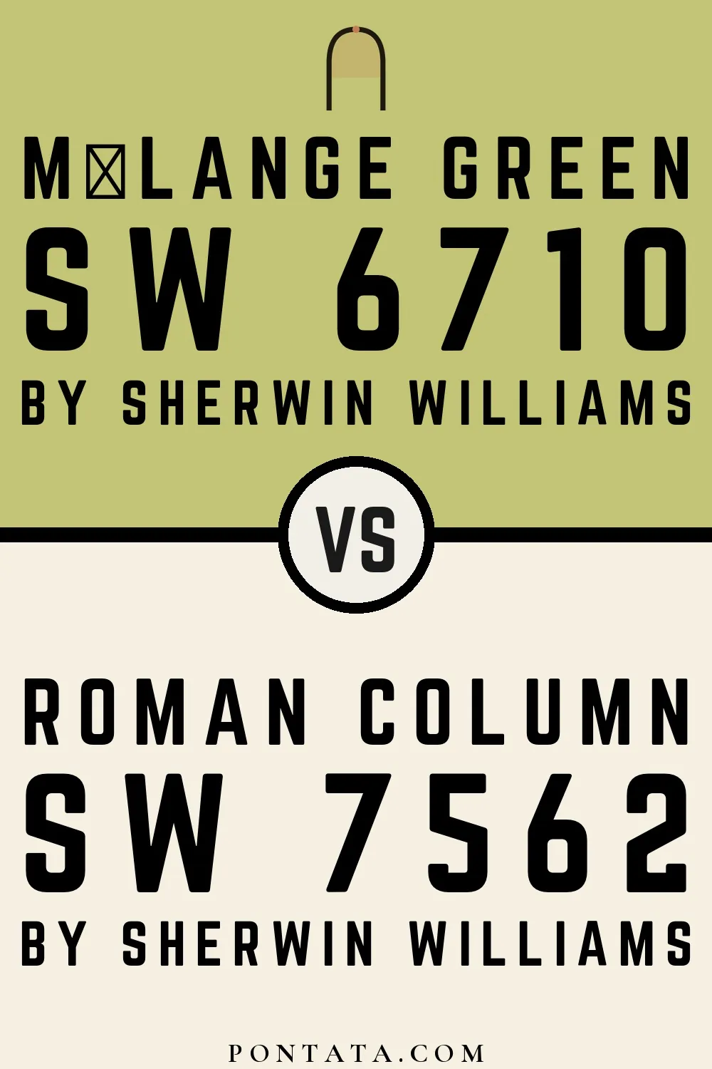

At LRV 88 vs 53, Roman Column is decisively the brighter choice.


At LRV 84 vs 53, Pure White is decisively the brighter choice.

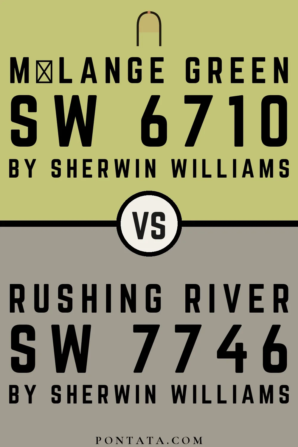
Mélange Green reflects far more light (LRV 53 vs 34), opening up a space where Rushing River encloses it.
Trim Color
At LRV 88 vs 53, Roman Column is decisively the brighter choice.
Similar Colors

Primavera reads slightly lighter (LRV 60 vs 53), a gap that shows most in low-lit rooms.


Mélange Green reads slightly lighter (LRV 53 vs 45), a gap that shows most in low-lit rooms.


A 5-point LRV gap (58 vs 53) makes Dancing Green the marginally brighter of the two.


At LRV 66 vs 53, Gleeful is decisively the brighter choice.


Mélange Green reads slightly lighter (LRV 53 vs 41), a gap that shows most in low-lit rooms.

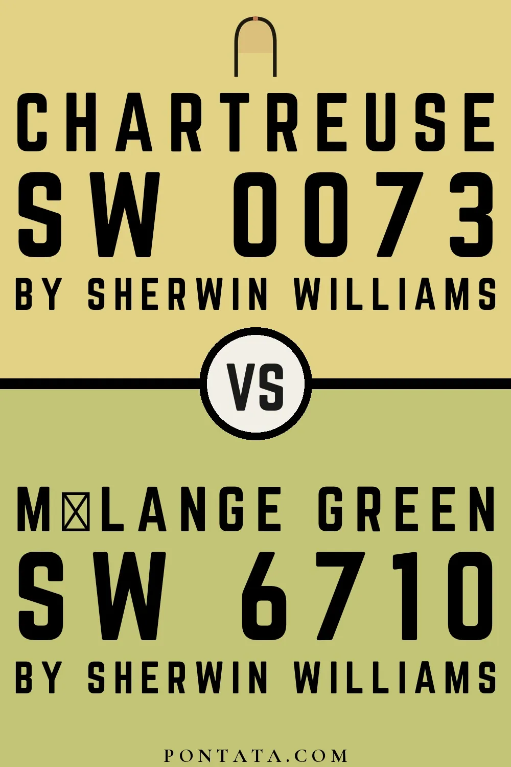
A 11-point LRV gap (64 vs 53) makes Chartreuse the marginally brighter of the two.

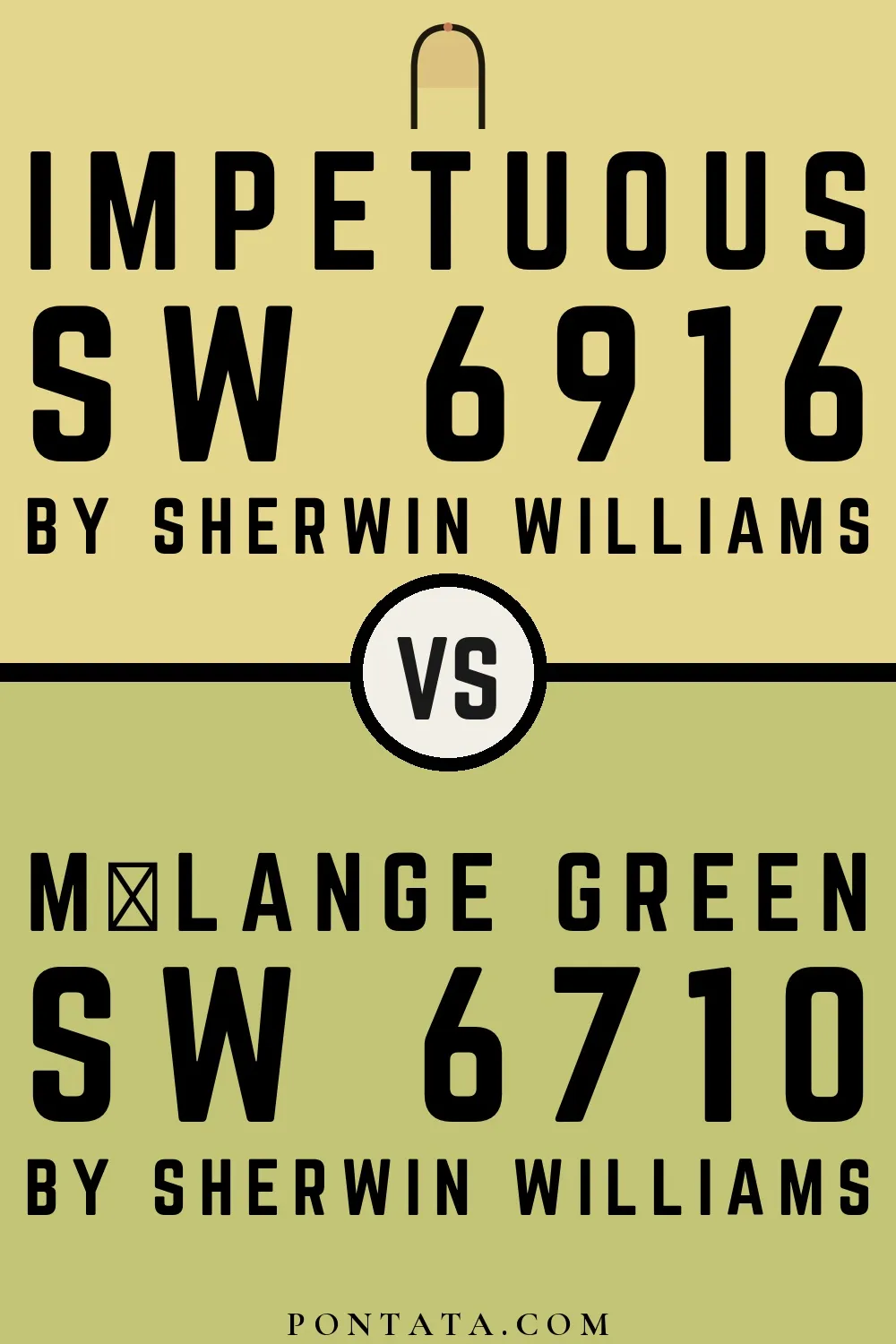
Impetuous reflects far more light (LRV 67 vs 53), opening up a space where Mélange Green encloses it.

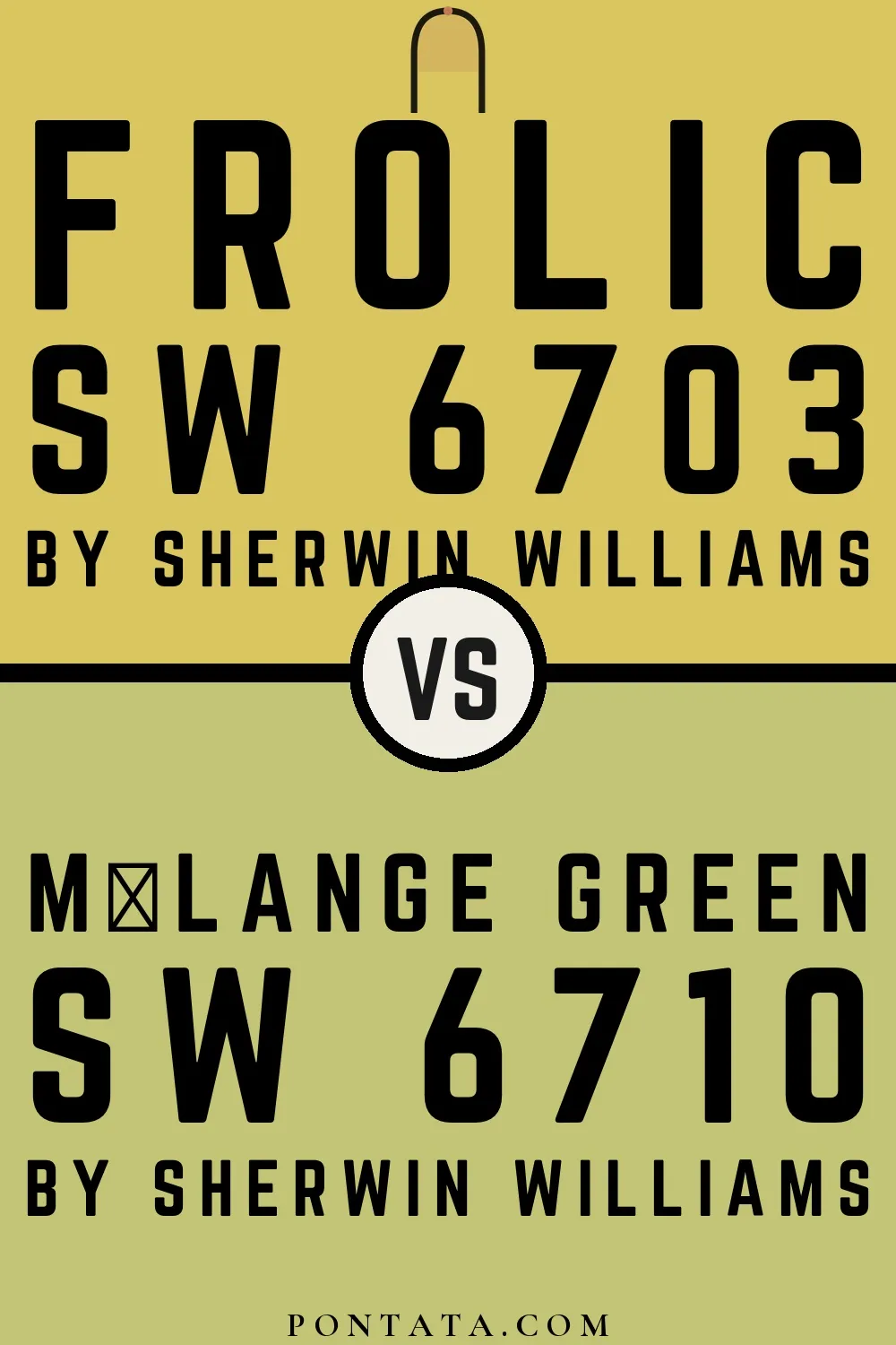
Frolic reads slightly lighter (LRV 56 vs 53), a gap that shows most in low-lit rooms.


With LRVs of 56 and 53, the two reflect almost the same amount of light.
Color Codes
Manufacturer description
This balanced, medium green strikes a harmonious chord between cool and warm, evoking the serene feeling of a misty forest clearing at midday. Its bright saturation brings life to living spaces and bedrooms without overwhelming, pairing beautifully with warm wood tones and soft neutrals like cream and sage.
Attributed to Sherwin-Williams catalog data.