
Porpoise
Often used for its genuinely dark qualities, Porpoise remains a staple for Sherwin-Williams designers. It is widely considered one of the best colors in its class to anchor a room without demanding the spotlight. We've gathered 13 real-home scenarios to help you visualize this color alongside our expert data.
Hex
#6B645B
LRV
12.95
Porpoise's Color Strip
Porpoise is the sixth shade on this 7-color strip, sitting between Anonymous and Urbane Bronze. The strip spans from Worldly Gray at the lightest end to Urbane Bronze at the deepest. As part of strip 245, these colors are curated to work together — helpful when you're deciding how light or deep to go.


Porpoise in Real Rooms
Porpoise has a low LRV of 12.95 — it absorbs light and reads as a genuinely dark, enveloping color. It's neutral in temperature and , making it adaptable across different lighting conditions and room orientations. Grouped in the Neutral family, the photos below show it applied in a bedroom, front door, home office, house, kitchen, living room and misc.
1 Bedroom Photo
The bedroom is where Porpoise really earns its place as a sanctuary. Away from direct sunlight, the color settles into a rich, cocooning tone that actively promotes rest and psychological slowing. Pair it with crisp white bedding and warm-toned wood nightstands to keep the overall palette from feeling too heavy or closed-in.
Bedroom walls in Porpoise create a restful sanctuary with cool-toned serenity.
@mybudgetrecipes
2 Front Door Photos
A front door in Porpoise changes the entire read of a facade without requiring a renovation. The color is strong enough to register from the street but refined enough not to feel like a statement for its own sake. It's the "handshake" of the home.

Front door painted Porpoise makes a bold architectural statement.
@mybudgetrecipes

Entry door in Porpoise commands attention with bold, sophisticated color.
@from4wallstoahome
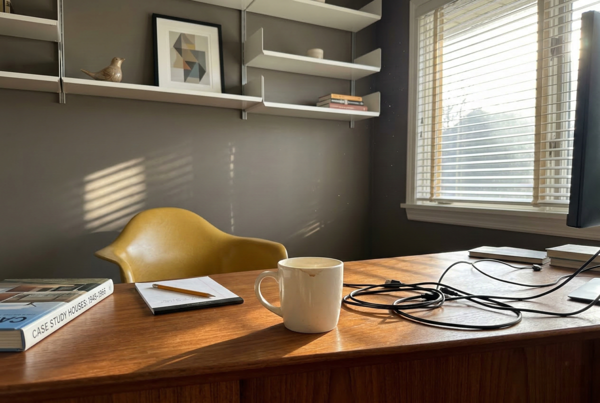
1 Home Office Photo
Porpoise in a home office signals that the space was thought about. The color holds up under the scrutiny of video calls without feeling staged, and it stays comfortable across the full working day in a way that brighter colors often don't.

Office walls in Porpoise foster focus with their calm, sophisticated depth.
@mybudgetrecipes
3 House Photos
When choosing Porpoise for an exterior, you are opting for a color that respects the landscape. It feels like it grew out of the earth rather than being dropped onto it, creating a harmonious relationship between the architecture and the garden.

Home exterior in Porpoise presents a modern, distinctive curb appeal.
@mybudgetrecipes

Home exterior finished in Porpoise presents modern style and lasting beauty.
@updatemynchouse

Exterior siding in Porpoise offers striking curb appeal on this contemporary home.
@ohmycozyhouse
1 Kitchen Photo
Using Porpoise in the kitchen allows the architectural details—like open shelving or a custom range hood—to stand out. It creates a soft-focus background that makes even a simple stack of white plates look like a deliberate design choice.

Kitchen walls in Porpoise balance coolness with welcoming neutral sophistication.
@mybudgetrecipes
3 Living Room Photos
In a living room, Porpoise acts as a bridge between the indoors and the view outside. It carries the organic weight of the natural world into the home, allowing the greenery from windows to pop while keeping the interior feeling protected and private. Pair it with oversized plants and ceramic vessels for a full organic-modern aesthetic.

Living room walls painted Porpoise deliver calm, contemporary elegance.
@mybudgetrecipes

Porpoise walls establish a soothing foundation for this modern living room.
@hohmadventures

This living room painted Porpoise feels serene and architecturally refined.
@hohmadventures
2 Misc Photos
These examples of Porpoise in transitional spaces—like entryways or landings—show how the color can act as a "thread" that ties the upper and lower floors of a house together into one cohesive story.

Laundry room walls in Porpoise create an organized, calm workspace.
@urbanoakdesigns

Furniture painted Porpoise adds contemporary style to a blank canvas.
@janeendolaninteriors
Expert Perspectives
In-depth articles and real-home features from across our network of home and design sites.
Coordinating Colors


Shoji White reflects far more light (LRV 74 vs 13), opening up a space where Porpoise encloses it.


Eider White reflects far more light (LRV 73 vs 13), opening up a space where Porpoise encloses it.
Trim Color
Shoji White reflects far more light (LRV 74 vs 13), opening up a space where Porpoise encloses it.
Similar Colors


Their light reflectance is nearly identical (LRV 13 vs 11), so neither reads brighter in a room.


Their light reflectance is nearly identical (LRV 14 vs 13), so neither reads brighter in a room.

Their light reflectance is nearly identical (LRV 14 vs 13), so neither reads brighter in a room.


With LRVs of 13 and 13, the two reflect almost the same amount of light.


Complementary Colors


A 7-point LRV gap (13 vs 6) makes Porpoise the marginally brighter of the two.


Their light reflectance is nearly identical (LRV 13 vs 11), so neither reads brighter in a room.


A 6-point LRV gap (13 vs 7) makes Porpoise the marginally brighter of the two.


At LRV 69 vs 13, Starry Night is decisively the brighter choice.


Soulful Blue reads slightly lighter (LRV 20 vs 13), a gap that shows most in low-lit rooms.
Lighter Colors


Hulett Ore reads slightly lighter (LRV 16 vs 13), a gap that shows most in low-lit rooms.


A 4-point LRV gap (17 vs 13) makes Gauntlet Gray the marginally brighter of the two.


Pewter Cast reflects far more light (LRV 31 vs 13), opening up a space where Porpoise encloses it.


A 9-point LRV gap (22 vs 13) makes Going Grey the marginally brighter of the two.


Darker Colors


A 5-point LRV gap (13 vs 8) makes Porpoise the marginally brighter of the two.

A 4-point LRV gap (13 vs 9) makes Porpoise the marginally brighter of the two.

