
Slate Tile
At first glance, Slate Tile belongs to the neutral family; in a room, light and context can make it far more elusive. Its blue and grey classifications hint at the directions it may take as daylight, lamps and neighboring colors move around it. Its related shades below reveal where the color harmonizes—and where contrast brings it fully to life.
Hex
#606E74LRV
14.77
Slate Tile's Color Strip
Slate Tile is the sixth shade on this 7-color strip, sitting between Wall Street and Smoky Blue. The strip spans from Reflection at the lightest end to Smoky Blue at the deepest. Color strip 233 groups these shades together so you can see how each reads next to its neighbors.


Slate Tile in Rooms
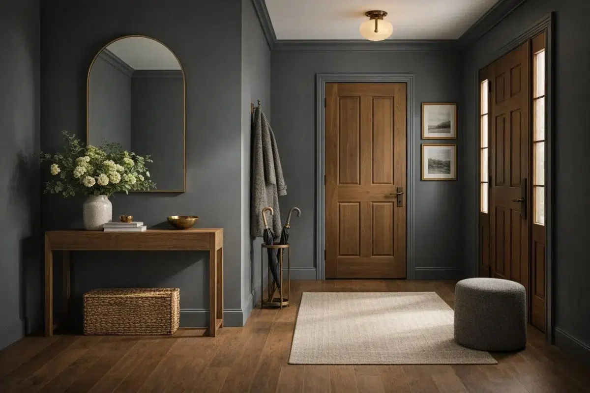
Follow Slate Tile from one space to another and watch how light, scale and surrounding materials reshape its character. 5 sourced room photos sit alongside 7 generated visualizations.
1 Living Room Photo
Slate Tile (7624) brings its neutral character into a space shaped by conversation, quiet evenings and changing daylight. Its brighter saturation allows the hue to remain present rather than fading quietly into the background.
Living room walls in Slate Tile establish a calm, sophisticated backdrop.
@mybudgetrecipes
1 Bedroom Photo
Slate Tile (7624) offers a starting mood rather than a finished formula: Its cool classification can bring a composed, clean tension to warmer finishes. Test it under gentle morning light and low evening lamps.

Bedroom painted in Slate Tile evokes a tranquil, slate-like serenity.
@mybudgetrecipes
1 Kitchen Photo
In a hardworking room where color meets movement and strong surfaces, the most interesting quality of Slate Tile (7624) may be the way it responds to stone, timber, tile and metal finishes. The blue, grey hue classifications suggest the subtle directions the color may take as the room changes.

Kitchen cabinetry finished in Slate Tile offers timeless, slate-inspired elegance.
@mybudgetrecipes
2 Bathroom Photos
Slate Tile (7624) brings its neutral character into a compact setting where tile, fixtures and color sit close together. Its brighter saturation allows the hue to remain present rather than fading quietly into the background.

Bathroom walls in Slate Tile create a spa-like, stone-inspired retreat.
@mybudgetrecipes

Bathroom walls in Slate Tile establish a moody, contemporary aesthetic.
@alicia.rae17
1 Home Office Photo
Slate Tile (7624) can change noticeably under daylight beside desk lamps and screen glow. Sample it beside the finishes that will remain in the room.

Home office walls in Slate Tile foster focus and professional calm.
@mybudgetrecipes
1 House Photo
Slate Tile (7624) moves through 1 house image without becoming a fixed prescription for the room. Its cool classification can bring a composed, clean tension to warmer finishes.

Exterior painted in Slate Tile brings slate-gray sophistication to the facade.
@mybudgetrecipes
2 Front Door Photos
Its place within Organic hints at the range of palettes it can inhabit. In this setting, let direct sun, porch shade and evening exterior light and hardware, glazing, masonry, timber and surrounding trim guide the final sample decision.

Front door finished in Slate Tile makes a striking, elegant entrance.
@mybudgetrecipes

Entry door in Slate Tile creates a bold, inviting first impression.
@lharperdesigns
2 Misc Photos
Viewed across 2 misc images in an assortment of spaces that reveals the color outside a single design formula, Slate Tile (7624) reveals how much color depends on scale, surface and shadow. With an LRV of 14.8, it carries enough visual weight to make light, trim and texture feel especially deliberate.

Accent wall with paneling in Slate Tile adds textural depth and drama.
@aimee.loveless.creative

Walls in Slate Tile showcase a soft, blue-gray sophistication throughout.
@bgainesinteriors
1 Kitchen Cabinets Photo
Across 1 kitchen cabinets image, Slate Tile (7624) meets light moving across doors, rails and recessed panels. Its cool classification can bring a composed, clean tension to warmer finishes.

Kitchen cabinets finished in Slate Tile deliver sophisticated, modern storage.
@tarasetzerdesign
Expert Perspectives
Articles and features from across our network of home and design sites.
Coordinating Colors


At LRV 77 vs 15, Ice Cube is decisively the brighter choice.


At LRV 74 vs 15, Shoji White is decisively the brighter choice.


Intellectual Gray reflects far more light (LRV 36 vs 15), opening up a space where Slate Tile encloses it.
Trim Color
At LRV 77 vs 15, Ice Cube is decisively the brighter choice.
Similar Colors


With LRVs of 15 and 15, the two reflect almost the same amount of light.


With LRVs of 15 and 15, the two reflect almost the same amount of light.


With LRVs of 15 and 14, the two reflect almost the same amount of light.


Their light reflectance is nearly identical (LRV 17 vs 15), so neither reads brighter in a room.


With LRVs of 15 and 14, the two reflect almost the same amount of light.


Their light reflectance is nearly identical (LRV 15 vs 13), so neither reads brighter in a room.


With LRVs of 15 and 13, the two reflect almost the same amount of light.


Their light reflectance is nearly identical (LRV 15 vs 14), so neither reads brighter in a room.

Their light reflectance is nearly identical (LRV 15 vs 14), so neither reads brighter in a room.


Their light reflectance is nearly identical (LRV 15 vs 12), so neither reads brighter in a room.
Complementary Colors

Mauve Tinge reflects far more light (LRV 76 vs 15), opening up a space where Slate Tile encloses it.


At LRV 50 vs 15, Studio Mauve is decisively the brighter choice.


Truly Taupe reflects far more light (LRV 35 vs 15), opening up a space where Slate Tile encloses it.


Heavenly White reflects far more light (LRV 81 vs 15), opening up a space where Slate Tile encloses it.

At LRV 74 vs 15, Original White is decisively the brighter choice.

At LRV 35 vs 15, Palisade is decisively the brighter choice.


Their light reflectance is nearly identical (LRV 15 vs 13), so neither reads brighter in a room.
Lighter Colors


African Gray reflects far more light (LRV 31 vs 15), opening up a space where Slate Tile encloses it.


A 8-point LRV gap (23 vs 15) makes Software the marginally brighter of the two.


A 7-point LRV gap (22 vs 15) makes Scattered Showers the marginally brighter of the two.


A 5-point LRV gap (20 vs 15) makes Foggy Day the marginally brighter of the two.


At LRV 31 vs 15, Cadet is decisively the brighter choice.
Darker Colors


Slate Tile reads slightly lighter (LRV 15 vs 7), a gap that shows most in low-lit rooms.
Their light reflectance is nearly identical (LRV 15 vs 12), so neither reads brighter in a room.


Slate Tile reads slightly lighter (LRV 15 vs 6), a gap that shows most in low-lit rooms.


Slate Tile reads slightly lighter (LRV 15 vs 11), a gap that shows most in low-lit rooms.


A 8-point LRV gap (15 vs 6) makes Slate Tile the marginally brighter of the two.
Color Codes
Manufacturer description
This cool blue-gray delivers subtle elegance. Dark but muted, it feels at home in almost any room.