
Adriatic Sea
Adriatic Sea begins as a blue color on paper, then shifts with every surface, shadow and neighboring material. Its blue classifications hint at the directions it may take as daylight, lamps and neighboring colors move around it. Move between the room imagery, color measurements and coordinating shades to build a fuller sense of how it might live in your space.
Hex
#016081LRV
9.22
Adriatic Sea's Color Strip
Adriatic Sea is the seventh shade on this 7-color strip, the deepest shade in this coordinated family. Strip 167 makes it easy to compare shades side by side and find the right depth for your space.


Adriatic Sea in Rooms
Follow Adriatic Sea from one space to another and watch how light, scale and surrounding materials reshape its character. 10 generated visualizations explore how the color might shape a finished room.
1 Bathroom Photo
The contrast between bright mornings and quieter evening light can draw different notes from Adriatic Sea (6790). The blue hue classifications suggest the subtle directions the color may take as the room changes.
Adriatic Sea — wabi-sabi bathroom
@mybudgetrecipes
1 Bedroom Photo
1 generated visualization explores how the color might shape the finished space. Together they show Adriatic Sea (6790) as inspiration rather than a promise of an identical result.

A traditional bedroom painted in Adriatic Sea
@mybudgetrecipes
1 Home Office Photo
Adriatic Sea (6790) can change noticeably under daylight beside desk lamps and screen glow. Sample it beside the finishes that will remain in the room.

Sherwin-Williams Adriatic Sea in a industrial home office
@mybudgetrecipes
1 Front Door Photo
Viewed across 1 front door image in a small architectural moment with an outsized first impression, Adriatic Sea (6790) reveals how much color depends on scale, surface and shadow. With an LRV of 9.2, it carries enough visual weight to make light, trim and texture feel especially deliberate.

cottagecore front door featuring Adriatic Sea by Sherwin-Williams
@mybudgetrecipes
1 Dining Room Photo
Adriatic Sea (6790) offers a starting mood rather than a finished formula: Its cool classification can bring a composed, clean tension to warmer finishes. Test it under natural light, candles and pendant lighting.

Adriatic Sea paint in a rustic modern dining room
@mybudgetrecipes
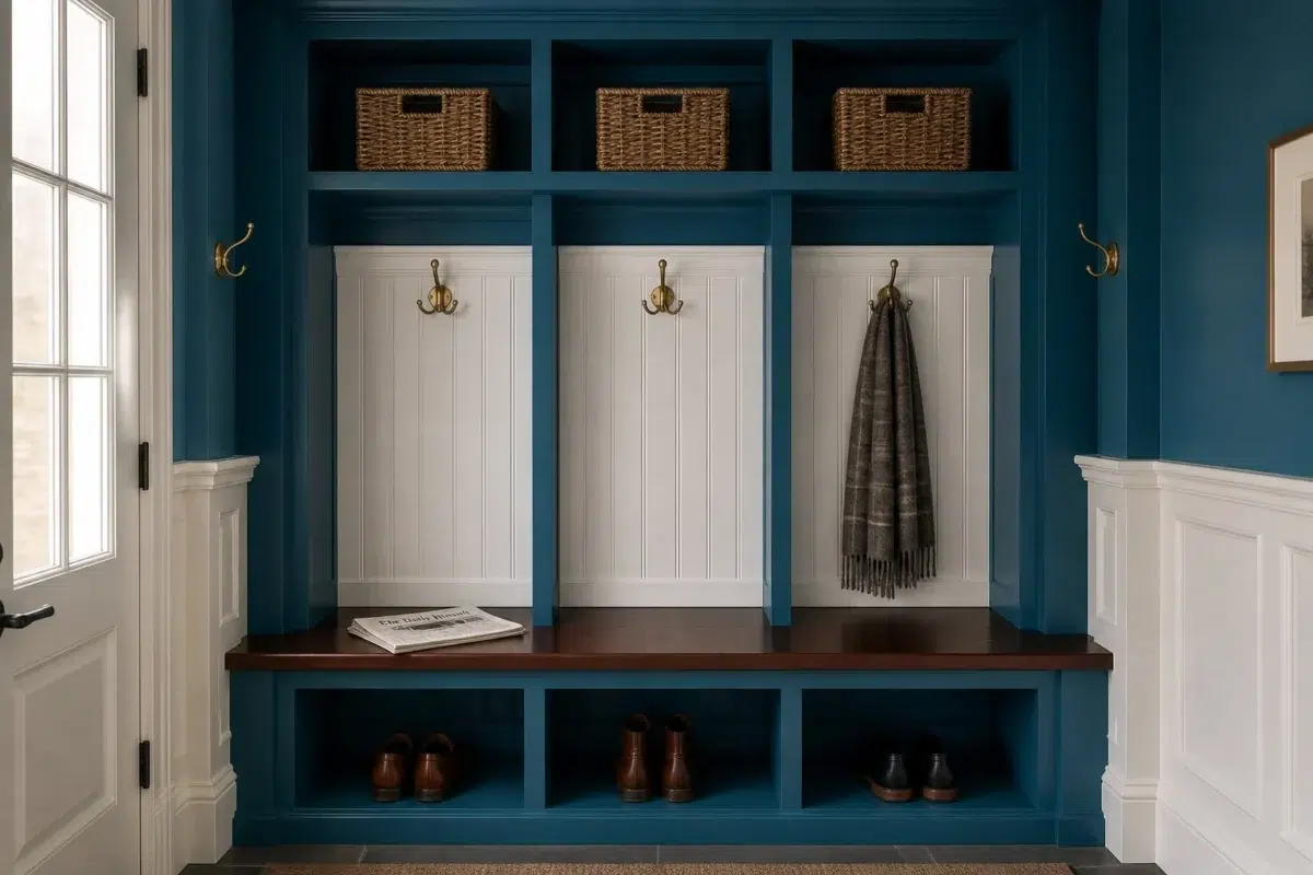
1 Mudroom Photo
Against flooring, storage, timber, baskets and hardware, Adriatic Sea (6790) may feel quieter, sharper or more atmospheric than the digital swatch alone. With an LRV of 9.2, it carries enough visual weight to make light, trim and texture feel especially deliberate.

Adriatic Sea paint in a traditional mudroom
@mybudgetrecipes
1 House Photo
1 house image trace Adriatic Sea (6790) through the façade’s movement through sun, shade and season. Its place within 2017 Unbounded hints at the range of palettes it can inhabit.

Adriatic Sea color — maximalist house inspiration
@mybudgetrecipes
1 Patio Photo
Against stone, timber, metal, textiles and greenery, Adriatic Sea (6790) may feel quieter, sharper or more atmospheric than the digital swatch alone. With an LRV of 9.2, it carries enough visual weight to make light, trim and texture feel especially deliberate.

mediterranean patio featuring Adriatic Sea by Sherwin-Williams
@mybudgetrecipes
1 Living Room Photo
Across 1 living room image, Adriatic Sea (6790) meets the movement from window light to lamplight. Its cool classification can bring a composed, clean tension to warmer finishes.

A hollywood regency living room painted in Adriatic Sea
@mybudgetrecipes
1 Kitchen Photo
1 generated visualization explores how the color might shape the finished space. Together they show Adriatic Sea (6790) as inspiration rather than a promise of an identical result.

Adriatic Sea — contemporary kitchen
@mybudgetrecipes
Expert Perspectives
Articles and features from across our network of home and design sites.
Coordinating Colors


Bravo Blue reflects far more light (LRV 77 vs 9), opening up a space where Adriatic Sea encloses it.


At LRV 73 vs 9, Aesthetic White is decisively the brighter choice.


At LRV 28 vs 9, Felted Wool is decisively the brighter choice.
Trim Color
Bravo Blue reflects far more light (LRV 77 vs 9), opening up a space where Adriatic Sea encloses it.
Similar Colors

Their light reflectance is nearly identical (LRV 10 vs 9), so neither reads brighter in a room.


With LRVs of 11 and 9, the two reflect almost the same amount of light.


With LRVs of 9 and 9, the two reflect almost the same amount of light.


With LRVs of 9 and 9, the two reflect almost the same amount of light.


Their light reflectance is nearly identical (LRV 9 vs 8), so neither reads brighter in a room.


Their light reflectance is nearly identical (LRV 9 vs 9), so neither reads brighter in a room.


With LRVs of 9 and 9, the two reflect almost the same amount of light.


With LRVs of 10 and 9, the two reflect almost the same amount of light.


Their light reflectance is nearly identical (LRV 12 vs 9), so neither reads brighter in a room.
Complementary Colors


At LRV 29 vs 9, Coral Reef is decisively the brighter choice.

At LRV 30 vs 9, Lei Flower is decisively the brighter choice.

Sumptuous Peach reflects far more light (LRV 54 vs 9), opening up a space where Adriatic Sea encloses it.

At LRV 76 vs 9, Organza is decisively the brighter choice.


At LRV 41 vs 9, Harvest Gold is decisively the brighter choice.


Raucous Orange reads slightly lighter (LRV 18 vs 9), a gap that shows most in low-lit rooms.


At LRV 68 vs 9, Blushing is decisively the brighter choice.
Lighter Colors


A 9-point LRV gap (19 vs 9) makes Cruising the marginally brighter of the two.


Capri reflects far more light (LRV 28 vs 9), opening up a space where Adriatic Sea encloses it.
Their light reflectance is nearly identical (LRV 12 vs 9), so neither reads brighter in a room.


Blue Mosque reads slightly lighter (LRV 17 vs 9), a gap that shows most in low-lit rooms.

Resonant Blue reflects far more light (LRV 30 vs 9), opening up a space where Adriatic Sea encloses it.
Darker Colors


A 4-point LRV gap (9 vs 5) makes Adriatic Sea the marginally brighter of the two.
With LRVs of 9 and 9, the two reflect almost the same amount of light.


At LRV NaN vs NaN, Blue Grotto is decisively the brighter choice.


With LRVs of 9 and 8, the two reflect almost the same amount of light.
Color Codes
Manufacturer description
This dark rich blue with cool turquoise undertones will lull you into a sense of fathomless calm. Pairs wonderfully with a warm gray like Felted Wool.