
Amalfi
There is more to Sherwin-Williams Amalfi (6783) than the swatch alone: its depth, undertones and setting all shape the final impression. Its LRV of 11.9 gives it real visual weight, allowing the color to hold a wall rather than simply recede from view. Its related shades below reveal where the color harmonizes—and where contrast brings it fully to life.
Hex
#016E85LRV
11.95
Amalfi's Color Strip
Amalfi is the seventh shade on this 7-color strip, the deepest shade in this coordinated family. Strip 166 puts these related shades in sequence, making it simple to find the tone that suits your room.


Amalfi in Rooms
Follow Amalfi from one space to another and watch how light, scale and surrounding materials reshape its character. 10 generated visualizations explore how the color might shape a finished room.
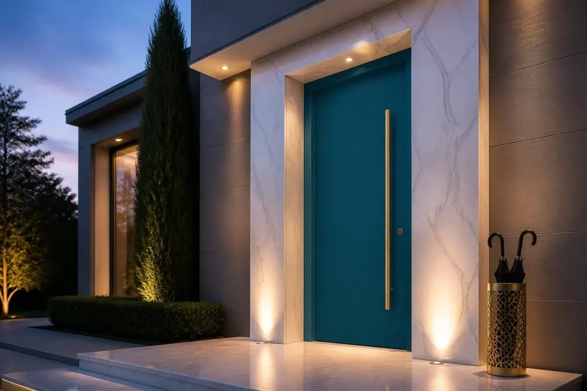
1 Front Door Photo
In a small architectural moment with an outsized first impression, the most interesting quality of Amalfi (6783) may be the way it responds to hardware, glazing, masonry, timber and surrounding trim. The blue hue classifications suggest the subtle directions the color may take as the room changes.
modern luxury front door featuring Amalfi by Sherwin-Williams
@mybudgetrecipes
1 Home Office Photo
Amalfi (6783) offers a starting mood rather than a finished formula: Its cool classification can bring a composed, clean tension to warmer finishes. Test it under daylight beside desk lamps and screen glow.

Sherwin-Williams Amalfi in a scandinavian home office
@mybudgetrecipes
1 Dining Room Photo
Against timber, table linen, glass and artwork, Amalfi (6783) may feel quieter, sharper or more atmospheric than the digital swatch alone. With an LRV of 11.9, it carries enough visual weight to make light, trim and texture feel especially deliberate.

Amalfi paint in a minimalist dining room
@mybudgetrecipes
1 Bedroom Photo
Against bed linen, timber, wool and upholstered textures, Amalfi (6783) may feel quieter, sharper or more atmospheric than the digital swatch alone. With an LRV of 11.9, it carries enough visual weight to make light, trim and texture feel especially deliberate.

A moody bedroom painted in Amalfi
@mybudgetrecipes
1 Bathroom Photo
Amalfi (6783) can change noticeably under window light, mirrors and focused task lighting. Sample it beside the finishes that will remain in the room.

Amalfi — vintage bathroom
@mybudgetrecipes
1 Living Room Photo
The room’s shift from daytime energy to evening calm can draw different notes from Amalfi (6783). The blue hue classifications suggest the subtle directions the color may take as the room changes.

A scandinavian living room painted in Amalfi
@mybudgetrecipes
1 Kitchen Photo
These 1 kitchen image show how Amalfi (6783) can sit beside stone, timber, tile and metal finishes. The blue hue classifications suggest the subtle directions the color may take as the room changes.

Amalfi — industrial kitchen
@mybudgetrecipes
1 House Photo
Amalfi (6783) can change noticeably under full daylight, cloud cover and long evening shadows. Sample it beside the finishes that will remain in the room.

Amalfi color — eclectic house inspiration
@mybudgetrecipes
1 Patio Photo
1 generated visualization explores how the color might shape the finished space. Together they show Amalfi (6783) as inspiration rather than a promise of an identical result.

boho patio featuring Amalfi by Sherwin-Williams
@mybudgetrecipes
1 Mudroom Photo
1 generated visualization explores how the color might shape the finished space. Together they show Amalfi (6783) as inspiration rather than a promise of an identical result.

Amalfi paint in a classy mudroom
@mybudgetrecipes
Expert Perspectives
Articles and features from across our network of home and design sites.
Coordinating Colors


Outerbanks reflects far more light (LRV 39 vs 12), opening up a space where Amalfi encloses it.


Trim Color
Similar Colors


Great Falls reads slightly lighter (LRV 15 vs 12), a gap that shows most in low-lit rooms.


Their light reflectance is nearly identical (LRV 12 vs 11), so neither reads brighter in a room.

A 4-point LRV gap (16 vs 12) makes Turkish Tile the marginally brighter of the two.


A 3-point LRV gap (15 vs 12) makes Silken Peacock the marginally brighter of the two.


With LRVs of 14 and 12, the two reflect almost the same amount of light.


Their light reflectance is nearly identical (LRV 14 vs 12), so neither reads brighter in a room.
Complementary Colors


A 6-point LRV gap (18 vs 12) makes Raucous Orange the marginally brighter of the two.


Copper Harbor reflects far more light (LRV 30 vs 12), opening up a space where Amalfi encloses it.


At LRV 63 vs 12, Bella Pink is decisively the brighter choice.


Lighter Colors


Gulfstream reads slightly lighter (LRV 18 vs 12), a gap that shows most in low-lit rooms.

Tempo Teal reads slightly lighter (LRV 19 vs 12), a gap that shows most in low-lit rooms.


With LRVs of 15 and 12, the two reflect almost the same amount of light.


Darker Colors


At LRV NaN vs NaN, Mosaic Tile is decisively the brighter choice.


Their light reflectance is nearly identical (LRV 12 vs 9), so neither reads brighter in a room.
Color Codes
Manufacturer description
This richly saturated deep blue evokes the dramatic coastline where cerulean waters meet shadowed cliffs, infusing your space with Mediterranean elegance and timeless sophistication. Perfect for creating an intimate, jewel-box atmosphere in bedrooms, studies, or accent walls that demand a bold statement.