
Aloe
Aloe is a Green paint color from Sherwin-Williams, but its character reaches beyond a single label. Its green classifications hint at the directions it may take as daylight, lamps and neighboring colors move around it. Treat the digital swatch as an opening note, then watch a physical sample from morning light through evening lamps.
Hex
#ACCABCLRV
54.76
Aloe's Color Strip
Aloe is the second shade on this 7-color strip, sitting between Breaktime and Spearmint. The strip spans from Breaktime at the lightest end to Hunt Club at the deepest. Strip 160 makes it easy to compare shades side by side and find the right depth for your space.


Aloe in Rooms
Follow Aloe from one space to another and watch how light, scale and surrounding materials reshape its character. 10 generated visualizations explore how the color might shape a finished room.
1 Dining Room Photo
Aloe (6464) brings its green character into a gathering space that can move from daylight to ceremony. Its midtone saturation keeps the color expressive without letting it dominate every surface around it.
Aloe paint in a minimalist dining room
@mybudgetrecipes
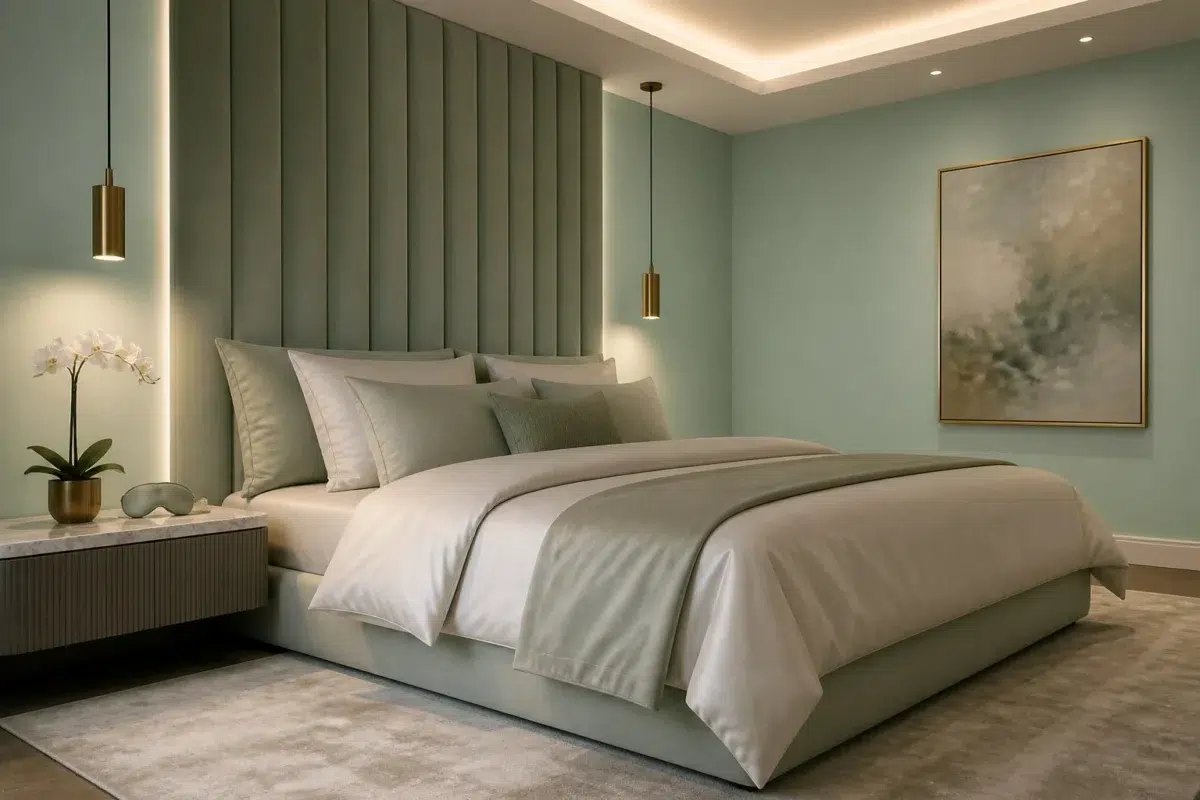
1 Bedroom Photo
The slower pace of morning and night can draw different notes from Aloe (6464). The green hue classifications suggest the subtle directions the color may take as the room changes.

A modern luxury bedroom painted in Aloe
@mybudgetrecipes
1 Home Office Photo
1 generated visualization explores how the color might shape the finished space. Together they show Aloe (6464) as inspiration rather than a promise of an identical result.

Sherwin-Williams Aloe in a scandinavian home office
@mybudgetrecipes
1 Bathroom Photo
Its place within Living Well and Vintage Moxie hints at the range of palettes it can inhabit. In this setting, let window light, mirrors and focused task lighting and tile, stone, glass, timber and metal fixtures guide the final sample decision.

Aloe — vintage bathroom
@mybudgetrecipes
1 Front Door Photo
The 1 front door image turn a green swatch into something more spatial and expressive. Its midtone saturation keeps the color expressive without letting it dominate every surface around it.

rustic modern front door featuring Aloe by Sherwin-Williams
@mybudgetrecipes
1 Mudroom Photo
1 mudroom image place Aloe (6464) in a practical threshold where the outdoors enters the home. An LRV of 54.8 lets the color hold its identity across both brighter and more shaded parts of the room.

Aloe paint in a neutral mudroom
@mybudgetrecipes
1 Living Room Photo
Its place within Living Well and Vintage Moxie hints at the range of palettes it can inhabit. In this setting, let the movement from window light to lamplight and upholstery, timber, art and metal accents guide the final sample decision.

A contemporary living room painted in Aloe
@mybudgetrecipes
1 Patio Photo
Its place within Living Well and Vintage Moxie hints at the range of palettes it can inhabit. In this setting, let direct sun, reflected daylight and deep exterior shade and stone, timber, metal, textiles and greenery guide the final sample decision.

boho patio featuring Aloe by Sherwin-Williams
@mybudgetrecipes
1 House Photo
Aloe (6464) offers a starting mood rather than a finished formula: Its cool classification can bring a composed, clean tension to warmer finishes. Test it under full daylight, cloud cover and long evening shadows.

Aloe color — traditional house inspiration
@mybudgetrecipes
1 Kitchen Photo
The 1 kitchen image turn a green swatch into something more spatial and expressive. Its midtone saturation keeps the color expressive without letting it dominate every surface around it.

Aloe — industrial kitchen
@mybudgetrecipes
Expert Perspectives
Articles and features from across our network of home and design sites.
Coordinating Colors


Green Trance reflects far more light (LRV 75 vs 55), opening up a space where Aloe encloses it.


Aloe reflects far more light (LRV 55 vs 9), opening up a space where Muddled Basil encloses it.

Aloe reflects far more light (LRV 55 vs 40), opening up a space where Sassy Green encloses it.
Trim Color
Green Trance reflects far more light (LRV 75 vs 55), opening up a space where Aloe encloses it.
Similar Colors


A 4-point LRV gap (55 vs 51) makes Aloe the marginally brighter of the two.


Reclining Green reads slightly lighter (LRV 63 vs 55), a gap that shows most in low-lit rooms.


Waterscape reads slightly lighter (LRV 62 vs 55), a gap that shows most in low-lit rooms.


With LRVs of 57 and 55, the two reflect almost the same amount of light.
Complementary Colors

Whimsical White reflects far more light (LRV 79 vs 55), opening up a space where Aloe encloses it.

At LRV 55 vs 24, Aloe is decisively the brighter choice.

Aloe reflects far more light (LRV 55 vs 17), opening up a space where Plum Dandy encloses it.


Wallflower reads slightly lighter (LRV 64 vs 55), a gap that shows most in low-lit rooms.


A 4-point LRV gap (55 vs 51) makes Aloe the marginally brighter of the two.


Aloe reflects far more light (LRV 55 vs 13), opening up a space where Grape Harvest encloses it.
Lighter Colors

At LRV 79 vs 55, Timid Blue is decisively the brighter choice.
Waterscape reads slightly lighter (LRV 62 vs 55), a gap that shows most in low-lit rooms.


Darker Colors


Aloe reflects far more light (LRV 55 vs 34), opening up a space where Verdigreen encloses it.
Color Codes
Manufacturer description
Like a salve for the soul, this soothing, blue-tinted green provides a soft, relaxing mood in any space. Try this soft midtone in a bedroom or bathroom.