
Balanced Beige
Sherwin-Williams Balanced Beige (7037) carries the measured structure of its color data and the less predictable beauty of paint in a finished space. Its beige and greige classifications hint at the directions it may take as daylight, lamps and neighboring colors move around it. Treat the digital swatch as an opening note, then watch a physical sample from morning light through evening lamps.
Hex
#C0B2A2LRV
45.60
Balanced Beige's Color Strip
Balanced Beige is the second shade on this 7-color strip, sitting between Accessible Beige and Tony Taupe. The strip spans from Accessible Beige at the lightest end to Van Dyke Brown at the deepest. Browsing strip 249 alongside this color helps you gauge whether to go lighter, darker, or stay right here.


Balanced Beige in Rooms
Follow Balanced Beige from one space to another and watch how light, scale and surrounding materials reshape its character. 29 sourced room photos sit alongside 7 generated visualizations.
12 Living Room Photos
11 sourced photos are joined by 1 generated visualization, offering both observed and imagined settings. Together they show Balanced Beige (7037) as inspiration rather than a promise of an identical result.
Living room walls in Balanced Beige create warmth without overwhelming the furnished space.
@mybudgetrecipes
2 Bedroom Photos
Its place within Acute Care Cool Foundations and Diaphanous hints at the range of palettes it can inhabit. In this setting, let gentle morning light and low evening lamps and bed linen, timber, wool and upholstered textures guide the final sample decision.

Bedroom walls painted Balanced Beige provide a serene backdrop for restful décor.
@mybudgetrecipes

Bedroom walls in Balanced Beige create an intimate, calming environment for sleep.
@marco_paints_perfection_htx
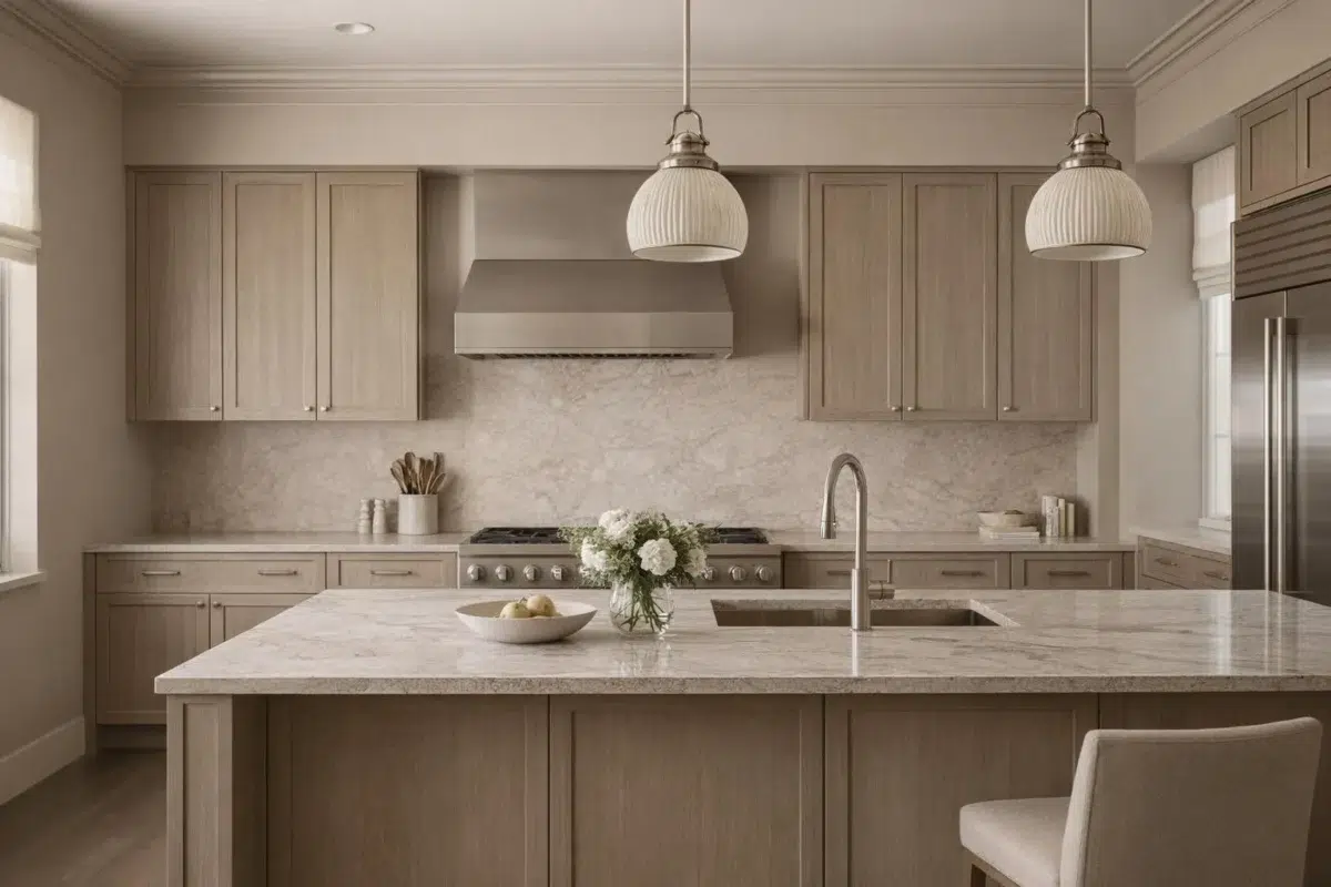
2 Kitchen Photos
1 sourced photo is joined by 1 generated visualization, offering both observed and imagined settings. Together they show Balanced Beige (7037) as inspiration rather than a promise of an identical result.

Kitchen cabinet doors in Balanced Beige coordinate with light wood flooring and counters.
@mybudgetrecipes

Kitchen walls in Balanced Beige complement natural light and create a cohesive dining area.
@honeyandlivdesignco
1 Bathroom Photo
Across 1 bathroom image, Balanced Beige (7037) meets window light, mirrors and focused task lighting. Its warm classification can feel inviting beside tactile, natural materials.

Bathroom walls in Balanced Beige brighten the space while maintaining spa-like tranquility.
@mybudgetrecipes
1 Home Office Photo
Balanced Beige (7037) can change noticeably under daylight beside desk lamps and screen glow. Sample it beside the finishes that will remain in the room.

Home office walls in Balanced Beige support focus and productivity throughout the workday.
@mybudgetrecipes
8 House Photos
The façade’s movement through sun, shade and season can draw different notes from Balanced Beige (7037). The beige, greige hue classifications suggest the subtle directions the color may take as the room changes.

Exterior siding in Balanced Beige complements traditional landscaping and stone accents.
@mybudgetrecipes
3 Front Door Photos
Balanced Beige (7037) moves through 3 front door images without becoming a fixed prescription for the room. Its warm classification can feel inviting beside tactile, natural materials.

Front door in Balanced Beige welcomes guests with warm, inviting curb appeal.
@mybudgetrecipes

Front door painted Balanced Beige welcomes guests with understated, sophisticated appeal.
@shasta_davidsondiy

Garage doors painted in Balanced Beige create a warm, cohesive entry.
@noblecasserole
2 Kitchen Cabinets Photos
2 sourced room photos give the gallery a lived-in point of reference. Together they show Balanced Beige (7037) as inspiration rather than a promise of an identical result.

Kitchen cabinets painted in Balanced Beige brighten this cooking space with neutral warmth.
@treci0630

Shaker-style cabinets in Balanced Beige provide timeless elegance in this kitchen.
@unhingeddesignstx
5 Misc Photos
Balanced Beige (7037) brings its neutral character into an assortment of spaces that reveals the color outside a single design formula. Its brighter saturation allows the hue to remain present rather than fading quietly into the background.

Painted furniture in Balanced Beige brings soft, neutral elegance to any room.
@ultrafinepoint

Trim and cabinetry painted Balanced Beige unify the entire home palette.
@lakelifekoh

Neutral Balanced Beige walls provide a serene backdrop for any décor.
@our_liberty_homestead

Ceiling and walls in Balanced Beige create continuity across open spaces.
@our_liberty_homestead

Balanced Beige paint on all surfaces establishes a harmonious, timeless aesthetic.
@mikebotrosdiy
Expert Perspectives
Articles and features from across our network of home and design sites.
Coordinating Colors


At LRV 73 vs 46, Aesthetic White is decisively the brighter choice.


At LRV 46 vs 10, Balanced Beige is decisively the brighter choice.

Stucco reflects far more light (LRV 63 vs 46), opening up a space where Balanced Beige encloses it.
Trim Color
At LRV 73 vs 46, Aesthetic White is decisively the brighter choice.
Similar Colors

With LRVs of 46 and 46, the two reflect almost the same amount of light.


With LRVs of 47 and 46, the two reflect almost the same amount of light.


With LRVs of 48 and 46, the two reflect almost the same amount of light.


Their light reflectance is nearly identical (LRV 46 vs 45), so neither reads brighter in a room.


Their light reflectance is nearly identical (LRV 48 vs 46), so neither reads brighter in a room.


Their light reflectance is nearly identical (LRV 46 vs 45), so neither reads brighter in a room.


With LRVs of 48 and 46, the two reflect almost the same amount of light.


A 5-point LRV gap (50 vs 46) makes Dhurrie Beige the marginally brighter of the two.


With LRVs of 47 and 46, the two reflect almost the same amount of light.
Complementary Colors


At LRV 46 vs 6, Balanced Beige is decisively the brighter choice.


A 12-point LRV gap (46 vs 34) makes Balanced Beige the marginally brighter of the two.


At LRV 46 vs 7, Balanced Beige is decisively the brighter choice.


At LRV 46 vs 11, Balanced Beige is decisively the brighter choice.


At LRV 46 vs 7, Balanced Beige is decisively the brighter choice.


At LRV 69 vs 46, Starry Night is decisively the brighter choice.


Balanced Beige reflects far more light (LRV 46 vs 20), opening up a space where Soulful Blue encloses it.
Lighter Colors


A 11-point LRV gap (57 vs 46) makes Alpaca the marginally brighter of the two.

With LRVs of 46 and 45, the two reflect almost the same amount of light.


At LRV 65 vs 46, Grey Heron is decisively the brighter choice.
With LRVs of 47 and 46, the two reflect almost the same amount of light.


With LRVs of 47 and 46, the two reflect almost the same amount of light.
Darker Colors


At LRV 46 vs 22, Balanced Beige is decisively the brighter choice.


At LRV 46 vs 22, Balanced Beige is decisively the brighter choice.

Balanced Beige reflects far more light (LRV 46 vs 28), opening up a space where Sandy Ridge encloses it.


Balanced Beige reflects far more light (LRV 46 vs 31), opening up a space where Colonial Revival Stone encloses it.

Balanced Beige reflects far more light (LRV 46 vs 22), opening up a space where Resort Tan encloses it.
Color Codes
Manufacturer description
With a true balance of warm and cool tones, this beige adapts well to almost any setting. Pair it with fresh whites like Alabaster or Aesthetic White.