
Accessible Beige
Accessible Beige begins as a neutral color on paper, then shifts with every surface, shadow and neighboring material. It appears in 2022 Method, Bold Invention and Living Well - Balance, plus 1 more, placing it within several distinct decorating stories rather than a single fixed look. Treat the digital swatch as an opening note, then watch a physical sample from morning light through evening lamps.
Hex
#D1C7B8LRV
57.67
Accessible Beige's Color Strip
Accessible Beige is the first shade on this 7-color strip, the lightest in this coordinated family. Browsing strip 249 alongside this color helps you gauge whether to go lighter, darker, or stay right here.


Accessible Beige in Rooms
Follow Accessible Beige from one space to another and watch how light, scale and surrounding materials reshape its character. 147 sourced room photos sit alongside 7 generated visualizations and 1 additional image.
47 Living Room Photos
In a space shaped by conversation, quiet evenings and changing daylight, the most interesting quality of Accessible Beige (7036) may be the way it responds to upholstery, timber, art and metal accents. The beige, greige hue classifications suggest the subtle directions the color may take as the room changes.
Living room walls in Accessible Beige create a warm, inviting atmosphere.
@mybudgetrecipes
19 Bedroom Photos
Across 19 bedroom images, Accessible Beige (7036) meets gentle morning light and low evening lamps. Its warm classification can feel inviting beside tactile, natural materials.

Soft bedroom walls in Accessible Beige create a calm, inviting sleeping space.
@mybudgetrecipes
1 Kitchen Photo
1 generated visualization explores how the color might shape the finished space. Together they show Accessible Beige (7036) as inspiration rather than a promise of an identical result.

Neutral kitchen cabinetry and walls in Accessible Beige brighten the cooking area.
@mybudgetrecipes
32 Bathroom Photos
Accessible Beige (7036) offers a starting mood rather than a finished formula: Its warm classification can feel inviting beside tactile, natural materials. Test it under window light, mirrors and focused task lighting.

Bathroom walls painted in Accessible Beige provide a clean, spa-like backdrop.
@mybudgetrecipes
8 Home Office Photos
Across 8 home office images, Accessible Beige (7036) meets daylight beside desk lamps and screen glow. Its warm classification can feel inviting beside tactile, natural materials.

Desk workspace with Accessible Beige walls offers a focused, distraction-free environment.
@mybudgetrecipes
13 House Photos
The 13 house images turn a neutral swatch into something more spatial and expressive. Its muted saturation softens the color’s edges, making texture and shadow part of the composition.

Exterior siding in Accessible Beige gives the home a warm, welcoming appearance.
@mybudgetrecipes
6 Front Door Photos
Accessible Beige (7036) offers a starting mood rather than a finished formula: Its warm classification can feel inviting beside tactile, natural materials. Test it under direct sun, porch shade and evening exterior light.

Front door in Accessible Beige stands out against traditional white trim and hardware.
@mybudgetrecipes
18 Kitchen Cabinets Photos
Viewed across 18 kitchen cabinets images in cabinetry, where color becomes part of the room’s architecture, Accessible Beige (7036) reveals how much color depends on scale, surface and shadow. An LRV of 57.7 lets the color hold its identity across both brighter and more shaded parts of the room.

Cabinet fronts painted in Accessible Beige brighten this kitchen space.
@homeimprovementdude
10 Misc Photos
Accessible Beige (7036) can change noticeably under the varied light of hallways, corners and transitional rooms. Sample it beside the finishes that will remain in the room.

Trim, doors, and beadboard details shine in Accessible Beige.
@little.byrd.house
1 Dining Room Photo
1 sourced room photo gives the gallery a lived-in point of reference. Together they show Accessible Beige (7036) as inspiration rather than a promise of an identical result.

Dining room walls glow with the warmth of Accessible Beige.
@fivestarpaintingphillyburbs
Expert Perspectives
Articles and features from across our network of home and design sites.
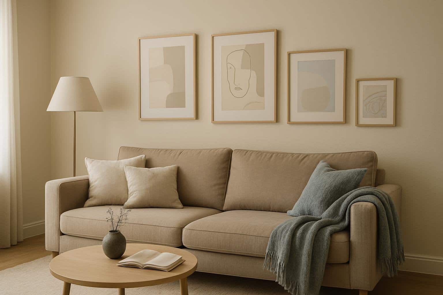
5 Stylish Accessible Beige Living Room Ideas for a Cozy Space
Accessible Beige is a soft, warm neutral that can turn your living room into a cozy sanctuary. This versatile shade pairs beautifully with a variety of decor styles, making it easy to create the perfect atmosphere. From modern minimalism to rustic charm, explore creative ideas to incorporate Accessible Beige into your space for a fresh
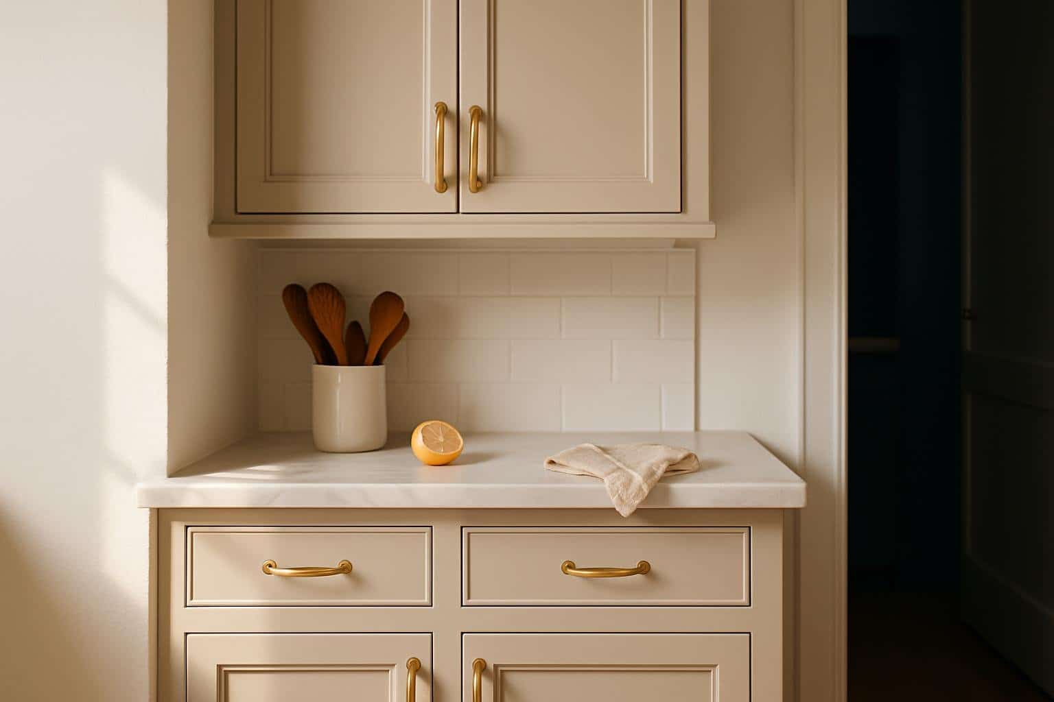
5 Cool Accessible Beige Kitchen Cabinet Ideas for a Cozy Home
Looking to give your kitchen a fresh look with Accessible Beige cabinets? This warm and inviting neutral is perfect for creating a cozy space that complements any style. From elegant finishes to smart organizational ideas, we’ve gathered some fantastic cabinet concepts to help you make the most of this versatile color. Introduction Choosing the right
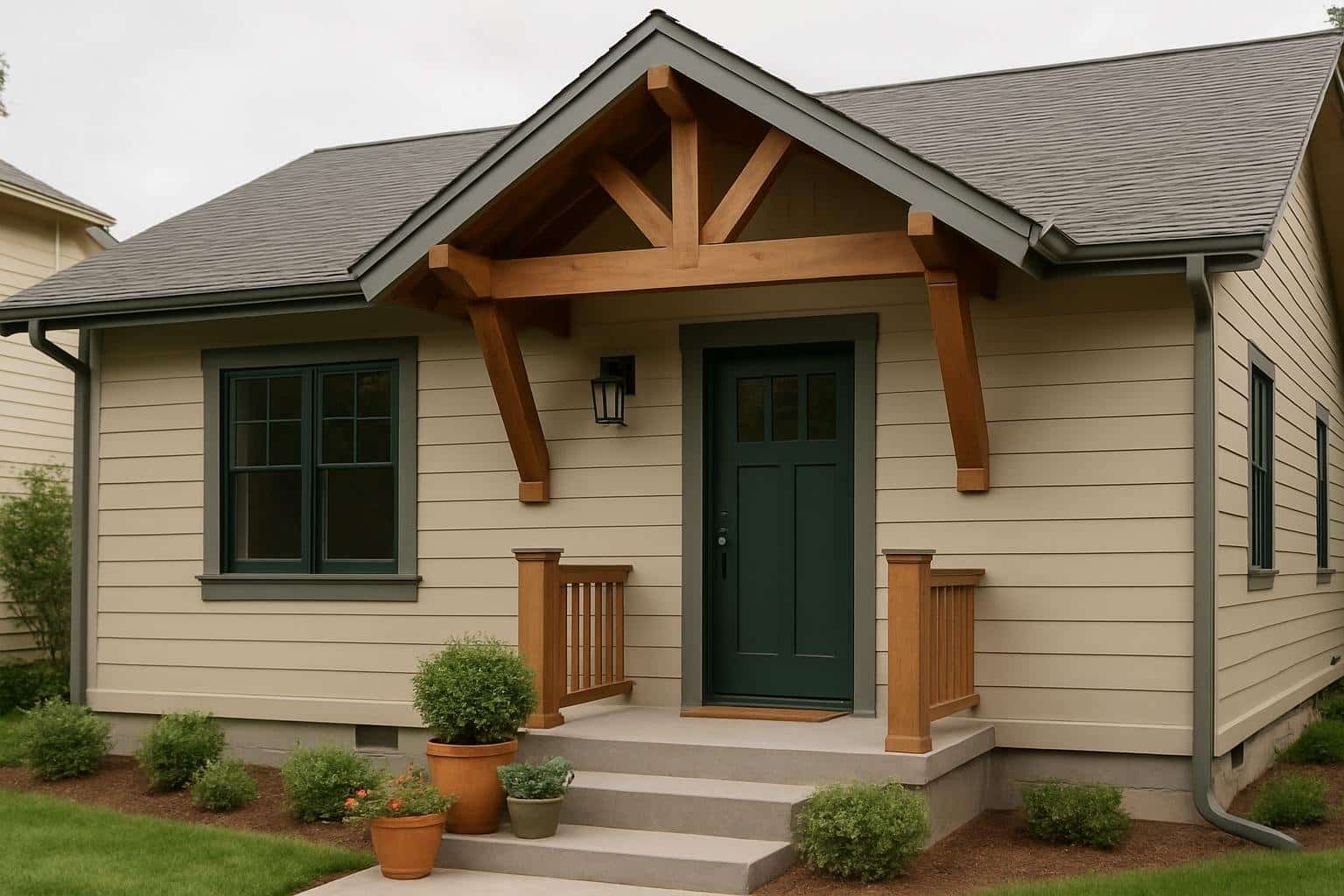
5 Stylish Accessible Beige House Ideas
Accessible Beige is a warm and inviting neutral that can truly enhance your home’s decor. If you’re looking to create a cozy yet stylish atmosphere, check out these five creative house ideas that incorporate this versatile shade. From interior accents to exterior inspiration, there’s something here for every space. Intro Accessible Beige is a warm
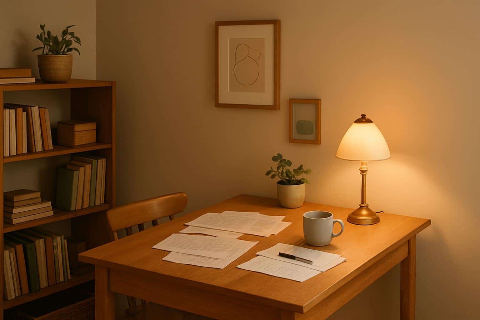
5 Stunning Accessible Beige Home Office Ideas for a Cozy Workspace
Creating a home office with Accessible Beige can bring warmth and comfort to your workspace. This versatile shade pairs beautifully with various decor styles, making it a perfect foundation for a productive, stylish environment. From cozy accents to functional furniture, here are some creative ideas to help you design a space that feels both inviting
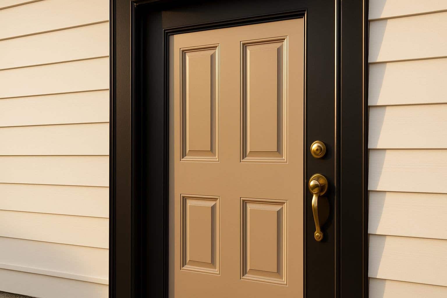
5 Accessible Beige Front Door Ideas: Inspiring Entryway Looks
Choosing the right front door color can transform the look of your home’s exterior without requiring a full renovation. When paired with Sherwin Williams Accessible Beige, your entryway gains a timeless, balanced appearance that feels both warm and modern. Accessible Beige offers a neutral foundation that complements a wide range of trim, hardware, and siding
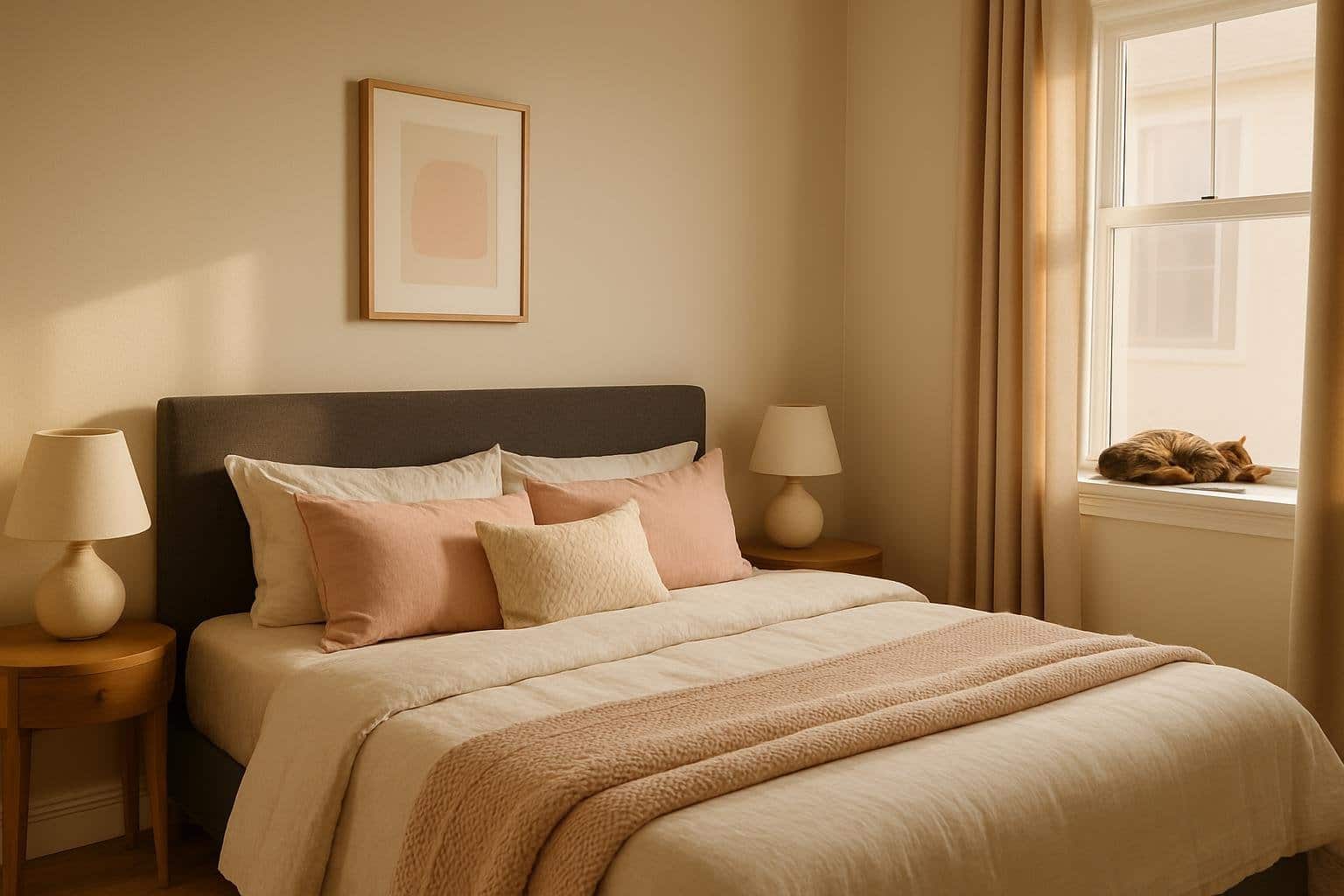
5 Accessible Beige Bedroom Ideas: Stylish Ways to Transform Your Space
Accessible Beige offers a balanced foundation that makes any bedroom feel calm, modern, and inviting. This soft neutral tone pairs easily with warm or cool accents, giving you flexibility to design a space that fits your personal style. You can use Accessible Beige to create a bedroom that feels cohesive, comfortable, and effortlessly stylish. You’ll
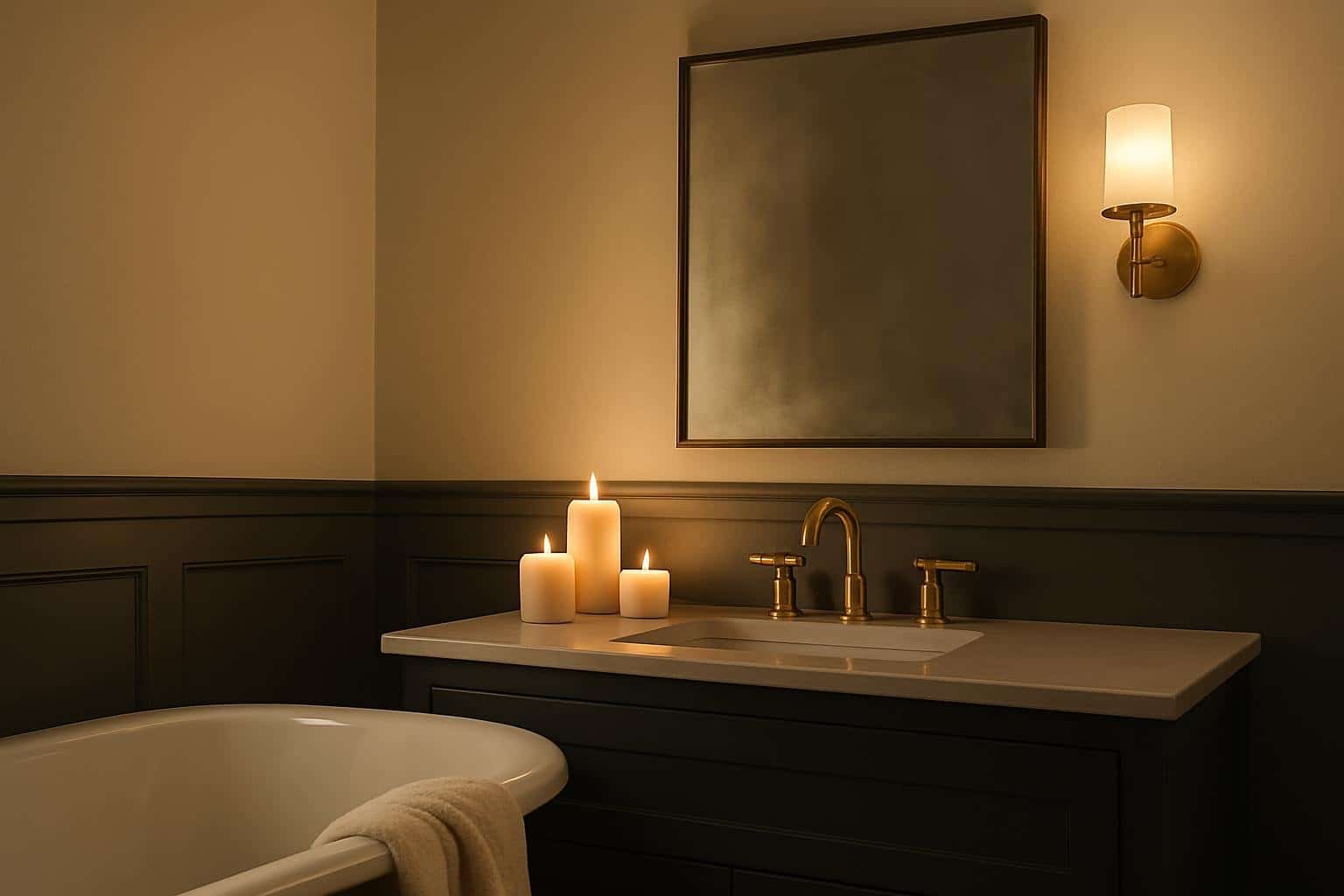
5 Accessible Beige Bathroom Ideas For A Stylish And Functional Space
Creating a bathroom that feels both stylish and functional doesn’t have to mean bold colors or over-the-top designs. In fact, sometimes the most timeless spaces are built on a foundation of subtle, versatile tones—like accessible beige. This warm, neutral shade strikes the perfect balance between classic elegance and contemporary comfort, making it ideal for any

Accessible Beige by Sherwin Williams SW 7036: The Perfect Neutral Tone for Your Home
Looking for the perfect neutral paint color that isn't too boring? Accessible Beige (SW 7036) by Sherwin-Williams might be just what you need for your home. This versatile shade combines the warmth of beige with subtle gray undertones, creating a soft, neutral backdrop that works in almost any space. Unlike typical beiges, this color has
Coordinating Colors


At LRV 73 vs 58, Aesthetic White is decisively the brighter choice.

Accessible Beige reflects far more light (LRV 58 vs 31), opening up a space where Sanderling encloses it.


Accessible Beige reflects far more light (LRV 58 vs 31), opening up a space where Cadet encloses it.
Trim Color
At LRV 73 vs 58, Aesthetic White is decisively the brighter choice.
Similar Colors


With LRVs of 58 and 57, the two reflect almost the same amount of light.

With LRVs of 58 and 56, the two reflect almost the same amount of light.


Their light reflectance is nearly identical (LRV 58 vs 57), so neither reads brighter in a room.

Their light reflectance is nearly identical (LRV 61 vs 58), so neither reads brighter in a room.


With LRVs of 58 and 57, the two reflect almost the same amount of light.


Accessible Beige reads slightly lighter (LRV 58 vs 53), a gap that shows most in low-lit rooms.


With LRVs of 59 and 58, the two reflect almost the same amount of light.


A 4-point LRV gap (62 vs 58) makes Accolade the marginally brighter of the two.


Grecian Ivory reads slightly lighter (LRV 63 vs 58), a gap that shows most in low-lit rooms.

Their light reflectance is nearly identical (LRV 58 vs 57), so neither reads brighter in a room.
Complementary Colors


At LRV 58 vs 7, Accessible Beige is decisively the brighter choice.


At LRV 58 vs 11, Accessible Beige is decisively the brighter choice.


At LRV 58 vs 7, Accessible Beige is decisively the brighter choice.


A 11-point LRV gap (69 vs 58) makes Starry Night the marginally brighter of the two.


Accessible Beige reflects far more light (LRV 58 vs 20), opening up a space where Soulful Blue encloses it.


Accessible Beige reflects far more light (LRV 58 vs 28), opening up a space where Dusty Heather encloses it.


A 11-point LRV gap (58 vs 47) makes Accessible Beige the marginally brighter of the two.
Lighter Colors


A 4-point LRV gap (61 vs 58) makes Pediment the marginally brighter of the two.


Eider White reflects far more light (LRV 73 vs 58), opening up a space where Accessible Beige encloses it.


Their light reflectance is nearly identical (LRV 60 vs 58), so neither reads brighter in a room.


A 4-point LRV gap (62 vs 58) makes Gossamer Veil the marginally brighter of the two.


Drift of Mist reads slightly lighter (LRV 69 vs 58), a gap that shows most in low-lit rooms.
Darker Colors


At LRV 58 vs 41, Accessible Beige is decisively the brighter choice.


Accessible Beige reads slightly lighter (LRV 58 vs 48), a gap that shows most in low-lit rooms.


A 6-point LRV gap (58 vs 51) makes Accessible Beige the marginally brighter of the two.


Accessible Beige reads slightly lighter (LRV 58 vs 53), a gap that shows most in low-lit rooms.


Accessible Beige reads slightly lighter (LRV 58 vs 52), a gap that shows most in low-lit rooms.
Color Codes
Manufacturer description
Unlike many beiges, this color has undertones of gray that can give your space a warm, snug feel. Pair with earthy tones.