
Biscuit
Biscuit is a White paint color from Sherwin-Williams, but its character reaches beyond a single label. Its warm classification can bring a gentle glow to the color, particularly beside natural wood and softer whites. Treat the digital swatch as an opening note, then watch a physical sample from morning light through evening lamps.
Hex
#EBDDCBLRV
73.69
Biscuit's Color Strip
Biscuit is the third shade on this 7-color strip, sitting between Medici Ivory and Intricate Ivory. The strip spans from Cotton White at the lightest end to Irish Cream at the deepest. As part of strip 265, these colors are curated to work together — helpful when you're deciding how light or deep to go.


Biscuit in Rooms
Follow Biscuit from one space to another and watch how light, scale and surrounding materials reshape its character. 10 generated visualizations explore how the color might shape a finished room.
1 Dining Room Photo
Biscuit (6112) brings its white character into a gathering space that can move from daylight to ceremony. Its brighter saturation allows the hue to remain present rather than fading quietly into the background.
Biscuit paint in a contemporary dining room
@mybudgetrecipes
1 Front Door Photo
Biscuit (6112) moves through 1 front door image without becoming a fixed prescription for the room. Its warm classification can feel inviting beside tactile, natural materials.

traditional front door featuring Biscuit by Sherwin-Williams
@mybudgetrecipes
1 Bedroom Photo
1 generated visualization explores how the color might shape the finished space. Together they show Biscuit (6112) as inspiration rather than a promise of an identical result.

A moody bedroom painted in Biscuit
@mybudgetrecipes
1 Home Office Photo
In a focused room balancing work, concentration and comfort, the most interesting quality of Biscuit (6112) may be the way it responds to wood, paper, shelving and upholstered seating. The beige hue classifications suggest the subtle directions the color may take as the room changes.

Sherwin-Williams Biscuit in a neutral home office
@mybudgetrecipes
1 Mudroom Photo
The 1 mudroom image turn a white swatch into something more spatial and expressive. Its brighter saturation allows the hue to remain present rather than fading quietly into the background.

Biscuit paint in a earthy mudroom
@mybudgetrecipes
1 Kitchen Photo
Against stone, timber, tile and metal finishes, Biscuit (6112) may feel quieter, sharper or more atmospheric than the digital swatch alone. Its LRV of 73.7 gives it a light-reflective character, though shadows and neighboring finishes can still draw out surprising depth.

Biscuit — modern luxury kitchen
@mybudgetrecipes
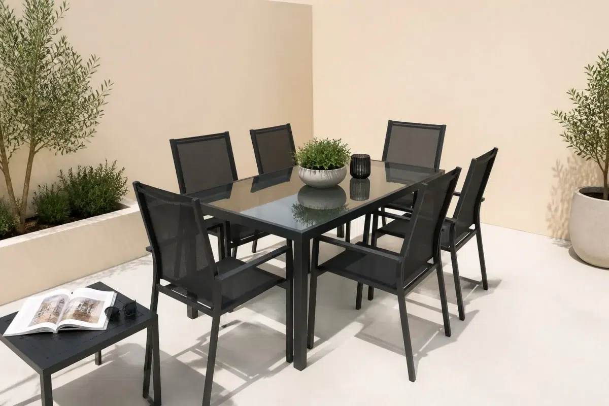
1 Patio Photo
The broad shift from bright afternoon to dusk can draw different notes from Biscuit (6112). The beige hue classifications suggest the subtle directions the color may take as the room changes.

contemporary patio featuring Biscuit by Sherwin-Williams
@mybudgetrecipes
1 Living Room Photo
Across 1 living room image, Biscuit (6112) meets the movement from window light to lamplight. Its warm classification can feel inviting beside tactile, natural materials.

A contemporary living room painted in Biscuit
@mybudgetrecipes
1 House Photo
In an exterior viewed across distance, weather and the changing sky, the most interesting quality of Biscuit (6112) may be the way it responds to roofing, masonry, timber, planting and trim. The beige hue classifications suggest the subtle directions the color may take as the room changes.

Biscuit color — eclectic house inspiration
@mybudgetrecipes
1 Bathroom Photo
Against tile, stone, glass, timber and metal fixtures, Biscuit (6112) may feel quieter, sharper or more atmospheric than the digital swatch alone. Its LRV of 73.7 gives it a light-reflective character, though shadows and neighboring finishes can still draw out surprising depth.

Biscuit — minimalist bathroom
@mybudgetrecipes
Expert Perspectives
Articles and features from across our network of home and design sites.
Coordinating Colors


Biscuit reads slightly lighter (LRV 74 vs 62), a gap that shows most in low-lit rooms.


Biscuit reflects far more light (LRV 74 vs 32), opening up a space where Subdued Sienna encloses it.
Trim Color
Similar Colors


With LRVs of 74 and 74, the two reflect almost the same amount of light.


A 3-point LRV gap (77 vs 74) makes Choice Cream the marginally brighter of the two.


With LRVs of 74 and 72, the two reflect almost the same amount of light.


Their light reflectance is nearly identical (LRV 76 vs 74), so neither reads brighter in a room.


With LRVs of 74 and 74, the two reflect almost the same amount of light.


Their light reflectance is nearly identical (LRV 75 vs 74), so neither reads brighter in a room.


With LRVs of 76 and 74, the two reflect almost the same amount of light.


A 3-point LRV gap (77 vs 74) makes Alluring White the marginally brighter of the two.


Complementary Colors


At LRV 74 vs 6, Biscuit is decisively the brighter choice.


At LRV 74 vs 11, Biscuit is decisively the brighter choice.


At LRV 74 vs 7, Biscuit is decisively the brighter choice.


A 5-point LRV gap (74 vs 69) makes Biscuit the marginally brighter of the two.


Biscuit reflects far more light (LRV 74 vs 20), opening up a space where Soulful Blue encloses it.
Lighter Colors


At LRV 86 vs 74, Westhighland White is decisively the brighter choice.


Classic Light Buff reads slightly lighter (LRV 83 vs 74), a gap that shows most in low-lit rooms.


A 9-point LRV gap (83 vs 74) makes Dover White the marginally brighter of the two.


At LRV 87 vs 74, White Flour is decisively the brighter choice.
Darker Colors


Biscuit reflects far more light (LRV 74 vs 43), opening up a space where Stonebriar encloses it.

At LRV 74 vs 46, Biscuit is decisively the brighter choice.

Biscuit reflects far more light (LRV 74 vs 58), opening up a space where Toasted Pine Nut encloses it.


Color Codes
Manufacturer description
Add a warm and welcoming glow with this bright white and its soft but radiant orange undertone. Perfect for kitchens.
Attributed to Sherwin-Williams catalog data.