
Brandywine
Sherwin-Williams Brandywine (7710) carries the measured structure of its color data and the less predictable beauty of paint in a finished space. It appears in 2017 Holistic and Timeless Color Wall, placing it within several distinct decorating stories rather than a single fixed look. The manufacturer's description below offers one reading; the room imagery leaves space for your own.
Hex
#A56C4ALRV
19.14
Brandywine's Color Strip
Brandywine is the seventh shade on this 7-color strip, the deepest shade in this coordinated family. Browsing strip 287 alongside this color helps you gauge whether to go lighter, darker, or stay right here.


Brandywine in Rooms
Follow Brandywine from one space to another and watch how light, scale and surrounding materials reshape its character. 10 generated visualizations explore how the color might shape a finished room.
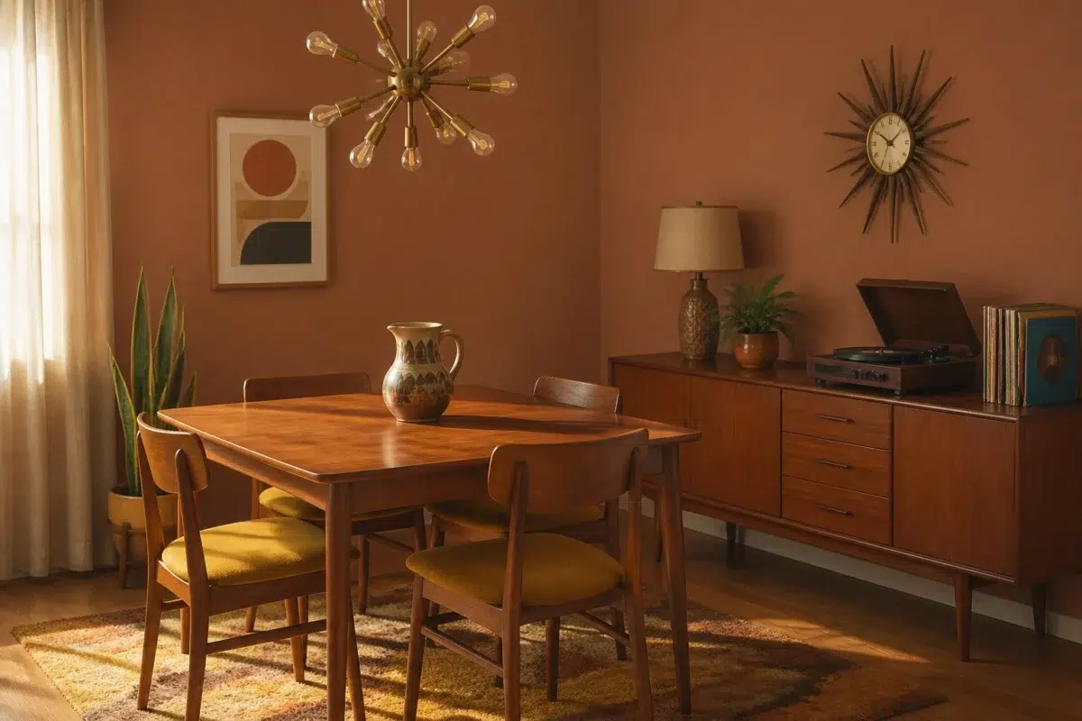
1 Dining Room Photo
Brandywine (7710) brings its orange character into a gathering space that can move from daylight to ceremony. Its midtone saturation keeps the color expressive without letting it dominate every surface around it.
Brandywine paint in a mid century dining room
@mybudgetrecipes
1 Bedroom Photo
Viewed across 1 bedroom image in a room designed around rest, softness and retreat, Brandywine (7710) reveals how much color depends on scale, surface and shadow. An LRV of 19.1 lets the color hold its identity across both brighter and more shaded parts of the room.

A traditional bedroom painted in Brandywine
@mybudgetrecipes
1 Home Office Photo
1 generated visualization explores how the color might shape the finished space. Together they show Brandywine (7710) as inspiration rather than a promise of an identical result.

Sherwin-Williams Brandywine in a moody home office
@mybudgetrecipes
1 Front Door Photo
The 1 front door image turn a orange swatch into something more spatial and expressive. Its midtone saturation keeps the color expressive without letting it dominate every surface around it.

mediterranean front door featuring Brandywine by Sherwin-Williams
@mybudgetrecipes
1 Bathroom Photo
Its place within 2017 Holistic and Timeless Color Wall hints at the range of palettes it can inhabit. In this setting, let window light, mirrors and focused task lighting and tile, stone, glass, timber and metal fixtures guide the final sample decision.

Brandywine — traditional bathroom
@mybudgetrecipes
1 House Photo
Against roofing, masonry, timber, planting and trim, Brandywine (7710) may feel quieter, sharper or more atmospheric than the digital swatch alone. An LRV of 19.1 lets the color hold its identity across both brighter and more shaded parts of the room.

Brandywine color — coastal house inspiration
@mybudgetrecipes
1 Mudroom Photo
Brandywine (7710) moves through 1 mudroom image without becoming a fixed prescription for the room. Its warm classification can feel inviting beside tactile, natural materials.

Brandywine paint in a small mudroom
@mybudgetrecipes
1 Kitchen Photo
The changing light from breakfast through dinner can draw different notes from Brandywine (7710). The beige hue classifications suggest the subtle directions the color may take as the room changes.

Brandywine — bold kitchen
@mybudgetrecipes
1 Patio Photo
The 1 patio image turn a orange swatch into something more spatial and expressive. Its midtone saturation keeps the color expressive without letting it dominate every surface around it.

rustic modern patio featuring Brandywine by Sherwin-Williams
@mybudgetrecipes
1 Living Room Photo
1 living room image place Brandywine (7710) in a space shaped by conversation, quiet evenings and changing daylight. An LRV of 19.1 lets the color hold its identity across both brighter and more shaded parts of the room.

A elegant living room painted in Brandywine
@mybudgetrecipes
Expert Perspectives
Articles and features from across our network of home and design sites.
Coordinating Colors


Creamy reflects far more light (LRV 81 vs 19), opening up a space where Brandywine encloses it.


Polvo de Oro reflects far more light (LRV 53 vs 19), opening up a space where Brandywine encloses it.


Brandywine reads slightly lighter (LRV 19 vs 9), a gap that shows most in low-lit rooms.
Trim Color
Creamy reflects far more light (LRV 81 vs 19), opening up a space where Brandywine encloses it.
Similar Colors


With LRVs of 20 and 19, the two reflect almost the same amount of light.

Their light reflectance is nearly identical (LRV 21 vs 19), so neither reads brighter in a room.


A 3-point LRV gap (22 vs 19) makes Decorous Amber the marginally brighter of the two.


With LRVs of 19 and 17, the two reflect almost the same amount of light.


Their light reflectance is nearly identical (LRV 19 vs 18), so neither reads brighter in a room.


With LRVs of 20 and 19, the two reflect almost the same amount of light.


Their light reflectance is nearly identical (LRV 19 vs 16), so neither reads brighter in a room.

With LRVs of 20 and 19, the two reflect almost the same amount of light.


With LRVs of 20 and 19, the two reflect almost the same amount of light.


A 4-point LRV gap (23 vs 19) makes Spiced Cider the marginally brighter of the two.
Complementary Colors


At LRV 53 vs 19, Niebla Azul is decisively the brighter choice.


Silver Lake reflects far more light (LRV 53 vs 19), opening up a space where Brandywine encloses it.


Brandywine reads slightly lighter (LRV 19 vs 16), a gap that shows most in low-lit rooms.


Glass Bead reflects far more light (LRV 77 vs 19), opening up a space where Brandywine encloses it.


A 10-point LRV gap (29 vs 19) makes Morning at Sea the marginally brighter of the two.


At LRV 19 vs 6, Brandywine is decisively the brighter choice.


At LRV 34 vs 19, Debonair is decisively the brighter choice.
Lighter Colors


Smokey Topaz reads slightly lighter (LRV 22 vs 19), a gap that shows most in low-lit rooms.
A 3-point LRV gap (22 vs 19) makes Decorous Amber the marginally brighter of the two.


Beige Intenso reflects far more light (LRV 42 vs 19), opening up a space where Brandywine encloses it.


At LRV 32 vs 19, Roycroft Rose is decisively the brighter choice.

At LRV 37 vs 19, Wickerwork is decisively the brighter choice.
Darker Colors


A 9-point LRV gap (19 vs 10) makes Brandywine the marginally brighter of the two.


At LRV NaN vs NaN, Carmel is decisively the brighter choice.
Their light reflectance is nearly identical (LRV 19 vs 16), so neither reads brighter in a room.


Brandywine reads slightly lighter (LRV 19 vs 14), a gap that shows most in low-lit rooms.

Brandywine reads slightly lighter (LRV 19 vs 10), a gap that shows most in low-lit rooms.
Color Codes
Manufacturer description
This rich, saturated orange carries deep amber and burnt sienna undertones that evoke the warmth of autumn harvest and candlelit evenings. A sophisticated choice for dining rooms or accent walls, it pairs beautifully with deep browns, creams, and jewel-toned accents.
Attributed to Sherwin-Williams catalog data.