
Clary Sage
Often used for its versatile qualities, Clary Sage remains a staple for Sherwin-Williams designers. It is widely considered one of the best colors in its class to add character and warmth to any space. We've gathered 90 real-home scenarios to help you visualize this color alongside our expert data.
Hex
#ACAD97
LRV
40.89
Clary Sage's Color Strip
Clary Sage is the third shade on this 7-color strip, sitting between Softened Green and Green Onyx. The strip spans from Liveable Green at the lightest end to Secret Garden at the deepest. Color strip 213 groups these shades together so you can see how each reads next to its neighbors.


Clary Sage in Real Rooms
Clary Sage has a medium-high LRV of 40.89 — present enough to register on the wall without making a room feel heavy. It's neutral in temperature and , making it adaptable across different lighting conditions and room orientations. Grouped in the Green family, the photos below show it applied in a living room, bedroom, kitchen, bathroom, home office, exterior, front door, kitchen cabinets, house and misc.
16 Living Room Photos
For open-concept living rooms, Clary Sage is a powerful tool for definition. It has enough presence to signal where the living area begins without creating a harsh visual break from the rest of the house. It defines the "zone" of relaxation through color psychology and sophisticated depth.
Living room walls envelop the space in Clary Sage.
@mybudgetrecipes
9 Bedroom Photos
The bedroom is where Clary Sage really earns its place as a sanctuary. Away from direct sunlight, the color settles into a rich, cocooning tone that actively promotes rest and psychological slowing. Pair it with crisp white bedding and warm-toned wood nightstands to keep the overall palette from feeling too heavy or closed-in.

Bed positioning anchors this tranquil room in Clary Sage.
@mybudgetrecipes
2 Kitchen Photos
Clary Sage in a kitchen reads differently from how it might anywhere else — the hard surfaces, task lighting, and constant activity give it more to work against, and it holds up beautifully. It doesn't compete with the colors of food or the texture of countertops; instead, it frames them with a professional finish.

Cabinet doors display beautifully painted in Clary Sage.
@mybudgetrecipes

Kitchen walls and trim combine beautifully in Clary Sage.
@eacinteriordesign
14 Bathroom Photos
Small bathrooms amplify whatever color is on the wall, which makes the choice more consequential than it first appears. Clary Sage has enough depth to register without closing the room in, and it plays well with white subway tile or warm wood accents.

Vanity surround brings calming green Clary Sage to the bathroom.
@mybudgetrecipes
7 Home Office Photos
In a workspace, Clary Sage helps to reduce "visual noise," allowing your mind to focus on the task at hand. It provides a steady, non-distracting horizon line that is particularly helpful for those in creative or high-concentration fields.

Desk setup feels focused and creative in Clary Sage.
@mybudgetrecipes
1 Exterior Photo

Exterior boards dressed in soft Clary Sage create curb appeal.
@mybudgetrecipes
8 Front Door Photos
Clary Sage on a front door looks particularly stunning when framed by greenery or seasonal wreaths. The color provides a deep, matte background that makes the organic textures of a boxwood wreath or autumn garland really pop.

Entry door makes a statement painted in Clary Sage.
@mybudgetrecipes
22 Kitchen Cabinets Photos
Clary Sage cabinets paired with a matching backsplash create a "monolith" look that is incredibly popular in contemporary design. It's a bold, seamless approach that makes the kitchen feel integrated into the home's overall architecture.

Shaker-style cabinets painted in Clary Sage create a warm farmhouse kitchen.
@homeimprovementdude
5 House Photos
The way Clary Sage interacts with exterior lighting—like sconces or path lights—is dramatic. At night, the house takes on a protective, fortress-like quality that feels incredibly secure and welcoming to those returning home.

White trim and stonework accent the craftsman house in Clary Sage.
@homeimprovementdude

Modern farmhouse siding in Clary Sage establishes clean architectural lines.
@homeimprovementdude

Navy shutters frame the coastal house with Clary Sage exterior.
@homeimprovementdude

Cream trim and brick accents define the traditional home's style.
@homeimprovementdude

Charcoal trim contrasts the contemporary home painted in Clary Sage.
@homeimprovementdude
6 Misc Photos
Note how Clary Sage is used as a "ceiling color" in some of these rooms. This "fifth wall" application is a bold designer move that can make a room feel infinitely more cozy and architecturally unique.

Walls throughout this home feature calming Clary Sage.
@_stylesbyellen
Expert Perspectives
In-depth articles and real-home features from across our network of home and design sites.

Clary Sage Kitchen Cabinets - 5 Examples of a Fresh and Inviting Home
Picking the right cabinet color shapes the whole vibe of your kitchen. Soft greens like clary sage bring a calm, welcoming feel that fits with just about any style, whether you lean rustic or modern. Clary sage gives you that timeless balance of warmth and sophistication, making your kitchen look stylish and inviting at the

Clary Sage House - 5 Cozy Examples of Relaxed Living
Picking the right exterior color can get a little overwhelming, can’t it? But there’s one shade that just keeps working—year after year—for its calm, natural vibe. Clary Sage brings a soft, earthy green that looks great on all sorts of styles, classic or modern. It’s easy to pair this color with a bunch of trims,
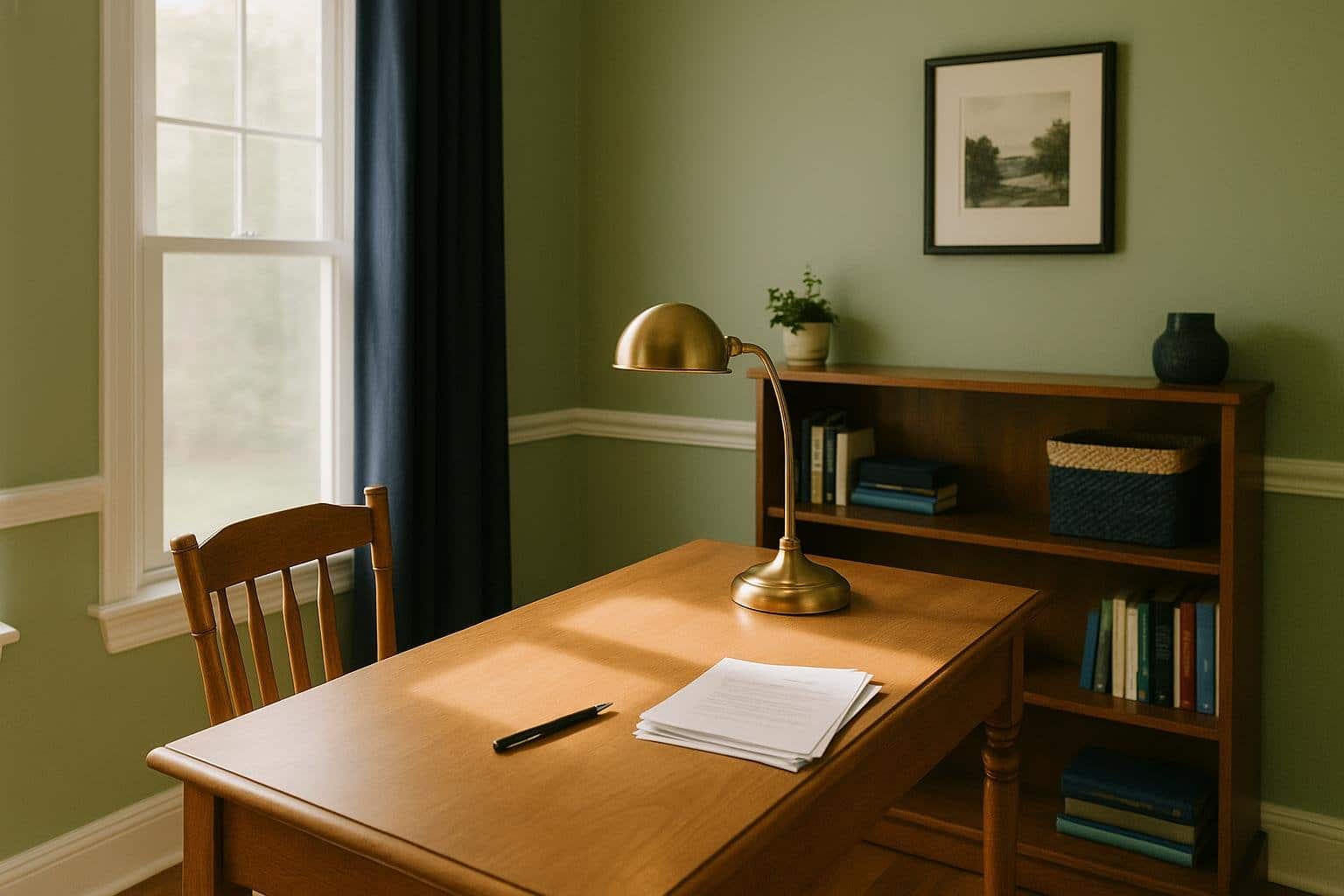
Clary Sage Home Office - 5 Ideas for a Calm and Productive Space
Trying to make a home office that feels comfy but still helps you get things done? It’s not always easy. The colors you pick really matter for your mood and focus, believe it or not. Clary Sage offers a cool balance of calm and function, so it’s a smart choice if you want a workspace

Clary Sage Front Door - 5 Ideas To Refresh Your Home’s Curb Appeal
Choosing the right front door color can feel overwhelming, but it doesn’t have to be. A shade like Clary Sage offers a calm, welcoming look that works with many home styles without feeling too bold or too plain. You can use Clary Sage to create a front door that feels inviting, timeless, and easy to

Clary Sage Bedroom - 5 Ideas For A Calm And Cozy Retreat
Bedrooms should feel calm and comfortable. Choosing the right paint color makes a big difference. Clary Sage brings a soft, natural tone that helps you unwind at the end of a long day. This shade balances warmth and freshness, so your bedroom feels inviting but never too much. Clary Sage works with so many styles,

Clary Sage Bathroom - 5 Ideas For A Relaxing Refresh
Picking the right paint color for your bathroom totally shapes the mood. Clary Sage is this soft, calming green that feels both fresh and classic. It’s versatile enough to bring comfort and style without taking over the whole room. With the right combos, Clary Sage fits all sorts of looks—from spa-inspired to rustic or coastal.
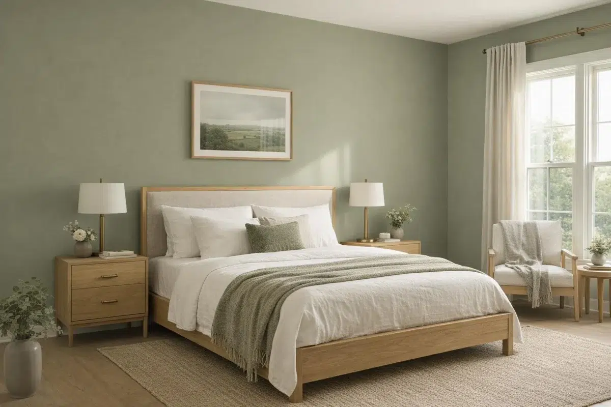
Clary Sage by Sherwin Williams, SW 6178: A Beautiful Green-Gray Paint for Your Home
Looking to transform your space with a versatile and calming color? Clary Sage SW 6178 is a soft green-gray paint shade that creates a peaceful atmosphere while maintaining enough warmth to keep spaces inviting. This nature-inspired hue works beautifully in any room of your home, from living areas to bedrooms. You'll love how it pairs
Coordinating Colors


At LRV 75 vs 41, Sagey is decisively the brighter choice.


Dover White reflects far more light (LRV 83 vs 41), opening up a space where Clary Sage encloses it.

Tumblin' Tumbleweed reads slightly lighter (LRV 51 vs 41), a gap that shows most in low-lit rooms.
Trim Color
At LRV 75 vs 41, Sagey is decisively the brighter choice.
Similar Colors


Their light reflectance is nearly identical (LRV 41 vs 41), so neither reads brighter in a room.


With LRVs of 43 and 41, the two reflect almost the same amount of light.


Their light reflectance is nearly identical (LRV 41 vs 38), so neither reads brighter in a room.


With LRVs of 42 and 41, the two reflect almost the same amount of light.


With LRVs of 41 and 41, the two reflect almost the same amount of light.


Their light reflectance is nearly identical (LRV 41 vs 41), so neither reads brighter in a room.


With LRVs of 42 and 41, the two reflect almost the same amount of light.


Clary Sage reads slightly lighter (LRV 41 vs 37), a gap that shows most in low-lit rooms.


Softened Green reads slightly lighter (LRV 49 vs 41), a gap that shows most in low-lit rooms.


Their light reflectance is nearly identical (LRV 41 vs 41), so neither reads brighter in a room.
Complementary Colors


At LRV 41 vs 20, Clary Sage is decisively the brighter choice.

At LRV 41 vs 12, Clary Sage is decisively the brighter choice.

Clary Sage reflects far more light (LRV 41 vs 4), opening up a space where Mountain Fig encloses it.


Elation reflects far more light (LRV 72 vs 41), opening up a space where Clary Sage encloses it.


At LRV 76 vs 41, Lady's Slipper is decisively the brighter choice.


Clary Sage reflects far more light (LRV 41 vs 16), opening up a space where Forget-Me-Not encloses it.

At LRV 41 vs 5, Clary Sage is decisively the brighter choice.
Lighter Colors


Front Porch reflects far more light (LRV 60 vs 41), opening up a space where Clary Sage encloses it.


Sweater Weather reflects far more light (LRV 60 vs 41), opening up a space where Clary Sage encloses it.


At LRV 57 vs 41, Antimony is decisively the brighter choice.


Sensible Hue reads slightly lighter (LRV 46 vs 41), a gap that shows most in low-lit rooms.
Their light reflectance is nearly identical (LRV 41 vs 41), so neither reads brighter in a room.
Darker Colors


Clary Sage reflects far more light (LRV 41 vs 21), opening up a space where Artichoke encloses it.


Clary Sage reads slightly lighter (LRV 41 vs 31), a gap that shows most in low-lit rooms.
Their light reflectance is nearly identical (LRV 41 vs 38), so neither reads brighter in a room.
With LRVs of 42 and 41, the two reflect almost the same amount of light.


Clary Sage reflects far more light (LRV 41 vs 19), opening up a space where Crooked River encloses it.