
Chocolate Powder
At first glance, Chocolate Powder belongs to the red family; in a room, light and context can make it far more elusive. A muted saturation softens the hue, giving it a quieter quality that can sit comfortably among layered neutrals. Because screens flatten both light and texture, sample the paint beside the finishes that will ultimately surround it.
Hex
#A58C7BLRV
28.12
Chocolate Powder's Color Strip
Chocolate Powder is the fourth shade on this 7-color strip, sitting between Sand Trap and Mocha. The strip spans from Reticence at the lightest end to French Roast at the deepest. Color strip 196 groups these shades together so you can see how each reads next to its neighbors.


Chocolate Powder in Rooms
Follow Chocolate Powder from one space to another and watch how light, scale and surrounding materials reshape its character. 10 generated visualizations explore how the color might shape a finished room.
1 Bedroom Photo
The beige, greige hue classifications suggest the subtle directions the color may take as the room changes. In this setting, let gentle morning light and low evening lamps and bed linen, timber, wool and upholstered textures guide the final sample decision.
A scandinavian bedroom painted in Chocolate Powder
@mybudgetrecipes
1 Bathroom Photo
The contrast between bright mornings and quieter evening light can draw different notes from Chocolate Powder (9082). The beige, greige hue classifications suggest the subtle directions the color may take as the room changes.

Chocolate Powder — minimalist bathroom
@mybudgetrecipes
1 Home Office Photo
Across 1 home office image, Chocolate Powder (9082) meets daylight beside desk lamps and screen glow. Its warm classification can feel inviting beside tactile, natural materials.

Sherwin-Williams Chocolate Powder in a art deco home office
@mybudgetrecipes
1 Dining Room Photo
The 1 dining room image turn a red swatch into something more spatial and expressive. Its muted saturation softens the color’s edges, making texture and shadow part of the composition.

Chocolate Powder paint in a boho dining room
@mybudgetrecipes
1 Front Door Photo
The 1 front door image turn a red swatch into something more spatial and expressive. Its muted saturation softens the color’s edges, making texture and shadow part of the composition.

classy front door featuring Chocolate Powder by Sherwin-Williams
@mybudgetrecipes
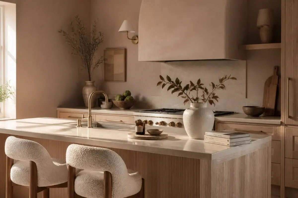
1 Kitchen Photo
The beige, greige hue classifications suggest the subtle directions the color may take as the room changes. In this setting, let daylight, task lighting and evening pendants and stone, timber, tile and metal finishes guide the final sample decision.

Chocolate Powder — organic modern kitchen
@mybudgetrecipes
1 House Photo
Against roofing, masonry, timber, planting and trim, Chocolate Powder (9082) may feel quieter, sharper or more atmospheric than the digital swatch alone. An LRV of 28.1 lets the color hold its identity across both brighter and more shaded parts of the room.

Chocolate Powder color — traditional house inspiration
@mybudgetrecipes
1 Mudroom Photo
1 mudroom image place Chocolate Powder (9082) in a practical threshold where the outdoors enters the home. An LRV of 28.1 lets the color hold its identity across both brighter and more shaded parts of the room.

Chocolate Powder paint in a coastal mudroom
@mybudgetrecipes
1 Patio Photo
1 patio image trace Chocolate Powder (9082) through the broad shift from bright afternoon to dusk. The beige, greige hue classifications suggest the subtle directions the color may take as the room changes.

warm patio featuring Chocolate Powder by Sherwin-Williams
@mybudgetrecipes
1 Living Room Photo
Chocolate Powder (9082) can change noticeably under the movement from window light to lamplight. Sample it beside the finishes that will remain in the room.

A hollywood regency living room painted in Chocolate Powder
@mybudgetrecipes
Expert Perspectives
Articles and features from across our network of home and design sites.
Coordinating Colors


At LRV 73 vs 28, Nice White is decisively the brighter choice.


Touch of Sand reflects far more light (LRV 58 vs 28), opening up a space where Chocolate Powder encloses it.
Trim Color
At LRV 73 vs 28, Nice White is decisively the brighter choice.
Similar Colors


Their light reflectance is nearly identical (LRV 28 vs 28), so neither reads brighter in a room.

With LRVs of 29 and 28, the two reflect almost the same amount of light.

With LRVs of 29 and 28, the two reflect almost the same amount of light.


With LRVs of 28 and 28, the two reflect almost the same amount of light.


Chocolate Powder reads slightly lighter (LRV 28 vs 25), a gap that shows most in low-lit rooms.


Their light reflectance is nearly identical (LRV 30 vs 28), so neither reads brighter in a room.


With LRVs of 28 and 27, the two reflect almost the same amount of light.


Their light reflectance is nearly identical (LRV 28 vs 27), so neither reads brighter in a room.


With LRVs of 28 and 25, the two reflect almost the same amount of light.


Dormer Brown reads slightly lighter (LRV 32 vs 28), a gap that shows most in low-lit rooms.
Complementary Colors


At LRV 77 vs 28, Glass Bead is decisively the brighter choice.


With LRVs of 29 and 28, the two reflect almost the same amount of light.


Chocolate Powder reflects far more light (LRV 28 vs 6), opening up a space where Mount Etna encloses it.


Debonair reads slightly lighter (LRV 34 vs 28), a gap that shows most in low-lit rooms.


Chocolate Powder reflects far more light (LRV 28 vs 7), opening up a space where Tarragon encloses it.


Chocolate Powder reflects far more light (LRV 28 vs 11), opening up a space where Rain Cloud encloses it.


Chocolate Powder reflects far more light (LRV 28 vs 7), opening up a space where Sea Mariner encloses it.
Lighter Colors


Sticks & Stones reads slightly lighter (LRV 31 vs 28), a gap that shows most in low-lit rooms.


Mega Greige reads slightly lighter (LRV 37 vs 28), a gap that shows most in low-lit rooms.


Alpaca reflects far more light (LRV 57 vs 28), opening up a space where Chocolate Powder encloses it.


At LRV 42 vs 28, Perfect Greige is decisively the brighter choice.
Darker Colors


Chocolate Powder reflects far more light (LRV 28 vs 14), opening up a space where Cobble Brown encloses it.

A 10-point LRV gap (28 vs 19) makes Chocolate Powder the marginally brighter of the two.
Chocolate Powder reads slightly lighter (LRV 28 vs 25), a gap that shows most in low-lit rooms.

At LRV 28 vs 16, Chocolate Powder is decisively the brighter choice.

A 9-point LRV gap (28 vs 19) makes Chocolate Powder the marginally brighter of the two.
Color Codes
Manufacturer description
This muted, warm red carries deep chocolate undertones that evoke the richness of cocoa and create an intimate, grounding atmosphere perfect for dining rooms or dens. Its medium depth and restrained saturation bring sophistication without drama, pairing beautifully with warm woods and cream accents for a refined, enveloping space.