
Bridgeport
Bridgeport is a versatile paint color from Sherwin-Williams. Our real-world data shows it is a primary choice when homeowners need to add character and warmth to any space. Below, you'll find 10 examples of this shade in actual homes along with suggested color relationships.
Hex
#005553
LRV
NaN
Bridgeport in Real Rooms
Bridgeport has a low LRV of NaN — it absorbs light and reads as a genuinely dark, enveloping color. It's neutral in temperature, making it adaptable across different lighting conditions and room orientations.
1 Bedroom Photo
In the context of a primary suite, Bridgeport suggests a boutique-hotel level of refinement. It creates a seamless flow between the sleeping area and the dressing room, providing a steadying influence that makes the morning routine feel more organized and serene.
A organic modern bedroom painted in Bridgeport
@mybudgetrecipes
1 Front Door Photo
In a world of boring front doors, Bridgeport is a breath of fresh air. It's a sophisticated choice that works with almost any siding color, providing a much-needed focal point that guides guests naturally toward the entrance.

bold front door featuring Bridgeport by Sherwin-Williams
@mybudgetrecipes
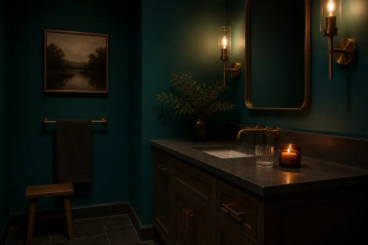
1 Bathroom Photo
The interaction between Bridgeport and steam or humidity creates a beautiful, diffused atmosphere in a bathroom. It's a color that feels "alive," shifting slightly in character as the environment changes during a hot shower or a long soak.

Bridgeport — moody bathroom
@mybudgetrecipes
1 Dining Room Photo
Bridgeport encourages conversation. Its calm, grounded presence creates a sense of safety and comfort that allows guests to relax and stay at the table longer, which is the ultimate goal of any well-designed dining area.

Bridgeport paint in a art deco dining room
@mybudgetrecipes
1 Home Office Photo
The transition from "home life" to "work life" can be signaled by the color of the room. Entering a space painted in Bridgeport provides a mental shift, telling your brain that it's time to settle in and be productive.

Sherwin-Williams Bridgeport in a warm home office
@mybudgetrecipes
1 Living Room Photo
There is a specific "glow" that Bridgeport takes on during the golden hour in a living room. As the sun sets, the pigments react with the low-angled light to create a hazy, ethereal atmosphere that feels incredibly high-end. It's a color that rewards those who use the room during the transition of the day.

A organic modern living room painted in Bridgeport
@mybudgetrecipes
1 Mudroom Photo
In a laundry/mudroom combo, Bridgeport adds a touch of luxury to a space that is usually purely functional. It makes the chores feel a little less like work by surrounding you with a color that is sophisticated and calming.

Bridgeport paint in a small mudroom
@mybudgetrecipes
1 Patio Photo
Outside, Bridgeport takes on a completely different life. Whether on deck boards, patio furniture, a fence, or a garden wall, it weathers beautifully and holds its character in open light. It is a natural companion to stone, weathered wood, and greenery.

boho patio featuring Bridgeport by Sherwin-Williams
@mybudgetrecipes
1 House Photo
Exterior paint earns its keep over years, not months — it needs to handle bleaching summers, wet winters, and the slow shifts of a neighborhood's context. Bridgeport has the depth and pigment quality to age gracefully through all of it.

Bridgeport color — coastal house inspiration
@mybudgetrecipes
1 Kitchen Photo
The challenge with kitchen color is longevity: it needs to look right at 7am under bright task lights and at dinner with the pendants dimmed low. Bridgeport manages to bridge all three lighting scenarios with ease, which is a rarer quality in a paint pigment than it sounds.

Bridgeport — scandinavian kitchen
@mybudgetrecipes
Expert Perspectives
In-depth articles and real-home features from across our network of home and design sites.
Coordinating Colors


Intellectual Gray reflects far more light (LRV NaN vs NaN), opening up a space where Bridgeport encloses it.
Similar Colors


At LRV NaN vs NaN, Honorable Blue is decisively the brighter choice.


Indigo reflects far more light (LRV NaN vs NaN), opening up a space where Bridgeport encloses it.


Bridgeport reflects far more light (LRV NaN vs NaN), opening up a space where Blueblood encloses it.


At LRV NaN vs NaN, Frank Blue is decisively the brighter choice.


At LRV NaN vs NaN, Commodore is decisively the brighter choice.


At LRV NaN vs NaN, Dignity Blue is decisively the brighter choice.


At LRV NaN vs NaN, Dress Blues is decisively the brighter choice.


Salty Dog reflects far more light (LRV NaN vs NaN), opening up a space where Bridgeport encloses it.

Morning Glory reflects far more light (LRV NaN vs NaN), opening up a space where Bridgeport encloses it.
Complementary Colors


Emberglow reflects far more light (LRV NaN vs NaN), opening up a space where Bridgeport encloses it.


Copper Harbor reflects far more light (LRV NaN vs NaN), opening up a space where Bridgeport encloses it.


At LRV NaN vs NaN, Caen Stone is decisively the brighter choice.


At LRV NaN vs NaN, Vanillin is decisively the brighter choice.


At LRV NaN vs NaN, Morning Sun is decisively the brighter choice.


Creme reflects far more light (LRV NaN vs NaN), opening up a space where Bridgeport encloses it.


At LRV NaN vs NaN, Paperwhite is decisively the brighter choice.
Lighter Colors


At LRV NaN vs NaN, Bridgeport is decisively the brighter choice.


At LRV NaN vs NaN, Hyper Blue is decisively the brighter choice.
Bridgeport reflects far more light (LRV NaN vs NaN), opening up a space where Blueblood encloses it.