
Briny
At first glance, Briny belongs to the blue family; in a room, light and context can make it far more elusive. Its brighter saturation keeps the hue present and expressive, even when the overall color is pale. Its related shades below reveal where the color harmonizes—and where contrast brings it fully to life.
Hex
#08808ELRV
17.49
Briny's Color Strip
Briny is the sixth shade on this 7-color strip, sitting between Freshwater and Blue Nile. The strip spans from Bathe Blue at the lightest end to Blue Nile at the deepest. Strip 165 lines up the full value range so you can see exactly where this color lands among its closest relatives.


Briny in Rooms
Follow Briny from one space to another and watch how light, scale and surrounding materials reshape its character. 10 generated visualizations explore how the color might shape a finished room.
1 Dining Room Photo
1 generated visualization explores how the color might shape the finished space. Together they show Briny (6775) as inspiration rather than a promise of an identical result.
Briny paint in a rustic modern dining room
@mybudgetrecipes
1 Front Door Photo
1 generated visualization explores how the color might shape the finished space. Together they show Briny (6775) as inspiration rather than a promise of an identical result.

classy front door featuring Briny by Sherwin-Williams
@mybudgetrecipes
1 Home Office Photo
Briny (6775) brings its blue character into a focused room balancing work, concentration and comfort. Its brighter saturation allows the hue to remain present rather than fading quietly into the background.

Sherwin-Williams Briny in a neutral home office
@mybudgetrecipes
1 Bedroom Photo
The 1 bedroom image turn a blue swatch into something more spatial and expressive. Its brighter saturation allows the hue to remain present rather than fading quietly into the background.

A boho bedroom painted in Briny
@mybudgetrecipes
1 Bathroom Photo
The blue hue classifications suggest the subtle directions the color may take as the room changes. In this setting, let window light, mirrors and focused task lighting and tile, stone, glass, timber and metal fixtures guide the final sample decision.

Briny — traditional bathroom
@mybudgetrecipes
1 Living Room Photo
Against upholstery, timber, art and metal accents, Briny (6775) may feel quieter, sharper or more atmospheric than the digital swatch alone. With an LRV of 17.5, it carries enough visual weight to make light, trim and texture feel especially deliberate.

Briny paint in a cozy living room
@mybudgetrecipes
1 House Photo
The blue hue classifications suggest the subtle directions the color may take as the room changes. In this setting, let full daylight, cloud cover and long evening shadows and roofing, masonry, timber, planting and trim guide the final sample decision.

Briny — scandinavian house
@mybudgetrecipes
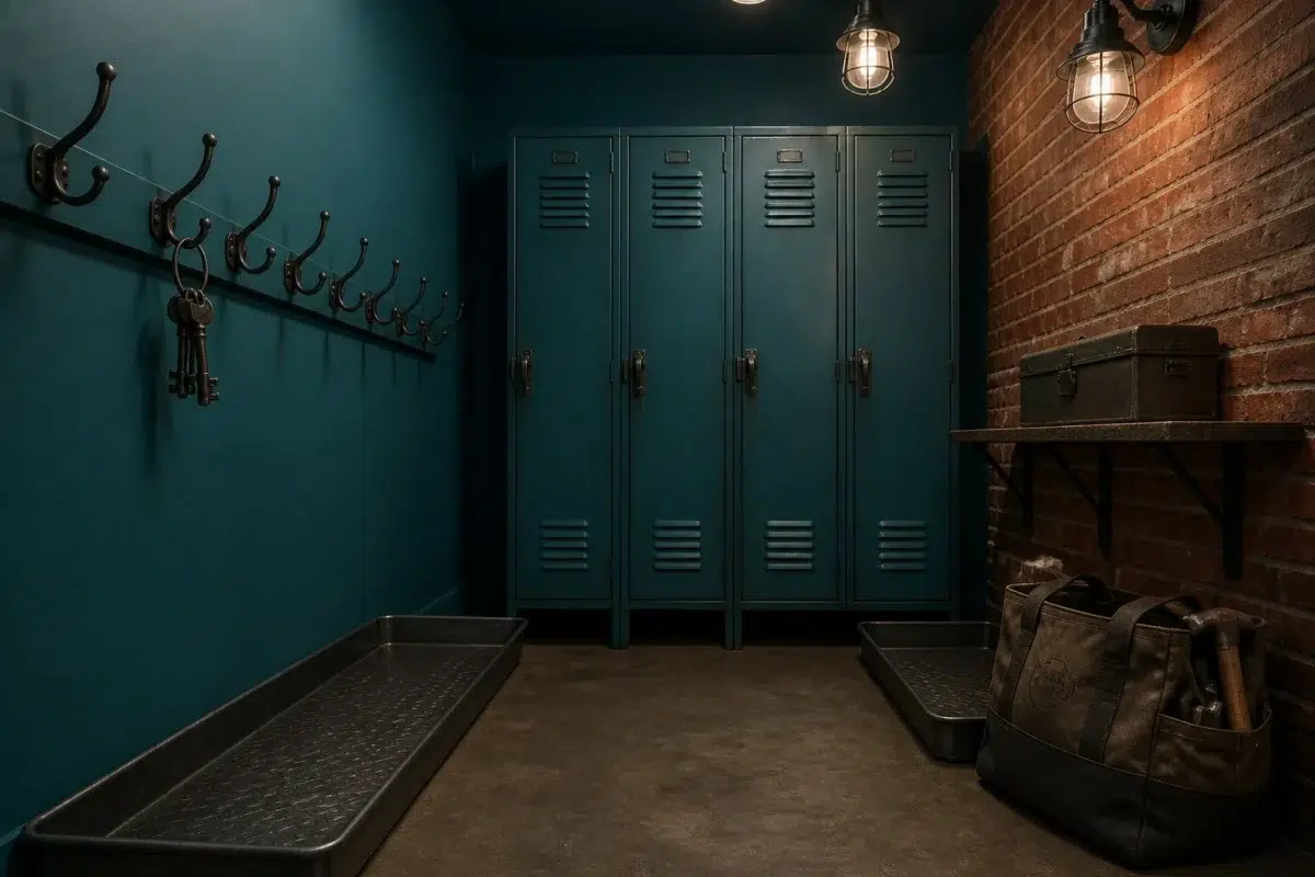
1 Mudroom Photo
Against flooring, storage, timber, baskets and hardware, Briny (6775) may feel quieter, sharper or more atmospheric than the digital swatch alone. With an LRV of 17.5, it carries enough visual weight to make light, trim and texture feel especially deliberate.

industrial mudroom featuring Briny by Sherwin-Williams
@mybudgetrecipes
1 Kitchen Photo
The 1 kitchen image turn a blue swatch into something more spatial and expressive. Its brighter saturation allows the hue to remain present rather than fading quietly into the background.

A contemporary kitchen painted in Briny
@mybudgetrecipes
1 Patio Photo
1 generated visualization explores how the color might shape the finished space. Together they show Briny (6775) as inspiration rather than a promise of an identical result.

Sherwin-Williams Briny in a boho patio
@mybudgetrecipes
Expert Perspectives
Articles and features from across our network of home and design sites.
Coordinating Colors


Blue Horizon reflects far more light (LRV 78 vs 17), opening up a space where Briny encloses it.


Svelte Sage reflects far more light (LRV 41 vs 17), opening up a space where Briny encloses it.
Trim Color
Blue Horizon reflects far more light (LRV 78 vs 17), opening up a space where Briny encloses it.
Similar Colors


With LRVs of 17 and 15, the two reflect almost the same amount of light.


With LRVs of 17 and 15, the two reflect almost the same amount of light.


With LRVs of 18 and 17, the two reflect almost the same amount of light.


A 4-point LRV gap (17 vs 14) makes Briny the marginally brighter of the two.

With LRVs of 19 and 17, the two reflect almost the same amount of light.


With LRVs of 17 and 16, the two reflect almost the same amount of light.


Their light reflectance is nearly identical (LRV 17 vs 17), so neither reads brighter in a room.
Complementary Colors


With LRVs of 17 and 15, the two reflect almost the same amount of light.


Quite Coral reads slightly lighter (LRV 22 vs 17), a gap that shows most in low-lit rooms.


Smoky Salmon reflects far more light (LRV 52 vs 17), opening up a space where Briny encloses it.


Their light reflectance is nearly identical (LRV 19 vs 17), so neither reads brighter in a room.
Color Codes
Manufacturer description
Plunge into the depths of a stormy sea with this dark, saturated blue that carries the crisp, mineral undertones of salt spray and weathered driftwood. Perfect for creating a moody, sophisticated retreat in a bedroom or study, it pairs beautifully with warm whites and natural wood accents.