
Cay
Cay is a Blue paint color from Sherwin-Williams, but its character reaches beyond a single label. Its blue classifications hint at the directions it may take as daylight, lamps and neighboring colors move around it. Treat the digital swatch as an opening note, then watch a physical sample from morning light through evening lamps.
Hex
#A6D0D6LRV
58.24
Cay's Color Strip
Cay is the second shade on this 7-color strip, sitting between Bathe Blue and Gentle Aquamarine. The strip spans from Bathe Blue at the lightest end to Blue Nile at the deepest. As part of strip 165, these colors are curated to work together — helpful when you're deciding how light or deep to go.


Cay in Rooms
Follow Cay from one space to another and watch how light, scale and surrounding materials reshape its character. 10 generated visualizations explore how the color might shape a finished room.
1 Home Office Photo
Cay (6772) can change noticeably under daylight beside desk lamps and screen glow. Sample it beside the finishes that will remain in the room.
Sherwin-Williams Cay in a industrial home office
@mybudgetrecipes
1 Front Door Photo
The threshold between the street and the interior can draw different notes from Cay (6772). The blue hue classifications suggest the subtle directions the color may take as the room changes.

cottagecore front door featuring Cay by Sherwin-Williams
@mybudgetrecipes
1 Dining Room Photo
1 generated visualization explores how the color might shape the finished space. Together they show Cay (6772) as inspiration rather than a promise of an identical result.

Cay paint in a moody dining room
@mybudgetrecipes
1 Living Room Photo
In a space shaped by conversation, quiet evenings and changing daylight, the most interesting quality of Cay (6772) may be the way it responds to upholstery, timber, art and metal accents. The blue hue classifications suggest the subtle directions the color may take as the room changes.

A mid century living room painted in Cay
@mybudgetrecipes
1 Mudroom Photo
1 generated visualization explores how the color might shape the finished space. Together they show Cay (6772) as inspiration rather than a promise of an identical result.

Cay paint in a cottagecore mudroom
@mybudgetrecipes
1 Patio Photo
Across 1 patio image, Cay (6772) meets direct sun, reflected daylight and deep exterior shade. Its cool classification can bring a composed, clean tension to warmer finishes.

rustic modern patio featuring Cay by Sherwin-Williams
@mybudgetrecipes
1 Bathroom Photo
1 bathroom image place Cay (6772) in a compact setting where tile, fixtures and color sit close together. An LRV of 58.2 lets the color hold its identity across both brighter and more shaded parts of the room.

Cay — moody bathroom
@mybudgetrecipes
1 Kitchen Photo
These 1 kitchen image show how Cay (6772) can sit beside stone, timber, tile and metal finishes. The blue hue classifications suggest the subtle directions the color may take as the room changes.

contemporary kitchen featuring Cay by Sherwin-Williams
@mybudgetrecipes
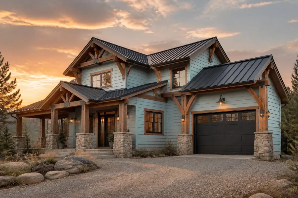
1 House Photo
These 1 house image show how Cay (6772) can sit beside roofing, masonry, timber, planting and trim. The blue hue classifications suggest the subtle directions the color may take as the room changes.

Cay paint in a rustic modern house
@mybudgetrecipes
1 Bedroom Photo
Cay (6772) moves through 1 bedroom image without becoming a fixed prescription for the room. Its cool classification can bring a composed, clean tension to warmer finishes.

A industrial bedroom painted in Cay
@mybudgetrecipes
Expert Perspectives
Articles and features from across our network of home and design sites.
Coordinating Colors


At LRV 78 vs 58, Blue Horizon is decisively the brighter choice.


Their light reflectance is nearly identical (LRV 59 vs 58), so neither reads brighter in a room.


At LRV 58 vs 29, Cay is decisively the brighter choice.
Trim Color
At LRV 78 vs 58, Blue Horizon is decisively the brighter choice.
Similar Colors

With LRVs of 60 and 58, the two reflect almost the same amount of light.


A 4-point LRV gap (58 vs 54) makes Cay the marginally brighter of the two.


A 8-point LRV gap (66 vs 58) makes Blue Bauble the marginally brighter of the two.


Quench Blue reads slightly lighter (LRV 69 vs 58), a gap that shows most in low-lit rooms.

A 10-point LRV gap (68 vs 58) makes Minor Blue the marginally brighter of the two.


Blue Click reads slightly lighter (LRV 63 vs 58), a gap that shows most in low-lit rooms.
Complementary Colors

At LRV 76 vs 58, Mauve Tinge is decisively the brighter choice.


Cay reads slightly lighter (LRV 58 vs 50), a gap that shows most in low-lit rooms.


At LRV 58 vs 35, Cay is decisively the brighter choice.


At LRV 81 vs 58, Heavenly White is decisively the brighter choice.

Original White reflects far more light (LRV 74 vs 58), opening up a space where Cay encloses it.


Cay reflects far more light (LRV 58 vs 5), opening up a space where Bitter Chocolate encloses it.
Lighter Colors


Bravo Blue reflects far more light (LRV 77 vs 58), opening up a space where Cay encloses it.

Tibetan Sky reflects far more light (LRV 80 vs 58), opening up a space where Cay encloses it.


Atmospheric reads slightly lighter (LRV 67 vs 58), a gap that shows most in low-lit rooms.


Darker Colors
A 4-point LRV gap (58 vs 54) makes Cay the marginally brighter of the two.


Color Codes
Manufacturer description
This bright, crystalline blue captures the shimmering clarity of tropical waters meeting white sand, infused with cool undertones that evoke seaside serenity. Perfect for bathrooms, bedrooms, or any space seeking a refreshing escape that feels both energizing and calming.