
Burlap
At first glance, Burlap belongs to the yellow family; in a room, light and context can make it far more elusive. An LRV of 31.5 places it through the middle of the scale, where color and depth can remain visible as the light changes. Its related shades below reveal where the color harmonizes—and where contrast brings it fully to life.
Hex
#AC9571LRV
31.46
Burlap's Color Strip
Burlap is the fifth shade on this 7-color strip, sitting between Tarnished Treasure and Artifact. The strip spans from Netsuke at the lightest end to Mossy Gold at the deepest. Color strip 208 groups these shades together so you can see how each reads next to its neighbors.


Burlap in Rooms
Follow Burlap from one space to another and watch how light, scale and surrounding materials reshape its character. 10 generated visualizations explore how the color might shape a finished room.
1 Front Door Photo
Viewed across 1 front door image in a small architectural moment with an outsized first impression, Burlap (6137) reveals how much color depends on scale, surface and shadow. An LRV of 31.5 lets the color hold its identity across both brighter and more shaded parts of the room.
mediterranean front door featuring Burlap by Sherwin-Williams
@mybudgetrecipes
1 Bedroom Photo
1 bedroom image place Burlap (6137) in a room designed around rest, softness and retreat. An LRV of 31.5 lets the color hold its identity across both brighter and more shaded parts of the room.

A minimalist bedroom painted in Burlap
@mybudgetrecipes
1 Dining Room Photo
1 dining room image place Burlap (6137) in a gathering space that can move from daylight to ceremony. An LRV of 31.5 lets the color hold its identity across both brighter and more shaded parts of the room.

Burlap paint in a contemporary dining room
@mybudgetrecipes
1 Bathroom Photo
1 bathroom image place Burlap (6137) in a compact setting where tile, fixtures and color sit close together. An LRV of 31.5 lets the color hold its identity across both brighter and more shaded parts of the room.

Burlap — industrial bathroom
@mybudgetrecipes
1 Home Office Photo
Burlap (6137) offers a starting mood rather than a finished formula: Its warm classification can feel inviting beside tactile, natural materials. Test it under daylight beside desk lamps and screen glow.

Sherwin-Williams Burlap in a moody home office
@mybudgetrecipes
1 Mudroom Photo
Burlap (6137) moves through 1 mudroom image without becoming a fixed prescription for the room. Its warm classification can feel inviting beside tactile, natural materials.

Burlap paint in a cottagecore mudroom
@mybudgetrecipes
1 House Photo
Burlap (6137) brings its yellow character into an exterior viewed across distance, weather and the changing sky. Its muted saturation softens the color’s edges, making texture and shadow part of the composition.

Burlap color — scandinavian house inspiration
@mybudgetrecipes
1 Kitchen Photo
Burlap (6137) can change noticeably under daylight, task lighting and evening pendants. Sample it beside the finishes that will remain in the room.

Burlap — bold kitchen
@mybudgetrecipes
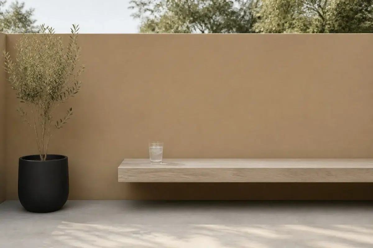
1 Patio Photo
Burlap (6137) moves through 1 patio image without becoming a fixed prescription for the room. Its warm classification can feel inviting beside tactile, natural materials.

minimalist patio featuring Burlap by Sherwin-Williams
@mybudgetrecipes
1 Living Room Photo
Against upholstery, timber, art and metal accents, Burlap (6137) may feel quieter, sharper or more atmospheric than the digital swatch alone. An LRV of 31.5 lets the color hold its identity across both brighter and more shaded parts of the room.

A elegant living room painted in Burlap
@mybudgetrecipes
Expert Perspectives
Articles and features from across our network of home and design sites.
Coordinating Colors


At LRV 71 vs 31, Eaglet Beige is decisively the brighter choice.


Burlap reflects far more light (LRV 31 vs 15), opening up a space where Homburg Gray encloses it.
Trim Color
Similar Colors


Their light reflectance is nearly identical (LRV 31 vs 31), so neither reads brighter in a room.

With LRVs of 31 and 31, the two reflect almost the same amount of light.


With LRVs of 33 and 31, the two reflect almost the same amount of light.

Their light reflectance is nearly identical (LRV 32 vs 31), so neither reads brighter in a room.

A 4-point LRV gap (35 vs 31) makes Sugared Almond the marginally brighter of the two.


A 4-point LRV gap (36 vs 31) makes Coriander Powder the marginally brighter of the two.


A 4-point LRV gap (36 vs 31) makes Dried Edamame the marginally brighter of the two.

A 5-point LRV gap (31 vs 27) makes Burlap the marginally brighter of the two.


A 4-point LRV gap (31 vs 28) makes Burlap the marginally brighter of the two.

Their light reflectance is nearly identical (LRV 34 vs 31), so neither reads brighter in a room.
Complementary Colors


Burlap reflects far more light (LRV 31 vs 11), opening up a space where Rain Cloud encloses it.


Burlap reflects far more light (LRV 31 vs 7), opening up a space where Sea Mariner encloses it.


Starry Night reflects far more light (LRV 69 vs 31), opening up a space where Burlap encloses it.


A 11-point LRV gap (31 vs 20) makes Burlap the marginally brighter of the two.


A 4-point LRV gap (31 vs 28) makes Burlap the marginally brighter of the two.


Burlap reflects far more light (LRV 31 vs 3), opening up a space where After the Storm encloses it.
Lighter Colors

Smoky Beige reads slightly lighter (LRV 40 vs 31), a gap that shows most in low-lit rooms.


Their light reflectance is nearly identical (LRV 31 vs 31), so neither reads brighter in a room.


Studio Taupe reads slightly lighter (LRV 34 vs 31), a gap that shows most in low-lit rooms.


At LRV 57 vs 31, Soft Suede is decisively the brighter choice.


Darker Colors

At LRV 31 vs 19, Burlap is decisively the brighter choice.
A 5-point LRV gap (31 vs 27) makes Burlap the marginally brighter of the two.


Their light reflectance is nearly identical (LRV 31 vs 31), so neither reads brighter in a room.
With LRVs of 31 and 31, the two reflect almost the same amount of light.
Color Codes
Manufacturer description
This warm, muted yellow-tan conjures images of natural linen and woven textures, grounding a space with earthy comfort and understated elegance. Perfect for creating a sophisticated, lived-in warmth in bedrooms, studies, or dining rooms, it pairs beautifully with creamy whites and soft wood tones.