
Cachet Cream
Cachet Cream begins as a orange color on paper, then shifts with every surface, shadow and neighboring material. Its warm classification can bring a gentle glow to the color, particularly beside natural wood and softer whites. The manufacturer's description below offers one reading; the room imagery leaves space for your own.
Hex
#F3D9BALRV
72.23
Cachet Cream's Color Strip
Cachet Cream is the first shade on this 7-color strip, the lightest in this coordinated family. As part of strip 128, these colors are curated to work together — helpful when you're deciding how light or deep to go.


Cachet Cream in Rooms
Follow Cachet Cream from one space to another and watch how light, scale and surrounding materials reshape its character. 10 generated visualizations explore how the color might shape a finished room.
1 Dining Room Photo
These 1 dining room image show how Cachet Cream (6365) can sit beside timber, table linen, glass and artwork. The beige hue classifications suggest the subtle directions the color may take as the room changes.
Cachet Cream paint in a moody dining room
@mybudgetrecipes
1 Home Office Photo
Cachet Cream (6365) can change noticeably under daylight beside desk lamps and screen glow. Sample it beside the finishes that will remain in the room.

Sherwin-Williams Cachet Cream in a contemporary home office
@mybudgetrecipes
1 Bathroom Photo
Viewed across 1 bathroom image in a compact setting where tile, fixtures and color sit close together, Cachet Cream (6365) reveals how much color depends on scale, surface and shadow. Its LRV of 72.2 gives it a light-reflective character, though shadows and neighboring finishes can still draw out surprising depth.

Cachet Cream — japandi bathroom
@mybudgetrecipes
1 Front Door Photo
In a small architectural moment with an outsized first impression, the most interesting quality of Cachet Cream (6365) may be the way it responds to hardware, glazing, masonry, timber and surrounding trim. The beige hue classifications suggest the subtle directions the color may take as the room changes.

cottagecore front door featuring Cachet Cream by Sherwin-Williams
@mybudgetrecipes
1 Bedroom Photo
1 bedroom image trace Cachet Cream (6365) through the slower pace of morning and night. Its place within Assistance and Living Well hints at the range of palettes it can inhabit.

A organic modern bedroom painted in Cachet Cream
@mybudgetrecipes
1 House Photo
1 generated visualization explores how the color might shape the finished space. Together they show Cachet Cream (6365) as inspiration rather than a promise of an identical result.

Cachet Cream color — scandinavian house inspiration
@mybudgetrecipes
1 Living Room Photo
Its place within Assistance and Living Well hints at the range of palettes it can inhabit. In this setting, let the movement from window light to lamplight and upholstery, timber, art and metal accents guide the final sample decision.

A industrial living room painted in Cachet Cream
@mybudgetrecipes
1 Mudroom Photo
1 generated visualization explores how the color might shape the finished space. Together they show Cachet Cream (6365) as inspiration rather than a promise of an identical result.

Cachet Cream paint in a earthy mudroom
@mybudgetrecipes
1 Patio Photo
The 1 patio image turn a orange swatch into something more spatial and expressive. Its midtone saturation keeps the color expressive without letting it dominate every surface around it.

rustic modern patio featuring Cachet Cream by Sherwin-Williams
@mybudgetrecipes
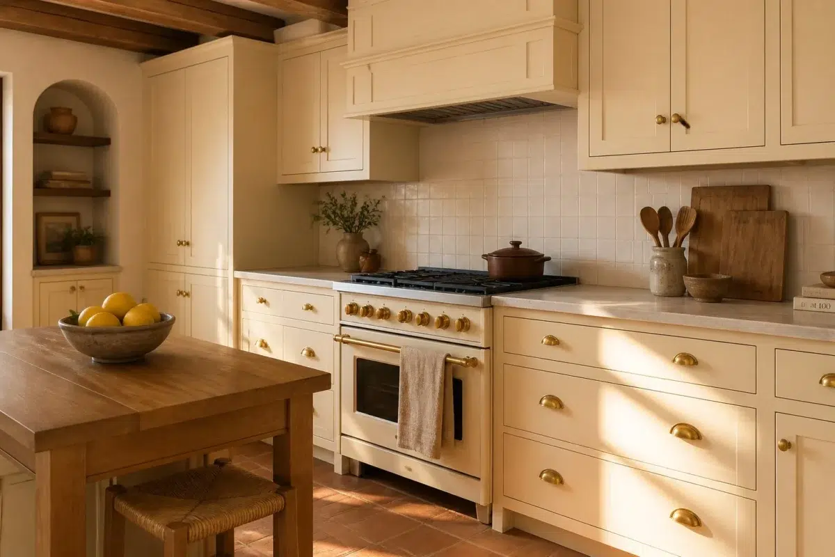
1 Kitchen Photo
Across 1 kitchen image, Cachet Cream (6365) meets daylight, task lighting and evening pendants. Its warm classification can feel inviting beside tactile, natural materials.

Cachet Cream — earthy kitchen
@mybudgetrecipes
Expert Perspectives
Articles and features from across our network of home and design sites.
Coordinating Colors


A 8-point LRV gap (80 vs 72) makes Eggwhite the marginally brighter of the two.


Cachet Cream reflects far more light (LRV 72 vs 26), opening up a space where Baked Clay encloses it.


Cachet Cream reflects far more light (LRV 72 vs 36), opening up a space where Dried Edamame encloses it.
Trim Color
A 8-point LRV gap (80 vs 72) makes Eggwhite the marginally brighter of the two.
Similar Colors

A 5-point LRV gap (72 vs 68) makes Cachet Cream the marginally brighter of the two.


Impressive Ivory reads slightly lighter (LRV 76 vs 72), a gap that shows most in low-lit rooms.


With LRVs of 72 and 70, the two reflect almost the same amount of light.


A 6-point LRV gap (72 vs 67) makes Cachet Cream the marginally brighter of the two.


Their light reflectance is nearly identical (LRV 72 vs 70), so neither reads brighter in a room.


Cachet Cream reads slightly lighter (LRV 72 vs 66), a gap that shows most in low-lit rooms.


Their light reflectance is nearly identical (LRV 75 vs 72), so neither reads brighter in a room.


Jersey Cream reads slightly lighter (LRV 75 vs 72), a gap that shows most in low-lit rooms.


With LRVs of 72 and 69, the two reflect almost the same amount of light.


Their light reflectance is nearly identical (LRV 72 vs 69), so neither reads brighter in a room.
Complementary Colors


Cachet Cream reflects far more light (LRV 72 vs 31), opening up a space where Bluebird Feather encloses it.


At LRV 72 vs 22, Cachet Cream is decisively the brighter choice.


Cachet Cream reads slightly lighter (LRV 72 vs 69), a gap that shows most in low-lit rooms.


At LRV 72 vs 23, Cachet Cream is decisively the brighter choice.


A 9-point LRV gap (72 vs 63) makes Cachet Cream the marginally brighter of the two.


Cachet Cream reflects far more light (LRV 72 vs 56), opening up a space where Blissful Blue encloses it.


At LRV 72 vs 12, Cachet Cream is decisively the brighter choice.
Lighter Colors


Gardenia reads slightly lighter (LRV 78 vs 72), a gap that shows most in low-lit rooms.


A 4-point LRV gap (76 vs 72) makes Classic Ivory the marginally brighter of the two.


Paper Lantern reads slightly lighter (LRV 76 vs 72), a gap that shows most in low-lit rooms.

At LRV 86 vs 72, Venetian Lace is decisively the brighter choice.


Cherish Cream reads slightly lighter (LRV 78 vs 72), a gap that shows most in low-lit rooms.
Darker Colors

At LRV 72 vs 48, Cachet Cream is decisively the brighter choice.


Cachet Cream reflects far more light (LRV 72 vs 53), opening up a space where Polvo de Oro encloses it.


At LRV 72 vs 57, Cachet Cream is decisively the brighter choice.


At LRV 72 vs 56, Cachet Cream is decisively the brighter choice.


A 11-point LRV gap (72 vs 61) makes Cachet Cream the marginally brighter of the two.
Color Codes
Manufacturer description
Rooms coated in this light yellowish orange give off a gentle, warmish glow. Feels right at home in kitchens and bathrooms.