
Ambitious Amber
Ambitious Amber is a Orange paint color from Sherwin-Williams, but its character reaches beyond a single label. It appears in Energetic, placing it within several distinct decorating stories rather than a single fixed look. Move between the room imagery, color measurements and coordinating shades to build a fuller sense of how it might live in your space.
Hex
#F0CB97LRV
63.47
Ambitious Amber's Color Strip
Ambitious Amber is the second shade on this 7-color strip, sitting between Cachet Cream and Viva Gold. The strip spans from Cachet Cream at the lightest end to Copper Pot at the deepest. Browsing strip 128 alongside this color helps you gauge whether to go lighter, darker, or stay right here.


Ambitious Amber in Rooms
Follow Ambitious Amber from one space to another and watch how light, scale and surrounding materials reshape its character. 10 generated visualizations explore how the color might shape a finished room.
1 Front Door Photo
1 front door image trace Ambitious Amber (6366) through the threshold between the street and the interior. Its place within Energetic hints at the range of palettes it can inhabit.
cottagecore front door featuring Ambitious Amber by Sherwin-Williams
@mybudgetrecipes
1 Bedroom Photo
Ambitious Amber (6366) brings its orange character into a room designed around rest, softness and retreat. Its midtone saturation keeps the color expressive without letting it dominate every surface around it.

A art deco bedroom painted in Ambitious Amber
@mybudgetrecipes
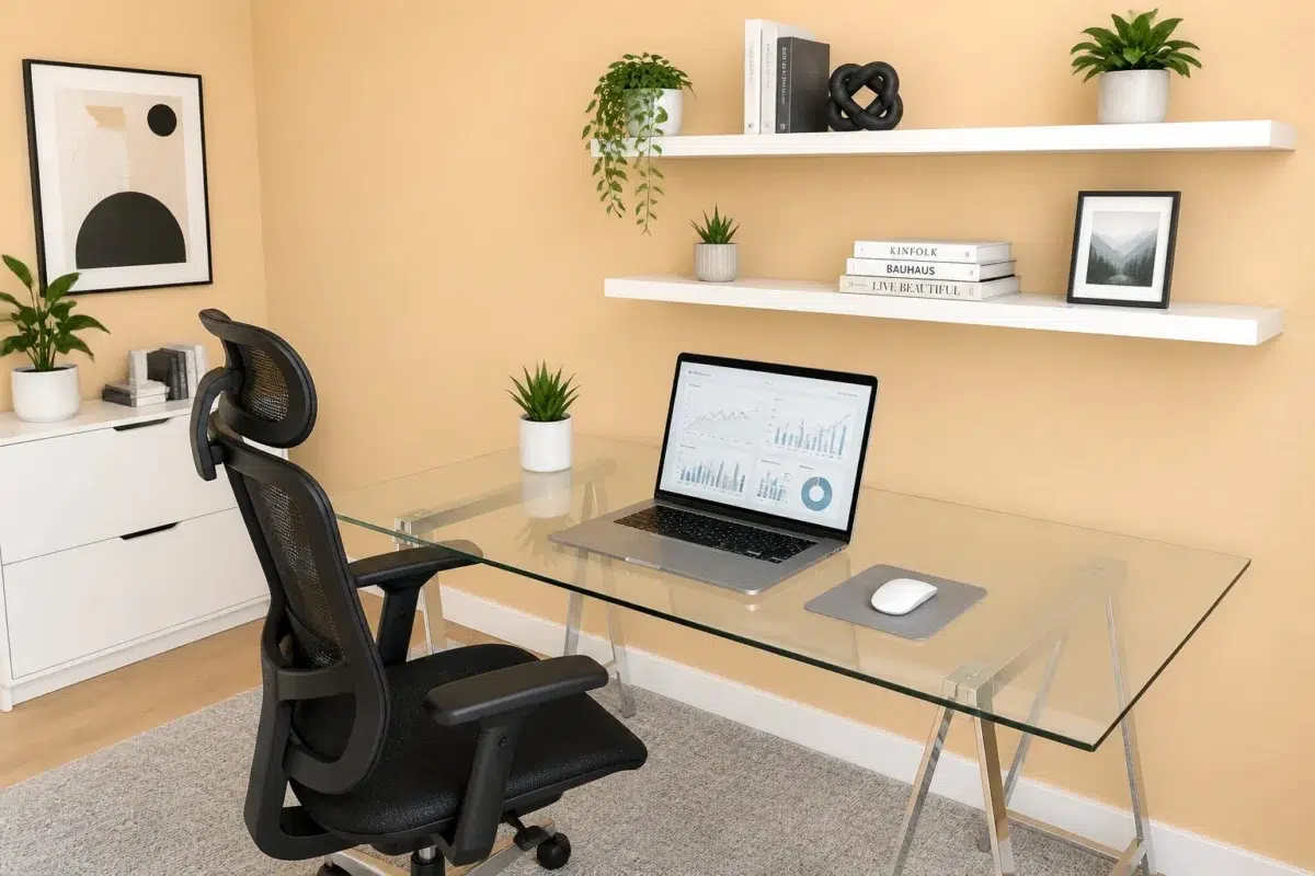
1 Home Office Photo
These 1 home office image show how Ambitious Amber (6366) can sit beside wood, paper, shelving and upholstered seating. The beige hue classifications suggest the subtle directions the color may take as the room changes.

Sherwin-Williams Ambitious Amber in a contemporary home office
@mybudgetrecipes
1 Bathroom Photo
1 bathroom image place Ambitious Amber (6366) in a compact setting where tile, fixtures and color sit close together. An LRV of 63.5 lets the color hold its identity across both brighter and more shaded parts of the room.

Ambitious Amber — wabi-sabi bathroom
@mybudgetrecipes
1 Dining Room Photo
The room’s change from everyday meals to evening occasions can draw different notes from Ambitious Amber (6366). The beige hue classifications suggest the subtle directions the color may take as the room changes.

Ambitious Amber paint in a minimalist dining room
@mybudgetrecipes
1 Living Room Photo
Viewed across 1 living room image in a space shaped by conversation, quiet evenings and changing daylight, Ambitious Amber (6366) reveals how much color depends on scale, surface and shadow. An LRV of 63.5 lets the color hold its identity across both brighter and more shaded parts of the room.

A industrial living room painted in Ambitious Amber
@mybudgetrecipes
1 Patio Photo
Ambitious Amber (6366) can change noticeably under direct sun, reflected daylight and deep exterior shade. Sample it beside the finishes that will remain in the room.

rustic modern patio featuring Ambitious Amber by Sherwin-Williams
@mybudgetrecipes
1 Mudroom Photo
1 generated visualization explores how the color might shape the finished space. Together they show Ambitious Amber (6366) as inspiration rather than a promise of an identical result.

Ambitious Amber paint in a traditional mudroom
@mybudgetrecipes
1 House Photo
1 generated visualization explores how the color might shape the finished space. Together they show Ambitious Amber (6366) as inspiration rather than a promise of an identical result.

Ambitious Amber color — scandinavian house inspiration
@mybudgetrecipes
1 Kitchen Photo
1 kitchen image place Ambitious Amber (6366) in a hardworking room where color meets movement and strong surfaces. An LRV of 63.5 lets the color hold its identity across both brighter and more shaded parts of the room.

Ambitious Amber — organic modern kitchen
@mybudgetrecipes
Expert Perspectives
Articles and features from across our network of home and design sites.
Coordinating Colors


At LRV 80 vs 63, Eggwhite is decisively the brighter choice.


At LRV 83 vs 63, Dover White is decisively the brighter choice.


Ambitious Amber reflects far more light (LRV 63 vs 29), opening up a space where Illusive Green encloses it.
Trim Color
At LRV 80 vs 63, Eggwhite is decisively the brighter choice.
Similar Colors


A 3-point LRV gap (67 vs 63) makes Honey Blush the marginally brighter of the two.


Their light reflectance is nearly identical (LRV 63 vs 61), so neither reads brighter in a room.


With LRVs of 65 and 63, the two reflect almost the same amount of light.

With LRVs of 65 and 63, the two reflect almost the same amount of light.


A 4-point LRV gap (63 vs 59) makes Ambitious Amber the marginally brighter of the two.

With LRVs of 66 and 63, the two reflect almost the same amount of light.


With LRVs of 63 and 63, the two reflect almost the same amount of light.


Ambitious Amber reads slightly lighter (LRV 63 vs 58), a gap that shows most in low-lit rooms.


With LRVs of 65 and 63, the two reflect almost the same amount of light.


With LRVs of 63 and 62, the two reflect almost the same amount of light.
Complementary Colors

At LRV 63 vs 30, Ambitious Amber is decisively the brighter choice.

At LRV 63 vs 8, Ambitious Amber is decisively the brighter choice.


A 9-point LRV gap (63 vs 55) makes Ambitious Amber the marginally brighter of the two.


Ambitious Amber reflects far more light (LRV 63 vs 8), opening up a space where Marea Baja encloses it.

Ambitious Amber reflects far more light (LRV 63 vs 16), opening up a space where Turkish Tile encloses it.


At LRV 63 vs 9, Ambitious Amber is decisively the brighter choice.


At LRV 63 vs 44, Ambitious Amber is decisively the brighter choice.
Lighter Colors


Impressive Ivory reflects far more light (LRV 76 vs 63), opening up a space where Ambitious Amber encloses it.


At LRV 81 vs 63, Conch Shell is decisively the brighter choice.


Cachet Cream reads slightly lighter (LRV 72 vs 63), a gap that shows most in low-lit rooms.
With LRVs of 65 and 63, the two reflect almost the same amount of light.

Melon Tint reflects far more light (LRV 82 vs 63), opening up a space where Ambitious Amber encloses it.
Darker Colors


Ambitious Amber reflects far more light (LRV 63 vs 40), opening up a space where Sunflower encloses it.


A 10-point LRV gap (63 vs 53) makes Ambitious Amber the marginally brighter of the two.


A 4-point LRV gap (63 vs 60) makes Ambitious Amber the marginally brighter of the two.


At LRV 63 vs 39, Ambitious Amber is decisively the brighter choice.

At LRV 63 vs 47, Ambitious Amber is decisively the brighter choice.
Color Codes
Manufacturer description
This luminous amber glows with a warm, honeyed optimism that fills a space with gentle encouragement and understated energy. Perfect for creative studios or accent walls, its golden undertones pair beautifully with cream trim and natural wood accents.