
Caramelized
Caramelized is a Yellow paint color from Sherwin-Williams, but its character reaches beyond a single label. Its warm classification can bring a gentle glow to the color, particularly beside natural wood and softer whites. Move between the room imagery, color measurements and coordinating shades to build a fuller sense of how it might live in your space.
Hex
#C29871LRV
35.35
Caramelized's Color Strip
Caramelized is the fourth shade on this 7-color strip, sitting between Totally Tan and Tatami Tan. The strip spans from Interactive Cream at the lightest end to Leather Bound at the deepest. Browsing strip 291 alongside this color helps you gauge whether to go lighter, darker, or stay right here.


Caramelized in Rooms
Follow Caramelized from one space to another and watch how light, scale and surrounding materials reshape its character. 10 generated visualizations explore how the color might shape a finished room.
1 Home Office Photo
Its place within 2019 Wanderer and Timeless Color Wall hints at the range of palettes it can inhabit. In this setting, let daylight beside desk lamps and screen glow and wood, paper, shelving and upholstered seating guide the final sample decision.
Sherwin-Williams Caramelized in a scandinavian home office
@mybudgetrecipes
1 Dining Room Photo
Against timber, table linen, glass and artwork, Caramelized (9186) may feel quieter, sharper or more atmospheric than the digital swatch alone. An LRV of 35.4 lets the color hold its identity across both brighter and more shaded parts of the room.

Caramelized paint in a minimalist dining room
@mybudgetrecipes
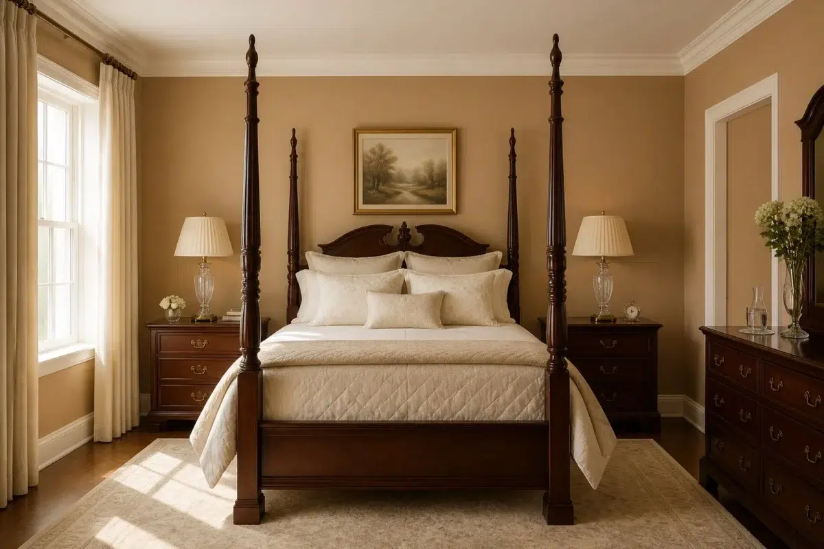
1 Bedroom Photo
Caramelized (9186) brings its yellow character into a room designed around rest, softness and retreat. Its midtone saturation keeps the color expressive without letting it dominate every surface around it.

A traditional bedroom painted in Caramelized
@mybudgetrecipes
1 Front Door Photo
Its place within 2019 Wanderer and Timeless Color Wall hints at the range of palettes it can inhabit. In this setting, let direct sun, porch shade and evening exterior light and hardware, glazing, masonry, timber and surrounding trim guide the final sample decision.

bold front door featuring Caramelized by Sherwin-Williams
@mybudgetrecipes
1 Bathroom Photo
Its place within 2019 Wanderer and Timeless Color Wall hints at the range of palettes it can inhabit. In this setting, let window light, mirrors and focused task lighting and tile, stone, glass, timber and metal fixtures guide the final sample decision.

Caramelized — coastal bathroom
@mybudgetrecipes
1 House Photo
1 house image trace Caramelized (9186) through the façade’s movement through sun, shade and season. Its place within 2019 Wanderer and Timeless Color Wall hints at the range of palettes it can inhabit.

Caramelized color — modern luxury house inspiration
@mybudgetrecipes
1 Patio Photo
Against stone, timber, metal, textiles and greenery, Caramelized (9186) may feel quieter, sharper or more atmospheric than the digital swatch alone. An LRV of 35.4 lets the color hold its identity across both brighter and more shaded parts of the room.

warm patio featuring Caramelized by Sherwin-Williams
@mybudgetrecipes
1 Mudroom Photo
Against flooring, storage, timber, baskets and hardware, Caramelized (9186) may feel quieter, sharper or more atmospheric than the digital swatch alone. An LRV of 35.4 lets the color hold its identity across both brighter and more shaded parts of the room.

Caramelized paint in a earthy mudroom
@mybudgetrecipes
1 Kitchen Photo
Caramelized (9186) moves through 1 kitchen image without becoming a fixed prescription for the room. Its warm classification can feel inviting beside tactile, natural materials.

Caramelized — organic modern kitchen
@mybudgetrecipes
1 Living Room Photo
1 living room image place Caramelized (9186) in a space shaped by conversation, quiet evenings and changing daylight. An LRV of 35.4 lets the color hold its identity across both brighter and more shaded parts of the room.

A organic modern living room painted in Caramelized
@mybudgetrecipes
Expert Perspectives
Articles and features from across our network of home and design sites.
Coordinating Colors


Biscuit reflects far more light (LRV 74 vs 35), opening up a space where Caramelized encloses it.


At LRV 83 vs 35, Dover White is decisively the brighter choice.


At LRV 54 vs 35, Blonde is decisively the brighter choice.
Trim Color
Biscuit reflects far more light (LRV 74 vs 35), opening up a space where Caramelized encloses it.
Similar Colors


With LRVs of 35 and 35, the two reflect almost the same amount of light.

Their light reflectance is nearly identical (LRV 36 vs 35), so neither reads brighter in a room.

With LRVs of 35 and 34, the two reflect almost the same amount of light.

Their light reflectance is nearly identical (LRV 37 vs 35), so neither reads brighter in a room.


Caramelized reads slightly lighter (LRV 35 vs 32), a gap that shows most in low-lit rooms.


A 5-point LRV gap (35 vs 30) makes Caramelized the marginally brighter of the two.

With LRVs of 35 and 34, the two reflect almost the same amount of light.


Their light reflectance is nearly identical (LRV 35 vs 34), so neither reads brighter in a room.

With LRVs of 35 and 33, the two reflect almost the same amount of light.


A 5-point LRV gap (35 vs 31) makes Caramelized the marginally brighter of the two.
Complementary Colors


At LRV 35 vs 6, Caramelized is decisively the brighter choice.


Their light reflectance is nearly identical (LRV 35 vs 34), so neither reads brighter in a room.


At LRV 35 vs 7, Caramelized is decisively the brighter choice.


At LRV 35 vs 11, Caramelized is decisively the brighter choice.


At LRV 35 vs 7, Caramelized is decisively the brighter choice.


At LRV 69 vs 35, Starry Night is decisively the brighter choice.


Caramelized reflects far more light (LRV 35 vs 20), opening up a space where Soulful Blue encloses it.
Lighter Colors
Their light reflectance is nearly identical (LRV 37 vs 35), so neither reads brighter in a room.


Kilim Beige reflects far more light (LRV 57 vs 35), opening up a space where Caramelized encloses it.


Classic Sand reflects far more light (LRV 53 vs 35), opening up a space where Caramelized encloses it.


Fresco Cream reflects far more light (LRV 57 vs 35), opening up a space where Caramelized encloses it.
Their light reflectance is nearly identical (LRV 36 vs 35), so neither reads brighter in a room.
Darker Colors

At LRV 35 vs 15, Caramelized is decisively the brighter choice.
A 5-point LRV gap (35 vs 30) makes Caramelized the marginally brighter of the two.

At LRV 35 vs 17, Caramelized is decisively the brighter choice.
Caramelized reads slightly lighter (LRV 35 vs 32), a gap that shows most in low-lit rooms.


At LRV NaN vs NaN, Carmel is decisively the brighter choice.
Color Codes
Manufacturer description
This warm, honeyed yellow brings the richness of caramelized sugar into your space, with subtle amber undertones that glow softly in both natural and artificial light. Perfect for kitchens, dining rooms, or accent walls, it creates an inviting warmth that feels both sophisticated and deeply comforting.
Attributed to Sherwin-Williams catalog data.