
Childlike
Childlike is a Red paint color from Sherwin-Williams, but its character reaches beyond a single label. Its pink classifications hint at the directions it may take as daylight, lamps and neighboring colors move around it. The manufacturer's description below offers one reading; the room imagery leaves space for your own.
Hex
#E8C0CFLRV
59.58
Childlike's Color Strip
Childlike is the second shade on this 7-color strip, sitting between Lighthearted Pink and Haute Pink. The strip spans from Lighthearted Pink at the lightest end to Framboise at the deepest. Browsing strip 103 alongside this color helps you gauge whether to go lighter, darker, or stay right here.

Childlike in Rooms
Follow Childlike from one space to another and watch how light, scale and surrounding materials reshape its character. 10 generated visualizations explore how the color might shape a finished room.
1 Bedroom Photo
1 bedroom image trace Childlike (6569) through the slower pace of morning and night. Its place within Living Well hints at the range of palettes it can inhabit.
A modern luxury bedroom painted in Childlike
@mybudgetrecipes
1 Front Door Photo
1 generated visualization explores how the color might shape the finished space. Together they show Childlike (6569) as inspiration rather than a promise of an identical result.

rustic modern front door featuring Childlike by Sherwin-Williams
@mybudgetrecipes
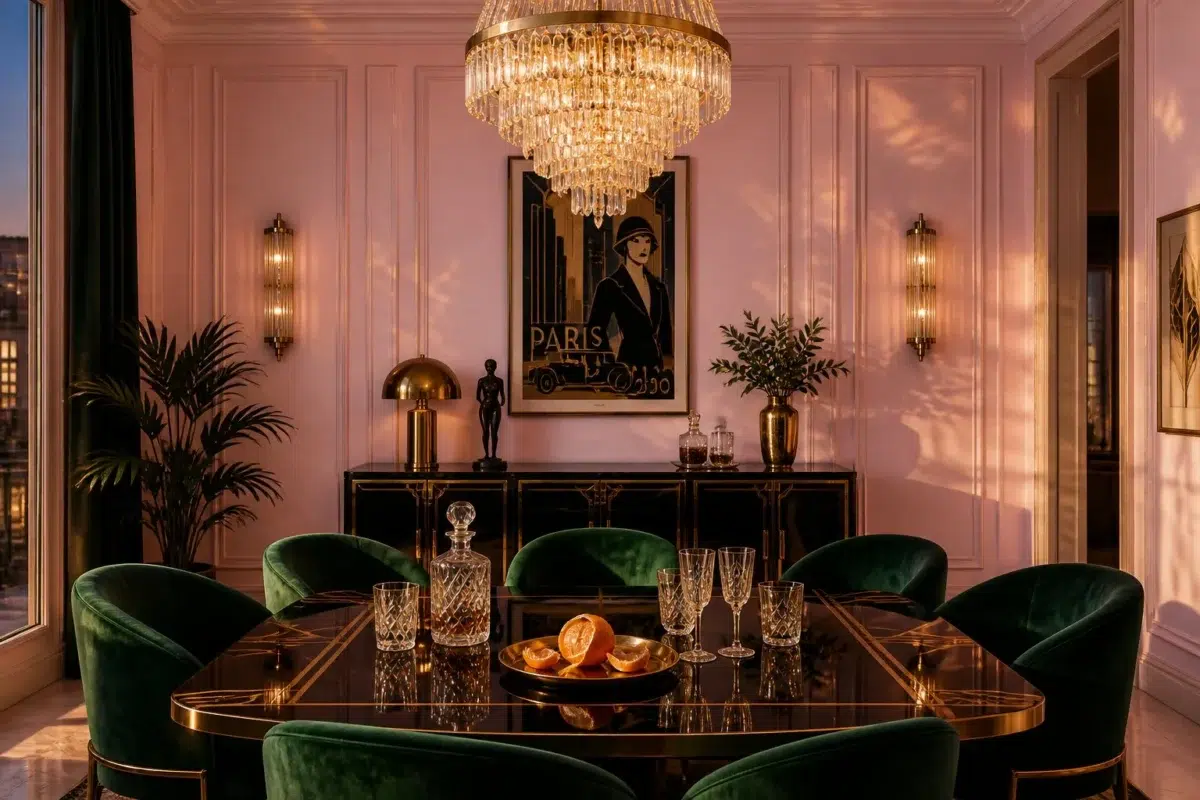
1 Dining Room Photo
Its place within Living Well hints at the range of palettes it can inhabit. In this setting, let natural light, candles and pendant lighting and timber, table linen, glass and artwork guide the final sample decision.

Childlike paint in a art deco dining room
@mybudgetrecipes
1 Home Office Photo
Its place within Living Well hints at the range of palettes it can inhabit. In this setting, let daylight beside desk lamps and screen glow and wood, paper, shelving and upholstered seating guide the final sample decision.

Sherwin-Williams Childlike in a neutral home office
@mybudgetrecipes
1 Bathroom Photo
1 bathroom image trace Childlike (6569) through the contrast between bright mornings and quieter evening light. Its place within Living Well hints at the range of palettes it can inhabit.

Childlike — industrial bathroom
@mybudgetrecipes
1 Kitchen Photo
1 kitchen image place Childlike (6569) in a hardworking room where color meets movement and strong surfaces. An LRV of 59.6 lets the color hold its identity across both brighter and more shaded parts of the room.

Childlike — bold kitchen
@mybudgetrecipes
1 Patio Photo
Across 1 patio image, Childlike (6569) meets direct sun, reflected daylight and deep exterior shade. Its cool classification can bring a composed, clean tension to warmer finishes.

boho patio featuring Childlike by Sherwin-Williams
@mybudgetrecipes
1 Living Room Photo
Childlike (6569) can change noticeably under the movement from window light to lamplight. Sample it beside the finishes that will remain in the room.

A contemporary living room painted in Childlike
@mybudgetrecipes
1 Mudroom Photo
1 generated visualization explores how the color might shape the finished space. Together they show Childlike (6569) as inspiration rather than a promise of an identical result.

Childlike paint in a small mudroom
@mybudgetrecipes
1 House Photo
Across 1 house image, Childlike (6569) meets full daylight, cloud cover and long evening shadows. Its cool classification can bring a composed, clean tension to warmer finishes.

Childlike color — maximalist house inspiration
@mybudgetrecipes
Expert Perspectives
Articles and features from across our network of home and design sites.
Coordinating Colors


Ibis White reflects far more light (LRV 84 vs 60), opening up a space where Childlike encloses it.


Greek Villa reflects far more light (LRV 84 vs 60), opening up a space where Childlike encloses it.


Childlike reflects far more light (LRV 60 vs 42), opening up a space where Perfect Greige encloses it.
Trim Color
Ibis White reflects far more light (LRV 84 vs 60), opening up a space where Childlike encloses it.
Similar Colors


With LRVs of 60 and 59, the two reflect almost the same amount of light.


Desire Pink reads slightly lighter (LRV 63 vs 60), a gap that shows most in low-lit rooms.


Their light reflectance is nearly identical (LRV 61 vs 60), so neither reads brighter in a room.

Panache Pink reads slightly lighter (LRV 64 vs 60), a gap that shows most in low-lit rooms.

A 4-point LRV gap (64 vs 60) makes Merry Pink the marginally brighter of the two.


Their light reflectance is nearly identical (LRV 60 vs 58), so neither reads brighter in a room.

Reverie Pink reads slightly lighter (LRV 66 vs 60), a gap that shows most in low-lit rooms.


Their light reflectance is nearly identical (LRV 60 vs 59), so neither reads brighter in a room.


A 6-point LRV gap (65 vs 60) makes Vanity Pink the marginally brighter of the two.
Complementary Colors


At LRV 73 vs 60, Mountain Air is decisively the brighter choice.


Childlike reflects far more light (LRV 60 vs 9), opening up a space where Billiard Green encloses it.


Childlike reflects far more light (LRV 60 vs 5), opening up a space where Roycroft Bottle Green encloses it.


Childlike reflects far more light (LRV 60 vs 30), opening up a space where Parisian Patina encloses it.


Lighter Colors
Panache Pink reads slightly lighter (LRV 64 vs 60), a gap that shows most in low-lit rooms.


Darker Colors


At LRV 60 vs 41, Childlike is decisively the brighter choice.


Color Codes
Manufacturer description
This bright, cheerful red carries cool undertones that feel playful and innocent rather than aggressive or bold. Perfect for nurturing spaces like children's rooms or creative studios, it radiates joy and imagination while remaining approachable and warm-hearted.