
Child's Play
There is more to Sherwin-Williams Child's Play (6845) than the swatch alone: its depth, undertones and setting all shape the final impression. Its cool classification gives it a crisper edge that may become clearer beside warm timber, cream or brass. Because screens flatten both light and texture, sample the paint beside the finishes that will ultimately surround it.
Hex
#E7BCD4LRV
57.51
Child's Play in Rooms
Follow Child's Play from one space to another and watch how light, scale and surrounding materials reshape its character. 10 generated visualizations explore how the color might shape a finished room.
1 Bedroom Photo
In a room designed around rest, softness and retreat, the most interesting quality of Child's Play (6845) may be the way it responds to bed linen, timber, wool and upholstered textures. The pink hue classifications suggest the subtle directions the color may take as the room changes.
A moody bedroom painted in Child's Play
@mybudgetrecipes
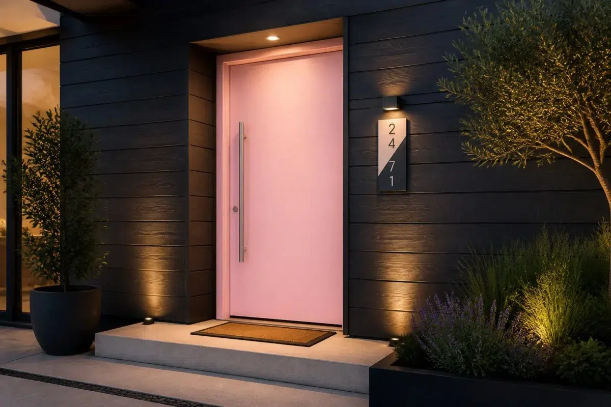
1 Front Door Photo
The threshold between the street and the interior can draw different notes from Child's Play (6845). The pink hue classifications suggest the subtle directions the color may take as the room changes.

stylish front door featuring Child's Play by Sherwin-Williams
@mybudgetrecipes
1 Dining Room Photo
Against timber, table linen, glass and artwork, Child's Play (6845) may feel quieter, sharper or more atmospheric than the digital swatch alone. An LRV of 57.5 lets the color hold its identity across both brighter and more shaded parts of the room.

Child's Play paint in a parisian dining room
@mybudgetrecipes
1 Home Office Photo
1 generated visualization explores how the color might shape the finished space. Together they show Child's Play (6845) as inspiration rather than a promise of an identical result.

Sherwin-Williams Child's Play in a unique home office
@mybudgetrecipes
1 Bathroom Photo
The 1 bathroom image turn a pink swatch into something more spatial and expressive. Its cool classification can bring a composed, clean tension to warmer finishes.

Child's Play — japandi bathroom
@mybudgetrecipes
1 Living Room Photo
1 living room image trace Child's Play (6845) through the room’s shift from daytime energy to evening calm. The pink hue classifications suggest the subtle directions the color may take as the room changes.

A industrial living room painted in Child's Play
@mybudgetrecipes
1 Patio Photo
The pink hue classifications suggest the subtle directions the color may take as the room changes. In this setting, let direct sun, reflected daylight and deep exterior shade and stone, timber, metal, textiles and greenery guide the final sample decision.

industrial patio featuring Child's Play by Sherwin-Williams
@mybudgetrecipes
1 Kitchen Photo
Across 1 kitchen image, Child's Play (6845) meets daylight, task lighting and evening pendants. Its cool classification can bring a composed, clean tension to warmer finishes.

Child's Play — vintage kitchen
@mybudgetrecipes
1 House Photo
1 house image place Child's Play (6845) in an exterior viewed across distance, weather and the changing sky. An LRV of 57.5 lets the color hold its identity across both brighter and more shaded parts of the room.

Child's Play color — traditional house inspiration
@mybudgetrecipes
1 Mudroom Photo
The pink hue classifications suggest the subtle directions the color may take as the room changes. In this setting, let doorway light and the softer illumination of an internal passage and flooring, storage, timber, baskets and hardware guide the final sample decision.

Child's Play paint in a rustic modern mudroom
@mybudgetrecipes
Expert Perspectives
Articles and features from across our network of home and design sites.
Coordinating Colors


Child's Play reflects far more light (LRV 58 vs 4), opening up a space where Black Bean encloses it.


At LRV 76 vs 58, Diminutive Pink is decisively the brighter choice.
Similar Colors


Their light reflectance is nearly identical (LRV 60 vs 58), so neither reads brighter in a room.


Their light reflectance is nearly identical (LRV 59 vs 58), so neither reads brighter in a room.

Merry Pink reads slightly lighter (LRV 64 vs 58), a gap that shows most in low-lit rooms.


A 5-point LRV gap (63 vs 58) makes Desire Pink the marginally brighter of the two.


With LRVs of 59 and 58, the two reflect almost the same amount of light.


Azalea Flower reads slightly lighter (LRV 61 vs 58), a gap that shows most in low-lit rooms.

A 7-point LRV gap (64 vs 58) makes Panache Pink the marginally brighter of the two.

A 9-point LRV gap (58 vs 49) makes Child's Play the marginally brighter of the two.

A 10-point LRV gap (58 vs 48) makes Child's Play the marginally brighter of the two.

Vanity Pink reads slightly lighter (LRV 65 vs 58), a gap that shows most in low-lit rooms.
Complementary Colors

With LRVs of 60 and 58, the two reflect almost the same amount of light.


Child's Play reflects far more light (LRV 58 vs 6), opening up a space where Dard Hunter Green encloses it.


At LRV 58 vs 9, Child's Play is decisively the brighter choice.


At LRV 58 vs 5, Child's Play is decisively the brighter choice.


At LRV 58 vs 35, Child's Play is decisively the brighter choice.


Topsail reflects far more light (LRV 75 vs 58), opening up a space where Child's Play encloses it.


At LRV 78 vs 58, Glimmer is decisively the brighter choice.
Lighter Colors
Merry Pink reads slightly lighter (LRV 64 vs 58), a gap that shows most in low-lit rooms.
Darker Colors


At LRV 58 vs 31, Child's Play is decisively the brighter choice.

At LRV 58 vs 43, Child's Play is decisively the brighter choice.
A 9-point LRV gap (58 vs 49) makes Child's Play the marginally brighter of the two.
Color Codes
Manufacturer description
This cheerful light blue carries cool undertones that evoke carefree afternoons and imagination running wild in sunlit spaces. Perfect for nurseries, playrooms, or any room where joy and creativity should take center stage.