
Citrus
Sherwin-Williams's Citrus is a beige shade whose quieter details emerge through comparison. An LRV of 61.0 places it through the middle of the scale, where color and depth can remain visible as the light changes. Its related shades below reveal where the color harmonizes—and where contrast brings it fully to life.
Hex
#FFC401LRV
60.98
Citrus in Rooms
Follow Citrus from one space to another and watch how light, scale and surrounding materials reshape its character. 10 generated visualizations explore how the color might shape a finished room.
1 Bedroom Photo
The 1 bedroom image turn a beige swatch into something more spatial and expressive. Its warm classification can feel inviting beside tactile, natural materials.
A moody bedroom painted in Citrus
@mybudgetrecipes
1 Dining Room Photo
The beige, yellow hue classifications suggest the subtle directions the color may take as the room changes. In this setting, let natural light, candles and pendant lighting and timber, table linen, glass and artwork guide the final sample decision.

Citrus paint in a minimalist dining room
@mybudgetrecipes
1 Home Office Photo
Citrus (6906) brings its beige character into a focused room balancing work, concentration and comfort. Its warm classification can feel inviting beside tactile, natural materials.

Sherwin-Williams Citrus in a neutral home office
@mybudgetrecipes
1 Bathroom Photo
Citrus (6906) brings its beige character into a compact setting where tile, fixtures and color sit close together. Its warm classification can feel inviting beside tactile, natural materials.

Citrus — vintage bathroom
@mybudgetrecipes
1 Front Door Photo
Citrus (6906) can change noticeably under direct sun, porch shade and evening exterior light. Sample it beside the finishes that will remain in the room.

cottagecore front door featuring Citrus by Sherwin-Williams
@mybudgetrecipes
1 Mudroom Photo
Citrus (6906) brings its beige character into a practical threshold where the outdoors enters the home. Its warm classification can feel inviting beside tactile, natural materials.

Citrus paint in a cottagecore mudroom
@mybudgetrecipes
1 Living Room Photo
In a space shaped by conversation, quiet evenings and changing daylight, the most interesting quality of Citrus (6906) may be the way it responds to upholstery, timber, art and metal accents. The beige, yellow hue classifications suggest the subtle directions the color may take as the room changes.

A organic modern living room painted in Citrus
@mybudgetrecipes
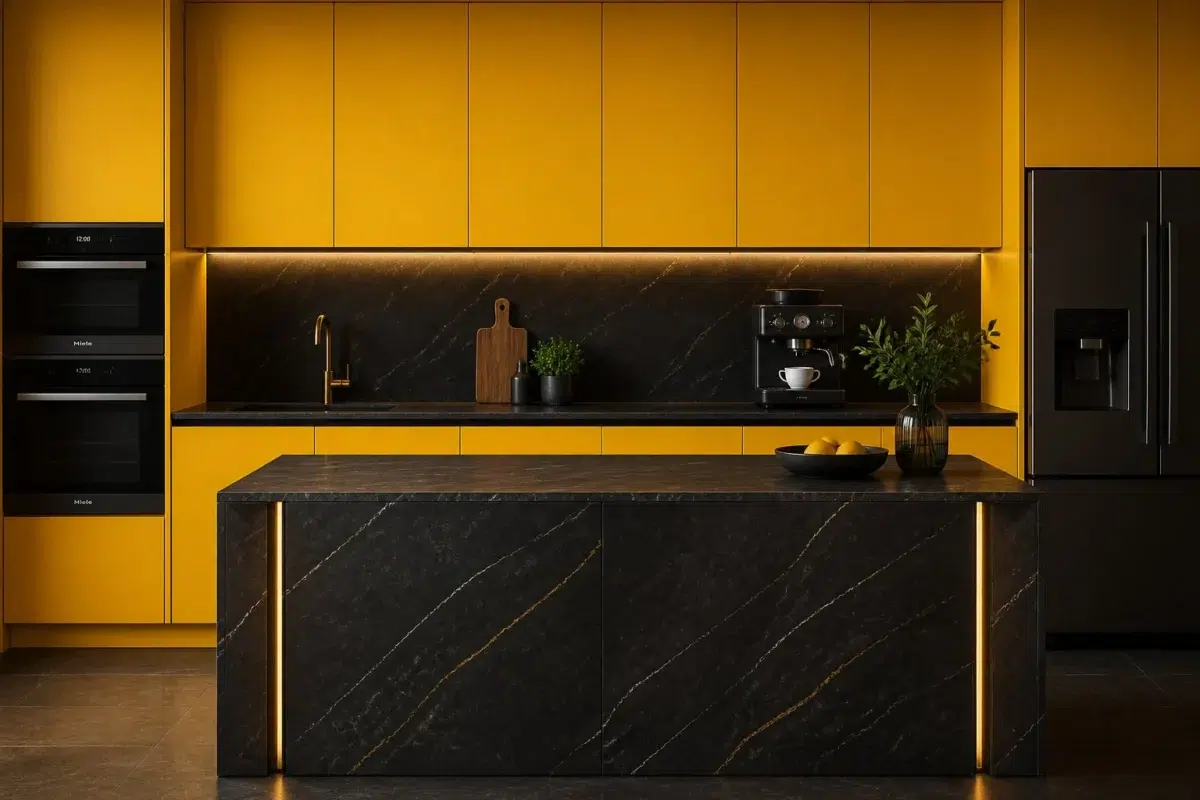
1 Kitchen Photo
Citrus (6906) offers a starting mood rather than a finished formula: Its warm classification can feel inviting beside tactile, natural materials. Test it under daylight, task lighting and evening pendants.

Citrus — bold kitchen
@mybudgetrecipes
1 House Photo
Across 1 house image, Citrus (6906) meets full daylight, cloud cover and long evening shadows. Its warm classification can feel inviting beside tactile, natural materials.

Citrus color — transitional house inspiration
@mybudgetrecipes
1 Patio Photo
These 1 patio image show how Citrus (6906) can sit beside stone, timber, metal, textiles and greenery. The beige, yellow hue classifications suggest the subtle directions the color may take as the room changes.

rustic modern patio featuring Citrus by Sherwin-Williams
@mybudgetrecipes
Expert Perspectives
Articles and features from across our network of home and design sites.
Coordinating Colors


Citrus reflects far more light (LRV 61 vs 38), opening up a space where Stone Lion encloses it.
Similar Colors


Their light reflectance is nearly identical (LRV 64 vs 61), so neither reads brighter in a room.


A 4-point LRV gap (65 vs 61) makes Decisive Yellow the marginally brighter of the two.


With LRVs of 61 and 60, the two reflect almost the same amount of light.


A 11-point LRV gap (61 vs 50) makes Citrus the marginally brighter of the two.

A 4-point LRV gap (65 vs 61) makes Sunny Side Up the marginally brighter of the two.

Complementary Colors


At LRV 61 vs 6, Citrus is decisively the brighter choice.


Citrus reflects far more light (LRV NaN vs NaN), opening up a space where Bridgeport encloses it.
Lighter Colors


A 11-point LRV gap (61 vs 50) makes Citrus the marginally brighter of the two.
A 4-point LRV gap (65 vs 61) makes Decisive Yellow the marginally brighter of the two.


A 11-point LRV gap (72 vs 61) makes Lemon Twist the marginally brighter of the two.
Darker Colors


At LRV 61 vs 41, Citrus is decisively the brighter choice.
Color Codes
Manufacturer description
This luminous light yellow practically glows with the warmth of fresh-squeezed sunshine and subtle peachy undertones, conjuring the cheerful energy of a Mediterranean citrus grove. Perfect for kitchens, breakfast nooks, or any space where you want to radiate optimism and lift the spirits of everyone who enters.