Cheerful featured
Sherwin-Williams6903

Cheerful

Often used for its versatile and reflective qualities, Cheerful remains a staple for Sherwin-Williams designers. It is widely considered one of the best colors in its class to provide a clean, timeless feel that works across various lighting conditions. We've gathered 10 real-home scenarios to help you visualize this color alongside our expert data.

Hex

#FFC723

LRV

62.57

Find matches across brands →
Light Reflectance Value
62.57
Light
TemperatureWarm
SaturationBright

Cheerful's Color Strip

Cheerful is the seventh shade on this 7-color strip, the deepest shade in this coordinated family. Strip 134 puts these related shades in sequence, making it simple to find the tone that suits your room.

Cheerful in Real Rooms

Cheerful has a high LRV of 62.57 — it reflects a lot of light and will read pale and airy in most spaces. It's neutral in temperature and , making it adaptable across different lighting conditions and room orientations. Grouped in the Yellow family, the photos below show it applied in a bedroom, home office, front door, bathroom, dining room, mudroom, kitchen, house, patio and living room.

1 Bedroom Photo

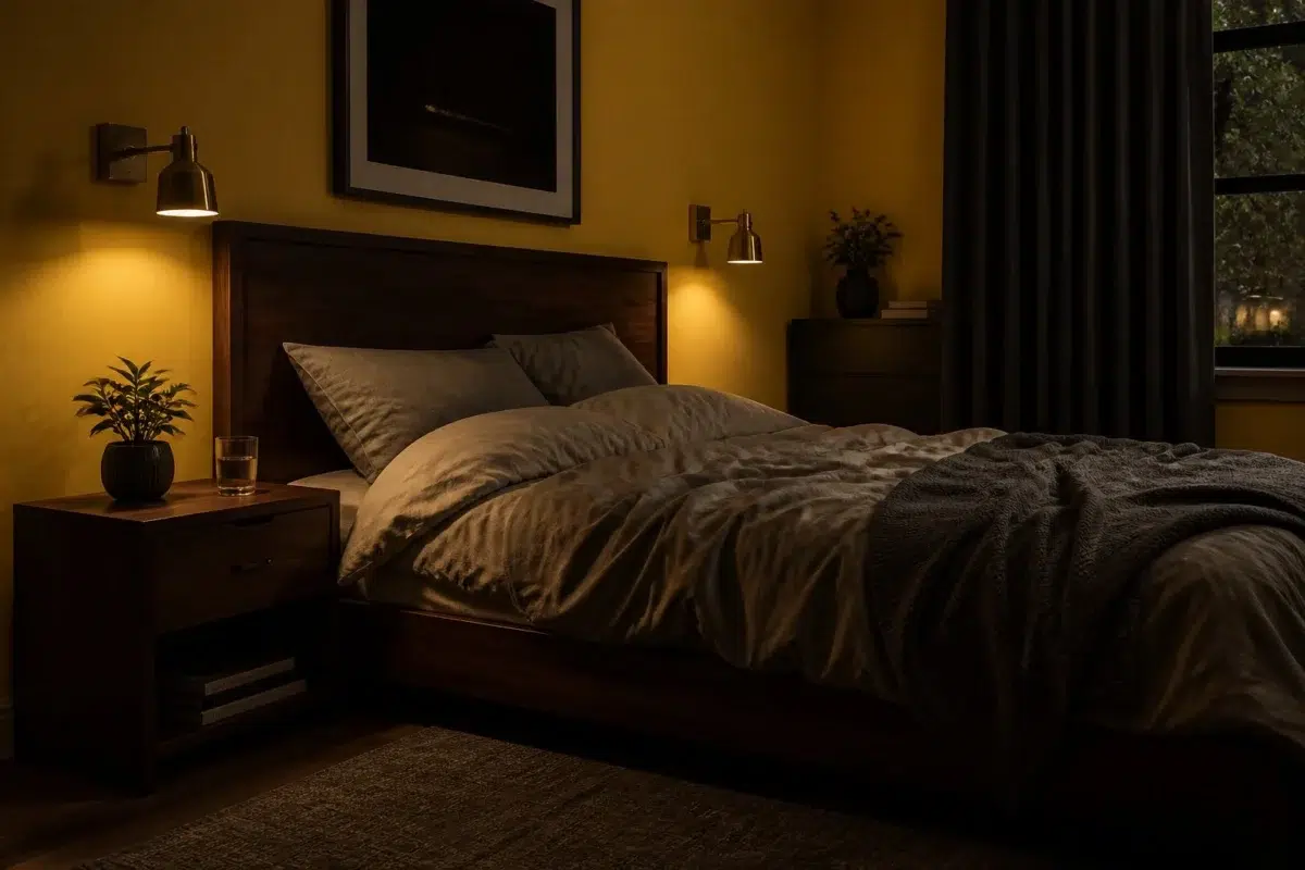
Cheerful has a unique ability to make a bedroom feel larger yet more intimate at the same time. By softening the "edges" of the room, the walls seem to move back, while the warmth of the tone makes the bed feel like a safe, protected island in the center of the space.

A moody bedroom painted in Cheerful

A moody bedroom painted in Cheerful

@mybudgetrecipes

1 Home Office Photo

For those who spend their day on camera, Cheerful is a highly flattering background color. It doesn't wash out skin tones or create weird reflections, providing a professional and "expensive" look for virtual meetings and presentations.

Sherwin-Williams Cheerful in a neutral home office

Sherwin-Williams Cheerful in a neutral home office

@mybudgetrecipes

1 Front Door Photo

Using Cheerful for the front door allows the hardware to be the "jewelry" of the house. Whether you choose a modern long-bar handle or a traditional knocker, the color provides the perfect stage for the metalwork to shine.

traditional front door featuring Cheerful by Sherwin-Williams

traditional front door featuring Cheerful by Sherwin-Williams

@mybudgetrecipes

1 Bathroom Photo

Using Cheerful on a bathroom vanity is a clever way to introduce color without painting the walls. It creates a sophisticated anchor for the room, especially when topped with a thick white quartz or a contrasting dark stone.

Cheerful — moody bathroom

Cheerful — moody bathroom

@mybudgetrecipes

1 Dining Room Photo

Dining rooms are often the best place to take a "color risk." By choosing Cheerful, you're opting for a shade that is saturated and confident, yet still refined enough to act as a neutral backdrop for colorful table linens and floral arrangements.

Cheerful paint in a art deco dining room

Cheerful paint in a art deco dining room

@mybudgetrecipes

1 Mudroom Photo

Cheerful in the mudroom earns its keep. It's a color that can handle the traffic — grounding enough to hide the daily chaos, and intentional enough to make the transition from outside feel considered and high-end.

Cheerful paint in a tiny mudroom

Cheerful paint in a tiny mudroom

@mybudgetrecipes

1 Kitchen Photo

Cheerful in a kitchen reads differently from how it might anywhere else — the hard surfaces, task lighting, and constant activity give it more to work against, and it holds up beautifully. It doesn't compete with the colors of food or the texture of countertops; instead, it frames them with a professional finish.

Cheerful — modern luxury kitchen

Cheerful — modern luxury kitchen

@mybudgetrecipes

1 House Photo

Cheerful on an exterior reads differently at different scales: approachable up close, commanding from the street. It works especially well on houses with good trim detail, where the contrast between wall and trim can do real visual work.

Cheerful color — aesthetic house inspiration

Cheerful color — aesthetic house inspiration

@mybudgetrecipes

1 Patio Photo

Using Cheerful on outdoor furniture or structures helps them "recede" into the shadows of the garden, creating a more seamless and naturalistic look. It avoids the harsh, synthetic feel that many outdoor-specific colors can have.

wabi-sabi patio featuring Cheerful by Sherwin-Williams

wabi-sabi patio featuring Cheerful by Sherwin-Williams

@mybudgetrecipes

1 Living Room Photo

When applied to living room walls, Cheerful creates a sense of "visual quiet." It eliminates the erratic shadows found in busier spaces, instead providing a steady, rhythmic tone that ties together disparate furniture styles. It's the common thread that makes a room full of heirlooms and modern pieces feel like a cohesive collection.

A scandinavian living room painted in Cheerful

A scandinavian living room painted in Cheerful

@mybudgetrecipes

Coordinating Colors

Cheerful
Full Moon
Cheerful vs Full Moon
Cheerful
Full Moon
Sherwin-Williams
Cheerful
6903 · LRV 63
Sherwin-Williams
Full Moon
6679 · LRV 78

At LRV 78 vs 63, Full Moon is decisively the brighter choice.

Cheerful
Sensible Hue
Cheerful vs Sensible Hue
Cheerful
Sensible Hue
Sherwin-Williams
Cheerful
6903 · LRV 63
Sherwin-Williams
Sensible Hue
6198 · LRV 46

Cheerful reflects far more light (LRV 63 vs 46), opening up a space where Sensible Hue encloses it.

Andiron
Cheerful
Andiron vs Cheerful
Andiron
Cheerful
Sherwin-Williams
Andiron
6174 · LRV 5
Sherwin-Williams
Cheerful
6903 · LRV 63

At LRV 63 vs 5, Cheerful is decisively the brighter choice.

Trim Color

Cheerful
Full Moon
Cheerful vs Full Moon
Cheerful
Full Moon
Sherwin-Williams
Cheerful
6903 · LRV 63
Sherwin-Williams
Full Moon
6679 · LRV 78

At LRV 78 vs 63, Full Moon is decisively the brighter choice.

Similar Colors

Cheerful
Citrus
Cheerful vs Citrus
Cheerful
Citrus
Sherwin-Williams
Cheerful
6903 · LRV 63
Sherwin-Williams
Citrus
6906 · LRV 61

With LRVs of 63 and 61, the two reflect almost the same amount of light.

Cheerful
Forsythia
Cheerful vs Forsythia
Cheerful
Forsythia
Sherwin-Williams
Cheerful
6903 · LRV 63
Sherwin-Williams
Forsythia
6907 · LRV 63

Their light reflectance is nearly identical (LRV 63 vs 63), so neither reads brighter in a room.

Cheerful
Confident Yellow
Cheerful vs Confident Yellow
Cheerful
Confident Yellow
Sherwin-Williams
Cheerful
6903 · LRV 63
Sherwin-Williams
Confident Yellow
6911 · LRV 64

Their light reflectance is nearly identical (LRV 64 vs 63), so neither reads brighter in a room.

Cheerful
Decisive Yellow
Cheerful vs Decisive Yellow
Cheerful
Decisive Yellow
Sherwin-Williams
Cheerful
6903 · LRV 63
Sherwin-Williams
Decisive Yellow
6902 · LRV 65

Their light reflectance is nearly identical (LRV 65 vs 63), so neither reads brighter in a room.

Cheerful
Daisy
Cheerful vs Daisy
Cheerful
Daisy
Sherwin-Williams
Cheerful
6903 · LRV 63
Sherwin-Williams
Daisy
6910 · LRV 68

Daisy reads slightly lighter (LRV 68 vs 63), a gap that shows most in low-lit rooms.

Cheerful
Cheerful vs Rayo de Sol
Cheerful
Rayo de Sol
Sherwin-Williams
Cheerful
6903 · LRV 63
Sherwin-Williams
Rayo de Sol
9020 · LRV 60

Cheerful reads slightly lighter (LRV 63 vs 60), a gap that shows most in low-lit rooms.

Cheerful
Goldfinch
Cheerful vs Goldfinch
Cheerful
Goldfinch
Sherwin-Williams
Cheerful
6903 · LRV 63
Sherwin-Williams
Goldfinch
6905 · LRV 55

Cheerful reads slightly lighter (LRV 63 vs 55), a gap that shows most in low-lit rooms.

Cheerful
Cheerful vs Sunny Side Up
Cheerful
Sunny Side Up
Sherwin-Williams
Cheerful
6903 · LRV 63
Sherwin-Williams
Sunny Side Up
9665 · LRV 65

Their light reflectance is nearly identical (LRV 65 vs 63), so neither reads brighter in a room.

Cheerful
Lemon Twist
Cheerful vs Lemon Twist
Cheerful
Lemon Twist
Sherwin-Williams
Cheerful
6903 · LRV 63
Sherwin-Williams
Lemon Twist
6909 · LRV 72

A 9-point LRV gap (72 vs 63) makes Lemon Twist the marginally brighter of the two.

Cheerful
Cheerful vs Overjoy
Cheerful
Overjoy
Sherwin-Williams
Cheerful
6903 · LRV 63
Sherwin-Williams
Overjoy
6689 · LRV 58

Cheerful reads slightly lighter (LRV 63 vs 58), a gap that shows most in low-lit rooms.

Complementary Colors

Cheerful
Honorable Blue
Cheerful vs Honorable Blue
Cheerful
Honorable Blue
Sherwin-Williams
Cheerful
6903 · LRV 63
Sherwin-Williams
Honorable Blue
6811 · LRV 6

At LRV 63 vs 6, Cheerful is decisively the brighter choice.

Bridgeport
Cheerful
Bridgeport vs Cheerful
Bridgeport
Cheerful
Sherwin-Williams
Bridgeport
2940 · LRV NaN
Sherwin-Williams
Cheerful
6903 · LRV 63

Cheerful reflects far more light (LRV NaN vs NaN), opening up a space where Bridgeport encloses it.

Lighter Colors

Cheerful
Cheerful vs Nasturtium
Cheerful
Nasturtium
Sherwin-Williams
Cheerful
6903 · LRV 63
Sherwin-Williams
Nasturtium
6899 · LRV 50

Cheerful reflects far more light (LRV 63 vs 50), opening up a space where Nasturtium encloses it.

Afternoon
Cheerful
Afternoon vs Cheerful
Afternoon
Cheerful
Sherwin-Williams
Afternoon
6675 · LRV 65
Sherwin-Williams
Cheerful
6903 · LRV 63

With LRVs of 65 and 63, the two reflect almost the same amount of light.

Cheerful
Cheerful vs Pollen Powder
Cheerful
Pollen Powder
Sherwin-Williams
Cheerful
6903 · LRV 63
Sherwin-Williams
Pollen Powder
9014 · LRV 68

Pollen Powder reads slightly lighter (LRV 68 vs 63), a gap that shows most in low-lit rooms.

Cheerful
Golden Plumeria
Cheerful vs Golden Plumeria
Cheerful
Golden Plumeria
Sherwin-Williams
Cheerful
6903 · LRV 63
Sherwin-Williams
Golden Plumeria
9019 · LRV 67

A 5-point LRV gap (67 vs 63) makes Golden Plumeria the marginally brighter of the two.

Cheerful
Honey Bees
Cheerful vs Honey Bees
Cheerful
Honey Bees
Sherwin-Williams
Cheerful
6903 · LRV 63
Sherwin-Williams
Honey Bees
9018 · LRV 70

A 8-point LRV gap (70 vs 63) makes Honey Bees the marginally brighter of the two.

Darker Colors

Cheerful
Citrus
Cheerful vs Citrus
Cheerful
Citrus
Sherwin-Williams
Cheerful
6903 · LRV 63
Sherwin-Williams
Citrus
6906 · LRV 61

With LRVs of 63 and 61, the two reflect almost the same amount of light.

Cheerful
Forsythia
Cheerful vs Forsythia
Cheerful
Forsythia
Sherwin-Williams
Cheerful
6903 · LRV 63
Sherwin-Williams
Forsythia
6907 · LRV 63

Their light reflectance is nearly identical (LRV 63 vs 63), so neither reads brighter in a room.

Cheerful
Goldfinch
Cheerful vs Goldfinch
Cheerful
Goldfinch
Sherwin-Williams
Cheerful
6903 · LRV 63
Sherwin-Williams
Goldfinch
6905 · LRV 55

Cheerful reads slightly lighter (LRV 63 vs 55), a gap that shows most in low-lit rooms.

Cheerful
Confident Yellow
Cheerful vs Confident Yellow
Cheerful
Confident Yellow
Sherwin-Williams
Cheerful
6903 · LRV 63
Sherwin-Williams
Confident Yellow
6911 · LRV 64

Their light reflectance is nearly identical (LRV 64 vs 63), so neither reads brighter in a room.

Cheerful
Citronella
Cheerful vs Citronella
Cheerful
Citronella
Sherwin-Williams
Cheerful
6903 · LRV 63
Sherwin-Williams
Citronella
6915 · LRV 41

At LRV 63 vs 41, Cheerful is decisively the brighter choice.

Color Codes

HEX#FFC723
RGB255, 199, 35
HSL45° 100% 57%
CMYK0 22 86 0
CIE LabL: 83.0 a: 6.7 b: 79.5
XYZX: 61.97 Y: 62.23 Z: 10.34
Strip134 pos. C7