Antimony featured
Sherwin-Williams9552

Antimony

Often used for its versatile and reflective qualities, Antimony remains a staple for Sherwin-Williams designers. It is widely considered one of the best colors in its class to provide a clean, timeless feel that works across various lighting conditions. We've gathered 10 real-home scenarios to help you visualize this color alongside our expert data.

Hex

#C7C8C1

LRV

57.23

Find matches across brands →
Light Reflectance Value
57.23
Light
TemperatureNeutral

Antimony in Real Rooms

Antimony has a high LRV of 57.23 — it reflects a lot of light and will read pale and airy in most spaces. It's neutral in temperature, making it adaptable across different lighting conditions and room orientations. Grouped in the Neutral family, the photos below show it applied in a bedroom, dining room, front door, bathroom, kitchen, patio, house, living room, mudroom and home office.

1 Bedroom Photo

For guest bedrooms, Antimony is a welcoming embrace. It's a universally appealing tone that feels clean and fresh for new arrivals, yet has enough "personality" to make their stay feel special and considered. It works across all seasons, feeling cool in summer and cozy in winter.

A organic modern bedroom painted in Antimony

A organic modern bedroom painted in Antimony

@mybudgetrecipes

1 Dining Room Photo

Dining rooms are often the best place to take a "color risk." By choosing Antimony, you're opting for a shade that is saturated and confident, yet still refined enough to act as a neutral backdrop for colorful table linens and floral arrangements.

Antimony paint in a minimalist dining room

Antimony paint in a minimalist dining room

@mybudgetrecipes

1 Front Door Photo

A front door painted Antimony makes a confident first impression without shouting. The color's depth draws the eye and signals personality before guests even step inside. Pair with crisp white trim and warm brass hardware to complete the look.

bold front door featuring Antimony by Sherwin-Williams

bold front door featuring Antimony by Sherwin-Williams

@mybudgetrecipes

1 Bathroom Photo

Bathrooms test color in specific ways — task lighting, tile grout, and chrome or brass fixtures all compete for attention. Antimony holds its own against all of it, and tends to photograph even better than it reads in person.

Antimony — minimalist bathroom

Antimony — minimalist bathroom

@mybudgetrecipes

1 Kitchen Photo

The challenge with kitchen color is longevity: it needs to look right at 7am under bright task lights and at dinner with the pendants dimmed low. Antimony manages to bridge all three lighting scenarios with ease, which is a rarer quality in a paint pigment than it sounds.

Antimony — scandinavian kitchen

Antimony — scandinavian kitchen

@mybudgetrecipes

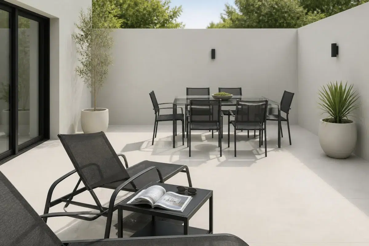
1 Patio Photo

Using Antimony on outdoor furniture or structures helps them "recede" into the shadows of the garden, creating a more seamless and naturalistic look. It avoids the harsh, synthetic feel that many outdoor-specific colors can have.

contemporary patio featuring Antimony by Sherwin-Williams

contemporary patio featuring Antimony by Sherwin-Williams

@mybudgetrecipes

1 House Photo

In suburban environments, Antimony provides a sophisticated point of difference. It stands out from the sea of beige and grey without being "that house" that's too loud. It's the subtle, high-end choice that improves the curb appeal of the entire block.

Antimony color — scandinavian house inspiration

Antimony color — scandinavian house inspiration

@mybudgetrecipes

1 Living Room Photo

In a living room, Antimony acts as a bridge between the indoors and the view outside. It carries the organic weight of the natural world into the home, allowing the greenery from windows to pop while keeping the interior feeling protected and private. Pair it with oversized plants and ceramic vessels for a full organic-modern aesthetic.

A organic modern living room painted in Antimony

A organic modern living room painted in Antimony

@mybudgetrecipes

1 Mudroom Photo

Using Antimony on mudroom walls makes the white trim and hooks pop. It creates a high-contrast, organized look that makes even a room full of sports gear and rain boots look like it has a system and a sense of order.

Antimony paint in a coastal mudroom

Antimony paint in a coastal mudroom

@mybudgetrecipes

1 Home Office Photo

The transition from "home life" to "work life" can be signaled by the color of the room. Entering a space painted in Antimony provides a mental shift, telling your brain that it's time to settle in and be productive.

Antimony — contemporary home office

Antimony — contemporary home office

@mybudgetrecipes

Expert Perspectives

In-depth articles and real-home features from across our network of home and design sites.
Coordinating Colors

Antimony
Antimony
White Sail
Antimony vs White Sail
Sherwin-Williams
Antimony
9552 · LRV 57
Sherwin-Williams
White Sail
9622 · LRV 83

White Sail reflects far more light (LRV 83 vs 57), opening up a space where Antimony encloses it.

Antimony
Antimony
Tarragon
Tarragon
Antimony vs Tarragon
Sherwin-Williams
Antimony
9552 · LRV 57
Sherwin-Williams
Tarragon
9660 · LRV 7

At LRV 57 vs 7, Antimony is decisively the brighter choice.

Antimony
Antimony
Marine
Antimony vs Marine
Sherwin-Williams
Antimony
9552 · LRV 57
Sherwin-Williams
Marine
9659 · LRV 36

At LRV 57 vs 36, Antimony is decisively the brighter choice.

Similar Colors

Aloof Gray
Aloof Gray
Antimony
Antimony
Aloof Gray vs Antimony
Sherwin-Williams
Aloof Gray
6197 · LRV 58
Sherwin-Williams
Antimony
9552 · LRV 57

With LRVs of 58 and 57, the two reflect almost the same amount of light.

Antimony
Antimony
Sweater Weather
Sweater Weather
Antimony vs Sweater Weather
Sherwin-Williams
Antimony
9552 · LRV 57
Sherwin-Williams
Sweater Weather
9548 · LRV 60

Their light reflectance is nearly identical (LRV 60 vs 57), so neither reads brighter in a room.

Antimony
Antimony
Front Porch
Front Porch
Antimony vs Front Porch
Sherwin-Williams
Antimony
9552 · LRV 57
Sherwin-Williams
Front Porch
7651 · LRV 60

Their light reflectance is nearly identical (LRV 60 vs 57), so neither reads brighter in a room.

Antimony
Antimony
Silver Strand
Silver Strand
Antimony vs Silver Strand
Sherwin-Williams
Antimony
9552 · LRV 57
Sherwin-Williams
Silver Strand
7057 · LRV 59

Their light reflectance is nearly identical (LRV 59 vs 57), so neither reads brighter in a room.

Antimony
Antimony
Tinsmith
Tinsmith
Antimony vs Tinsmith
Sherwin-Williams
Antimony
9552 · LRV 57
Sherwin-Williams
Tinsmith
7657 · LRV 57

Their light reflectance is nearly identical (LRV 57 vs 57), so neither reads brighter in a room.

Antimony
Antimony
Constellation
Constellation
Antimony vs Constellation
Sherwin-Williams
Antimony
9552 · LRV 57
Sherwin-Williams
Constellation
9629 · LRV 60

Constellation reads slightly lighter (LRV 60 vs 57), a gap that shows most in low-lit rooms.

Antimony
Antimony
Lattice
Lattice
Antimony vs Lattice
Sherwin-Williams
Antimony
9552 · LRV 57
Sherwin-Williams
Lattice
7654 · LRV 61

A 4-point LRV gap (61 vs 57) makes Lattice the marginally brighter of the two.

Antimony
Antimony
Create
Create
Antimony vs Create
Sherwin-Williams
Antimony
9552 · LRV 57
Sherwin-Williams
Create
9646 · LRV 58

Their light reflectance is nearly identical (LRV 58 vs 57), so neither reads brighter in a room.

Antimony
Antimony
Pearl Gray
Pearl Gray
Antimony vs Pearl Gray
Sherwin-Williams
Antimony
9552 · LRV 57
Sherwin-Williams
Pearl Gray
0052 · LRV 61

A 4-point LRV gap (61 vs 57) makes Pearl Gray the marginally brighter of the two.

Antimony
Antimony
Repose Gray
Repose Gray
Antimony vs Repose Gray
Sherwin-Williams
Antimony
9552 · LRV 57
Sherwin-Williams
Repose Gray
7015 · LRV 58

Their light reflectance is nearly identical (LRV 58 vs 57), so neither reads brighter in a room.

Complementary Colors

Antimony
Antimony
Purple Passage
Antimony vs Purple Passage
Sherwin-Williams
Antimony
9552 · LRV 57
Sherwin-Williams
Purple Passage
6551 · LRV 12

Antimony reflects far more light (LRV 57 vs 12), opening up a space where Purple Passage encloses it.

Antimony
Antimony
Elation
Elation
Antimony vs Elation
Sherwin-Williams
Antimony
9552 · LRV 57
Sherwin-Williams
Elation
6827 · LRV 72

At LRV 72 vs 57, Elation is decisively the brighter choice.

Antimony
Antimony
Lady's Slipper
Lady's Slipper
Antimony vs Lady's Slipper
Sherwin-Williams
Antimony
9552 · LRV 57
Sherwin-Williams
Lady's Slipper
7139 · LRV 76

Lady's Slipper reflects far more light (LRV 76 vs 57), opening up a space where Antimony encloses it.

Antimony
Antimony
Forget-Me-Not
Forget-Me-Not
Antimony vs Forget-Me-Not
Sherwin-Williams
Antimony
9552 · LRV 57
Sherwin-Williams
Forget-Me-Not
6824 · LRV 16

At LRV 57 vs 16, Antimony is decisively the brighter choice.

Antimony
Antimony
Majestic Purple
Antimony vs Majestic Purple
Sherwin-Williams
Antimony
9552 · LRV 57
Sherwin-Williams
Majestic Purple
6545 · LRV 5

Antimony reflects far more light (LRV 57 vs 5), opening up a space where Majestic Purple encloses it.

Antimony
Antimony
Dewberry
Dewberry
Antimony vs Dewberry
Sherwin-Williams
Antimony
9552 · LRV 57
Sherwin-Williams
Dewberry
6552 · LRV 5

At LRV 57 vs 5, Antimony is decisively the brighter choice.

Antimony
Antimony
Brave Purple
Brave Purple
Antimony vs Brave Purple
Sherwin-Williams
Antimony
9552 · LRV 57
Sherwin-Williams
Brave Purple
6823 · LRV 29

Antimony reflects far more light (LRV 57 vs 29), opening up a space where Brave Purple encloses it.

Lighter Colors

Antimony
Antimony
Silverpointe
Silverpointe
Antimony vs Silverpointe
Sherwin-Williams
Antimony
9552 · LRV 57
Sherwin-Williams
Silverpointe
7653 · LRV 64

A 7-point LRV gap (64 vs 57) makes Silverpointe the marginally brighter of the two.

Antimony
Antimony
Fleur De Sel
Fleur De Sel
Antimony vs Fleur De Sel
Sherwin-Williams
Antimony
9552 · LRV 57
Sherwin-Williams
Fleur De Sel
7666 · LRV 72

Fleur De Sel reflects far more light (LRV 72 vs 57), opening up a space where Antimony encloses it.

Antimony
Antimony
Moorstone
Moorstone
Antimony vs Moorstone
Sherwin-Williams
Antimony
9552 · LRV 57
Sherwin-Williams
Moorstone
9630 · LRV 63

A 6-point LRV gap (63 vs 57) makes Moorstone the marginally brighter of the two.

Antimony
Antimony
Create
Create
Antimony vs Create
Sherwin-Williams
Antimony
9552 · LRV 57
Sherwin-Williams
Create
9646 · LRV 58

Their light reflectance is nearly identical (LRV 58 vs 57), so neither reads brighter in a room.

Antimony
Antimony
Gypsum
Gypsum
Antimony vs Gypsum
Sherwin-Williams
Antimony
9552 · LRV 57
Sherwin-Williams
Gypsum
9543 · LRV 82

Gypsum reflects far more light (LRV 82 vs 57), opening up a space where Antimony encloses it.

Darker Colors

Antimony
Antimony
Evergreen Fog
Evergreen Fog
Antimony vs Evergreen Fog
Sherwin-Williams
Antimony
9552 · LRV 57
Sherwin-Williams
Evergreen Fog
9130 · LRV 30

At LRV 57 vs 30, Antimony is decisively the brighter choice.

Antimony
Antimony
Chelsea Gray
Chelsea Gray
Antimony vs Chelsea Gray
Sherwin-Williams
Antimony
9552 · LRV 57
Sherwin-Williams
Chelsea Gray
2850 · LRV 47

Antimony reads slightly lighter (LRV 57 vs 47), a gap that shows most in low-lit rooms.

Antimony
Antimony
Escape Gray
Escape Gray
Antimony vs Escape Gray
Sherwin-Williams
Antimony
9552 · LRV 57
Sherwin-Williams
Escape Gray
6185 · LRV 41

Antimony reflects far more light (LRV 57 vs 41), opening up a space where Escape Gray encloses it.

Antimony
Antimony
Willow Tree
Willow Tree
Antimony vs Willow Tree
Sherwin-Williams
Antimony
9552 · LRV 57
Sherwin-Williams
Willow Tree
7741 · LRV 41

Antimony reflects far more light (LRV 57 vs 41), opening up a space where Willow Tree encloses it.

Color Codes

HEX#C7C8C1
RGB199, 200, 193
HSL69° 6% 77%
CMYK1 0 4 22
CIE LabL: 80.3 a: -1.6 b: 3.4
XYZX: 53.83 Y: 57.30 Z: 58.67