
Classical Gold
At first glance, Classical Gold belongs to the yellow family; in a room, light and context can make it far more elusive. Its midtone saturation balances color with restraint, so the hue can register without overwhelming nearby finishes. Its related shades below reveal where the color harmonizes—and where contrast brings it fully to life.
Hex
#EBB875LRV
53.23
Classical Gold in Rooms
Follow Classical Gold from one space to another and watch how light, scale and surrounding materials reshape its character. 10 generated visualizations explore how the color might shape a finished room.
1 Home Office Photo
Classical Gold (2831) can change noticeably under daylight beside desk lamps and screen glow. Sample it beside the finishes that will remain in the room.
Sherwin-Williams Classical Gold in a mid century home office
@mybudgetrecipes
1 Front Door Photo
Classical Gold (2831) can change noticeably under direct sun, porch shade and evening exterior light. Sample it beside the finishes that will remain in the room.

bold front door featuring Classical Gold by Sherwin-Williams
@mybudgetrecipes
1 Bathroom Photo
Its place within Colonial Revival (1870s-1900s) and Historic Exterior Color Wall hints at the range of palettes it can inhabit. In this setting, let window light, mirrors and focused task lighting and tile, stone, glass, timber and metal fixtures guide the final sample decision.

Classical Gold — moody bathroom
@mybudgetrecipes
1 Bedroom Photo
Classical Gold (2831) can change noticeably under gentle morning light and low evening lamps. Sample it beside the finishes that will remain in the room.

A moody bedroom painted in Classical Gold
@mybudgetrecipes
1 Dining Room Photo
Classical Gold (2831) brings its yellow character into a gathering space that can move from daylight to ceremony. Its midtone saturation keeps the color expressive without letting it dominate every surface around it.

Classical Gold paint in a parisian dining room
@mybudgetrecipes
1 Living Room Photo
Classical Gold (2831) moves through 1 living room image without becoming a fixed prescription for the room. Its warm classification can feel inviting beside tactile, natural materials.

A contemporary living room painted in Classical Gold
@mybudgetrecipes
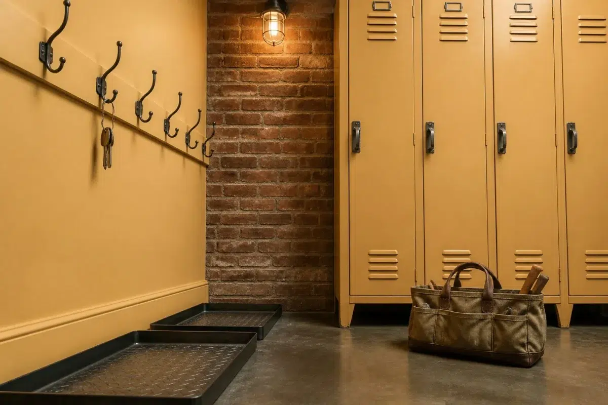
1 Mudroom Photo
Classical Gold (2831) offers a starting mood rather than a finished formula: Its warm classification can feel inviting beside tactile, natural materials. Test it under doorway light and the softer illumination of an internal passage.

Classical Gold paint in a industrial mudroom
@mybudgetrecipes
1 Kitchen Photo
Classical Gold (2831) can change noticeably under daylight, task lighting and evening pendants. Sample it beside the finishes that will remain in the room.

Classical Gold — minimalist kitchen
@mybudgetrecipes
1 Patio Photo
Across 1 patio image, Classical Gold (2831) meets direct sun, reflected daylight and deep exterior shade. Its warm classification can feel inviting beside tactile, natural materials.

boho patio featuring Classical Gold by Sherwin-Williams
@mybudgetrecipes
1 House Photo
Its place within Colonial Revival (1870s-1900s) and Historic Exterior Color Wall hints at the range of palettes it can inhabit. In this setting, let full daylight, cloud cover and long evening shadows and roofing, masonry, timber, planting and trim guide the final sample decision.

Classical Gold color — rustic modern house inspiration
@mybudgetrecipes
Expert Perspectives
Articles and features from across our network of home and design sites.
Coordinating Colors


Westhighland White reflects far more light (LRV 86 vs 53), opening up a space where Classical Gold encloses it.


Classical Gold reflects far more light (LRV 53 vs 29), opening up a space where Keystone Gray encloses it.
Similar Colors

With LRVs of 53 and 53, the two reflect almost the same amount of light.


With LRVs of 55 and 53, the two reflect almost the same amount of light.


A 5-point LRV gap (58 vs 53) makes Sunrise the marginally brighter of the two.


Their light reflectance is nearly identical (LRV 53 vs 53), so neither reads brighter in a room.

Classical Gold reads slightly lighter (LRV 53 vs 48), a gap that shows most in low-lit rooms.


Bee's Wax reads slightly lighter (LRV 57 vs 53), a gap that shows most in low-lit rooms.

Their light reflectance is nearly identical (LRV 53 vs 53), so neither reads brighter in a room.


Classical Gold reads slightly lighter (LRV 53 vs 46), a gap that shows most in low-lit rooms.


Colonial Yellow reads slightly lighter (LRV 60 vs 53), a gap that shows most in low-lit rooms.


Classical Gold reads slightly lighter (LRV 53 vs 48), a gap that shows most in low-lit rooms.
Complementary Colors

Classical Gold reflects far more light (LRV 53 vs 30), opening up a space where Lobelia encloses it.

Classical Gold reflects far more light (LRV 53 vs 8), opening up a space where Morning Glory encloses it.


With LRVs of 55 and 53, the two reflect almost the same amount of light.


At LRV 53 vs 8, Classical Gold is decisively the brighter choice.

At LRV 53 vs 16, Classical Gold is decisively the brighter choice.


Classical Gold reflects far more light (LRV 53 vs 9), opening up a space where Endless Sea encloses it.


Classical Gold reads slightly lighter (LRV 53 vs 44), a gap that shows most in low-lit rooms.
Lighter Colors


At LRV 76 vs 53, Impressive Ivory is decisively the brighter choice.


Their light reflectance is nearly identical (LRV 54 vs 53), so neither reads brighter in a room.
Their light reflectance is nearly identical (LRV 53 vs 53), so neither reads brighter in a room.


At LRV 72 vs 53, Cachet Cream is decisively the brighter choice.
Bee's Wax reads slightly lighter (LRV 57 vs 53), a gap that shows most in low-lit rooms.
Darker Colors


At LRV 53 vs 40, Classical Gold is decisively the brighter choice.

Classical Gold reads slightly lighter (LRV 53 vs 47), a gap that shows most in low-lit rooms.
Classical Gold reads slightly lighter (LRV 53 vs 48), a gap that shows most in low-lit rooms.


Classical Gold reflects far more light (LRV 53 vs 39), opening up a space where Gold Crest encloses it.
With LRVs of 53 and 53, the two reflect almost the same amount of light.
Color Codes
Manufacturer description
This warm golden yellow glows with the richness of honey and aged brass, bringing an air of timeless elegance to any space it graces. Perfect for dining rooms, studies, or accent walls, it pairs beautifully with deep burgundies, forest greens, and warm wood tones for a sophisticated, inviting atmosphere.
Attributed to Sherwin-Williams catalog data.