
Craftsman Brown
Sherwin-Williams's Craftsman Brown is a orange shade whose quieter details emerge through comparison. An LRV of 30.9 places it through the middle of the scale, where color and depth can remain visible as the light changes. Its related shades below reveal where the color harmonizes—and where contrast brings it fully to life.
Hex
#AE9278LRV
30.91
Craftsman Brown in Rooms
Follow Craftsman Brown from one space to another and watch how light, scale and surrounding materials reshape its character. 10 generated visualizations explore how the color might shape a finished room.
1 Front Door Photo
Against hardware, glazing, masonry, timber and surrounding trim, Craftsman Brown (2835) may feel quieter, sharper or more atmospheric than the digital swatch alone. An LRV of 30.9 lets the color hold its identity across both brighter and more shaded parts of the room.
bold front door featuring Craftsman Brown by Sherwin-Williams
@mybudgetrecipes
1 Home Office Photo
Craftsman Brown (2835) moves through 1 home office image without becoming a fixed prescription for the room. Its warm classification can feel inviting beside tactile, natural materials.

Sherwin-Williams Craftsman Brown in a minimalist home office
@mybudgetrecipes
1 Bedroom Photo
Craftsman Brown (2835) moves through 1 bedroom image without becoming a fixed prescription for the room. Its warm classification can feel inviting beside tactile, natural materials.

A cozy bedroom painted in Craftsman Brown
@mybudgetrecipes
1 Bathroom Photo
Across 1 bathroom image, Craftsman Brown (2835) meets window light, mirrors and focused task lighting. Its warm classification can feel inviting beside tactile, natural materials.

Craftsman Brown — coastal bathroom
@mybudgetrecipes
1 Living Room Photo
Craftsman Brown (2835) can change noticeably under the movement from window light to lamplight. Sample it beside the finishes that will remain in the room.

A organic modern living room painted in Craftsman Brown
@mybudgetrecipes
1 Mudroom Photo
Across 1 mudroom image, Craftsman Brown (2835) meets doorway light and the softer illumination of an internal passage. Its warm classification can feel inviting beside tactile, natural materials.

Craftsman Brown paint in a earthy mudroom
@mybudgetrecipes
1 Kitchen Photo
Across 1 kitchen image, Craftsman Brown (2835) meets daylight, task lighting and evening pendants. Its warm classification can feel inviting beside tactile, natural materials.

Craftsman Brown — organic modern kitchen
@mybudgetrecipes
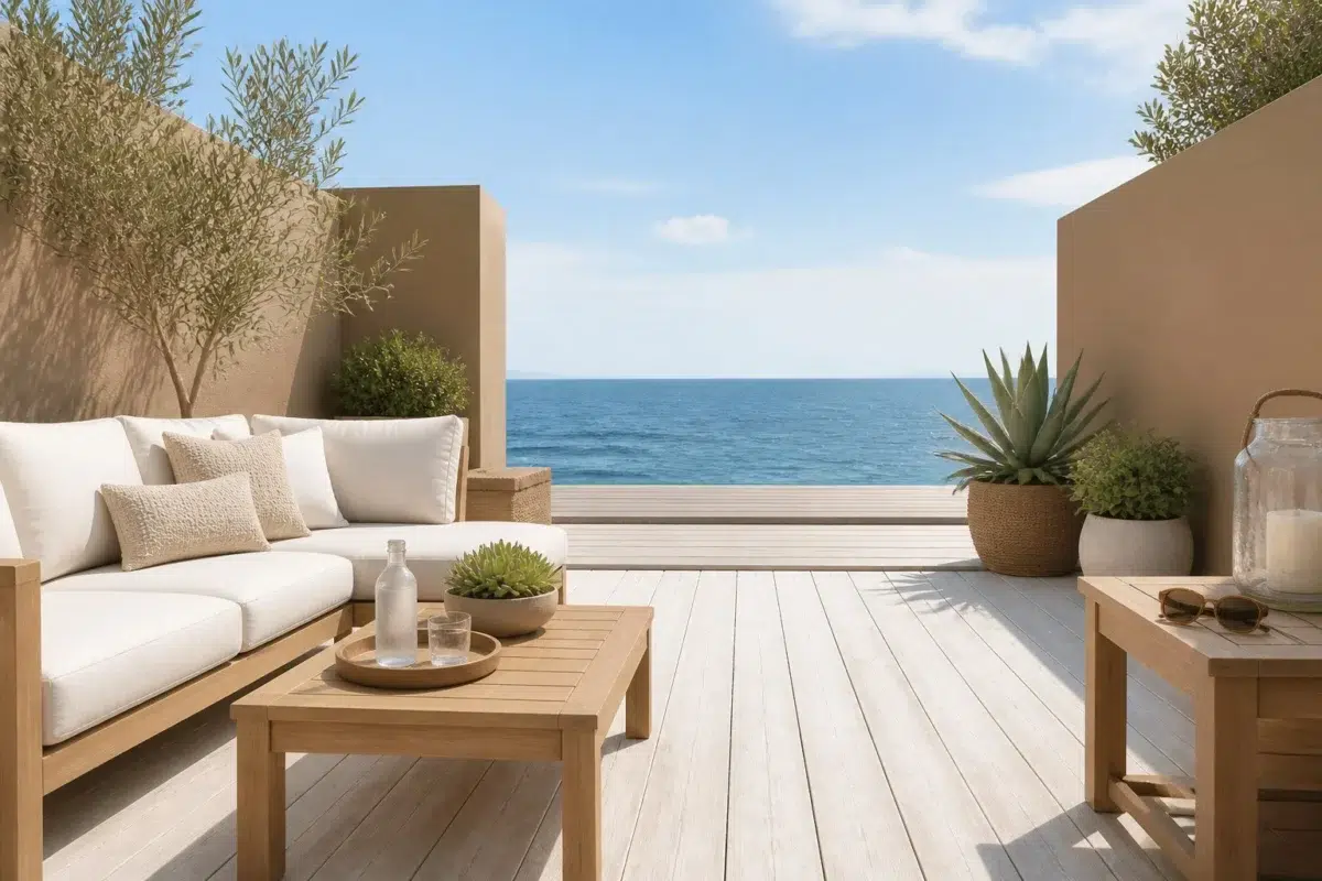
1 Patio Photo
These 1 patio image show how Craftsman Brown (2835) can sit beside stone, timber, metal, textiles and greenery. The beige, greige hue classifications suggest the subtle directions the color may take as the room changes.

coastal patio featuring Craftsman Brown by Sherwin-Williams
@mybudgetrecipes
1 Dining Room Photo
Craftsman Brown (2835) moves through 1 dining room image without becoming a fixed prescription for the room. Its warm classification can feel inviting beside tactile, natural materials.

Craftsman Brown — mid century dining room
@mybudgetrecipes
1 House Photo
1 house image trace Craftsman Brown (2835) through the façade’s movement through sun, shade and season. Its place within Arts & Crafts (1880s-1910s) and Historic Exterior Color Wall hints at the range of palettes it can inhabit.

A rustic modern house painted in Craftsman Brown
@mybudgetrecipes
Expert Perspectives
Articles and features from across our network of home and design sites.
Coordinating Colors


Stamped Concrete reads slightly lighter (LRV 35 vs 31), a gap that shows most in low-lit rooms.


Craftsman Brown reflects far more light (LRV 31 vs 15), opening up a space where Homburg Gray encloses it.
Similar Colors


With LRVs of 32 and 31, the two reflect almost the same amount of light.

With LRVs of 31 and 29, the two reflect almost the same amount of light.


With LRVs of 31 and 28, the two reflect almost the same amount of light.

With LRVs of 33 and 31, the two reflect almost the same amount of light.

Their light reflectance is nearly identical (LRV 33 vs 31), so neither reads brighter in a room.


With LRVs of 34 and 31, the two reflect almost the same amount of light.

With LRVs of 33 and 31, the two reflect almost the same amount of light.

With LRVs of 31 and 29, the two reflect almost the same amount of light.

Their light reflectance is nearly identical (LRV 32 vs 31), so neither reads brighter in a room.


With LRVs of 33 and 31, the two reflect almost the same amount of light.
Complementary Colors


Craftsman Brown reflects far more light (LRV 31 vs 6), opening up a space where Mount Etna encloses it.


With LRVs of 34 and 31, the two reflect almost the same amount of light.


Craftsman Brown reflects far more light (LRV 31 vs 7), opening up a space where Tarragon encloses it.


Craftsman Brown reflects far more light (LRV 31 vs 11), opening up a space where Rain Cloud encloses it.


Craftsman Brown reflects far more light (LRV 31 vs 7), opening up a space where Sea Mariner encloses it.


Starry Night reflects far more light (LRV 69 vs 31), opening up a space where Craftsman Brown encloses it.


A 11-point LRV gap (31 vs 20) makes Craftsman Brown the marginally brighter of the two.
Lighter Colors


Chelsea Mauve reflects far more light (LRV 43 vs 31), opening up a space where Craftsman Brown encloses it.


At LRV 46 vs 31, Balanced Beige is decisively the brighter choice.


At LRV 47 vs 31, Doeskin is decisively the brighter choice.


A 6-point LRV gap (37 vs 31) makes Trusty Tan the marginally brighter of the two.

Smoky Beige reads slightly lighter (LRV 40 vs 31), a gap that shows most in low-lit rooms.
Darker Colors

Craftsman Brown reflects far more light (LRV 31 vs 14), opening up a space where Tea Chest encloses it.

A 7-point LRV gap (31 vs 24) makes Craftsman Brown the marginally brighter of the two.


A 6-point LRV gap (31 vs 25) makes Craftsman Brown the marginally brighter of the two.
With LRVs of 31 and 28, the two reflect almost the same amount of light.
With LRVs of 31 and 29, the two reflect almost the same amount of light.
Color Codes
Manufacturer description
This warm, earthy brown carries subtle orange undertones that echo the handcrafted heritage of early 20th-century design, bringing a grounded authenticity to any space. Perfect for libraries, dens, or accent walls, it pairs beautifully with cream trim and warm wood tones to create an inviting, timeless atmosphere.
Attributed to Sherwin-Williams catalog data.