
Neutral Ground
Sherwin-Williams Neutral Ground (7568) carries the measured structure of its color data and the less predictable beauty of paint in a finished space. Its beige classifications hint at the directions it may take as daylight, lamps and neighboring colors move around it. Treat the digital swatch as an opening note, then watch a physical sample from morning light through evening lamps.
Hex
#E2DACALRV
70.47
Neutral Ground's Color Strip
Neutral Ground is the fifth shade on this 7-color strip, sitting between Aged White and Canvas Tan. The strip spans from Whitetail at the lightest end to Patience at the deepest. As part of strip 261, these colors are curated to work together — helpful when you're deciding how light or deep to go.


Neutral Ground in Rooms
Follow Neutral Ground from one space to another and watch how light, scale and surrounding materials reshape its character. 59 sourced room photos sit alongside 7 generated visualizations.
11 Bathroom Photos
Viewed across 11 bathroom images in a compact setting where tile, fixtures and color sit close together, Neutral Ground (7568) reveals how much color depends on scale, surface and shadow. Its LRV of 70.5 gives it a light-reflective character, though shadows and neighboring finishes can still draw out surprising depth.
Bathroom walls in Neutral Ground create a calm, spa-like backdrop for fixtures.
@mybudgetrecipes
6 Bedroom Photos
Neutral Ground (7568) offers a starting mood rather than a finished formula: Its warm classification can feel inviting beside tactile, natural materials. Test it under gentle morning light and low evening lamps.

Soft Neutral Ground on bedroom walls pairs beautifully with natural wood flooring.
@mybudgetrecipes
3 Front Door Photos
These 3 front door images show how Neutral Ground (7568) can sit beside hardware, glazing, masonry, timber and surrounding trim. The beige hue classifications suggest the subtle directions the color may take as the room changes.

A welcoming front door painted in Neutral Ground anchors the home's entrance.
@mybudgetrecipes

A solid front door in Neutral Ground makes a sophisticated entry statement.
@brittany.countryman

This entry door finished in Neutral Ground pairs beautifully with traditional hardware.
@brittany.countryman
4 Home Office Photos
4 home office images trace Neutral Ground (7568) through the transition between focused work and the rest of the home. Its place within 2016 Pura Vida and Finest Whites hints at the range of palettes it can inhabit.

Built-in shelving against Neutral Ground walls maximizes storage in this compact office.
@mybudgetrecipes

Walls painted in Neutral Ground create a serene workspace with excellent natural light.
@jaques_house_splitrock2021

The office's accent wall in Neutral Ground balances warm wood tones nicely.
@jaques_house_splitrock2021

Trim and walls in Neutral Ground establish a cohesive, professional atmosphere.
@jaques_house_splitrock2021
5 House Photos
These 5 house images show how Neutral Ground (7568) can sit beside roofing, masonry, timber, planting and trim. The beige hue classifications suggest the subtle directions the color may take as the room changes.

The exterior of this home glows warmly in Neutral Ground.
@mybudgetrecipes

Horizontal siding dressed in Neutral Ground complements traditional architectural details beautifully.
@ourhavenhillhome

The home's exterior walls in Neutral Ground blend seamlessly with natural landscaping.
@5pointpaintpros

Board-and-batten siding in Neutral Ground provides subtle depth and character.
@ourhavenhillhome

Clapboard siding finished in Neutral Ground enhances the home's classic curb appeal.
@chuffinesinteriordesign
1 Kitchen Photo
The changing light from breakfast through dinner can draw different notes from Neutral Ground (7568). The beige hue classifications suggest the subtle directions the color may take as the room changes.

Kitchen cabinetry stands out against walls finished in understated Neutral Ground.
@mybudgetrecipes
18 Living Room Photos
17 sourced photos are joined by 1 generated visualization, offering both observed and imagined settings. Together they show Neutral Ground (7568) as inspiration rather than a promise of an identical result.

A fireplace mantel becomes the focal point above Neutral Ground walls.
@mybudgetrecipes
5 Misc Photos
The 5 misc images turn a white swatch into something more spatial and expressive. Its brighter saturation allows the hue to remain present rather than fading quietly into the background.

Neutral Ground brings cohesion and warmth to any wall surface.
@herbertpainting

Hallway walls in Neutral Ground create an inviting passage between rooms.
@buildingacasehouse

Laundry room cabinets coordinate seamlessly with Neutral Ground painted walls.
@mancashomestead

Neutral Ground walls in the laundry room provide a serene backdrop.
@mancashomestead

Trim and architectural details gain subtle definition against Neutral Ground.
@buildingacasehouse
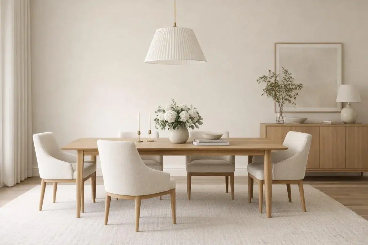
3 Dining Room Photos
Neutral Ground (7568) moves through 3 dining room images without becoming a fixed prescription for the room. Its warm classification can feel inviting beside tactile, natural materials.

Dining room walls in Neutral Ground enhance both modern and traditional settings.
@aspicypineapple

Warm Neutral Ground walls set an intimate tone for dining.
@aspicypineapple

This dining space glows under warm lighting with Neutral Ground walls.
@aspicypineapple
10 Kitchen Cabinets Photos
In cabinetry, where color becomes part of the room’s architecture, the most interesting quality of Neutral Ground (7568) may be the way it responds to countertops, hardware, splashbacks and flooring. The beige hue classifications suggest the subtle directions the color may take as the room changes.

Kitchen cabinets painted in Neutral Ground bring subtle warmth to this cooking space.
@customcabinetryfinishes
Expert Perspectives
Articles and features from across our network of home and design sites.
Coordinating Colors


Alabaster reads slightly lighter (LRV 82 vs 70), a gap that shows most in low-lit rooms.


At LRV 83 vs 70, Shell White is decisively the brighter choice.


Neutral Ground reflects far more light (LRV 70 vs 31), opening up a space where Honed Soapstone encloses it.
Trim Color
Alabaster reads slightly lighter (LRV 82 vs 70), a gap that shows most in low-lit rooms.
Similar Colors


Their light reflectance is nearly identical (LRV 71 vs 70), so neither reads brighter in a room.


A 3-point LRV gap (73 vs 70) makes Arrowroote the marginally brighter of the two.

With LRVs of 70 and 70, the two reflect almost the same amount of light.


Aged White reads slightly lighter (LRV 74 vs 70), a gap that shows most in low-lit rooms.


With LRVs of 72 and 70, the two reflect almost the same amount of light.


With LRVs of 73 and 70, the two reflect almost the same amount of light.


With LRVs of 73 and 70, the two reflect almost the same amount of light.


Their light reflectance is nearly identical (LRV 72 vs 70), so neither reads brighter in a room.


White Duck reads slightly lighter (LRV 74 vs 70), a gap that shows most in low-lit rooms.


Their light reflectance is nearly identical (LRV 70 vs 68), so neither reads brighter in a room.
Complementary Colors


At LRV 70 vs 7, Neutral Ground is decisively the brighter choice.


Their light reflectance is nearly identical (LRV 70 vs 69), so neither reads brighter in a room.


Neutral Ground reflects far more light (LRV 70 vs 20), opening up a space where Soulful Blue encloses it.


Neutral Ground reflects far more light (LRV 70 vs 28), opening up a space where Dusty Heather encloses it.


At LRV 70 vs 47, Neutral Ground is decisively the brighter choice.


At LRV 70 vs 3, Neutral Ground is decisively the brighter choice.

Lavender Wisp reflects far more light (LRV 83 vs 70), opening up a space where Neutral Ground encloses it.
Lighter Colors
Their light reflectance is nearly identical (LRV 72 vs 70), so neither reads brighter in a room.


A 6-point LRV gap (76 vs 70) makes White Heron the marginally brighter of the two.


Pearly White reads slightly lighter (LRV 77 vs 70), a gap that shows most in low-lit rooms.
With LRVs of 73 and 70, the two reflect almost the same amount of light.
White Duck reads slightly lighter (LRV 74 vs 70), a gap that shows most in low-lit rooms.
Darker Colors


A 8-point LRV gap (70 vs 63) makes Neutral Ground the marginally brighter of the two.


Neutral Ground reflects far more light (LRV 70 vs 43), opening up a space where Earthy Ochre encloses it.

Neutral Ground reflects far more light (LRV 70 vs 54), opening up a space where Threaded Loom encloses it.

At LRV 70 vs 45, Neutral Ground is decisively the brighter choice.

At LRV 70 vs 52, Neutral Ground is decisively the brighter choice.
Color Codes
Manufacturer description
Khaki undertones make this warm white feel like home. A lovely shade in bathrooms and living rooms. Pair it with Honed Soapstone for a cozy, neutral palette.