
Mindful Gray
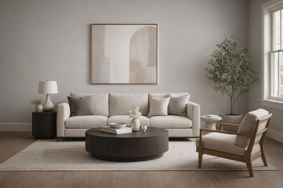
Mindful Gray begins as a neutral color on paper, then shifts with every surface, shadow and neighboring material. Its warm classification can bring a gentle glow to the color, particularly beside natural wood and softer whites. The manufacturer's description below offers one reading; the room imagery leaves space for your own.
Hex
#BCB7ADLRV
47.70
Mindful Gray's Color Strip
Mindful Gray is the second shade on this 7-color strip, sitting between Repose Gray and Dorian Gray. The strip spans from Repose Gray at the lightest end to Black Fox at the deepest. Browsing strip 244 alongside this color helps you gauge whether to go lighter, darker, or stay right here.


Mindful Gray in Rooms
Follow Mindful Gray from one space to another and watch how light, scale and surrounding materials reshape its character. 25 sourced room photos sit alongside 7 generated visualizations.
8 Living Room Photos
The room’s shift from daytime energy to evening calm can draw different notes from Mindful Gray (7016). The greige, grey hue classifications suggest the subtle directions the color may take as the room changes.
Walls in Mindful Gray wrap the living room in sophisticated neutral warmth.
@mybudgetrecipes
3 Bedroom Photos
Mindful Gray (7016) brings its neutral character into a room designed around rest, softness and retreat. Its midtone saturation keeps the color expressive without letting it dominate every surface around it.

Bedroom walls painted Mindful Gray complement soft linens and natural wood.
@mybudgetrecipes

Bedroom walls painted in Mindful Gray promote restful, peaceful atmospheres.
@sarahwilliamshome

Soft Mindful Gray walls create intimate sleeping quarters with subtle warmth.
@billopspropertiesllc
2 Kitchen Photos
2 kitchen images trace Mindful Gray (7016) through the changing light from breakfast through dinner. Its place within Living Well - Renew and Nurturer hints at the range of palettes it can inhabit.

Kitchen cabinets in Mindful Gray pair beautifully with white countertops.
@mybudgetrecipes

Kitchen walls in Mindful Gray harmonize with natural wood cabinetry.
@wifeonadime
1 Bathroom Photo
Its place within Living Well - Renew and Nurturer hints at the range of palettes it can inhabit. In this setting, let window light, mirrors and focused task lighting and tile, stone, glass, timber and metal fixtures guide the final sample decision.

Bathroom walls in Mindful Gray create a spa-like, serene retreat.
@mybudgetrecipes
1 Home Office Photo
Mindful Gray (7016) offers a starting mood rather than a finished formula: Its warm classification can feel inviting beside tactile, natural materials. Test it under daylight beside desk lamps and screen glow.

Desk nook painted Mindful Gray provides a focused workspace with natural light.
@mybudgetrecipes
1 House Photo
Viewed across 1 house image in an exterior viewed across distance, weather and the changing sky, Mindful Gray (7016) reveals how much color depends on scale, surface and shadow. An LRV of 47.7 lets the color hold its identity across both brighter and more shaded parts of the room.

Exterior siding in Mindful Gray gives the home a timeless, elegant appearance.
@mybudgetrecipes
1 Front Door Photo
Against hardware, glazing, masonry, timber and surrounding trim, Mindful Gray (7016) may feel quieter, sharper or more atmospheric than the digital swatch alone. An LRV of 47.7 lets the color hold its identity across both brighter and more shaded parts of the room.

Front door in Mindful Gray makes a refined architectural statement.
@mybudgetrecipes
7 Misc Photos
Mindful Gray (7016) offers a starting mood rather than a finished formula: Its warm classification can feel inviting beside tactile, natural materials. Test it under the varied light of hallways, corners and transitional rooms.

Shiplap wall paneling in Mindful Gray adds texture and depth.
@thatwoodworkingchick
3 Dining Room Photos
Mindful Gray (7016) can change noticeably under natural light, candles and pendant lighting. Sample it beside the finishes that will remain in the room.

Dining room walls in Mindful Gray complement traditional furniture and fixtures.
@our.marvalus.house

Wainscoting below Mindful Gray walls adds classic architectural interest.
@chiq.enierga

Dining room walls in Mindful Gray provide an elegant setting for gatherings.
@bluestarpaintproperty
5 Kitchen Cabinets Photos
Mindful Gray (7016) moves through 5 kitchen cabinets images without becoming a fixed prescription for the room. Its warm classification can feel inviting beside tactile, natural materials.

Kitchen cabinets in Mindful Gray pair beautifully with marble countertops.
@mywoodencanvas

Cabinet doors painted Mindful Gray brighten kitchens with neutral sophistication.
@mywoodencanvas

Cabinetry in Mindful Gray coordinates seamlessly with stainless steel appliances.
@mywoodencanvas

Mindful Gray cabinets add timeless elegance to contemporary kitchen layouts.
@sherryhdesigns

Cabinet fronts in Mindful Gray maximize visual space and clean lines.
@sherryhdesigns
Expert Perspectives
Articles and features from across our network of home and design sites.
Coordinating Colors


Eider White reflects far more light (LRV 73 vs 48), opening up a space where Mindful Gray encloses it.


Pearly White reflects far more light (LRV 77 vs 48), opening up a space where Mindful Gray encloses it.


At LRV 48 vs 15, Mindful Gray is decisively the brighter choice.
Trim Color
Eider White reflects far more light (LRV 73 vs 48), opening up a space where Mindful Gray encloses it.
Similar Colors

Their light reflectance is nearly identical (LRV 50 vs 48), so neither reads brighter in a room.

With LRVs of 48 and 45, the two reflect almost the same amount of light.


With LRVs of 48 and 45, the two reflect almost the same amount of light.


A 3-point LRV gap (51 vs 48) makes Roycroft Mist Gray the marginally brighter of the two.


With LRVs of 48 and 47, the two reflect almost the same amount of light.


With LRVs of 48 and 47, the two reflect almost the same amount of light.


Mindful Gray reads slightly lighter (LRV 48 vs 45), a gap that shows most in low-lit rooms.


With LRVs of 49 and 48, the two reflect almost the same amount of light.


Their light reflectance is nearly identical (LRV 48 vs 46), so neither reads brighter in a room.
Complementary Colors


At LRV 48 vs 7, Mindful Gray is decisively the brighter choice.


At LRV 69 vs 48, Starry Night is decisively the brighter choice.


Mindful Gray reflects far more light (LRV 48 vs 20), opening up a space where Soulful Blue encloses it.


Mindful Gray reflects far more light (LRV 48 vs 28), opening up a space where Dusty Heather encloses it.


Their light reflectance is nearly identical (LRV 48 vs 47), so neither reads brighter in a room.


At LRV 48 vs 3, Mindful Gray is decisively the brighter choice.

Lavender Wisp reflects far more light (LRV 83 vs 48), opening up a space where Mindful Gray encloses it.
Lighter Colors


Zircon reads slightly lighter (LRV 59 vs 48), a gap that shows most in low-lit rooms.


A 8-point LRV gap (56 vs 48) makes Fortitude the marginally brighter of the two.


Light French Gray reads slightly lighter (LRV 53 vs 48), a gap that shows most in low-lit rooms.


Knitting Needles reads slightly lighter (LRV 53 vs 48), a gap that shows most in low-lit rooms.


Silverplate reads slightly lighter (LRV 53 vs 48), a gap that shows most in low-lit rooms.
Darker Colors


At LRV 48 vs 23, Mindful Gray is decisively the brighter choice.


At LRV 48 vs 23, Mindful Gray is decisively the brighter choice.

Mindful Gray reflects far more light (LRV 48 vs 23), opening up a space where Terrain encloses it.

Mindful Gray reflects far more light (LRV 48 vs 28), opening up a space where Zeus encloses it.


At LRV 48 vs 28, Mindful Gray is decisively the brighter choice.
Color Codes
Manufacturer description
Create a warm, inviting presence in your living room with this light gray. Make this neutral pop by pairing with a cool white like Pearly White.