
Drift of Mist
Often used for its versatile and reflective qualities, Drift of Mist remains a staple for Sherwin-Williams designers. It is widely considered one of the best colors in its class to provide a clean, timeless feel that works across various lighting conditions. We've gathered 43 real-home scenarios to help you visualize this color alongside our expert data.
Hex
#DCD8D0
LRV
69.14
Drift of Mist's Color Strip
Drift of Mist is the second shade on this 7-color strip, sitting between Gossamer Veil and Gray Clouds. The strip spans from Gossamer Veil at the lightest end to Homburg Gray at the deepest. Browsing strip 238 alongside this color helps you gauge whether to go lighter, darker, or stay right here.


Drift of Mist in Real Rooms
Drift of Mist has a high LRV of 69.14 — it reflects a lot of light and will read pale and airy in most spaces. It's neutral in temperature and , making it adaptable across different lighting conditions and room orientations. Grouped in the Neutral family, the photos below show it applied in a living room, bedroom, kitchen, bathroom, home office, house, front door, kitchen cabinets, misc and dining room.
7 Living Room Photos
When applied to living room walls, Drift of Mist creates a sense of "visual quiet." It eliminates the erratic shadows found in busier spaces, instead providing a steady, rhythmic tone that ties together disparate furniture styles. It's the common thread that makes a room full of heirlooms and modern pieces feel like a cohesive collection.
Soft walls in Drift of Mist create a serene backdrop for comfortable living room seating.
@mybudgetrecipes
3 Bedroom Photos
Drift of Mist has a unique ability to make a bedroom feel larger yet more intimate at the same time. By softening the "edges" of the room, the walls seem to move back, while the warmth of the tone makes the bed feel like a safe, protected island in the center of the space.

Bedroom walls painted in Drift of Mist enhance the calm, restful atmosphere throughout the space.
@mybudgetrecipes

Accent wall in Drift of Mist adds subtle depth to this minimalist bedroom layout.
@jmn.portfolio

Headboard wall painted in Drift of Mist creates a gentle, neutral focal point for rest.
@house.candy.home
1 Kitchen Photo
For smaller kitchens, Drift of Mist can be used to create a "jewel box" effect. By painting the walls and trim in this same shade, you eliminate visual breaks, making the room feel more expansive and sophisticated despite its modest footprint.

Kitchen cabinets in Drift of Mist provide a neutral, sophisticated look for this modern cooking area.
@mybudgetrecipes
11 Bathroom Photos
For bathrooms with limited natural light, Drift of Mist provides a necessary "glow." It uses its subtle undertones to mimic the warmth of sunlight, preventing the space from feeling subterranean or overly dark, even in windowless layouts.

Vanity and wall surfaces in Drift of Mist brighten this airy bathroom with understated elegance.
@mybudgetrecipes
1 Home Office Photo
In a multi-use room where an office corner is required, Drift of Mist can be used to "zone" the desk area. By painting just that section, you create a visual boundary that separates your professional life from your personal space.

Desk area surrounded by Drift of Mist walls establishes a focused, peaceful home office environment.
@mybudgetrecipes
4 House Photos
Using Drift of Mist on an exterior allows you to be more creative with your landscaping. The color provides a dark, rich backdrop that makes the greens of boxwoods or the colors of perennials look much more vivid and professional.

Exterior siding in Drift of Mist gives this house a timeless, welcoming curb appeal.
@mybudgetrecipes

House exterior cladding in Drift of Mist blends beautifully with natural surroundings.
@nccolorguru

Exterior siding painted Drift of Mist complements traditional architectural details.
@paintflowermound

Home facade wrapped in Drift of Mist grey for timeless curb appeal.
@coastalpaintingservicesllc
1 Front Door Photo
A front door painted Drift of Mist makes a confident first impression without shouting. The color's depth draws the eye and signals personality before guests even step inside. Pair with crisp white trim and warm brass hardware to complete the look.

Front door entrance in Drift of Mist complements the neutral tones of the surrounding facade.
@mybudgetrecipes
7 Kitchen Cabinets Photos
Cabinet color commits in a way wall color doesn't — it reads from every angle and dominates the room's material palette. Drift of Mist earns that commitment. It pairs with hardware in brass, matte black, or unlacquered bronze without fighting any of them.

Cabinet doors painted in Drift of Mist complement stainless steel hardware.
@bizzylizzydesigns
6 Misc Photos
These photos show Drift of Mist in spaces that don't fit neatly into a single category: transitional spaces, accent applications, and rooms where the color becomes a fine detail rather than a broad backdrop.

Stairwell walls painted in Drift of Mist create quiet visual continuity.
@projectstray
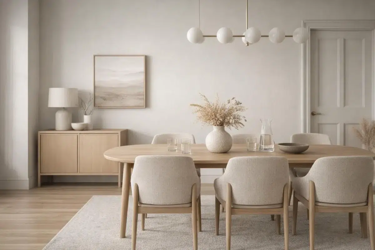
2 Dining Room Photos
In a formal dining room, Drift of Mist provides a sophisticated backdrop for artwork and large-scale mirrors. The color's depth helps to "absorb" the room's edges, making the flickering light of candles and the sparkle of glassware the stars of the show.

Dining room walls wrapped in Drift of Mist enhance intimate gatherings.
@montgomery_manor

Dining room walls in Drift of Mist complement traditional furnishings beautifully.
@threadofgoldhome
Expert Perspectives
In-depth articles and real-home features from across our network of home and design sites.
Coordinating Colors


Eider White reads slightly lighter (LRV 73 vs 69), a gap that shows most in low-lit rooms.

At LRV 69 vs 32, Drift of Mist is decisively the brighter choice.


Drift of Mist reflects far more light (LRV 69 vs 8), opening up a space where Perle Noir encloses it.
Trim Color
Eider White reads slightly lighter (LRV 73 vs 69), a gap that shows most in low-lit rooms.
Similar Colors


With LRVs of 70 and 69, the two reflect almost the same amount of light.


Their light reflectance is nearly identical (LRV 69 vs 69), so neither reads brighter in a room.

Their light reflectance is nearly identical (LRV 69 vs 69), so neither reads brighter in a room.

With LRVs of 69 and 66, the two reflect almost the same amount of light.


With LRVs of 70 and 69, the two reflect almost the same amount of light.


Their light reflectance is nearly identical (LRV 69 vs 67), so neither reads brighter in a room.


Their light reflectance is nearly identical (LRV 70 vs 69), so neither reads brighter in a room.


A 4-point LRV gap (69 vs 66) makes Drift of Mist the marginally brighter of the two.


A 4-point LRV gap (69 vs 65) makes Drift of Mist the marginally brighter of the two.


A 4-point LRV gap (73 vs 69) makes Aesthetic White the marginally brighter of the two.
Complementary Colors


At LRV 69 vs 7, Drift of Mist is decisively the brighter choice.


Their light reflectance is nearly identical (LRV 69 vs 69), so neither reads brighter in a room.


Drift of Mist reflects far more light (LRV 69 vs 20), opening up a space where Soulful Blue encloses it.


Drift of Mist reflects far more light (LRV 69 vs 28), opening up a space where Dusty Heather encloses it.


At LRV 69 vs 47, Drift of Mist is decisively the brighter choice.


At LRV 69 vs 3, Drift of Mist is decisively the brighter choice.

Lavender Wisp reflects far more light (LRV 83 vs 69), opening up a space where Drift of Mist encloses it.
Lighter Colors


A 4-point LRV gap (73 vs 69) makes Snowfall the marginally brighter of the two.


A 6-point LRV gap (75 vs 69) makes Ghosted the marginally brighter of the two.

Natural White reflects far more light (LRV 83 vs 69), opening up a space where Drift of Mist encloses it.


Lunar Lite reads slightly lighter (LRV 73 vs 69), a gap that shows most in low-lit rooms.
Their light reflectance is nearly identical (LRV 69 vs 69), so neither reads brighter in a room.
Darker Colors


A 7-point LRV gap (69 vs 62) makes Drift of Mist the marginally brighter of the two.


At LRV 69 vs 38, Drift of Mist is decisively the brighter choice.


At LRV 69 vs 45, Drift of Mist is decisively the brighter choice.


At LRV 69 vs 45, Drift of Mist is decisively the brighter choice.


Drift of Mist reflects far more light (LRV 69 vs 49), opening up a space where Jogging Path encloses it.