
Crushed Ice
There is more to Sherwin-Williams Crushed Ice (7647) than the swatch alone: its depth, undertones and setting all shape the final impression. An LRV of 65.5 places it through the middle of the scale, where color and depth can remain visible as the light changes. Because screens flatten both light and texture, sample the paint beside the finishes that will ultimately surround it.
Hex
#D6D3CCLRV
65.54
Crushed Ice's Color Strip
Crushed Ice is the sixth shade on this 7-color strip, sitting between Pediment and On The Rocks. The strip spans from Pure White at the lightest end to On The Rocks at the deepest. Strip 255 lines up the full value range so you can see exactly where this color lands among its closest relatives.


Crushed Ice in Rooms
Follow Crushed Ice from one space to another and watch how light, scale and surrounding materials reshape its character. 96 sourced room photos sit alongside 14 generated visualizations.
50 Living Room Photos
Crushed Ice (7647) brings its white character into a space shaped by conversation, quiet evenings and changing daylight. Its brighter saturation allows the hue to remain present rather than fading quietly into the background.
Walls throughout the living room glow with Crushed Ice's cool neutrality.
@mybudgetrecipes
15 Bedroom Photos
13 sourced photos are joined by 2 generated visualizations, offering both observed and imagined settings. Together they show Crushed Ice (7647) as inspiration rather than a promise of an identical result.

Bedroom walls painted in Crushed Ice create a serene retreat.
@mybudgetrecipes
3 Kitchen Photos
Crushed Ice (7647) moves through 3 kitchen images without becoming a fixed prescription for the room. Its warm classification can feel inviting beside tactile, natural materials.

Kitchen cabinets in Crushed Ice brighten the cooking space beautifully.
@mybudgetrecipes

Kitchen walls in Crushed Ice brighten the heart of the home.
@mybudgetrecipes

Kitchen cabinetry contrasts nicely with Crushed Ice painted walls.
@littlehomeonarbor
26 Bathroom Photos
Across 26 bathroom images, Crushed Ice (7647) meets window light, mirrors and focused task lighting. Its warm classification can feel inviting beside tactile, natural materials.

Bathroom vanity and walls in Crushed Ice enhance spa-like tranquility.
@mybudgetrecipes
2 Home Office Photos
Its place within 2021 Continuum and Living Well hints at the range of palettes it can inhabit. In this setting, let daylight beside desk lamps and screen glow and wood, paper, shelving and upholstered seating guide the final sample decision.

Home office walls in Crushed Ice provide a calm professional backdrop.
@mybudgetrecipes

Home office walls in Crushed Ice support focused, productive work.
@mybudgetrecipes
6 House Photos
Viewed across 6 house images in an exterior viewed across distance, weather and the changing sky, Crushed Ice (7647) reveals how much color depends on scale, surface and shadow. An LRV of 65.5 lets the color hold its identity across both brighter and more shaded parts of the room.

Exterior trim in Crushed Ice complements the home's architectural details.
@mybudgetrecipes
2 Front Door Photos
Crushed Ice (7647) moves through 2 front door images without becoming a fixed prescription for the room. Its warm classification can feel inviting beside tactile, natural materials.

Front door painted Crushed Ice offers a fresh, modern entrance.
@mybudgetrecipes

Front entrance door in Crushed Ice presents timeless curb appeal.
@mybudgetrecipes
3 Misc Photos
In an assortment of spaces that reveals the color outside a single design formula, the most interesting quality of Crushed Ice (7647) may be the way it responds to a changing mix of architectural details and personal finishes. The greige, grey hue classifications suggest the subtle directions the color may take as the room changes.

Dining room walls in Crushed Ice capture cool, refreshing architectural appeal.
@kainteriorsky

Interior walls in Crushed Ice create a calm, balanced environment.
@kate_gailey

Room walls painted in light Crushed Ice enhance natural lighting.
@teaandtapemeasure
3 Dining Room Photos
Crushed Ice (7647) moves through 3 dining room images without becoming a fixed prescription for the room. Its warm classification can feel inviting beside tactile, natural materials.

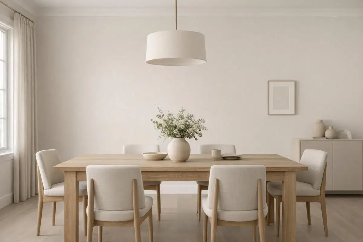
Dining room walls in Crushed Ice provide a neutral backdrop for artwork.
@teaandtapemeasure

Dining room featuring Crushed Ice walls pairs well with modern furnishings.
@whitneymichellewilliams

Dining room in Crushed Ice works beautifully with contemporary decor.
@teaandtapemeasure
Expert Perspectives
Articles and features from across our network of home and design sites.
Coordinating Colors


Extra White reflects far more light (LRV 86 vs 66), opening up a space where Crushed Ice encloses it.


Crushed Ice reflects far more light (LRV 66 vs 46), opening up a space where Magnetic Gray encloses it.


Crushed Ice reflects far more light (LRV 66 vs 23), opening up a space where Mountain Road encloses it.
Trim Color
Extra White reflects far more light (LRV 86 vs 66), opening up a space where Crushed Ice encloses it.
Similar Colors


With LRVs of 66 and 65, the two reflect almost the same amount of light.

Their light reflectance is nearly identical (LRV 66 vs 66), so neither reads brighter in a room.


Their light reflectance is nearly identical (LRV 66 vs 63), so neither reads brighter in a room.

With LRVs of 66 and 63, the two reflect almost the same amount of light.


A 4-point LRV gap (69 vs 66) makes Drift of Mist the marginally brighter of the two.


Crushed Ice reads slightly lighter (LRV 66 vs 62), a gap that shows most in low-lit rooms.

A 3-point LRV gap (66 vs 62) makes Crushed Ice the marginally brighter of the two.

Solstice reads slightly lighter (LRV 69 vs 66), a gap that shows most in low-lit rooms.


A 4-point LRV gap (66 vs 62) makes Crushed Ice the marginally brighter of the two.


With LRVs of 67 and 66, the two reflect almost the same amount of light.
Complementary Colors


Crushed Ice reflects far more light (LRV 66 vs 7), opening up a space where Sea Mariner encloses it.


Starry Night reads slightly lighter (LRV 69 vs 66), a gap that shows most in low-lit rooms.


At LRV 66 vs 20, Crushed Ice is decisively the brighter choice.


At LRV 66 vs 28, Crushed Ice is decisively the brighter choice.


Crushed Ice reflects far more light (LRV 66 vs 47), opening up a space where Lakeside encloses it.


Crushed Ice reflects far more light (LRV 66 vs 3), opening up a space where After the Storm encloses it.

At LRV 83 vs 66, Lavender Wisp is decisively the brighter choice.
Lighter Colors


A 4-point LRV gap (69 vs 66) makes First Star the marginally brighter of the two.


Snowfall reads slightly lighter (LRV 73 vs 66), a gap that shows most in low-lit rooms.


Ghosted reads slightly lighter (LRV 75 vs 66), a gap that shows most in low-lit rooms.

At LRV 83 vs 66, Natural White is decisively the brighter choice.


A 7-point LRV gap (73 vs 66) makes Lunar Lite the marginally brighter of the two.
Darker Colors

At LRV 66 vs 36, Crushed Ice is decisively the brighter choice.


Crushed Ice reflects far more light (LRV 66 vs 51), opening up a space where Roycroft Mist Gray encloses it.


At LRV 66 vs 34, Crushed Ice is decisively the brighter choice.


At LRV 66 vs 41, Crushed Ice is decisively the brighter choice.


Crushed Ice reflects far more light (LRV 66 vs 41), opening up a space where Gateway Gray encloses it.
Color Codes
Manufacturer description
Clear, bright and refreshing – this versatile hue is a must-have for minimalists. Its cool gray undertone is subtle enough to work with a variety of palettes.