
Illusive Green
Sherwin-Williams Illusive Green (9164) carries the measured structure of its color data and the less predictable beauty of paint in a finished space. Its neutral temperature leaves room for surrounding materials and light to pull the color warmer or cooler. The manufacturer's description below offers one reading; the room imagery leaves space for your own.
Hex
#92948DLRV
29.27
Illusive Green's Color Strip
Illusive Green is the fourth shade on this 7-color strip, sitting between Unusual Gray and Attitude Gray. The strip spans from Silver Strand at the lightest end to Laurel Woods at the deepest. As part of strip 237, these colors are curated to work together — helpful when you're deciding how light or deep to go.


Illusive Green in Rooms
Follow Illusive Green from one space to another and watch how light, scale and surrounding materials reshape its character. 83 sourced room photos sit alongside 7 generated visualizations.
8 Bathroom Photos
Illusive Green (9164) brings its neutral character into a compact setting where tile, fixtures and color sit close together. Its brighter saturation allows the hue to remain present rather than fading quietly into the background.
Bathroom vanity area painted Icicle brightens and refreshes the space.
@mybudgetrecipes
27 Bedroom Photos
26 sourced photos are joined by 1 generated visualization, offering both observed and imagined settings. Together they show Illusive Green (9164) as inspiration rather than a promise of an identical result.

Cabinet fronts in Illusive Green add sophisticated color to the bathroom.
@mybudgetrecipes
4 Front Door Photos
Illusive Green (9164) brings its neutral character into a small architectural moment with an outsized first impression. Its brighter saturation allows the hue to remain present rather than fading quietly into the background.

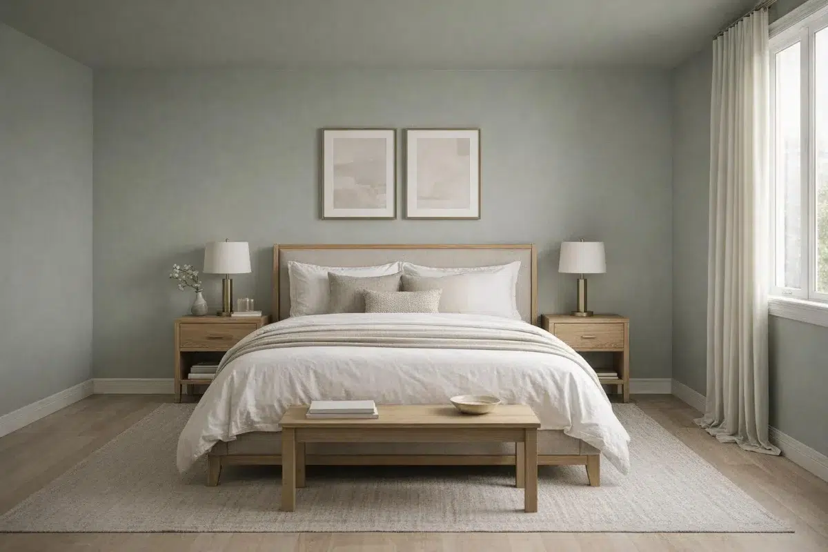
Bedroom walls dressed in Illusive Green create a serene, nature-inspired retreat.
@mybudgetrecipes

Home office walls in Illusive Green support concentration and calm productivity.
@gumdroptreehouse

Panelled accent wall in Illusive Green adds architectural texture and color.
@susiemaddoxinteriors

Front door painted in bold Illusive Green makes a confident statement.
@sparrowconstruction.co
3 Home Office Photos
These 3 home office images show how Illusive Green (9164) can sit beside wood, paper, shelving and upholstered seating. The green, grey hue classifications suggest the subtle directions the color may take as the room changes.

Front door painted Illusive Green makes a bold architectural statement.
@mybudgetrecipes

Staircase risers painted Illusive Green add understated color to vertical space.
@welcomehomestyling

Entry door finished in Illusive Green creates an inviting first impression.
@judahtherealtor_imyourguy
16 House Photos
16 house images place Illusive Green (9164) in an exterior viewed across distance, weather and the changing sky. An LRV of 29.3 lets the color hold its identity across both brighter and more shaded parts of the room.

Workspace walls in Illusive Green foster calm focus and creativity.
@mybudgetrecipes
1 Kitchen Photo
1 kitchen image trace Illusive Green (9164) through the changing light from breakfast through dinner. Its place within Nurturer hints at the range of palettes it can inhabit.

Exterior painted Illusive Green presents a striking, welcoming curb appeal.
@mybudgetrecipes
14 Living Room Photos
14 living room images place Illusive Green (9164) in a space shaped by conversation, quiet evenings and changing daylight. An LRV of 29.3 lets the color hold its identity across both brighter and more shaded parts of the room.

Kitchen walls in Illusive Green complement natural wood and stainless fixtures.
@mybudgetrecipes
2 Misc Photos
Against a changing mix of architectural details and personal finishes, Illusive Green (9164) may feel quieter, sharper or more atmospheric than the digital swatch alone. An LRV of 29.3 lets the color hold its identity across both brighter and more shaded parts of the room.

Living room accent wall in Illusive Green brings muted sophistication indoors.
@natandbeckdesign

Living room accent wall brings subtle green tones to the gathering space.
@allisonkayeinteriors
15 Kitchen Cabinets Photos
Across 15 kitchen cabinets images, Illusive Green (9164) meets light moving across doors, rails and recessed panels. Its neutral temperature gives the surrounding palette unusual influence over the final mood.

Entrance door in Illusive Green makes a sophisticated design statement.
@customcarebycaleb
Expert Perspectives
Articles and features from across our network of home and design sites.
Coordinating Colors


At LRV 74 vs 29, Reserved White is decisively the brighter choice.


Navajo White reflects far more light (LRV 73 vs 29), opening up a space where Illusive Green encloses it.


At LRV 54 vs 29, Blonde is decisively the brighter choice.
Trim Color
At LRV 74 vs 29, Reserved White is decisively the brighter choice.
Similar Colors


With LRVs of 30 and 29, the two reflect almost the same amount of light.


Their light reflectance is nearly identical (LRV 29 vs 29), so neither reads brighter in a room.


Their light reflectance is nearly identical (LRV 32 vs 29), so neither reads brighter in a room.


Their light reflectance is nearly identical (LRV 30 vs 29), so neither reads brighter in a room.


With LRVs of 30 and 29, the two reflect almost the same amount of light.


With LRVs of 32 and 29, the two reflect almost the same amount of light.


With LRVs of 31 and 29, the two reflect almost the same amount of light.


Their light reflectance is nearly identical (LRV 29 vs 29), so neither reads brighter in a room.


A 4-point LRV gap (34 vs 29) makes Bedrock the marginally brighter of the two.


A 6-point LRV gap (35 vs 29) makes Stamped Concrete the marginally brighter of the two.
Complementary Colors

Illusive Green reflects far more light (LRV 29 vs 16), opening up a space where Wood Violet encloses it.

Illusive Green reflects far more light (LRV 29 vs 12), opening up a space where Purple Passage encloses it.

At LRV 29 vs 11, Illusive Green is decisively the brighter choice.


At LRV 72 vs 29, Elation is decisively the brighter choice.


Lady's Slipper reflects far more light (LRV 76 vs 29), opening up a space where Illusive Green encloses it.


At LRV 71 vs 29, Inspired Lilac is decisively the brighter choice.


At LRV 29 vs 16, Illusive Green is decisively the brighter choice.
Lighter Colors


Chelsea Gray reflects far more light (LRV 47 vs 29), opening up a space where Illusive Green encloses it.
Their light reflectance is nearly identical (LRV 30 vs 29), so neither reads brighter in a room.


Antimony reflects far more light (LRV 57 vs 29), opening up a space where Illusive Green encloses it.


Willow Tree reads slightly lighter (LRV 41 vs 29), a gap that shows most in low-lit rooms.
Darker Colors


Illusive Green reflects far more light (LRV 29 vs 13), opening up a space where Night Owl encloses it.


A 8-point LRV gap (29 vs 21) makes Illusive Green the marginally brighter of the two.


A 6-point LRV gap (29 vs 24) makes Illusive Green the marginally brighter of the two.


At LRV 29 vs 14, Illusive Green is decisively the brighter choice.
Color Codes
Manufacturer description
This dark and pensive green is gracefully softened by cyan and gray undertones. A peaceful hue for bedrooms and home offices.