
Origami White
At first glance, Origami White belongs to the white family; in a room, light and context can make it far more elusive. With an LRV of 76, it sits on the light-reflective side of the palette and can feel especially open in generous daylight. 11 sourced room photos sit alongside 7 generated visualizations.
Hex
#E5E2DALRV
76.00
Origami White's Color Strip
Origami White is the third shade on this 7-color strip, sitting between Zurich White and Aesthetic White. The strip spans from Heron Plume at the lightest end to Windfresh White at the deepest. Strip 259 lines up the full value range so you can see exactly where this color lands among its closest relatives.


Origami White in Rooms
Follow Origami White from one space to another and watch how light, scale and surrounding materials reshape its character. 11 sourced room photos sit alongside 7 generated visualizations.
5 Living Room Photos
The 5 living room images turn a white swatch into something more spatial and expressive. Its brighter saturation allows the hue to remain present rather than fading quietly into the background.
Living room walls glow in crisp Origami White.
@mybudgetrecipes

Living room walls glow in bright Origami White.
@lifeofblissblog

Wall tones in Origami White enhance natural light.
@burge_painting_co

Living room walls showcase classic Origami White.
@burge_painting_co

Living room walls dressed in pure Origami White.
@burge_painting_co
1 Bedroom Photo
Its place within 2019 Wanderer and Cool White hints at the range of palettes it can inhabit. In this setting, let gentle morning light and low evening lamps and bed linen, timber, wool and upholstered textures guide the final sample decision.

Bedroom walls painted in clean Origami White.
@mybudgetrecipes
1 Kitchen Cabinets Photo
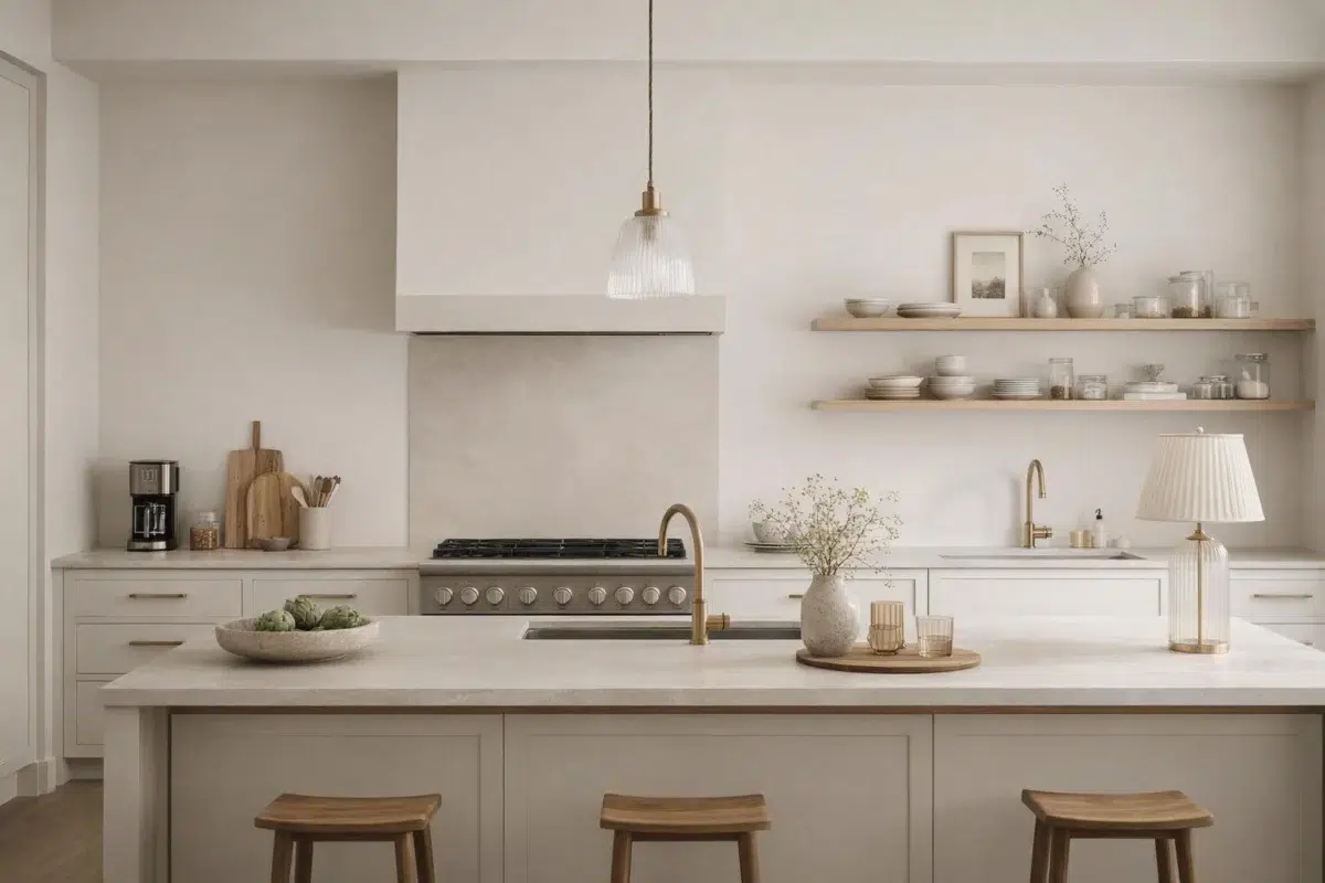
Across 1 kitchen cabinets image, Origami White (7636) meets light moving across doors, rails and recessed panels. Its warm classification can feel inviting beside tactile, natural materials.

Cabinet faces feature fresh Origami White finish.
@mybudgetrecipes
3 Bathroom Photos
The contrast between bright mornings and quieter evening light can draw different notes from Origami White (7636). The beige, greige, white hue classifications suggest the subtle directions the color may take as the room changes.

Bathroom vanity area brightened by Origami White.
@mybudgetrecipes

Bathroom walls finished in pristine Origami White.
@asterhome_

Vanity walls brightened by pure Origami White.
@revive_interiors_llc
1 Home Office Photo
1 home office image place Origami White (7636) in a focused room balancing work, concentration and comfort. Its LRV of 76 gives it a light-reflective character, though shadows and neighboring finishes can still draw out surprising depth.

Office walls provide neutral backdrop in Origami White.
@mybudgetrecipes
1 House Photo
The façade’s movement through sun, shade and season can draw different notes from Origami White (7636). The beige, greige, white hue classifications suggest the subtle directions the color may take as the room changes.

Throughout the home, walls display timeless Origami White.
@mybudgetrecipes
1 Front Door Photo
In a small architectural moment with an outsized first impression, the most interesting quality of Origami White (7636) may be the way it responds to hardware, glazing, masonry, timber and surrounding trim. The beige, greige, white hue classifications suggest the subtle directions the color may take as the room changes.

Entry door painted in classic Origami White.
@mybudgetrecipes
5 Misc Photos
5 misc images place Origami White (7636) in an assortment of spaces that reveals the color outside a single design formula. Its LRV of 76 gives it a light-reflective character, though shadows and neighboring finishes can still draw out surprising depth.

Wall color Origami White offers versatile elegance.
@lifeofblissblog

Walls throughout feature clean Origami White.
@gilbertranchhouse

Wall surfaces finished in neutral Origami White.
@urbanhausdesigns

All walls painted in luminous Origami White.
@itsbrittanyporter

Wall coverage in Origami White throughout.
@23416home
Expert Perspectives
Articles and features from across our network of home and design sites.
Coordinating Colors


At LRV 76 vs 47, Origami White is decisively the brighter choice.

Origami White reflects far more light (LRV 76 vs 22), opening up a space where Spalding Gray encloses it.
Similar Colors


With LRVs of 76 and 76, the two reflect almost the same amount of light.


With LRVs of 76 and 75, the two reflect almost the same amount of light.


With LRVs of 76 and 74, the two reflect almost the same amount of light.


With LRVs of 76 and 76, the two reflect almost the same amount of light.


Their light reflectance is nearly identical (LRV 76 vs 76), so neither reads brighter in a room.


With LRVs of 76 and 75, the two reflect almost the same amount of light.


Their light reflectance is nearly identical (LRV 76 vs 74), so neither reads brighter in a room.


Their light reflectance is nearly identical (LRV 77 vs 76), so neither reads brighter in a room.


With LRVs of 76 and 76, the two reflect almost the same amount of light.


With LRVs of 76 and 74, the two reflect almost the same amount of light.
Complementary Colors


Origami White reflects far more light (LRV 76 vs 7), opening up a space where Sea Mariner encloses it.


Origami White reads slightly lighter (LRV 76 vs 69), a gap that shows most in low-lit rooms.


At LRV 76 vs 20, Origami White is decisively the brighter choice.


At LRV 76 vs 28, Origami White is decisively the brighter choice.


Origami White reflects far more light (LRV 76 vs 3), opening up a space where After the Storm encloses it.

A 7-point LRV gap (83 vs 76) makes Lavender Wisp the marginally brighter of the two.


Origami White reflects far more light (LRV 76 vs 6), opening up a space where Charcoal Blue encloses it.
Lighter Colors

White Sand reads slightly lighter (LRV 84 vs 76), a gap that shows most in low-lit rooms.


Pure White reads slightly lighter (LRV 84 vs 76), a gap that shows most in low-lit rooms.


A 7-point LRV gap (83 vs 76) makes Snowbound the marginally brighter of the two.
With LRVs of 76 and 76, the two reflect almost the same amount of light.
Their light reflectance is nearly identical (LRV 76 vs 76), so neither reads brighter in a room.
Darker Colors

Origami White reflects far more light (LRV 76 vs 42), opening up a space where Meander encloses it.

Origami White reflects far more light (LRV 76 vs 57), opening up a space where Simple Stone encloses it.


Origami White reflects far more light (LRV 76 vs 59), opening up a space where Useful Gray encloses it.

At LRV 76 vs 45, Origami White is decisively the brighter choice.


Origami White reflects far more light (LRV 76 vs 45), opening up a space where Outrigger encloses it.
Color Codes
Manufacturer description
A clean, delicate white with cool violet undertones. Perfect for freshening up walls or making a crisp contrast with more saturated colors.