
Pearly White
Pearly White is a White paint color from Sherwin-Williams, but its character reaches beyond a single label. Its warm classification can bring a gentle glow to the color, particularly beside natural wood and softer whites. The manufacturer's description below offers one reading; the room imagery leaves space for your own.
Hex
#E8E3D9LRV
77.33
Pearly White's Color Strip
Pearly White is the second shade on this 7-color strip, sitting between Greek Villa and Ivory Lace. The strip spans from Greek Villa at the lightest end to Oyster White at the deepest. Browsing strip 254 alongside this color helps you gauge whether to go lighter, darker, or stay right here.


Pearly White in Rooms
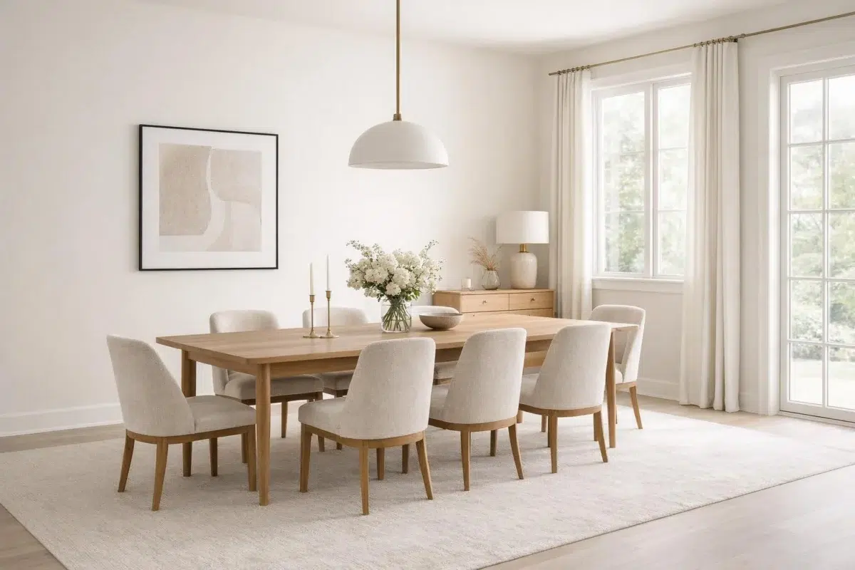
Follow Pearly White from one space to another and watch how light, scale and surrounding materials reshape its character. 28 sourced room photos sit alongside 14 generated visualizations.
9 Living Room Photos
The 9 living room images turn a white swatch into something more spatial and expressive. Its brighter saturation allows the hue to remain present rather than fading quietly into the background.
Living room walls in Pearly White brighten the space with soft luminosity.
@mybudgetrecipes
4 Bedroom Photos
Pearly White (7009) moves through 4 bedroom images without becoming a fixed prescription for the room. Its warm classification can feel inviting beside tactile, natural materials.

Bedroom painted in Pearly White creates a serene, airy retreat.
@mybudgetrecipes

Bedroom walls in Pearly White create a light, airy sanctuary.
@mybudgetrecipes

Bedroom walls in Pearly White provide restful backdrop.
@simplespacesathome

Pearly White walls create peaceful sleeping space in bedroom.
@welcomehomestyling
4 Kitchen Photos
Against stone, timber, tile and metal finishes, Pearly White (7009) may feel quieter, sharper or more atmospheric than the digital swatch alone. Its LRV of 77.3 gives it a light-reflective character, though shadows and neighboring finishes can still draw out surprising depth.

Kitchen cabinets in Pearly White provide classic, clean elegance.
@mybudgetrecipes

Kitchen cabinets in Pearly White bring timeless, classic elegance.
@mybudgetrecipes

Kitchen cabinetry finished in Pearly White brightens the workspace.
@colemanpaintingaz

Painted kitchen cabinets in Pearly White offer timeless appeal.
@thecolorconcierge
4 Bathroom Photos
4 bathroom images place Pearly White (7009) in a compact setting where tile, fixtures and color sit close together. Its LRV of 77.3 gives it a light-reflective character, though shadows and neighboring finishes can still draw out surprising depth.

Bathroom walls in Pearly White establish a fresh, spa-like atmosphere.
@mybudgetrecipes

Bathroom walls in Pearly White deliver clean, bright, modern simplicity.
@mybudgetrecipes

Bathroom walls in Pearly White maximize brightness and openness.
@sarahjanechristy

Pearly White walls make the bathroom feel spa-like and calm.
@realkarencontent
2 Home Office Photos
Pearly White (7009) can change noticeably under daylight beside desk lamps and screen glow. Sample it beside the finishes that will remain in the room.

Home office walls in Pearly White maximize natural light and clarity.
@mybudgetrecipes

Home office walls in Pearly White enhance focus and clarity.
@mybudgetrecipes
12 House Photos
The 12 house images turn a white swatch into something more spatial and expressive. Its brighter saturation allows the hue to remain present rather than fading quietly into the background.

Home exterior painted in Pearly White offers timeless, crisp curb appeal.
@mybudgetrecipes
2 Front Door Photos
2 front door images trace Pearly White (7009) through the threshold between the street and the interior. Its place within Cool White and Finest Whites hints at the range of palettes it can inhabit.

Front door finished in Pearly White makes a bright, welcoming statement.
@mybudgetrecipes

Front door in Pearly White adds classic, bright architectural interest.
@mybudgetrecipes
2 Misc Photos
Viewed across 2 misc images in an assortment of spaces that reveals the color outside a single design formula, Pearly White (7009) reveals how much color depends on scale, surface and shadow. Its LRV of 77.3 gives it a light-reflective character, though shadows and neighboring finishes can still draw out surprising depth.

Crisp Pearly White walls reflect light throughout the space.
@fosforo.studio

Hallway walls in Pearly White provide clean, neutral backdrop.
@amyfreemaninteriors
3 Kitchen Cabinets Photos
Across 3 kitchen cabinets images, Pearly White (7009) meets light moving across doors, rails and recessed panels. Its warm classification can feel inviting beside tactile, natural materials.

Cabinet doors in Pearly White provide clean kitchen storage.
@zencohomes

Kitchen cabinets painted Pearly White brighten the entire room.
@zencohomes

Cabinet base in Pearly White creates streamlined kitchen look.
@premierbuildersc
Expert Perspectives
Articles and features from across our network of home and design sites.
Coordinating Colors


Pearly White reflects far more light (LRV 77 vs 49), opening up a space where Jogging Path encloses it.


Pearly White reflects far more light (LRV 77 vs 16), opening up a space where Grapy encloses it.
Similar Colors


Their light reflectance is nearly identical (LRV 77 vs 76), so neither reads brighter in a room.


Their light reflectance is nearly identical (LRV 77 vs 76), so neither reads brighter in a room.


Their light reflectance is nearly identical (LRV 77 vs 75), so neither reads brighter in a room.


Their light reflectance is nearly identical (LRV 77 vs 75), so neither reads brighter in a room.


Their light reflectance is nearly identical (LRV 77 vs 76), so neither reads brighter in a room.


With LRVs of 77 and 76, the two reflect almost the same amount of light.


Pearly White reads slightly lighter (LRV 77 vs 74), a gap that shows most in low-lit rooms.


Their light reflectance is nearly identical (LRV 77 vs 76), so neither reads brighter in a room.


Their light reflectance is nearly identical (LRV 80 vs 77), so neither reads brighter in a room.


With LRVs of 77 and 75, the two reflect almost the same amount of light.
Complementary Colors


At LRV 77 vs 7, Pearly White is decisively the brighter choice.


A 8-point LRV gap (77 vs 69) makes Pearly White the marginally brighter of the two.


Pearly White reflects far more light (LRV 77 vs 20), opening up a space where Soulful Blue encloses it.


Pearly White reflects far more light (LRV 77 vs 28), opening up a space where Dusty Heather encloses it.


At LRV 77 vs 47, Pearly White is decisively the brighter choice.


At LRV 77 vs 3, Pearly White is decisively the brighter choice.

Lavender Wisp reads slightly lighter (LRV 83 vs 77), a gap that shows most in low-lit rooms.
Lighter Colors
Their light reflectance is nearly identical (LRV 77 vs 76), so neither reads brighter in a room.
With LRVs of 77 and 76, the two reflect almost the same amount of light.
Their light reflectance is nearly identical (LRV 77 vs 76), so neither reads brighter in a room.


A 7-point LRV gap (84 vs 77) makes Cold Foam the marginally brighter of the two.


Alabaster reads slightly lighter (LRV 82 vs 77), a gap that shows most in low-lit rooms.
Darker Colors


At LRV 77 vs 50, Pearly White is decisively the brighter choice.


Pearly White reflects far more light (LRV 77 vs 63), opening up a space where Grecian Ivory encloses it.

Pearly White reflects far more light (LRV 77 vs 54), opening up a space where Threaded Loom encloses it.

Pearly White reflects far more light (LRV 77 vs 46), opening up a space where Woolen Mittens encloses it.

Pearly White reflects far more light (LRV 77 vs 49), opening up a space where Peace of Mind encloses it.
Color Codes
Manufacturer description
Gray undertones add a cool gentleness to this bright white. Elegant on its own or a lovely way to help darker hues stand out.