
Alabaster
Alabaster is a White paint color from Sherwin-Williams, but its character reaches beyond a single label. It appears in 2016 Pura Vida, 2021 Encounter and 2022 Ephemera, plus 9 more, placing it within several distinct decorating stories rather than a single fixed look. Treat the digital swatch as an opening note, then watch a physical sample from morning light through evening lamps.
Hex
#EDEAE0LRV
82.22
Alabaster's Color Strip
Alabaster is the second shade on this 7-color strip, sitting between Pure White and Westhighland White. The strip spans from Pure White at the lightest end to On The Rocks at the deepest. Browsing strip 255 alongside this color helps you gauge whether to go lighter, darker, or stay right here.


Alabaster in Rooms
Follow Alabaster from one space to another and watch how light, scale and surrounding materials reshape its character. 98 sourced room photos sit alongside 7 generated visualizations.
23 Living Room Photos
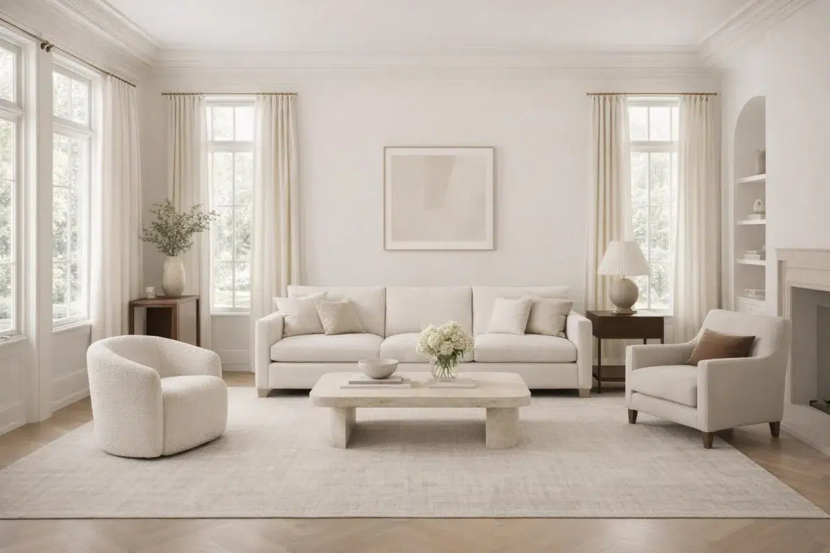
Its place within 2016 Pura Vida and 2021 Encounter hints at the range of palettes it can inhabit. In this setting, let the movement from window light to lamplight and upholstery, timber, art and metal accents guide the final sample decision.
Living room draped in Alabaster creates serene, light-filled atmosphere.
@mybudgetrecipes
22 Bedroom Photos
Viewed across 22 bedroom images in a room designed around rest, softness and retreat, Alabaster (7008) reveals how much color depends on scale, surface and shadow. Its LRV of 82.2 gives it a light-reflective character, though shadows and neighboring finishes can still draw out surprising depth.

Soft bedroom walls in Alabaster create a serene sleeping retreat.
@mybudgetrecipes
3 Kitchen Photos
2 sourced photos are joined by 1 generated visualization, offering both observed and imagined settings. Together they show Alabaster (7008) as inspiration rather than a promise of an identical result.

Kitchen cabinets painted in Alabaster brighten the cooking space.
@mybudgetrecipes

Kitchen cabinetry and walls gleam in soft Alabaster white.
@atimelessplace

Alabaster painted kitchen provides a clean, timeless backdrop.
@whybuythecowan
26 Bathroom Photos
Viewed across 26 bathroom images in a compact setting where tile, fixtures and color sit close together, Alabaster (7008) reveals how much color depends on scale, surface and shadow. Its LRV of 82.2 gives it a light-reflective character, though shadows and neighboring finishes can still draw out surprising depth.

Bathroom walls in Alabaster reflect natural light beautifully.
@mybudgetrecipes
6 Home Office Photos
Against wood, paper, shelving and upholstered seating, Alabaster (7008) may feel quieter, sharper or more atmospheric than the digital swatch alone. Its LRV of 82.2 gives it a light-reflective character, though shadows and neighboring finishes can still draw out surprising depth.

Desk in home office sits against clean Alabaster walls.
@mybudgetrecipes
1 Exterior Photo

Exterior siding in Alabaster pairs with natural landscaping.
@mybudgetrecipes
6 Front Door Photos
These 6 front door images show how Alabaster (7008) can sit beside hardware, glazing, masonry, timber and surrounding trim. The beige, greige, yellow hue classifications suggest the subtle directions the color may take as the room changes.

Front door painted Alabaster stands out against dark shutters.
@mybudgetrecipes
8 House Photos
8 house images place Alabaster (7008) in an exterior viewed across distance, weather and the changing sky. Its LRV of 82.2 gives it a light-reflective character, though shadows and neighboring finishes can still draw out surprising depth.

Slate roof contrasts beautifully with Alabaster exterior siding.
@homeimprovementdude
7 Kitchen Cabinets Photos
Across 7 kitchen cabinets images, Alabaster (7008) meets light moving across doors, rails and recessed panels. Its warm classification can feel inviting beside tactile, natural materials.

Butcher block countertop warms Alabaster kitchen cabinets.
@homeimprovementdude
3 Misc Photos
These 3 misc images show how Alabaster (7008) can sit beside a changing mix of architectural details and personal finishes. The beige, greige, yellow hue classifications suggest the subtle directions the color may take as the room changes.

Bright white Alabaster walls create a clean, minimalist bedroom backdrop.
@atimelessplace

Clean walls in soft Alabaster provide a neutral canvas for any décor.
@atimelessplace

Sherwin Williams Alabaster delivers a fresh, versatile white for modern spaces.
@atimelessplace
Expert Perspectives
Articles and features from across our network of home and design sites.
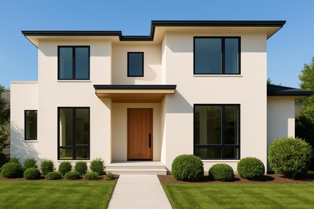
10 Stunning Houses Painted in Sherwin Williams Alabaster SW 7008: Inspiring Ideas for Your Next Makeover
Are you looking for a fresh way to brighten up your home's exterior? Sherwin Williams Alabaster SW 7008 is a timeless color that can give any house a clean, inviting look. This paint shade is loved by many homeowners for its soft, warm white tone that works well in different styles and settings. Get ready
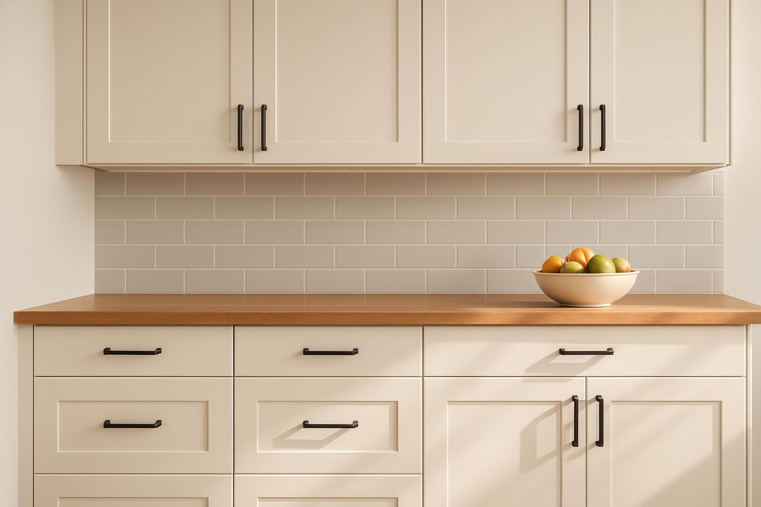
Alabaster Kitchen Cabinets - Everyday Function, Elevated
Alabaster kitchen cabinets balance everyday function with a refined, timeless look. Their soft white finish works across design styles, from modern to farmhouse, while still offering the durability needed for daily use. They elevate a kitchen by providing both practical storage and a versatile backdrop for a range of materials, colors, and finishes. This neutral
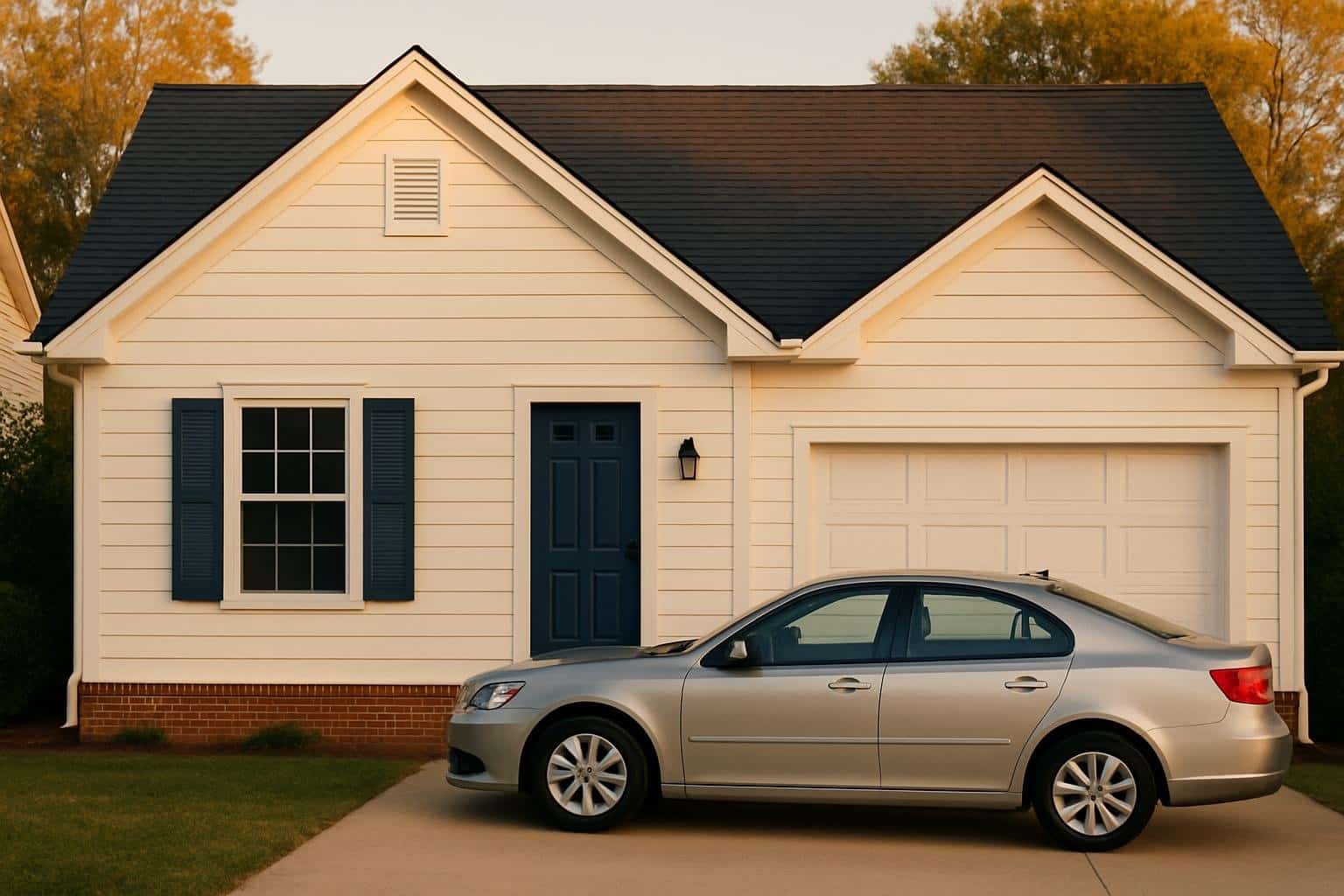
Alabaster Houses - 5 Curb Appeal Color Schemes for Timeless Style
Alabaster has become a go-to exterior color for homes because of its soft warmth and timeless appeal. It works well as a neutral backdrop, allowing accent colors and architectural details to stand out without overwhelming the design. The best way to elevate an alabaster house is by pairing it with the right color scheme that
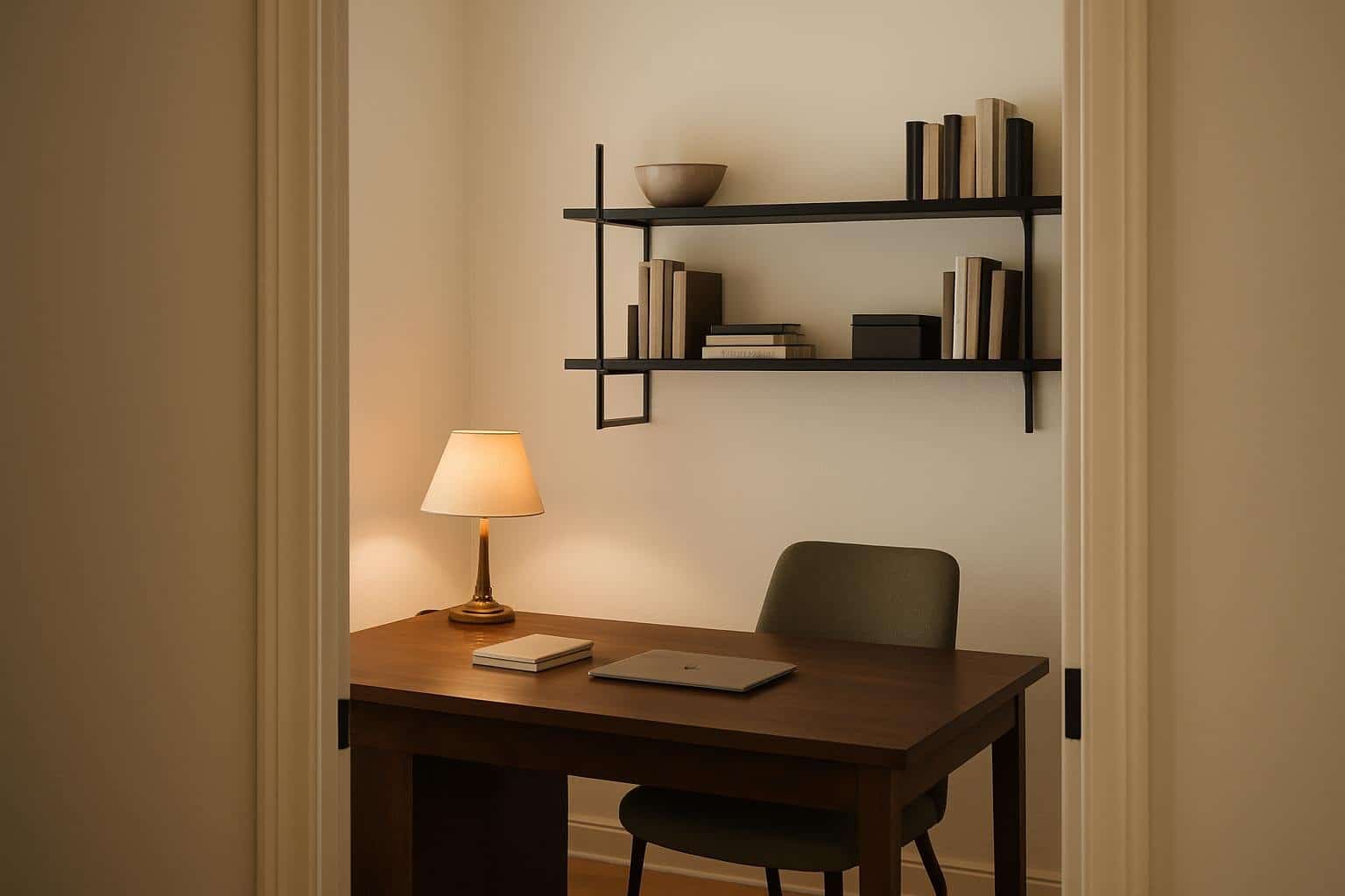
Alabaster Home Office - 5 Focused but Inviting Ideas
A home office works best when it balances focus with comfort. Too much emphasis on function can make the space feel cold, while too much emphasis on style can create distractions. The key is to design a workspace that supports productivity while still feeling inviting enough to spend long hours in. Simple choices like a
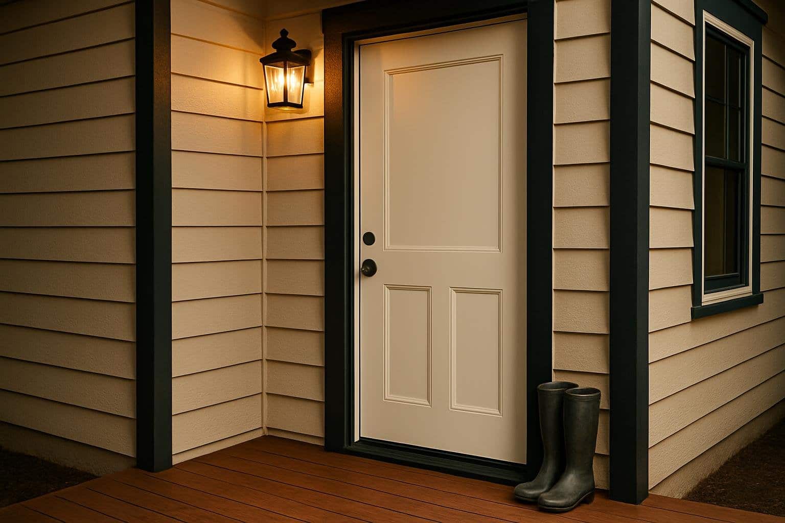
Alabaster Front Door – 5 Stylish Entryway Ideas
A front door sets the tone for the entire home, and when painted in Alabaster, it creates a warm and inviting entryway that feels timeless. An Alabaster front door offers a soft, neutral backdrop that pairs effortlessly with a wide range of siding colors and trim accents. This versatility makes it a reliable choice for
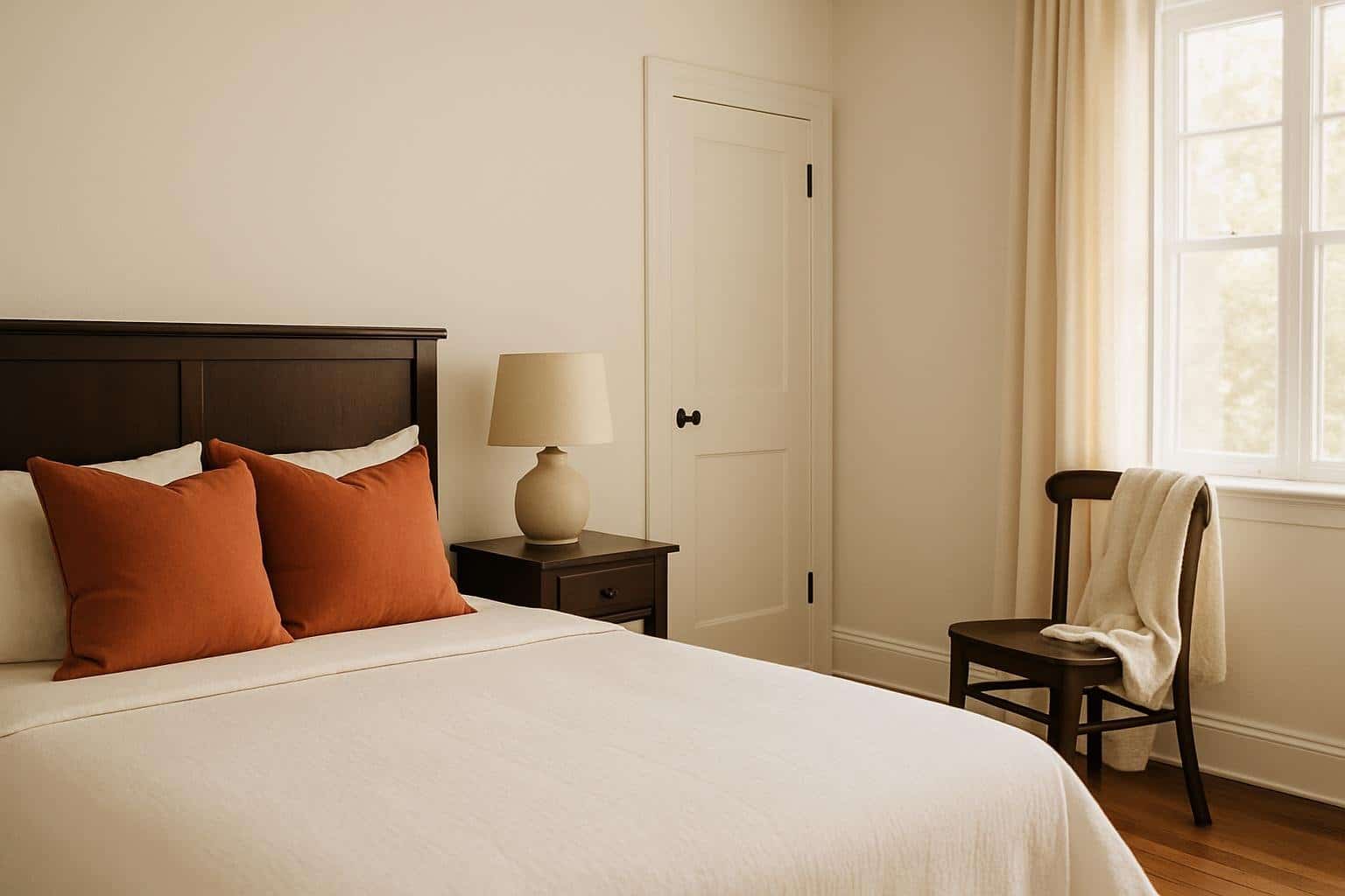
Alabaster Bedroom Ideas – 5 Inspiring Color Palettes
A bedroom should feel like a calm retreat, a place to escape the noise of the day. The colors and textures you choose can make all the difference. Alabaster offers a soft, timeless base that sets a restful tone. By starting with Alabaster, you get a versatile backdrop that supports comfort and style. You can
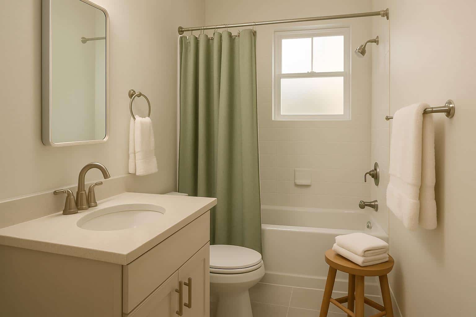
Alabaster Bathroom - 5 Ideas for a Calming Retreat
A bathroom should feel like more than a place to get ready—it can serve as a calm retreat from the pace of daily life. Choosing the right colors and finishes sets the tone for how peaceful and inviting the space becomes. When you use Alabaster walls as the base, you create a soft backdrop that
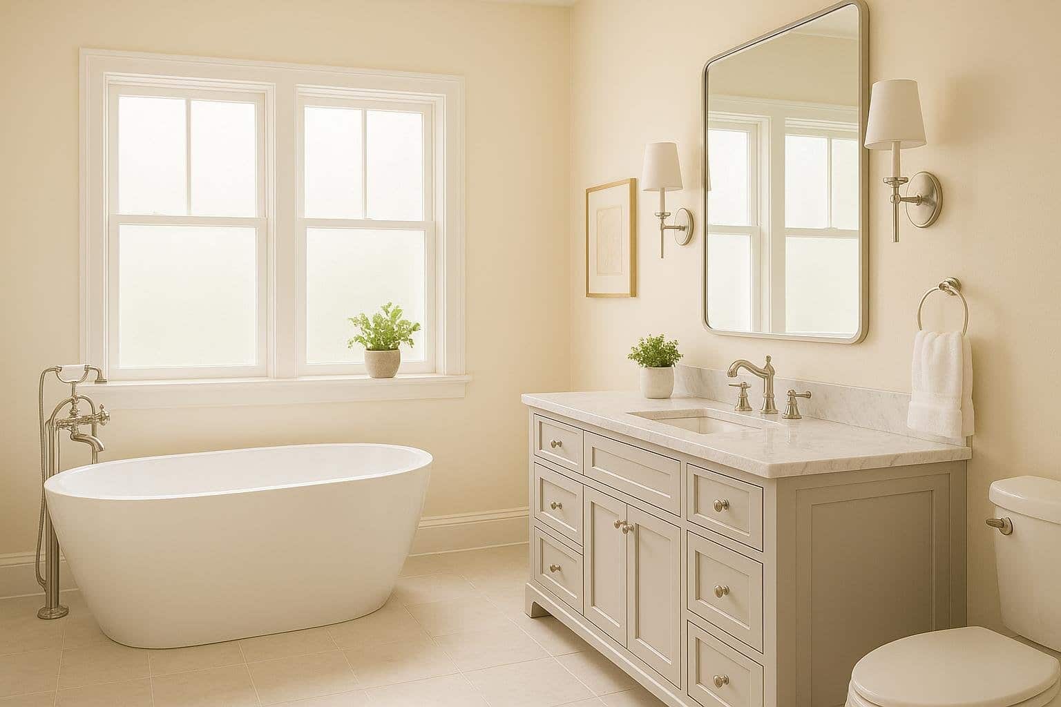
17 Gorgeous Bathrooms That Use Sherwin Williams Alabaster for a Spa-Like Feel: Transform Your Space Into a Relaxing Retreat
Creating a spa-like bathroom doesn’t require expensive renovations or luxury fixtures. Sherwin Williams Alabaster paint can transform your bathroom into a peaceful retreat with its warm, creamy white tone that feels both clean and cozy. This versatile paint color works beautifully with many design styles and materials. You’ll discover how Alabaster pairs with natural wood,
Alabaster by Sherwin Williams SW 7008: The Perfect Soft White for Your Home in 2025
Looking for the perfect white paint? Sherwin Williams Alabaster (SW 7008) might be just what you need. This popular shade offers the brightness of white while maintaining a warm, cozy feel that works in any space. With a high Light Reflectance Value of 82, Alabaster reflects plenty of light back into your room, making spaces
Coordinating Colors


Alabaster reflects far more light (LRV 82 vs 42), opening up a space where Townhall Tan encloses it.


At LRV 82 vs 54, Alabaster is decisively the brighter choice.
Similar Colors


With LRVs of 84 and 82, the two reflect almost the same amount of light.


Their light reflectance is nearly identical (LRV 83 vs 82), so neither reads brighter in a room.


With LRVs of 82 and 82, the two reflect almost the same amount of light.


A 4-point LRV gap (86 vs 82) makes Westhighland White the marginally brighter of the two.


A 4-point LRV gap (87 vs 82) makes White Flour the marginally brighter of the two.


Alabaster reads slightly lighter (LRV 82 vs 77), a gap that shows most in low-lit rooms.


Complementary Colors


At LRV 82 vs 7, Alabaster is decisively the brighter choice.


At LRV 82 vs 69, Alabaster is decisively the brighter choice.


Alabaster reflects far more light (LRV 82 vs 20), opening up a space where Soulful Blue encloses it.


Alabaster reflects far more light (LRV 82 vs 28), opening up a space where Dusty Heather encloses it.


At LRV 82 vs 3, Alabaster is decisively the brighter choice.

With LRVs of 83 and 82, the two reflect almost the same amount of light.


At LRV 82 vs 6, Alabaster is decisively the brighter choice.
Lighter Colors


White Snow reads slightly lighter (LRV 90 vs 82), a gap that shows most in low-lit rooms.
With LRVs of 82 and 82, the two reflect almost the same amount of light.
With LRVs of 84 and 82, the two reflect almost the same amount of light.
Darker Colors


Alabaster reflects far more light (LRV 82 vs 51), opening up a space where Lemongrass encloses it.


Alabaster reads slightly lighter (LRV 82 vs 73), a gap that shows most in low-lit rooms.


A 9-point LRV gap (82 vs 73) makes Alabaster the marginally brighter of the two.


Alabaster reads slightly lighter (LRV 82 vs 74), a gap that shows most in low-lit rooms.
Color Codes
Manufacturer description
When you want the brightness of a white without sacrificing a warm coziness, try this soft, warm but balanced white. And turn up the peaceful.
Attributed to Sherwin-Williams catalog data.