
Antique Red
Antique Red is a Red paint color from Sherwin-Williams, but its character reaches beyond a single label. Its pink and red classifications hint at the directions it may take as daylight, lamps and neighboring colors move around it. The manufacturer's description below offers one reading; the room imagery leaves space for your own.
Hex
#9F4442LRV
11.89
Antique Red's Color Strip
Antique Red is the seventh shade on this 7-color strip, the deepest shade in this coordinated family. Strip 107 makes it easy to compare shades side by side and find the right depth for your space.


Antique Red in Rooms
Follow Antique Red from one space to another and watch how light, scale and surrounding materials reshape its character. 10 generated visualizations explore how the color might shape a finished room.
1 Dining Room Photo
The room’s change from everyday meals to evening occasions can draw different notes from Antique Red (7587). The pink, red hue classifications suggest the subtle directions the color may take as the room changes.
Antique Red paint in a boho dining room
@mybudgetrecipes
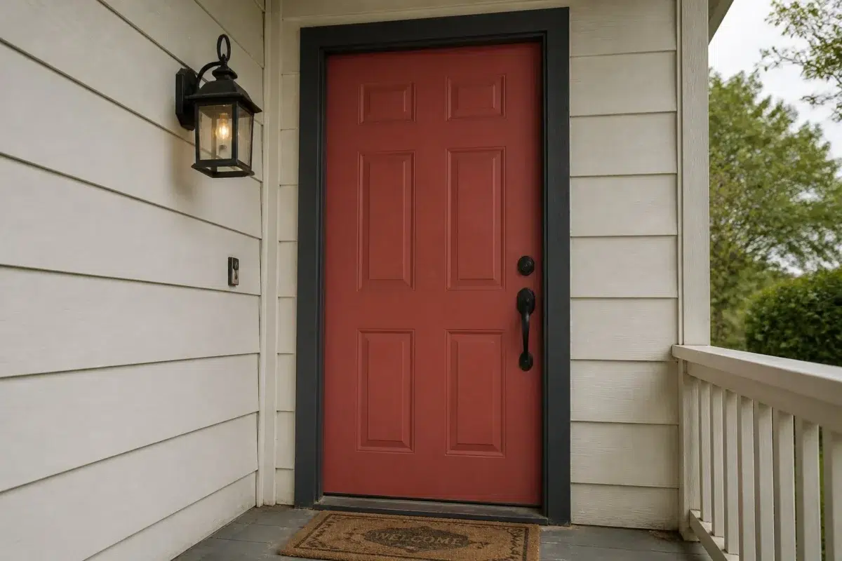
1 Front Door Photo
The threshold between the street and the interior can draw different notes from Antique Red (7587). The pink, red hue classifications suggest the subtle directions the color may take as the room changes.

bold front door featuring Antique Red by Sherwin-Williams
@mybudgetrecipes
1 Home Office Photo
Across 1 home office image, Antique Red (7587) meets daylight beside desk lamps and screen glow. Its warm classification can feel inviting beside tactile, natural materials.

Sherwin-Williams Antique Red in a mid century home office
@mybudgetrecipes
1 Bathroom Photo
These 1 bathroom image show how Antique Red (7587) can sit beside tile, stone, glass, timber and metal fixtures. The pink, red hue classifications suggest the subtle directions the color may take as the room changes.

Antique Red — minimalist bathroom
@mybudgetrecipes
1 Bedroom Photo
Antique Red (7587) brings its red character into a room designed around rest, softness and retreat. Its brighter saturation allows the hue to remain present rather than fading quietly into the background.

A cozy bedroom painted in Antique Red
@mybudgetrecipes
1 Living Room Photo
1 living room image trace Antique Red (7587) through the room’s shift from daytime energy to evening calm. The pink, red hue classifications suggest the subtle directions the color may take as the room changes.

A organic modern living room painted in Antique Red
@mybudgetrecipes
1 Mudroom Photo
Viewed across 1 mudroom image in a practical threshold where the outdoors enters the home, Antique Red (7587) reveals how much color depends on scale, surface and shadow. With an LRV of 11.9, it carries enough visual weight to make light, trim and texture feel especially deliberate.

Antique Red paint in a rustic modern mudroom
@mybudgetrecipes
1 Patio Photo
Across 1 patio image, Antique Red (7587) meets direct sun, reflected daylight and deep exterior shade. Its warm classification can feel inviting beside tactile, natural materials.

wabi-sabi patio featuring Antique Red by Sherwin-Williams
@mybudgetrecipes
1 House Photo
Antique Red (7587) can change noticeably under full daylight, cloud cover and long evening shadows. Sample it beside the finishes that will remain in the room.

Antique Red color — eclectic house inspiration
@mybudgetrecipes
1 Kitchen Photo
The changing light from breakfast through dinner can draw different notes from Antique Red (7587). The pink, red hue classifications suggest the subtle directions the color may take as the room changes.

Antique Red — minimalist kitchen
@mybudgetrecipes
Expert Perspectives
Articles and features from across our network of home and design sites.
Coordinating Colors


Intimate White reflects far more light (LRV 77 vs 12), opening up a space where Antique Red encloses it.


Moderate White reflects far more light (LRV 74 vs 12), opening up a space where Antique Red encloses it.


Calico reflects far more light (LRV 35 vs 12), opening up a space where Antique Red encloses it.
Trim Color
Intimate White reflects far more light (LRV 77 vs 12), opening up a space where Antique Red encloses it.
Similar Colors

Their light reflectance is nearly identical (LRV 12 vs 10), so neither reads brighter in a room.


Their light reflectance is nearly identical (LRV 12 vs 11), so neither reads brighter in a room.


Their light reflectance is nearly identical (LRV 13 vs 12), so neither reads brighter in a room.

Their light reflectance is nearly identical (LRV 12 vs 11), so neither reads brighter in a room.


With LRVs of 14 and 12, the two reflect almost the same amount of light.


With LRVs of 12 and 11, the two reflect almost the same amount of light.

With LRVs of 13 and 12, the two reflect almost the same amount of light.

Their light reflectance is nearly identical (LRV 14 vs 12), so neither reads brighter in a room.


With LRVs of 12 and 9, the two reflect almost the same amount of light.


With LRVs of 12 and 10, the two reflect almost the same amount of light.
Complementary Colors


At LRV 73 vs 12, Mountain Air is decisively the brighter choice.


At LRV 53 vs 12, Niebla Azul is decisively the brighter choice.


Silver Lake reflects far more light (LRV 53 vs 12), opening up a space where Antique Red encloses it.


Riverway reads slightly lighter (LRV 16 vs 12), a gap that shows most in low-lit rooms.


Glass Bead reflects far more light (LRV 77 vs 12), opening up a space where Antique Red encloses it.


At LRV 29 vs 12, Morning at Sea is decisively the brighter choice.


A 6-point LRV gap (12 vs 6) makes Antique Red the marginally brighter of the two.
Lighter Colors

Reddish reads slightly lighter (LRV 21 vs 12), a gap that shows most in low-lit rooms.
Their light reflectance is nearly identical (LRV 13 vs 12), so neither reads brighter in a room.


A 8-point LRV gap (20 vs 12) makes Henna Shade the marginally brighter of the two.


Coral Rose reflects far more light (LRV 28 vs 12), opening up a space where Antique Red encloses it.


Coral Clay reflects far more light (LRV 26 vs 12), opening up a space where Antique Red encloses it.
Darker Colors


A 5-point LRV gap (12 vs 7) makes Antique Red the marginally brighter of the two.


A 5-point LRV gap (12 vs 7) makes Antique Red the marginally brighter of the two.


A 7-point LRV gap (12 vs 5) makes Antique Red the marginally brighter of the two.


Antique Red reads slightly lighter (LRV 12 vs 7), a gap that shows most in low-lit rooms.
Color Codes
Manufacturer description
This deep, saturated red glows with the warmth of aged brick and candlelit corridors, evoking the richness of old-world elegance and timeless sophistication. Perfect for dining rooms or studies, its bright undertones create an intimate, inviting atmosphere that draws people together while maintaining an air of refined drama.