
Antiquity
Sherwin-Williams's Antiquity is a yellow shade whose quieter details emerge through comparison. Its midtone saturation balances color with restraint, so the hue can register without overwhelming nearby finishes. Because screens flatten both light and texture, sample the paint beside the finishes that will ultimately surround it.
Hex
#C2A462LRV
38.90
Antiquity's Color Strip
Antiquity is the fourth shade on this 7-color strip, sitting between Independent Gold and Escapade Gold. The strip spans from Lucent Yellow at the lightest end to Fervent Brass at the deepest. Color strip 143 groups these shades together so you can see how each reads next to its neighbors.


Antiquity in Rooms
Follow Antiquity from one space to another and watch how light, scale and surrounding materials reshape its character. 10 generated visualizations explore how the color might shape a finished room.
1 Dining Room Photo
Antiquity (6402) moves through 1 dining room image without becoming a fixed prescription for the room. Its warm classification can feel inviting beside tactile, natural materials.
Antiquity paint in a moody dining room
@mybudgetrecipes
1 Bedroom Photo
1 bedroom image trace Antiquity (6402) through the slower pace of morning and night. Its place within 2015 Voyage and Retro Revival hints at the range of palettes it can inhabit.

A scandinavian bedroom painted in Antiquity
@mybudgetrecipes
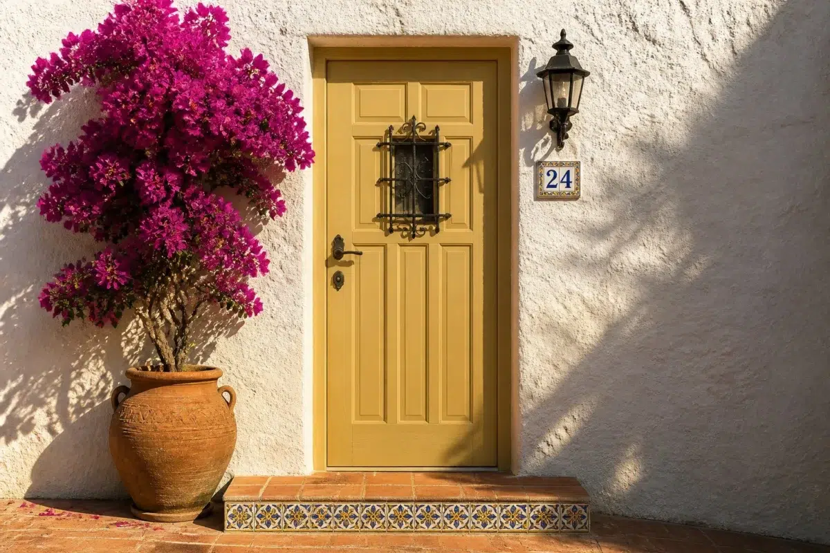
1 Front Door Photo
1 front door image place Antiquity (6402) in a small architectural moment with an outsized first impression. An LRV of 38.9 lets the color hold its identity across both brighter and more shaded parts of the room.

mediterranean front door featuring Antiquity by Sherwin-Williams
@mybudgetrecipes
1 Home Office Photo
1 home office image trace Antiquity (6402) through the transition between focused work and the rest of the home. Its place within 2015 Voyage and Retro Revival hints at the range of palettes it can inhabit.

Sherwin-Williams Antiquity in a minimalist home office
@mybudgetrecipes
1 Bathroom Photo
Viewed across 1 bathroom image in a compact setting where tile, fixtures and color sit close together, Antiquity (6402) reveals how much color depends on scale, surface and shadow. An LRV of 38.9 lets the color hold its identity across both brighter and more shaded parts of the room.

Antiquity — industrial bathroom
@mybudgetrecipes
1 Mudroom Photo
The 1 mudroom image turn a yellow swatch into something more spatial and expressive. Its midtone saturation keeps the color expressive without letting it dominate every surface around it.

Antiquity paint in a earthy mudroom
@mybudgetrecipes
1 House Photo
In an exterior viewed across distance, weather and the changing sky, the most interesting quality of Antiquity (6402) may be the way it responds to roofing, masonry, timber, planting and trim. The beige hue classifications suggest the subtle directions the color may take as the room changes.

Antiquity color — modern luxury house inspiration
@mybudgetrecipes
1 Kitchen Photo
These 1 kitchen image show how Antiquity (6402) can sit beside stone, timber, tile and metal finishes. The beige hue classifications suggest the subtle directions the color may take as the room changes.

Antiquity — minimalist kitchen
@mybudgetrecipes
1 Patio Photo
In an outdoor room surrounded by sky, planting and open light, the most interesting quality of Antiquity (6402) may be the way it responds to stone, timber, metal, textiles and greenery. The beige hue classifications suggest the subtle directions the color may take as the room changes.

coastal patio featuring Antiquity by Sherwin-Williams
@mybudgetrecipes
1 Living Room Photo
Antiquity (6402) offers a starting mood rather than a finished formula: Its warm classification can feel inviting beside tactile, natural materials. Test it under the movement from window light to lamplight.

A cozy living room painted in Antiquity
@mybudgetrecipes
Expert Perspectives
Articles and features from across our network of home and design sites.
Coordinating Colors


Lemon Meringue reflects far more light (LRV 83 vs 39), opening up a space where Antiquity encloses it.


At LRV 39 vs 9, Antiquity is decisively the brighter choice.
Trim Color
Similar Colors


A 5-point LRV gap (39 vs 34) makes Antiquity the marginally brighter of the two.

Their light reflectance is nearly identical (LRV 40 vs 39), so neither reads brighter in a room.


Their light reflectance is nearly identical (LRV 40 vs 39), so neither reads brighter in a room.


Antiquity reads slightly lighter (LRV 39 vs 35), a gap that shows most in low-lit rooms.


Their light reflectance is nearly identical (LRV 39 vs 37), so neither reads brighter in a room.


Tarnished Trumpet reads slightly lighter (LRV 47 vs 39), a gap that shows most in low-lit rooms.


Downing Straw reads slightly lighter (LRV 43 vs 39), a gap that shows most in low-lit rooms.


Antiquity reads slightly lighter (LRV 39 vs 32), a gap that shows most in low-lit rooms.
Complementary Colors


Antiquity reflects far more light (LRV 39 vs 7), opening up a space where Sea Mariner encloses it.


Starry Night reflects far more light (LRV 69 vs 39), opening up a space where Antiquity encloses it.


At LRV 39 vs 20, Antiquity is decisively the brighter choice.


A 11-point LRV gap (39 vs 28) makes Antiquity the marginally brighter of the two.


Antiquity reflects far more light (LRV 39 vs 3), opening up a space where After the Storm encloses it.

At LRV 83 vs 39, Lavender Wisp is decisively the brighter choice.
Lighter Colors
Antiquity reads slightly lighter (LRV 39 vs 35), a gap that shows most in low-lit rooms.


A 7-point LRV gap (46 vs 39) makes Cool Avocado the marginally brighter of the two.


Dromedary Camel reads slightly lighter (LRV 44 vs 39), a gap that shows most in low-lit rooms.


Darker Colors


Antiquity reflects far more light (LRV 39 vs 20), opening up a space where Fervent Brass encloses it.


Antiquity reads slightly lighter (LRV 39 vs 32), a gap that shows most in low-lit rooms.


A 5-point LRV gap (39 vs 34) makes Antiquity the marginally brighter of the two.
Color Codes
Manufacturer description
This warm, muted golden yellow evokes the patina of aged manuscript pages and candlelit library corners, with earthy undertones that feel both nostalgic and grounded. Perfect for studies, dining rooms, or accent walls where you want to introduce warmth without overwhelming the senses.