
Audrey's Blush
At first glance, Audrey's Blush belongs to the red family; in a room, light and context can make it far more elusive. Its midtone saturation balances color with restraint, so the hue can register without overwhelming nearby finishes. Because screens flatten both light and texture, sample the paint beside the finishes that will ultimately surround it.
Hex
#AE8087LRV
26.25
Audrey's Blush's Color Strip
Audrey's Blush is the fourth shade on this 7-color strip, sitting between Rose Embroidery and Concerto. The strip spans from Demure at the lightest end to Burgundy at the deepest. Strip 110 lines up the full value range so you can see exactly where this color lands among its closest relatives.


Audrey's Blush in Rooms
Follow Audrey's Blush from one space to another and watch how light, scale and surrounding materials reshape its character. 10 generated visualizations explore how the color might shape a finished room.
1 Front Door Photo
1 generated visualization explores how the color might shape the finished space. Together they show Audrey's Blush (9001) as inspiration rather than a promise of an identical result.
scandinavian front door featuring Audrey's Blush by Sherwin-Williams
@mybudgetrecipes
1 Home Office Photo
Audrey's Blush (9001) offers a starting mood rather than a finished formula: Its warm classification can feel inviting beside tactile, natural materials. Test it under daylight beside desk lamps and screen glow.

Sherwin-Williams Audrey's Blush in a unique home office
@mybudgetrecipes
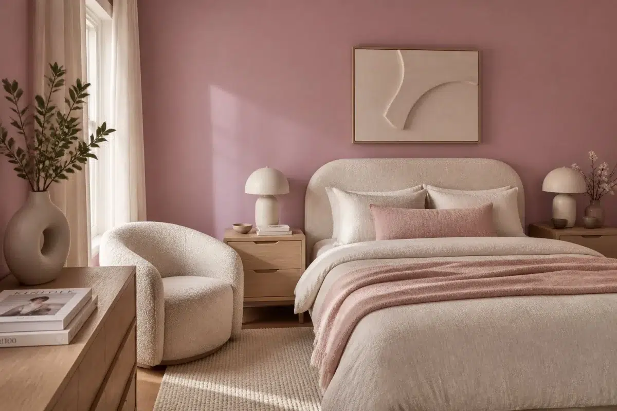
1 Bedroom Photo
The 1 bedroom image turn a red swatch into something more spatial and expressive. Its midtone saturation keeps the color expressive without letting it dominate every surface around it.

A organic modern bedroom painted in Audrey's Blush
@mybudgetrecipes
1 Dining Room Photo
These 1 dining room image show how Audrey's Blush (9001) can sit beside timber, table linen, glass and artwork. The pink hue classifications suggest the subtle directions the color may take as the room changes.

Audrey's Blush paint in a boho dining room
@mybudgetrecipes
1 Bathroom Photo
Audrey's Blush (9001) offers a starting mood rather than a finished formula: Its warm classification can feel inviting beside tactile, natural materials. Test it under window light, mirrors and focused task lighting.

Audrey's Blush — wabi-sabi bathroom
@mybudgetrecipes
1 Kitchen Photo
Audrey's Blush (9001) brings its red character into a hardworking room where color meets movement and strong surfaces. Its midtone saturation keeps the color expressive without letting it dominate every surface around it.

Audrey's Blush — modern luxury kitchen
@mybudgetrecipes
1 Mudroom Photo
1 mudroom image trace Audrey's Blush (9001) through the daily movement of arrivals, departures and changing weather. The pink hue classifications suggest the subtle directions the color may take as the room changes.

Audrey's Blush paint in a coastal mudroom
@mybudgetrecipes
1 Living Room Photo
Audrey's Blush (9001) can change noticeably under the movement from window light to lamplight. Sample it beside the finishes that will remain in the room.

A minimalist living room painted in Audrey's Blush
@mybudgetrecipes
1 House Photo
1 house image trace Audrey's Blush (9001) through the façade’s movement through sun, shade and season. The pink hue classifications suggest the subtle directions the color may take as the room changes.

Audrey's Blush color — rustic modern house inspiration
@mybudgetrecipes
1 Patio Photo
1 patio image trace Audrey's Blush (9001) through the broad shift from bright afternoon to dusk. The pink hue classifications suggest the subtle directions the color may take as the room changes.

contemporary patio featuring Audrey's Blush by Sherwin-Williams
@mybudgetrecipes
Expert Perspectives
Articles and features from across our network of home and design sites.
Coordinating Colors


At LRV 84 vs 26, Ibis White is decisively the brighter choice.


At LRV 81 vs 26, Creamy is decisively the brighter choice.


Utterly Beige reflects far more light (LRV 39 vs 26), opening up a space where Audrey's Blush encloses it.
Trim Color
At LRV 84 vs 26, Ibis White is decisively the brighter choice.
Similar Colors

Their light reflectance is nearly identical (LRV 26 vs 23), so neither reads brighter in a room.


A 4-point LRV gap (26 vs 22) makes Audrey's Blush the marginally brighter of the two.

Their light reflectance is nearly identical (LRV 27 vs 26), so neither reads brighter in a room.

With LRVs of 26 and 24, the two reflect almost the same amount of light.


A 4-point LRV gap (30 vs 26) makes Thistle the marginally brighter of the two.

With LRVs of 26 and 24, the two reflect almost the same amount of light.


With LRVs of 27 and 26, the two reflect almost the same amount of light.


Pressed Flower reads slightly lighter (LRV 35 vs 26), a gap that shows most in low-lit rooms.

Audrey's Blush reads slightly lighter (LRV 26 vs 20), a gap that shows most in low-lit rooms.

A 8-point LRV gap (34 vs 26) makes Rose the marginally brighter of the two.
Complementary Colors


Mountain Air reflects far more light (LRV 73 vs 26), opening up a space where Audrey's Blush encloses it.


Niebla Azul reflects far more light (LRV 53 vs 26), opening up a space where Audrey's Blush encloses it.


At LRV 53 vs 26, Silver Lake is decisively the brighter choice.


A 11-point LRV gap (26 vs 16) makes Audrey's Blush the marginally brighter of the two.


A 8-point LRV gap (35 vs 26) makes Calico the marginally brighter of the two.


Topsail reflects far more light (LRV 75 vs 26), opening up a space where Audrey's Blush encloses it.


Tradewind reflects far more light (LRV 61 vs 26), opening up a space where Audrey's Blush encloses it.
Lighter Colors


A 11-point LRV gap (37 vs 26) makes Orchid the marginally brighter of the two.


Delightful reflects far more light (LRV 51 vs 26), opening up a space where Audrey's Blush encloses it.


Rose Embroidery reflects far more light (LRV 39 vs 26), opening up a space where Audrey's Blush encloses it.


At LRV 55 vs 26, Fading Rose is decisively the brighter choice.
Darker Colors


A 7-point LRV gap (26 vs 19) makes Audrey's Blush the marginally brighter of the two.

Audrey's Blush reads slightly lighter (LRV 26 vs 15), a gap that shows most in low-lit rooms.


At LRV 26 vs 13, Audrey's Blush is decisively the brighter choice.
A 4-point LRV gap (26 vs 22) makes Audrey's Blush the marginally brighter of the two.


Audrey's Blush reflects far more light (LRV 26 vs 12), opening up a space where Alaea encloses it.
Color Codes
Manufacturer description
This sophisticated rose-red with warm coral undertones evokes the delicate flush of romance and understated elegance. Perfect for a bedroom or dining room, it pairs beautifully with cream, gold accents, and warm wood tones for a refined, intimate atmosphere.