
Carley's Rose
Carley's Rose is a Red paint color from Sherwin-Williams, but its character reaches beyond a single label. Its warm classification can bring a gentle glow to the color, particularly beside natural wood and softer whites. Treat the digital swatch as an opening note, then watch a physical sample from morning light through evening lamps.
Hex
#A87376LRV
21.94
Carley's Rose's Color Strip
Carley's Rose is the fourth shade on this 7-color strip, sitting between Pressed Flower and Rambling Rose. The strip spans from Innocence at the lightest end to Fine Wine at the deepest. As part of strip 111, these colors are curated to work together — helpful when you're deciding how light or deep to go.


Carley's Rose in Rooms
Follow Carley's Rose from one space to another and watch how light, scale and surrounding materials reshape its character. 10 generated visualizations explore how the color might shape a finished room.
1 Dining Room Photo
Carley's Rose (9002) brings its red character into a gathering space that can move from daylight to ceremony. Its midtone saturation keeps the color expressive without letting it dominate every surface around it.
Carley's Rose paint in a contemporary dining room
@mybudgetrecipes
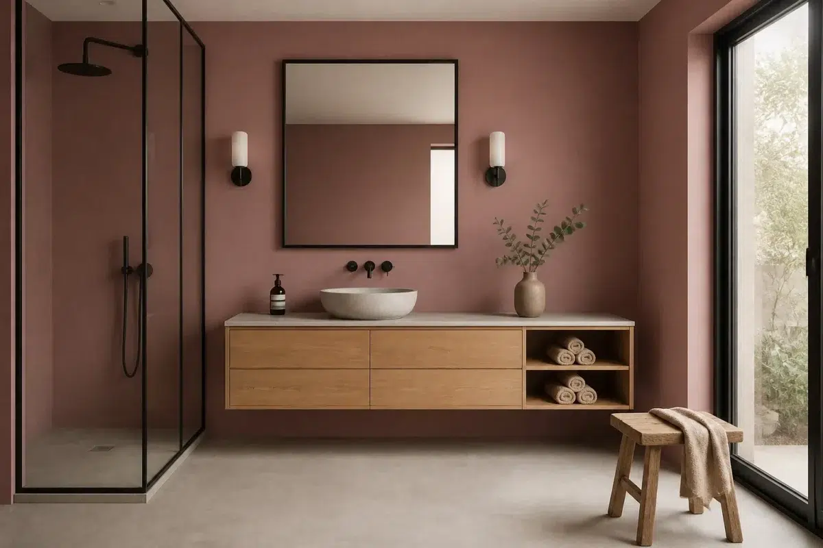
1 Bathroom Photo
Carley's Rose (9002) brings its red character into a compact setting where tile, fixtures and color sit close together. Its midtone saturation keeps the color expressive without letting it dominate every surface around it.

Carley's Rose — japandi bathroom
@mybudgetrecipes
1 Home Office Photo
Carley's Rose (9002) can change noticeably under daylight beside desk lamps and screen glow. Sample it beside the finishes that will remain in the room.

Sherwin-Williams Carley's Rose in a warm home office
@mybudgetrecipes
1 Bedroom Photo
1 bedroom image trace Carley's Rose (9002) through the slower pace of morning and night. Its place within West Elm hints at the range of palettes it can inhabit.

A scandinavian bedroom painted in Carley's Rose
@mybudgetrecipes
1 Front Door Photo
The threshold between the street and the interior can draw different notes from Carley's Rose (9002). The pink hue classifications suggest the subtle directions the color may take as the room changes.

bold front door featuring Carley's Rose by Sherwin-Williams
@mybudgetrecipes
1 Kitchen Photo
These 1 kitchen image show how Carley's Rose (9002) can sit beside stone, timber, tile and metal finishes. The pink hue classifications suggest the subtle directions the color may take as the room changes.

Carley's Rose — industrial kitchen
@mybudgetrecipes
1 House Photo
Carley's Rose (9002) brings its red character into an exterior viewed across distance, weather and the changing sky. Its midtone saturation keeps the color expressive without letting it dominate every surface around it.

Carley's Rose color — transitional house inspiration
@mybudgetrecipes
1 Mudroom Photo
The 1 mudroom image turn a red swatch into something more spatial and expressive. Its midtone saturation keeps the color expressive without letting it dominate every surface around it.

Carley's Rose paint in a traditional mudroom
@mybudgetrecipes
1 Patio Photo
1 generated visualization explores how the color might shape the finished space. Together they show Carley's Rose (9002) as inspiration rather than a promise of an identical result.

warm patio featuring Carley's Rose by Sherwin-Williams
@mybudgetrecipes
1 Living Room Photo
1 living room image trace Carley's Rose (9002) through the room’s shift from daytime energy to evening calm. Its place within West Elm hints at the range of palettes it can inhabit.

A hollywood regency living room painted in Carley's Rose
@mybudgetrecipes
Expert Perspectives
Articles and features from across our network of home and design sites.
Coordinating Colors


Ibis White reflects far more light (LRV 84 vs 22), opening up a space where Carley's Rose encloses it.


At LRV 83 vs 22, Dover White is decisively the brighter choice.


At LRV 59 vs 22, Useful Gray is decisively the brighter choice.
Trim Color
Ibis White reflects far more light (LRV 84 vs 22), opening up a space where Carley's Rose encloses it.
Similar Colors

With LRVs of 23 and 22, the two reflect almost the same amount of light.


A 3-point LRV gap (22 vs 19) makes Carley's Rose the marginally brighter of the two.


With LRVs of 22 and 19, the two reflect almost the same amount of light.

Their light reflectance is nearly identical (LRV 24 vs 22), so neither reads brighter in a room.

Their light reflectance is nearly identical (LRV 22 vs 20), so neither reads brighter in a room.


A 4-point LRV gap (26 vs 22) makes Audrey's Blush the marginally brighter of the two.

With LRVs of 22 and 21, the two reflect almost the same amount of light.


Their light reflectance is nearly identical (LRV 22 vs 19), so neither reads brighter in a room.

A 4-point LRV gap (22 vs 18) makes Carley's Rose the marginally brighter of the two.


Coral Rose reads slightly lighter (LRV 28 vs 22), a gap that shows most in low-lit rooms.
Complementary Colors


At LRV 73 vs 22, Mountain Air is decisively the brighter choice.


At LRV 53 vs 22, Niebla Azul is decisively the brighter choice.


Silver Lake reflects far more light (LRV 53 vs 22), opening up a space where Carley's Rose encloses it.


Carley's Rose reads slightly lighter (LRV 22 vs 16), a gap that shows most in low-lit rooms.


Glass Bead reflects far more light (LRV 77 vs 22), opening up a space where Carley's Rose encloses it.


A 7-point LRV gap (29 vs 22) makes Morning at Sea the marginally brighter of the two.


Calico reflects far more light (LRV 35 vs 22), opening up a space where Carley's Rose encloses it.
Lighter Colors


Orchid reflects far more light (LRV 37 vs 22), opening up a space where Carley's Rose encloses it.
A 4-point LRV gap (26 vs 22) makes Audrey's Blush the marginally brighter of the two.


At LRV 39 vs 22, Rose Embroidery is decisively the brighter choice.
Darker Colors

A 6-point LRV gap (22 vs 15) makes Carley's Rose the marginally brighter of the two.


A 10-point LRV gap (22 vs 12) makes Carley's Rose the marginally brighter of the two.
A 3-point LRV gap (22 vs 19) makes Carley's Rose the marginally brighter of the two.


A 11-point LRV gap (22 vs 11) makes Carley's Rose the marginally brighter of the two.
Color Codes
Manufacturer description
This warm, saturated rose red with subtle burgundy undertones evokes the romantic depths of a vintage velvet armchair or a cherished heirloom bloom. Perfect for creating intimate spaces—bedrooms, dining rooms, or accent walls—where you want to cultivate elegance and warmth.